This is the first post in a series I’m calling, “ItemsControl: A to Z”.
I’ve received quite a few questions lately that were either directly or indirectly related to the ItemsControl class. It’s noteworthy that often, the questioner did not even realize they were asking an ItemsControl question.
So it occurs to me that there may be a general need for better information about this class, including its usages, nuances, idiosyncrasies, as well as all the WPF goodness that can be had through styling and templating an ItemsControl and binding a collection to it.
(And let me just say up front that it’s highly unlikely I’ll make it all the way to Z without skipping a few letters. J)
But first things first… I suppose we should start with the basics.
What is an ItemsControl?
Quite simply, an ItemsControl is a control that presents a collection of items.
The ItemsControl is one of the most abundant controls in the user interface of just about any WPF application. It is the base class of every native WPF control that presents a collection of items, including but not limited to the following:
| ComboBox |  |
<ComboBox SelectedIndex="0">
  <ComboBoxItem>Item 1</ComboBoxItem>
  <ComboBoxItem>Item 2</ComboBoxItem>
  <ComboBoxItem>Item 3</ComboBoxItem>
</ComboBox>
| ContextMenu Menu MenuItem |
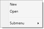 |
<ContextMenu>
  <MenuItem Header="New"/>
  <MenuItem Header="Open"/>
  <Separator/>
  <MenuItem Header="Submenu">
    <MenuItem Header="Submenu Item 1"/>
    <MenuItem Header="Submenu Item 2"/>
  </MenuItem>
</ContextMenu>
| ListBox | 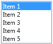 |
<ListBox SelectedIndex="0" Width="100">
  <ListBoxItem>Item 1</ListBoxItem>
  <ListBoxItem>Item 2</ListBoxItem>
  <ListBoxItem>Item 3</ListBoxItem>
  <ListBoxItem>Item 4</ListBoxItem>
  <ListBoxItem>Item 5</ListBoxItem>
</ListBox>
| ListView | 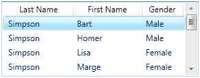 |
<ListView SelectedIndex="0" Height="110"
    ItemsSource="{StaticResource Characters}">
  <ListView.View>
    <GridView>
      <GridViewColumn Width="100"
        DisplayMemberBinding="{Binding Last}"
        Header="Last Name" />
      <GridViewColumn Width="100"
        DisplayMemberBinding="{Binding First}"
        Header="First Name" />
      <GridViewColumn Width="60"
        DisplayMemberBinding="{Binding Gender}"
        Header="Gender" />
    </GridView>
  </ListView.View>
</ListView>
| TabControl | 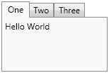 |
<TabControl Width="150" Height="100">
  <TabItem Header="One">
    <TextBlock>Hello World</TextBlock>
  </TabItem>
  <TabItem Header="Two" />
  <TabItem Header="Three" />
</TabControl>
| ToolBar |  |
<ToolBar Margin="2">
  <Button Command="ApplicationCommands.Open"
      Height="40" Width="40"
      Background="{StaticResource OpenIcon}" />
  <Button Command="ApplicationCommands.Save"
      Height="40" Width="40"
      Background="{StaticResource SaveIcon}" />
</ToolBar>
| TreeView TreeViewItem |
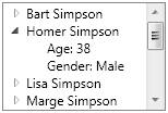 |
<TreeView Width="150" Height="100"
    ItemsSource="{StaticResource Characters}">
  <TreeView.Resources>
    <HierarchicalDataTemplate
        DataType="{x:Type src:Character}"
        ItemsSource ="{Binding Fact}">
      <TextBlock Text="{Binding Name}" />
    </HierarchicalDataTemplate>
    <DataTemplate DataType="{x:Type src:Fact}">
      <StackPanel Orientation="Horizontal">
        <TextBlock Text="{Binding Name}" />
        <TextBlock Text=": " />
        <TextBlock Text="{Binding Value}" />
      </StackPanel>
    </DataTemplate>
  </TreeView.Resources>
</TreeView>
A Control in its Own Right
The controls listed above are most often used because of the additional features they provide on top of the base ItemsControl class. However, it should also be noted that an ItemsControl may be instantiated and used directly, as shown in the following example:
<Grid xmlns:x="http://schemas.microsoft.com/winfx/2006/xaml"
    xmlns="http://schemas.microsoft.com/winfx/2006/xaml/presentation">
  <Grid.RowDefinitions>
    <RowDefinition Height="Auto" />
    <RowDefinition />
  </Grid.RowDefinitions>
  <ItemsControl VerticalAlignment="Top">
    <ItemsControl.ItemTemplate>
      <DataTemplate>
        <Button Command="{Binding}" Content="{Binding}"
          CommandTarget="{Binding ElementName=EditRegion}" />
      </DataTemplate>
    </ItemsControl.ItemTemplate>
    <ItemsControl.ItemsPanel>
      <ItemsPanelTemplate>
        <StackPanel Orientation="Horizontal" />
      </ItemsPanelTemplate>
    </ItemsControl.ItemsPanel>
    <x:Static Member="ApplicationCommands.Cut" />
    <x:Static Member="ApplicationCommands.Copy" />
    <x:Static Member="ApplicationCommands.Paste" />
  </ItemsControl>
  <TextBox Name="EditRegion" Grid.Row="1" />
</Grid>
This markup creates what you might call a poor man’s toolbar. (No, it’s not a very likely real-world scenario.) In future posts, we will explore reasons why you might choose to use an ItemsControl directly, rather than, say, a ListBox.
Is a Panel an ItemsControl?
No. The logical children of a panel are UIElements, whereas the logical children of an ItemsControl (its Items) can be any CLR objects.
Sidebar: So what is a panel? The main role of a panel is to provide layout support for its children. Although a panel does maintain a collection of child elements, it is not technically a WPF “control”… That is, it does not derive from the Control base class and it does not support the WPF notion of templating. Instead, it is a single element with a single purpose… namely, to size and position (a.k.a., measure and arrange) its children.
Why should I care about the ItemsControl class?
Since it’s such an abundant control, it will pay dividends to take time now to understand the basic principles that apply to the ItemsControl class and its descendants. Once you understand these concepts as they pertain to one ItemsControl variant, perhaps a ListBox, it will be very easy to apply that same knowledge to other variants.
And suppose you should someday stumble upon a declaration like this:
<dw:Graph ItemsSource="{Binding Source={StaticResource OrgChartItems}}"
    ItemContainerStyle="{StaticResource NodeStyle}"
    ItemTemplate="{StaticResource EmployeeTemplate}"
    ItemsPanel="{StaticResource TreeGraphPanelTemplate}" />
Armed with your existing knowledge, you won’t panic in the least. You will simply recognize that this Graph object is a custom ItemsControl and you will immediately understand how to use the majority of its features.
What will be covered?
In future posts in this series, I hope to cover each of the topics below in some detail. I’m sure this is not an exhaustive list, but it should give you a general feel for the direction of the series.
- The Item Collection: Items vs. ItemsSource
- Recognizing when to use an ItemsControl
- Item Templates
- Item Containers
- Item Container Generation
- The Items Host (or ItemsPanel)
- Styling and Templating an ItemsControl
- Traversing Container and Template Trees
- The HeaderedItemsControl
- Styling and Templating a Headered ItemsControl
- Building a Custom ItemsControl and Item Containers
- UI Virtualization
Please let me know what other topics you’d like me to add to the list. And please stay tuned for the next topic in this series… “B is for Bet You Can’t Find Them All!”
Great post. Go Doctor, go! 😉
Hi doc, your brilliant posts make me feel like saying something. It is always the pleasure to read your posts. They can always resolve some problems of mine, which makes me expect even more outputs from you. Just keep going, doc! I wish I could be as good as you are some day!
Hi. Well ,first thanks for a great intro to the different controls. I would though have been nice i you were able to download the xml / ico resources so you did have the possibility to fiddle a bit with the code. Regarding the illustration of the listview – As a newbee to wpf i have seen a couple of listview tutorials but none which have alignment of the text in a column ! e.g. if you wanted to represent currency to a user. Or a row select which collects all the cell values in a row , so you are able to manipulate data as one see fit. At this point it seems like the grid control is none existing in wpf yet. I think that this has a very high importancy to windows / web developers. This i think is an obstruction in adopting wpf in depth to one’s applications at this moment. Any way ,thanks for a great site which a have added to my rss feeds. Jens
Hi Jens, To right-align a column in a ListView, you need to define a cell template. If its just textual data in that column, your template can simply be a TextBlock element whose TextAlignment property is set to “Right”. Cheers, -dw
Great post, you are the best!!!!
Dr, I’m trying to override a TabControl’s ItemPanel so it displays it’s items in a vertical stack, but the intuitive <TabControl.ItemsPanel> <ItemsPanelTemplate> <StackPanel IsItemsHost="True"/> </ItemsPanelTemplate> </TabControl.ItemsPanel> — doesn’t seem to work. How can I do this? I realize it sounds funny (like why not just use a ListBox) but this is for a demo where I can demonstrate that a control can change appearance without changing logical structure.
Yes, if only it were that easy! TabControl is its own strange little beast in a lot of ways. I will have to dedicate a special post to it in this series. In the meantime, check out Nathan’s post here.
Sorry if the question has been asked already, but I am stuck at trying to access (read and write) the content on a cell give it row and column indexes. Pleeeeease help me Dr WPF.
God > infinity
Solid, Liquid, Gas, Plasma, Light, Soul, Spirit 🙂
Hi,
Im creating some treeview items inside a treeview. I tried giving background with border for the Treeview items and i find that there is a distance between the margin and the child items with no colours.Can you help me fix this?
Hi Ali,
I assume you are working with a ListView that is using a GridView to present its rows. Although this looks like a data grid conceptually, it is really a virtualized stack panel of GridViewRowPresenter objects. You should be able to use the row index to find the proper GridViewRowPresenter (which will be a child of the ListViewItem for the given row). You can then use the column index to find the cell within the presenter.
Chances are that you will want to modify a data item based on its column index. This can get tricky for a GridView (because columns can be dragged around to reorder them). There are some internal properties that will give you the proper cell/data item mapping, but it will require reflection to access these.
Although I have managed to push the native GridView further than it was designed to go, it has always been through trial and terror. The easiest (and best, imho) solution for .NET 3.0/3.5 is to use a *real* data grid from a 3rd party vendor like Xceed.
Cheers,
-dw
Hi WPF Developer,
It sounds like there may be a Padding value in play also in your scenario. I’d be happy to take a look if you want to send me a sample of the style you are using for your TreeViewItems that demonstrates the margin issue.
Regards,
-dw