A Few Good Metadata Options for Silverlight

May 8th, 2010

I’d like to highlight one more feature that is available in Silverlight if you use my code snippets.

Those who watched the value coercion video might have glimpsed the following enum within the FrameworkPropertyMetadata.cs code file:

[Flags]
public enum FrameworkPropertyMetadataOptions : int
{
    None = 0x0,
    AffectsMeasure = 0x1,
    AffectsArrange = 0x2,
    AffectsParentMeasure = 0x4,
    AffectsParentArrange = 0x8,
}

This enum provides a limited subset of the metadata options that are available in WPF.  Specifically, these are the options used with dependency properties that affect layout.

How do metadata options work?

If you are not familiar with these metadata options, here’s a quick rundown…  In WPF, a dependency property on a framework element can be registered with one or more metadata options.  This is done by combining the desired flags using a bitwise “OR” and then passing that value into the appropriate DependencyProperty.Register() overload.

As an example, the Width property on FrameworkElement is registered with the AffectsMeasure option.  As such, the property engine will take care of invalidating measure on the target element whenever the Width property changes.

The other layout options work pretty much the same way.  The AffectsArrange flag will cause InvalidateArrange() to be called on the target element when the property changes.  The AffectsParentMeasure and AffectsParentArrange flags will cause InvalidateMeasure() and InvalidateArrange() to be called, respectively, on the target element’s parent.

It’s All About Portability

In Silverlight, there is no native mechanism for registering a property to affect measure or arrange.  As such, you typically register a PropertyChangedCallback on the property and then explicitly call InvalidateMeasure() and/or InvalidateArrange() within your callback. 

If you use my snippets, you can follow the exact same approach in Silverlight that you would use in WPF for properties that affect layout. My FrameworkPropertyMetadata class will take care of the necessary layout invalidations.  So a property that affects measure could be declared in Silverlight using my ‘dp s1’ snippet, as follows:

#region VerticalExtent

/// <summary>
/// VerticalExtent Dependency Property
/// </summary>
public static readonly DependencyProperty VerticalExtentProperty =
    DependencyProperty.Register("VerticalExtent", typeof(double), typeof(MyControl),
        new FrameworkPropertyMetadata(double.NaN,
            FrameworkPropertyMetadataOptions.AffectsMeasure));

/// <summary>
/// Gets or sets the VerticalExtent property. This dependency property
/// indicates the vertical extent of the control.
/// </summary>
public double VerticalExtent
{
    get { return (double)GetValue(VerticalExtentProperty); }
    set { SetValue(VerticalExtentProperty, value); }
}

#endregion

What about the other WPF metadata options?

There are several metadata options in WPF that are not included in my Silverlight enum.  These are intentionally excluded because they either cannot be supported outside the native Silverlight framework (e.g., the property engine would need to be modified to support the NotDataBindable option) or they simply don’t make sense in Silverlight (e.g., Silverlight does not currently support direct rendering via an OnRender() override, so I don’t provide an AffectsRender flag).

I hope you find the provided layout metadata options handy!

Cheers!
Dr. WPF

Value Coercion for the Masses

May 5th, 2010

My latest snippets package adds value coercion support to Silverlight dependency properties. The mechanism for coercing values is identical to the CoerceValueCallback approach used in WPF.

What is value coercion?

If you are not familiar with value coercion, it is simply a mechanism by which related (or “interdependent”) dependency properties can be kept in sync and valid.

The quintessential example can be found within the Slider control. A Slider has both Minimum and Maximum properties. Clearly, it would be a problem if the Maximum value were allowed to fall below the Minimum value. Value coercion is used to prevent this invalid state from occuring.

In WPF, the Slider control (or more specifically, the RangeBase control) ensures that these property values stay valid by using a feature of the dependency property metadata called a CoerceValueCallback. Whenever the Maximum property value changes, it is passed through this coercion function. If the Maximum value happens to be less than the Minimum value, the function will coerce it to be equal to the Minimum value so that it is valid.

The coercion routine for the Maximum property looks something like this:

private static object CoerceMaximum(DependencyObject d,
    object value)
{
    double min = ((RangeBase)d).Minimum;
    double max = (double)value;
    if (max < min) return min;
    return value;
}

Whenever the related Minimum property changes, the control explicitly coerces the Maximum property. This ensures that the Maximum value stays valid with respect to the new Minimum value.

The property changed callback for the Minimum property looks similar to this:

private static void OnMinimumChanged(DependencyObject d,
    DependencyPropertyChangedEventArgs e)
{
     ((RangeBase)d).CoerceValue(MaximumProperty);
    ((RangeBase)d).CoerceValue(ValueProperty);
}

Notice that changes to the Minimum property also result in coercion of the Slider’s Value property. That’s because the Value property also needs to stay valid. More specifically, it must be kept between the Minimum and Maximum values. That means if either the Minimum or Maximum values change, the Value property must explicitly be coerced. As such, the property changed callback for the Maximum property also coerces the Value property, something like this:

private static void OnMaximumChanged(DependencyObject d,
    DependencyPropertyChangedEventArgs e)
{
    ((RangeBase)d).CoerceValue(ValueProperty);
}

Clearly, the Value property needs its own coercion routine to keep it between Minimum and Maximum. For completeness, here is what the CoerceValueCallback for the Value property looks like:

private static object CoerceValue(DependencyObject d,
    object value)
{
    double min = ((RangeBase)d).Minimum;
    double max = ((RangeBase)d).Maximum;
    double val = (double)value;
    if (val < min) return min;
    if (val > max) return max;
    return value;
}

Base Value vs. Effective Value

It is important to recognize that with value coercion, a dependency property has both a “base” (or “desired”) value and an “effective” (or “coerced”) value. The “base” value is always passed into the CoerceValueCallback and the value returned from that method becomes the new “effective” value.

In the case of the Minimum and Maximum example, if the “base” value of the Maximum property is less than the Minimum value, then the “effective” value of the Maximum property becomes equal to the Minimum value. Otherwise, the “base” and “effective” values are simply equal.

Value Coercion is Not Natively Supported in Silverlight

There’s nothing more frustrating than needing to port something from WPF to Silverlight and realizing that a key feature like value coercion does not yet exist in Silverlight. (For the record, I have no idea whether it will ever be supported natively, but if you use the mechanism provided by my snippets, you should be in great shape if/when we get true native support for value coercion in Silverlight.)

The lack of support for value coercion in Silverlight means you must roll a “do-it-yourself” version of the feature in your classes. The Silverlight Slider control attempts to do this. Unfortunately, this can lead to code that is cumbersome to maintain, especially if you need to use the same mechanism in several different classes.

Furthermore, achieving parity between frameworks can prove to be very difficult. As evidence of this, note that the pseudo-coercion within Silverlight’s native Slider control is just wrong. The Minimum property coerces the Value property upward, but does not coerce it back down correctly (and it’s likewise wrong for the Maximum property).

Value Coercion — There’s a Snippet for That!

To support value coercion in a consistent manner across your Silverlight classes, you can leverage my FrameworkPropertyMetadata class and the related SilverlightCoercionHelper class. Simply add a class file to your project called FrameworkPropertyMetadata.cs and then expand the “dp shc” snippet (Dependency Property — Silverlight Helper Classes) within it.

Whenever you declare a dependency property with a CoerceValueCallback (e.g., the “dp s3” snippet), you also need to initialize the owner type for value coercion and add a CoerceValue method to the class. To do this, expand the “dp scm” snippet (Dependency Property — Silverlight Coercion Methods) within your class.

To see a demonstration of the snippets in action, check out the video at the end of this post.

Cross-Framework Compatibility

If you use my snippets to support value coercion in Silverlight, your code should also compile just fine in WPF. When compiled in WPF, the framework’s native coercion mechanism will be used.

To support this cross-framework compatibility, you will notice that the helper classes and coercion methods in my snippets wrap certain code blocks within the #IF SILVERLIGHT directive.

Video Introduction to Value Coercion

I’ve put together a 14-minute screencast demonstrating all of this. Specifically, this video illustrates how value coercion works within the WPF and Silverlight native Slider controls. It then shows how to use my snippets to create similar interdependent Minimum, Maximum, and Value properties in a custom Silverlight control.

NOTE: The audio in this video has been “coerced” to protect the guilty! 😉

You can download the source code here for the Silverlight 4 sample coercion application created within the video.

I hope this helps a few folks maintain portable WPF/Silverlight code! 🙂

Cheers!
Dr. WPF

Updated Code Snippets for WPF and Silverlight

April 30th, 2010

I originally posted my Visual Studio WPF code snippets back in November of 2007. At that time, I was actually on the road delivering training for Silverlight 1.0. My co-instructor observed me using the snippets and suggested that I make them publicly available. It turned out to be a good suggestion, as I’ve received great feedback on the snippets over the last few years. Hopefully they’ve helped a few of you gain some productivity too. 🙂

We’ve definitely come a long ways since the days of SL 1.0 and javascript! My snippets have evolved over the years to better meet the needs of both WPF and Silverlight. An update is long overdue, so I’ve now posted the latest version of my snippets online…


Download the Snippets Here


Pick Your Language

As before, the installer package contains both C# and VB versions of each snippet. If you double click the .vsi file, you can choose exactly which snippets to install.

For those of you working in C#, you only have to remember a handful of shortcuts to access any of the 86 unique snippets:

  • dp (for dependency properties)
  • inpc (for an implementation of INotifyPropertyChanged)
  • op (for observable properties)
  • rc (for routed commands)
  • re (for routed events)

For those of you who work in VB, well… you have my sympathies! Just kidding. 😉 I would suggest using the snippet picker until you learn the shortcuts for the particular snippets that you find most helpful.

Pick Your Framework

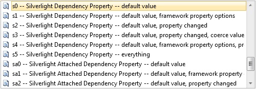
Although my (self-endowed) doctoral degree is in WPF, I also spend a good amount of time writing Silverlight code. This latest snippet package brings my Silverlight snippets in line with my WPF snippets. For example, all 6 variations of dependency property declarations are now fully supported for SL 3 and SL 4. In C#, you can quickly access the dependency property snippets for Silverlight by typing ‘dp’, hitting Tab twice, and then typing ‘s’. You should see something like the following:

Silverlight Snippets

In addition to declaring DPs, I also use the ‘inpc’ and ‘op’ snippets quite heavily in Silverlight.

The ‘rc’ and ‘re’ (routed commands and routed events) snippets are mostly for WPF. However, the ‘re c’ snippets are very useful for declaring custom event args even in Silverlight. Just remember to hit delete when you tab to the “Routed” field in the snippet. There is also an ‘re s’ snippet that I use in Silverlight when I need to provide a property changed event. Note that the event it provides is not truly routed, as SL does not allow you to insert custom events into its routed pipeline. Still, it is often the appropriate choice when you want to create cross-framework code.

What changed?

Aside from the addition of about 20 new snippets, there were also a few improvements to the older snippets.  If you are using an earlier release, you may notice a few of these changes.  Probably the biggest difference is in the following method signature (found in many DP snippets):

Old Snippet

/// <summary>
/// Provides derived classes an opportunity to handle changes
/// to the Whatever property.
/// </summary>
protected virtual void OnWhateverChanged(DependencyPropertyChangedEventArgs e)
{
}

New and Improved Snippet

/// <summary>
/// Provides derived classes an opportunity to handle changes 
/// to the Whatever property.
/// </summary>
protected virtual void OnWhateverChanged(double oldValue, double newValue)
{
}

Without going into the mundane details, I’ll just say that the motivation for changing this signature on the WPF snippets was mostly code portability between WPF and Silverlight.  The former signature did not always work well because Silverlight does not provide a public constructor for DependencyPropertyChangedEventArgs.  This became problematic in coercion scenarios.  I also prefer the latter version because it provides a type-specific OnChanged callback, but that’s just a personal preference.

Are the old snippets still available?

For the luddites who are not ready for these modernized snippets, you can still download the older snippets here. 😉

For everyone else, I hope you like the new snippets!  There are a few gems in there which I’ll expound upon further in future posts.

Time to Update Your Theme Files

April 13th, 2010

In ‘L’ is for Lookless, I introduce WPF’s lookless control model and examine what it means to style and template a control in WPF.  I also talk about the importance of  keeping the default Windows theme files on hand as a general reference for control styling and templating.

Now that WPF 4 has officially released (as part of Microsoft .NET Framework 4.0), it is a good time to update your WPF theme files.

The latest theme files can be downloaded here.

Not a lot has changed in the templates of the existing controls… mostly just fixes (e.g., dynamic bindings to system colors for border strokes).

The real benefit to the new theme files is that the updated styles demonstrate how to enable some of the new WPF 4 features (like ClearType text rendering and ScrollViewer panning in response to touch input).

There are also a few new controls (DatePicker, DataGrid, etc) that have officially moved out of the WPF Toolkit on CodePlex and into the framework.  The updated theme files provide a good reference for styling and templating these new controls.

Render Transforms and Focus Visuals

January 29th, 2010

While cleaning out my inbox, I came across a few old emails that I missed during a recent crunchtime. I think one question merits a public (albeit rather late) reply, as I’ve seen it crop up in other scenarios in the past:


Hi Dr WPF

When an element receives keyboard focus, it seems to get a dashed border indicating the focus by default. However, if I subsequently adjust the RenderTransform of the container, this keyboard-focus rectangle doesn’t move accordingly.

Can you explain what’s happening, and possibly suggest solutions?

Thanks
David


Hi David,

The dotted line that you are seeing is called the “focus visual” for the control. If the keyboard is used to focus an element, then its focus visual will be rendered within the nearest parent adorner layer. More on that in a moment.

Focus Visual Styles

Most controls simply use the default focus visual style which you’ve described in your email. All themes (Aero, Classic, Luna Homestead, Luna Metallic, Luna NormalColor) define the exact same default focus visual style:

<Style x:Key="{x:Static SystemParameters.FocusVisualStyleKey}">
  <Setter Property="Control.Template">
    <Setter.Value>
      <ControlTemplate>
        <Rectangle StrokeThickness="1" Stroke="Black"
            StrokeDashArray="1 2" SnapsToDevicePixels="true" />
      </ControlTemplate>
    </Setter.Value>
  </Setter>
</Style>

This provides a dotted line around the control that has keyboard focus. If you want something more elaborate, you can give an element a custom focus visual by setting its FocusVisualStyle property.

Focus Visuals are Rendered within an Adorner

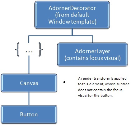
The important thing to note is that a focus visual is not part of the target control’s subelement tree. Rather, it is the child of a special adorner (FocusVisualAdorner) that is dynamically created by the keyboard navigation manager. This adorner is added to the adorner layer of the nearest parent AdornerDecorator element. As such, the focus visual is rendered over the top of the target control, but in a separate subtree of a larger visual tree.

Most of the time, the nearest parent AdornerDecorator will be the one declared as part of the parent Window control’s template. This is nearly at the top of the visual tree. This can lead to the problem you’ve described. Namely, if the focus visual is rendered and then you subsequently adjust the RenderTransform on the focused control, the focus visual will not automatically be rerendered in the correct location.

Consider the following simple scene:

<Canvas> 
  <Canvas.RenderTransform>
    <TransformGroup>
      <TranslateTransform x:Name="translateTransform" />
      <ScaleTransform ScaleX="2" ScaleY="2" />
    </TransformGroup>
  </Canvas.RenderTransform>
  <Button x:Name="button">Click Me</Button>
</Canvas>

Suppose we focus the button and then subsequently change the translate transform, as follows:

    translateTransform.X += 25;

This can lead to a broken visual appearance:

In this case, we have translated the canvas that contains our button after the focus visual has already been rendered at the button’s original location.

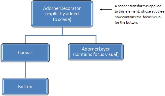
The following diagram depicts the problem showing the relevant elements of the visual tree:

A Simple Workaround

In the above scenario, if we were to cause a layout pass, perhaps by adding a call to button.InvalidateArrange(), the focus visual would suddenly pop into the correct position. This is because the framework uses the layout pass to update adorner positions to match their target elements.

So here is one way to work around the issue:

    translateTransform.X += 25;
    button.InvalidateArrange();

Shouldn’t changing the RenderTransform automatically affect focus visuals?

Arguably, it would have been nice of the framework developers to solve this problem for us. But that would have had an associated performance cost.

The great benefit of using a RenderTransform is that it does not incur a layout pass. The element only needs to measure, arrange, and render itself once. At that point, it has handed its render data to the MIL (Media Integration Layer) so that it can be quickly drawn to the screen. Any changes to the render transform from that point forward will cause a very performant redraw of the subtree using the existing render data with the appropriate matrix math applied.

To make things even more complex, the render transform that is affecting the focused element may appear anywhere in the parent tree. The framework could certainly track all this (and maybe it should), but it would add overhead so its easy to see why it does not.

An Alternative Workaround that Doesn’t Require Code

The real problem in this scenario is that the subtree containing the focused control is being affected by the render transfom while the the adorner layer containing the focus visual is not. As such, another solution is to simply add a closer adorner layer directly within the transformed subtree.

In the previous example, we were applying a render transform to the canvas that contained the button. We can give this canvas its own adorner layer by simply wrapping it with an AdornerDecorator element. Then we can apply our render transform directly to that new AdornerDecorator, as follows:

<AdornerDecorator> 
  <AdornerDecorator.RenderTransform>
   <TransformGroup>
      <TranslateTransform x:Name="translateTransform" />
      <ScaleTransform ScaleX="2" ScaleY="2" />
    </TransformGroup>
  </AdornerDecorator.RenderTransform>
  <Canvas>
    <Button x:Name="button">Click Me</Button>
  </Canvas>
</AdornerDecorator>

The visual tree for this scene now looks like this:

Since the render transform is now on the AdornerDecorator, it affects this entire tree (the AdornerDecorator and all of its descendants) so dynamically updating it causes all render data, including the data for the focus visual, to be updated.

Tip of the Day:  If you are going to apply a render transform to a tree that contains focusable controls, you might consider wrapping that tree in an AdornerDecorator and applying the render transform to the decorator instead.  Voîla!  Problem solved. 🙂

Hope this helps!

Cheers,
Dr. WPF

Greetings from the Cloud!

August 17th, 2009

I have completed the initial migration of this blog to my new host, RackspaceCloud.  If you’re able to read this, then I was (at least partially) successful! 🙂

Most URLs should be the same, although I’m sure people will find a few broken links over the short term.  If you stumble across anything on my site that is not working, please feel free to drop me an email and I’ll try to fix the issue.

Thanks to everyone who provided feedback and recommendations for web host providers.  In the end, it came down to a choice between DiscountASP and RackspaceCloud.  I chose the latter.  DiscountASP would probably have been great too, but they have basically the same terms of service as DailyRazor.  I just don’t want to risk running into more of the same issues.

As expected, the port to the new host was not entirely without issue.  The version of DotNetNuke (DNN) that I was using on the old host was not fully compatible with IIS 7 and SQL 2008.  As such, I had to upgrade to the latest DNN.  Unfortunately, the blog module I’m using only partially works on the latest DNN.  The “comments” feature does not work at all.  I tried upgrading the blog module, but the newer version throws even more exceptions than the old.  🙁

I wish I had time to get in and debug the blog module… well, not really… the last thing I want to do is debug VB-based  ASP.NET code!  For now, the comments feature remains disabled. 

This pretty much solidifies my plan to migrate to different blog software.  Once I’m up and running on wordpress (or whatever I settle on), I will try to move all of the old articles and comments to that package.  If I can, I’ll preserve the old article links.  At the very least, I’ll forward them to the new addresses.

As of December 2009, this site is now up and running on wordpress and comments are once again enabled.  🙂  Please let me know if you encounter any old links that do not resolve to the proper location on the new site.

Thanks for bearing with me during this migration!  I hope to get back to the interesting stuff (a.k.a., WPF) soon!

The Great Migration Begins! (blog comments are temporarily disabled)

August 14th, 2009

I’ve begun the rather tedious task of migrating this blog and all referenced web apps to a new web host.  The site will continue to be hosted by my old host during the transfer, but I wanted to give folks a heads up that I’ve temporarily disabled comments so that my current snapshot of the database remains accurate during the transfer. 

If all goes as planned, I will move the site in its entirety to my new host and then resume its normal functioning.  (Keep your fingers crossed!)

I am also planning to simplify my blog UI a bit in the near future, as I am finding DotNetNuke a little too cumbersome to maintain.  As such, I am evaluating several alternative blogging applications (including the newest version of DotNetNuke, just to be fair).

So far, I have to say that WordPress is winning the race, in large part due to its ease of use.  I’d hate to leave ASP.NET behind, but I’m really liking the MySQL/php solution a lot.  Unless I find a compelling .NET-based blog package that offers me something I can’t live without, I may bid IIS and MSSQL adieu.

We’ll see… I’d ask for feedback, but oh yeah… I disabled comments!  😉

If anyone feels strongly about their blogging software, I can still be reached by email.  Of course, if you make the email sound like an advertisement for your blog software, I’m fairly confident it will be stripped by my spam filters!  😛

See you on the flip side!

ItemsControl: 'N' is for Natural User Interface

August 5th, 2009

Okay, this post isn’t really about creating a full blown Natural User Interface (NUI)… I just wanted to jump on the NUI bandwagon while it’s still the cool new thing! 😉 This post is actually about supporting a very specific natural user interaction within an ItemsControl.

Microsoft Surface was first publicly unveiled a couple of years ago. Since then, I have periodically been asked how one would go about creating a panel that behaves like the application launcher in Surface. If you have not seen the app launcher, I would describe the panel as simply a horizontal StackPanel that infinitely cycles its children.

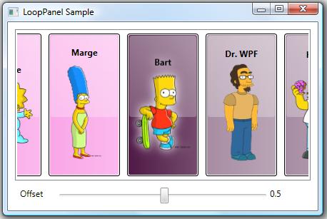
I had some extra time this weekend, so I refactored one of my early looping panels into something that might be useful for a wider audience. This post also includes a simple demo showing how the LoopPanel can be used as the items host of a custom ListBox class. The LoopingListBox class supports dragging its items in a manner similar to the Surface app launcher. This demo brings the same type of natural user interaction to desktop WPF (via mouse) that you might find on Surface.

If you are actually developing for Surface, be sure to check out the Sidenote for Surface Developers section below for information on why you might prefer my panel over the sample supplied in the Surface documentation. 😛

If you have not yet read ‘P’ is for Panel, I would highly recommend it as a foundation for this article.

The LoopPanel Sample Application

To give you a better understanding of the panel examined within this post, you can run this ClickOnce LoopPanel sample application. (Yes, I could have published an XBAP sample, but I was not willing to give up the glow effect used for the selected character… which is, incidentally, achieved using a DropShadowEffect in the new effects pipeline.)

You can also download the entire project with full source code to build the demo yourself.

Sidenote and Tip: Even in the new pipeline, DropShadowEffect is a rather expensive effect because it requires multiple passes. The LoopPanel sample is very simple and is therefore not impacted much by the use of DropShadowEffect. If you experience poor performance using DropShadowEffect in a real app scenario, you can usually accomplish a very similar effect by applying a BlurEffect to a second copy of an element residing directly behind the original element.

The LoopPanel Layout Algorithm

Whenever I’m creating a new panel, I start by clearly defining its layout algorithm. This allows me to identify the exact properties that will be necessary to support the new layout.

In the LoopPanel class, I wanted to support both a horizontal and vertical orientation, just as StackPanel does. I also decided to use the same basic measuring algorithm as StackPanel, measuring each child to infinity in the stacking direction (the orientation direction) and measuring it to the panel’s available size in the nonstacking direction. (This just means a child can be whatever size it desires in the stacking direction, but it is constrained in the nonstacking direction.) To support these layout requirements, it was clear that I would need an Orientation property.

Of course, there are some key differences between a LoopPanel and a StackPanel. For example, a StackPanel arranges its children sequentially, beginning with the first child and stacking subsequent children one right after the other. However, a LoopPanel really eases the concept of a “first” child. There’s no reason that the nth child cannot appear first. So I needed a way to define the element that would be considered pivotal during a given layout pass. As such, I created the notion of a “pivotal child”.

The pivotal child is the element around which the remaining children are arranged. The pivotal child is placed first. Then its neighboring siblings (the subsequent and preceding members of the children collection) are placed, working away from the pivotal child in both directions until all remaining visible children are arranged. This allows for a balanced layout around the pivotal child. Nonvisible children (those that are outside the panel’s viewport) are then arranged using a layout rect with no size (both width and height are zero). This zero-sized rect provides a perf optimization (less layout processing and generated render data), especially for elements with elaborate subtrees, which you might have in an ItemsControl with a complex item template.

Obviously, any child could be the pivotal child. This meant I would need a property that could be used to identify the index of the pivotal child. I decided to call this the Offset property. The name might not make a lot of sense at first, but it should shortly. What might make even less sense is that the Offset property is of type double. So why would we need a double value to act as an index into a collection?

Actually, only the whole portion of the Offset value is considered when determining the index of the pivotal child. The fractional portion is then used to further offset that pivotal child. For example, given an Offset value of 6.25, the child at index 6 is the pivotal child and it is offset by 25% of its width (for a horizontally oriented LoopPanel) from the pivotal location. This means that if the Offset animates from 6 to 7, the child’s location animates by its entire extent. Then the child at index 7 becomes the pivotal child. Using this approach, the Offset property simply specifies the logical offset of the panel’s children.

Okay, shouldn’t the Offset value be constrained to only valid child indices? What happens when you animate the Offset from 6 to 7, but there are only 5 children? Well recall that the LoopPanel needs to cycle its children infinitely. To enable this infinite looping of children, the Offset property is completely unbounded. Any double value is valid. So to truly determine the index of the pivotal child, the Offset value is taken modulo the current count of children. So animating the Offset from 6 to 7 when you only have 5 children is equivalent to animating the Offset from 1 to 2.

The final layout issue was to determine exactly where to place the pivotal child within the panel’s available extent. More specifically, where is the pivotal location for the placement of the pivotal child. We could simply start at the beginning of the available space (similar to a StackPanel), but that is rather limiting, especially considering that the motivation for this panel is the app launcher in Surface, which puts the central focus at the center of the panel. To this end, I decided to allow the pivotal location to be specified using a RelativeOffset property on the LoopPanel.

RelativeOffset is a double value ranging from 0 to 1. A value of 0 (zero) means that the pivotal location is at the beginning of the panel’s available space. A value of 1 means the pivotal location is at the end of the panel’s available space. The default value is 0.5, which means the pivotal location is at the center of the panel.

That’s it for the description of the layout algorithm. We’ve identified three properties: Orientation, Offset, and RelativeOffset. To see how these properties are defined and actually used to implement the described layout algorithm, I refer you to the LoopPanel code within the sample project. As with every panel, the key methods that implement the layout are MeasureOverride() and ArrangeOverride().

Not a Typical ScrollViewer Paradigm

Once the LoopPanel has been implemented, the next logical question becomes how will we support scrolling its children? Clearly, we have an Offset property that can be used to this effect. The first inclination might be to leverage a ScrollViewer and use its horizontal or vertical offset to update the Offset property on the LoopPanel. There are a couple of problems with this approach.

First, a ScrollViewer measures its child to infinity in each of the scrollable directions (vertical and horizontal). In a typical ItemsControl scenario, this means that the items host gets to be whatever size it desires. The big problem here is that the LoopPanel doesn’t want to determine its own size in the non-orientation direction. Instead, it simply wants to layout its children using the space available.

The other big problem with using a ScrollViewer with the LoopPanel is that the native WPF ScrollViewer was designed to support scrolling across a finite range. In the LoopPanel, however, we want to support an infinite offset range in the orientation direction. As such, we must come up with a new method of looping through (scrolling) the children in our panel. The most logical choice is to allow a simple dragging gesture to update the Offset property. We will come back to this idea in a bit (see “Supporting Natural User Interactions” below).

Sidenote for Surface Developers

The latest Surface SDK documentation includes a topic called, “Creating a Continuously Panning List”. It demonstrates how you can build a panel similar to my LoopPanel that will work in conjunction with the SurfaceScrollViewer control. If you are developing exclusively for Surface, you might want to look at that sample.

For the record, I am not a fan of the layout logic used within that sample. The purpose of a panel is to provide layout for its children by arranging them within the panel. The sample panel provided in the Surface SDK actually applies a RenderTransform to itself to achieve a big piece of its layout. I strongly discourage developers from implementing controls that set their own RenderTransform or LayoutTransform properties. These properties do not belong to the control author. Rather, they belong to the person who is using the control. In the Surface sample, if someone tries to use the panel and they then apply their own RenderTransform to it, that transform will get trounced by the panel’s own layout logic.

I am also very partial to my own layout algorithm (go figure! :P), as it supports more options for aligning the children (left, right, center, or anywhere in between), it supports both vertical and horizontal looping of children, and it contains render optimizations by arranging nonvisible children using a zero-sized rect.

The approach described in this article will actually work well on both desktop PCs and on Surface. For the reasons outlined above, LoopPanel does not currently implement IScrollInfo or ISurfaceScrollInfo. (Well, the real reason is that I originally created the panel prior to the introduction of the ISurfaceScrollInfo interface.) However, it probably will support these interfaces in the future (see Potential Future Enhancements below).

Using the LoopPanel as an Items Host

Alright, our goal is to use our new panel as the items host for our custom LoopingListBox control. An ItemsControl, including our LoopingListBox, typically wraps its items host in a ScrollViewer. As we noted above, we don’t want our panel to be scrollable in the orientation direction. This means we need to customize the ScrollViewer within the template of the LoopingListBox to disable scrolling in the direction of the control’s orientation. The template below demonstrates how to achieve this:

<ControlTemplate TargetType="{x:Type dw:LoopingListBox}">
  <Border
      Background="{TemplateBinding Background}"
      BorderBrush="{TemplateBinding BorderBrush}"
      BorderThickness="{TemplateBinding BorderThickness}">
    <ScrollViewer x:Name="sv" Padding="{TemplateBinding Padding}"
        HorizontalScrollBarVisibility="Disabled"
        VerticalScrollBarVisibility="Auto">
      <dw:LoopPanel x:Name="lp" IsItemsHost="True"
          BringChildrenIntoView="True"
          Offset="{Binding Offset, Mode=TwoWay,
              RelativeSource={RelativeSource TemplatedParent}}"
          Orientation="{TemplateBinding Orientation}"
          RelativeOffset="{TemplateBinding RelativeOffset}" />
    </ScrollViewer>
  </Border>
  <ControlTemplate.Triggers>
    <Trigger Property="Orientation" Value="Vertical">
      <Setter TargetName="sv" Property="HorizontalScrollBarVisibility"
          Value="Auto" />
      <Setter TargetName="sv" Property="VerticalScrollBarVisibility"
          Value="Disabled" />
    </Trigger>
  </ControlTemplate.Triggers>
</ControlTemplate>

In this template, we have simply set the HorizontalScrollBarVisibility property to Disabled for a Horizontal LoopingListBox. If the Orientation is Vertical, we set the VerticalScrollBarVisibility property to Disabled. This achieves our aim.

Ensuring the Selection is Visible

Of course, there is another issue to consider. When an element within a ListBox becomes focused, the framework calls the BringIntoView() method on the element. This, in turn, raises a RequestBringIntoView event from the target element. Typically, this event bubbles up to the ScrollViewer, which handles it by calling the IScrollInfo.MakeVisible() method on the items host. If the items host implements IScrollInfo, it can then take the necessary action to scroll the element into view.

In our scenario, our panel does not implement IScrollInfo (see “Not a Typical ScrollViewer Paradigm”). As such, selecting an item that is not within the current view of the LoopPanel does not scroll it into view.

To make the LoopPanel class more useful, I have added an opt-in mechanism for it to directly handle the RequestBringIntoView event. If you set the BringChildrenIntoView property to true, then the panel will automatically update its Offset property when a descendant raises RequestBringIntoView. (In the template above, you’ll notice that BringChildrenIntoView is True on the LoopPanel.) This covers the typical ListBox usage scenario.

Supporting Dynamic Changes to the Children Collection

Another concern within our LoopPanel arises when you consider that the Children collection might dynamically change. Since the looping algorithm is built around the notion of an Offset property that positions other children around a single pivotal child, removing the pivotal child or adding/removing another child before the pivotal child will cause the visible children to shift positions (because the pivotal child changes).

This type of issue actually exists for all panels. Changing the Children collection causes a layout update. So whether you deal with this within the panel itself or leave it up to users of your panel to code around the issue is totally up to you.

In my usage scenario, I always wanted to prevent this layout jumping, so I modified the LoopPanel class, itself, by overriding its OnVisualChildrenChanged() method. When a child is added or removed, the Offset property is adjusted to keep the remaining elements in their current positions.

Supporting Natural User Interactions

Now for the fun part! We need to actually support a natural user experience that allows the panel to scroll its children by dragging them in the orientation direction.

There are a number of approaches that could be used here. I could have built the dragging (a.k.a. panning) support directly into the panel, but I’m kind of a purist when it comes to layout elements. A panel should do one thing… layout its children. In WPF, a panel does this by sizing and positioning (a.k.a., measuring and arranging) its children. A panel should not, in my humble opinion, respond directly to user input. For this reason, the LoopPanel does not directly support dragging by capturing or reacting to input events. It simply exposes a property called Offset that, as described earlier, provides an unbounded logical offset for the panel’s children.

In addition to the Offset property, the panel also provides a public method called Scroll(). The Scroll() method will internally update the logical offset to accommodate a specified delta of viewport units. This is important since most scrolling scenarios involve updating the panel’s offset using viewport units (e.g., pixels) rather than logical units. For example, you may want to pan the content 30 pixels in response to a drag delta of that distance. Our Offset property is not directly helpful in this case, since it refers to logical units. (30 logical units would represent 30 children, each with their own unique sizes.)

So if the LoopPanel does not respond directly to input events, how does it participate in the scrolling scenario? Well, as we’ve alluded to previously, a panel that needs to support scrolling typically does so by implementing IScrollInfo. This allows it to work in conjunction with a parent ScrollViewer. The ScrollViewer is the control that actually reacts to user input. As noted earlier, however, the concepts behind a ScrollViewer do not necessarily translate to our infinite scrolling scenario. And recall that when I first created this panel, the SurfaceScrollViewer did not yet exist, so implementing ISurfaceScrollInfo was not really an option. Even if it had been, I probably wouldn’t have opted for an approach that was limited to Surface.

Since I knew that I was going to use the LoopPanel as the items host of a ListBox, I decided to derive a custom LoopingListBox control that would interact directly with its items panel (the LoopPanel) to provide scrolling. The LoopingListBox class provides an attached behavior called IsDragHandle that can be attached to any UI element (a ListBoxItem, for example) within the subtree to make that element draggable. Dragging a drag handle causes the parent LoopingListBox to capture the Mouse (or Surface Contact) and update the scroll offset accordingly.

At a high level, the LoopingListBox supports a typical Windows drag operation. The input device (Mouse or Contact) is captured and subsequent changes are translated into deltas in the LoopPanel’s offset. This continues until the input device is released (the Mouse button is released, the Contact is lifted, or the device capture is otherwise lost). The mundane details can all be found in the provided sample code, so I won’t go over them here.

Using a LoopPanel on Surface

As mentioned previously, the LoopPanel class also works well on Surface. Since it does not yet support ISurfaceScrollViewer, I have derived a custom SurfaceLoopingListBox control from LoopingListBox. This class adds drag support for Surface input devices (a.k.a., Contact devices).

If you are lucky enough to have access to a Surface computer, feel free to download the Surface LoopPanel Sample here. If you have the Surface SDK installed, you can also simply run this sample within the Surface Simulator.

Potential Future Enhancements

There are a couple of enhancements that could make LoopPanel even more useful, including ScrollViewer support (via IScrollInfo) and UI virtualization (by deriving from VirtualizingPanel).

IScrollInfo and ISurfaceScrollInfo

At some point in the future, I will likely update LoopPanel to support IScrollInfo. I will also likely derive a new SurfaceLoopPanel class that implements the additional members of ISurfaceScrollInfo. These interfaces enable a clean separation between the panel and the controlling input element (the ScrollViewer or SurfaceScrollViewer). This should be a super simple upgrade, given the current LoopPanel design. I will certainly update this article with the new code, once the panel supports IScrollInfo and/or ISurfaceScrollInfo. 🙂

UI Virtualization

This panel is a very natural candidate for UI virtualization, since it already scrolls its children using logical units. (The Offset property can easily be thought of as a logical offset for the children.) In fact, I will likely use this panel as the basis for the upcoming ‘V’ is for Virtualization entry in this series, unless someone gives me a better idea.

I hope you find LoopPanel useful. As always, I welcome feedback and would love other ideas for improving the panel. If you find any scenarios where this panel does not meet your needs or where it simply misbehaves (a.k.a., bugs), please let me know!

Sorry about the down time!

June 29th, 2009

Warning:  There is nothing technical in this post and definitely nothing about WPF.  It is just an explanation and request for web hosting recommendations.

If you tried to reach my blog today and received an error, I apologize.  Evidently, my hosting service (normally I’d include a link to DailyRazor.com, but I don’t want to send them any business!), has decided that my site is too popular.  This is the third time they have shut down my domain because it had more than 200 concurrent connections.

Okay… I know some of you are wondering how I possibly get that much traffic, as delinquent as I am lately in posting new stuff.  I apologize for that too!  😳

Anyway, for whatever reason (I like to think it’s because there’s a decent amount of good WPF information here), this site gets quite a few visitors each day.  Every once in a while, too many of these connections occur at once.  My host told me today that if it happens again, they are shutting my account down for good.  I am VERY disappointed about this, and needless to say, I will be seeking a new host as soon as my schedule allows.

In the meantime, if anyone has a recommendation for a company that offers Windows-based hosting, please let me know.  I don’t make any money off of this site and I prefer not to host ads, so I am hoping for something affordable… preferably someone who offers phone support!

Thanks in advance for any recommendations!  And if you just want to rant about DailyRazor, feel free to post a comment below with the title "DailyRazor Sucks!"  But please don’t everyone post a comment at once… that’ll get my site turned off for sure!  😉

ItemsControl: 'L' is for Lookless (a.k.a., "Styles, Templates, and Triggers… Oh My!")

May 12th, 2009

As we continue our series on ItemsControl, it probably makes sense to take a small detour and look at WPF controls in general. In this post, we will examine how WPF controls get their visual representation through styles and templates. Then we will look at how these techniques specifically apply to several ItemsControl classes.

This article is fairly long and covers a lot of really important information, including the following:

It is definitely worth taking your time to understand these concepts. Feel free to break the article up into more manageable pieces if you are time-constrained.

I would also encourage you to keep kaxaml up and running as you learn about styles and templates. I think you’ll find that it makes the content more meaningful when you directly interact with the samples. As such, this article contains a lot of kaxamples, which is my term for kaxaml-ready samples. When you see the kaxaml symbol, you know you can cut and paste the included markup snippet directly into kaxaml to interact with it live. Then you are free to tweak the markup and make a few cool new styles and templates of your own!

The Lookless Control Model

When developers first start learning WPF, they are often very surprised to learn that a WPF control does not include a hardcoded visual representation. Rather, the default visual representation is specified in XAML in a completely separate theme assembly from the class that implements the control’s logic. This separation of code-based logic from visual representation (the control’s look and feel) is what makes the WPF control model so powerful. We refer to this approach as a “lookless control model”.

Why, you may be asking, is such a model better than the traditional approach of defining the visuals as part of the control? I’ll give you two big reasons: design and reusability.

If you’ve studied WPF or Silverlight much, you have certainly heard about the new developer/designer workflow that these technologies enable. Namely, developers and designers can work side by side to simultaneously create powerful and visually stunning applications, with each person doing what they do best. A developer can implement an application’s logic at the same time that a designer creates the application’s look and feel. To a great degree, it is the lookless control model that enables this new workflow.

It turns out that left-brained developers don’t always come up with the most eye-pleasing visual designs, as can be seen by looking at the “battleship gray” user interfaces coming out of the Windows Forms world for the past decade. Now contrast these apps with the vibrant Flash-based web applications created in the same timeframe. The big difference is that most of the cool Flash applications were created by right-brained designers who take aesthetics very seriously. (Yes, I’m stereotyping with the whole left-brained/right-brained thing… some stereotypes are just true.)

By introducing a lookless control model where the visual representation of the control is specified apart from the control’s code, we are able to put the visual design into the hands of a qualified UX designer, where it belongs.

The second big reason for separating a control’s visuals from its code implementation is reusability. In the past, if you wanted to have two buttons with different visual appearances, you had to create two separate button classes with the correct rendering code baked into each class. Both classes contained the same basic button logic. They both provided a “click” event in response to the appropriate mouse or keyboard user interactions. The only difference between the button classes was in the rendering logic.

By moving the visual representation into XAML and out of the control class, we allow a single Button class to be reused wherever we need to support a Click interaction. The button can have whatever visual representation the designer wants to create. The developer no longer needs to be involved in the process of redefining a button’s visual representation.

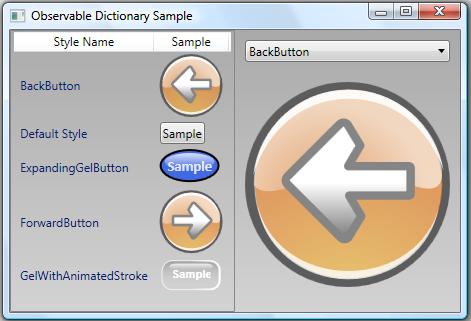
An example of this reusability can be seen in the following image (borrowed from my Observable Dictionary Sample) depicting a ListView in which each row contains a style name and a button. The only difference between each button is the “Style” used to define the button’s look and feel.
Introduction to Styles

We have already seen an example of how one might style and template an item container via the ItemContainerStyle property (see ‘I’ is for Item Container). Now it’s time to actually dig into the nitty gritty details of control styling and templating. If you are already familiar with styling and templating, you can skip ahead to the section entitled Templating an Items Control. (Of course, you might consider continuing on through the following sections as a refresher course and it’s possible you might even learn something new. :P)

A WPF style consists of a collection of property values that are applied to a framework element either explicitly (by setting its Style property) or implicitly (based on a resource lookup using the element’s default style key). These property values are applied using Setter objects. Thus, a style can be thought of as a collection of Setter objects. Here is a very simple example:

<Style TargetType="{x:Type Rectangle}">
  <Setter Property="Width" Value="50" />
  <Setter Property="Height" Value="50" />
</Style>

In this case, a style is created for a Rectangle. There are two setters in the style. These set the Width and Height properties of the Rectangle to 50.

So how do you actually use the style? Typically, you will give it a resource key and add it to a resource dictionary somewhere in your element hierarchy. Then you can use the resource key to apply the style to specific elements in the subtree. Here is a kaxample:

Kaxample: Try pasting the following markup snippet into kaxaml.

<Grid xmlns="http://schemas.microsoft.com/winfx/2006/xaml/presentation"
      xmlns:x="http://schemas.microsoft.com/winfx/2006/xaml">
  <Grid.Resources>
    <Style x:Key="MyRectangleStyle"
        TargetType="{x:Type Rectangle}">
      <Setter Property="Width" Value="50" />
      <Setter Property="Height" Value="50" />
    </Style>
  </Grid.Resources>
  <StackPanel Orientation="Horizontal">
    <Rectangle Style="{StaticResource MyRectangleStyle}" Fill="Red" />
    <Rectangle Style="{StaticResource MyRectangleStyle}" Fill="Green" />
    <Rectangle Style="{StaticResource MyRectangleStyle}" Fill="Blue" />
    <Rectangle Style="{StaticResource MyRectangleStyle}" Fill="Black" />
  </StackPanel>
</Grid>


In the above example, the style is explicitly applied to each Rectangle because we have set the Style property on the Rectangle elements. If we want the style to be applied implicitly to every Rectangle in the subtree, we can simply remove the x:Key attribute from the style declaration and then not specify the Style property on the Rectangle elements, as shown in this kaxample:

Kaxample: Try pasting the following markup snippet into kaxaml.

<Grid xmlns="http://schemas.microsoft.com/winfx/2006/xaml/presentation"
      xmlns:x="http://schemas.microsoft.com/winfx/2006/xaml">
  <Grid.Resources>
    <Style TargetType="{x:Type Rectangle}">
      <Setter Property="Width" Value="50" />
      <Setter Property="Height" Value="50" />
    </Style>
  </Grid.Resources>
  <StackPanel Orientation="Horizontal">
    <Rectangle Fill="Red" />
    <Rectangle Fill="Green" />
    <Rectangle Fill="Blue" />
    <Rectangle Fill="Black" />
  </StackPanel>
</Grid>

You may be curious as to why the above style is applied to all Rectangle elements in the subtree. The answer is hidden in the framework’s parsing routine for resource dictionaries. Each element added to a resource dictionary must have a key. It is noteworthy that the style above is conspicuously missing an x:Key attribute. It turns out that the XAML parser has special handling for Style objects that are added to a resource dictionary. If no key is specified, the parser uses the style’s TargetType as its key. So the above style declaration is actually equivalent to the following:

<Style x:Key="{x:Type Rectangle}" TargetType="{x:Type Rectangle}">
  <Setter Property="Width" Value="50" />
  <Setter Property="Height" Value="50" />
</Style>

There is a convention in WPF that an element’s type is used as its default style key. As mentioned earlier, if the Style property is not explicitly set on a framework element, a resource lookup takes place using this default style key (the element type) to find an appropriate style. Hence, in the example above, our style is applied to each Rectangle as a result of its default style key.

Now let’s take a look at a styling feature that even some of the most experienced designers may not know about…

Our style above can only be applied to Rectangle elements. What if we want to create a more generic style that can be applied to any framework element? It’s actually possible to create such a generic style by simply not setting the TargetType property. Of course, this creates some ambiguity for the framework because without knowing the object type, WPF doesn’t necessarily know how to interpret the Property member of a Setter. To remove this ambiguity, we must specify the object type in each setter, as shown here:

<Style x:Key="SharedStyle">
  <Setter Property="FrameworkElement.Width" Value="50" />
  <Setter Property="FrameworkElement.Height" Value="50" />
  <Setter Property="Button.IsDefault" Value="True" />
</Style>

Now the style can be applied to elements of differing types. In fact, generic styles actually give us the ability to set properties that are not shared by all of the elements to which the styles are applied. For example, the style above can be applied to both a Rectangle and a Button even though the style contains a Setter for the Button.IsDefault property, as shown in this kaxample:

Kaxample: Try pasting the following markup snippet into kaxaml.

<Grid xmlns="http://schemas.microsoft.com/winfx/2006/xaml/presentation"
      xmlns:x="http://schemas.microsoft.com/winfx/2006/xaml">
  <Grid.Resources>
    <Style x:Key="SharedStyle">
      <Setter Property="FrameworkElement.Width" Value="50" />
      <Setter Property="FrameworkElement.Height" Value="50" />
      <Setter Property="Button.IsDefault" Value="True" />
    </Style>
  </Grid.Resources>
  <StackPanel Orientation="Horizontal">
    <Rectangle Style="{StaticResource SharedStyle}" Fill="Red" />
    <Button Style="{StaticResource SharedStyle}">Click Me</Button>
  </StackPanel>
</Grid>


There is a lot more that could be covered in this section on element styling (including things like “based on” styles, overriding style properties, declaring styles at the application and theme levels, etc), but this is an introductory look so let’s move on now to control templates…

Introduction to Control Templates

We first introduced the concept of templates in ‘D’ is for DataTemplate. At that time, we learned that a template is just a tree of visual elements (along with some resources and triggers) used to define the look and feel of a member of the logical tree. As it builds the logical tree, the framework watches for controls and data items that have corresponding templates. When such an element is encountered, the appropriate template is “inflated” into the actual visuals that represent the logical item and those visuals are inserted into the visual tree.

We’ve already learned that a DataTemplate is used to declare the visual representation of a data item that appears within an application’s logical tree. In ‘P’ is for Panel, we learned that an ItemsPanelTemplate is used to declare the items host used within an ItemsControl. (Note that an ItemsPanelTemplate is a special template whose visual tree must consist of only a single Panel element.) In this section, we will look at a third type of template… a ControlTemplate.

As the name implies, a ControlTemplate is used to declare the visual representation for a control. All native WPF controls have default control templates for each Windows theme. These templates give controls their default visual appearance.

It should come as no surprise that the visual representation of a control like a Button is composed of several other WPF elements, including a ContentPresenter and an element to render the outer and inner lines that give the Button a 3-dimensional appearance. These subelements which make up the control’s appearance are part of its ControlTemplate.

The nice thing about the lookless control model is that we have full control over the visual appearance of all WPF controls. We can either accept a control’s default appearance or we can change the control’s appearance by defining our own ControlTemplate. Below is an example of a ControlTemplate for a ListBox:

<ControlTemplate x:Key="MyListBoxTemplate" TargetType="{x:Type ListBox}">
  <Border Background="White" BorderBrush="Black"
      BorderThickness="1" CornerRadius="6">
    <ScrollViewer Margin="4">
      <ItemsPresenter />
    </ScrollViewer>
  </Border>
</ControlTemplate>

This template defines a visual tree for the ListBox that consists of a Border, a ScrollViewer, and an ItemsPresenter. The logic behind the ListBox is still defined within the ListBox class, but the appearance is defined by us.

Note that similar to a style, the ControlTemplate class exposes a TargetType property. This property must always be set. If you ever notice your template is not being applied as expected, be sure to verify that the TargetType matches the control type.

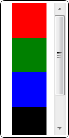
Now to apply our custom template to a ListBox, we simply set the Template property on the ListBox, as shown here:

<ListBox Width="80" Height="200"
    Template="{StaticResource MyListBoxTemplate}">
  <Rectangle Width="50" Height="50" Fill="Red" />
  <Rectangle Width="50" Height="50" Fill="Green" />
  <Rectangle Width="50" Height="50" Fill="Blue" />
  <Rectangle Width="50" Height="50" Fill="Black" />
</ListBox>

Setting the Template in a Style

In the previous example, we assigned a ControlTemplate to a ListBox by setting the Template property directly on the ListBox. This is not the most common scenario, though. Styles and templates were designed to go hand-in-hand. As such, templates are very often included as part of a style.

Remember that a style consists of a collection of Setter objects. For a control style, one of these Setter objects usually sets the Template property on the control, as shown in the following ListBox style:

<Style TargetType="{x:Type ListBox}">
  <Setter Property="Background" Value="LightGray" />
  <Setter Property="BorderThickness" Value="2" />
  <Setter Property="HorizontalContentAlignment" Value="Center" />
  <Setter Property="Padding" Value="5" />
  <Setter Property="Template">
    <Setter.Value>
      <ControlTemplate TargetType="{x:Type ListBox}">
        <Border Background="White" BorderBrush="Black"
            BorderThickness="1" CornerRadius="6">
          <ScrollViewer Margin="4">
            <ItemsPresenter />
          </ScrollViewer>
        </Border>
      </ControlTemplate>
    </Setter.Value>
  </Setter>
</Style>

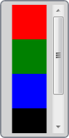
Suppose we add the above style to our application’s resources. Note that this style is using the exact same control template as we presented earlier. And since we’ve only set the TargetType on this style, all ListBox elements in our application will implicitly use our control template. So now we can add the following ListBox to our UI:

<ListBox Width="100" Height="200">
  <Rectangle Width="50" Height="50" Fill="Red" />
  <Rectangle Width="50" Height="50" Fill="Green" />
  <Rectangle Width="50" Height="50" Fill="Blue" />
  <Rectangle Width="50" Height="50" Fill="Black" />
</ListBox>

That looks pretty good, don’t you think? Well, upon closer inspection of our style, you might notice that a few things are not quite right. (Hint: Look at the first few Setter objects in the style.)

Clearly, we want our template and style to play nicely together. If we use a Setter in the style to set a property, we want the template to leverage that property. The problem in our example is that several property values (Background, BorderBrush, BorderThickness, Margin, etc) are hard coded on elements in our template. Other properties of the control are simply not bound to anything in the template. This clearly isn’t what we want. To fix these issues, we need to use something called a TemplateBinding within the template.

A TemplateBinding is a lightweight binding object used to link the value of a property on an element in the control template to the value of a property on the actual control that is being templated. In our ListBox example, we can add a few such bindings, as shown below, to achieve the desired result:

<Style TargetType="{x:Type ListBox}">
  <Setter Property="Background" Value="LightGray" />
  <Setter Property="BorderThickness" Value="2" />
  <Setter Property="HorizontalContentAlignment" Value="Center" />
  <Setter Property="Padding" Value="5" />
  <Setter Property="Template">
    <Setter.Value>
      <ControlTemplate TargetType="{x:Type ListBox}">
        <Border Background="{TemplateBinding Background}"
            BorderBrush="{TemplateBinding BorderBrush}"
            BorderThickness="{TemplateBinding BorderThickness}"
            CornerRadius="6">
          <ScrollViewer Margin="{TemplateBinding Padding}">
            <ItemsPresenter />
          </ScrollViewer>
        </Border>
      </ControlTemplate>
    </Setter.Value>
  </Setter>
</Style>

Now all of the properties being set within the style are connected to elements within the template. Thus, those properties are truly reflected in the control’s visual representation.

Introduction to Triggers

So far we’ve seen how to provide the look for a lookless control. Now let’s peek at the other half of the user experience… the feel. A control gets its look from the visuals. It gets its feel from how those visuals respond to state changes or user interactions. This is where triggers come into play.

A trigger is a collection of Setter objects (or animation actions) that get applied only when a given condition is true. WPF contains three main types of triggers: Trigger (also referred to as a property trigger), DataTrigger, and EventTrigger. It’s also possible to respond to multiple simultaneous conditions by using the related MultiTrigger and MultiDataTrigger objects.

There is a Triggers collection within each of the Style, ControlTemplate, and DataTemplate classes. This means that triggers can be used in both styles and templates, by adding them to the appropriate Triggers collection. (There is also a Triggers collection on FrameworkElement, but it can only contain event triggers… not property or data triggers.)

Let’s take a look at a very simple example. Here is a style for a Button:

<Style TargetType="{x:Type Button}">
  <Style.Triggers>
    <Trigger Property="IsMouseOver" Value="True">
      <Setter Property="Opacity" Value="0.7" />
      <Setter Property="TextBlock.FontWeight" Value="Bold" />
    </Trigger>
  </Style.Triggers>
</Style>

As you might expect, moving the mouse over a Button that is using this style causes the opacity of the Button to change to 0.7. It also changes the inherited FontWeight value for any contained TextBlock elements to Bold.

As the example above illustrates, triggers are fairly intuitive. You can pretty much understand how they work just by reading the markup. As such, we won’t spend too much time explaining their usage. Instead, we will just look at some tips and tricks for leveraging triggers in different scenarios.

A data trigger allows you to trigger off of a property on your data item by leveraging a Binding. This is most often used in the context of a DataTemplate, but don’t overlook the power of data triggers in other scenarios. For example, a data trigger is very handy for triggering off of a property on another object, as shown in this example:

<DataTemplate x:Key="MyItemTemplate">
  <Border x:Name="root" BorderThickness="2" CornerRadius="6">
    <TextBlock Margin="4" Text="{Binding XPath=@First}" />
  </Border>
  <DataTemplate.Triggers>
    <DataTrigger Value="True" Binding="{Binding Path=IsSelected,
        RelativeSource={RelativeSource AncestorType={x:Type ListBoxItem}}}">
      <Setter TargetName="root" Property="BorderBrush" Value="Pink" />
    </DataTrigger>
  </DataTemplate.Triggers>
</DataTemplate>

In this case, we are creating a DataTrigger that acts more like a property trigger by using a FindAncestor binding to get to a source object. Namely, we are triggering off of the IsSelected property on an ancestor ListBoxItem. This will allow us to draw a pink border around our template whenever it is selected. Now suppose our data item is a person and we only want a pink border when decorating a female. If the person is male, we instead want a blue border. We could achieve this by adding a second trigger, as shown in the following template:

<DataTemplate x:Key="MyItemTemplate">
  <Border x:Name="root" BorderThickness="2" CornerRadius="6">
    <TextBlock Margin="4" Text="{Binding XPath=@First}" />
  </Border>
  <DataTemplate.Triggers>
    <DataTrigger Value="True" Binding="{Binding Path=IsSelected,
        RelativeSource={RelativeSource AncestorType={x:Type ListBoxItem}}}">
      <Setter TargetName="root" Property="BorderBrush" Value="Pink" />
    </DataTrigger>
    <MultiDataTrigger>
      <MultiDataTrigger.Conditions>
        <Condition Binding="{Binding XPath=@Gender}" Value="Male" />
        <Condition Value="True" Binding="{Binding Path=IsSelected,
            RelativeSource={RelativeSource AncestorType={x:Type ListBoxItem}}}" />
      </MultiDataTrigger.Conditions>
      <Setter TargetName="root" Property="BorderBrush" Value="Blue" />
    </MultiDataTrigger>
  </DataTemplate.Triggers>
</DataTemplate>

Now we have added a MultiDataTrigger with two conditions. The first contains a Binding to a property on the data item that identifies the gender of the person. The second is the same binding we used earlier to get at the IsSelected property on the ancestor ListBoxItem. Now if the person is male and they are selected, the border will be blue.

The above example illustrates another important aspect of triggers and setters… namely that the order of triggers and setters is important. When multiple triggers evaluate to true, all of their setters are applied. More specifically, they are applied sequentially in the order that the triggers appear within the Triggers collection and in the order that the setters appear within each trigger. Here’s a simple way to think about this… if multiple setters target the same property, the last setter wins!

The final thing I will point out about this example is that it demonstrates how to combine both property triggers and data triggers by leveraging a MultiDataTrigger. At times, this can come in very handy. People tend to forget that a DataTrigger can always be used as a property trigger simply by setting the source of the binding appropriately.

There is one more type of trigger called an EventTrigger. An event trigger, as the name implies, can be used to start an action in response to an event. More specifically, an event trigger executes in response to a routed event. Here’s a kaxample of a Button that uses an event trigger to begin an opacity animation when the Button is first loaded:

Kaxample: Try pasting the following markup snippet into kaxaml.

<Canvas xmlns="http://schemas.microsoft.com/winfx/2006/xaml/presentation"
        xmlns:x="http://schemas.microsoft.com/winfx/2006/xaml">
  <Button Opacity="0" Content="My Button">
    <Button.Triggers>
      <EventTrigger RoutedEvent="FrameworkElement.Loaded">
        <BeginStoryboard Name="MyBeginAction">
          <Storyboard>
            <DoubleAnimation Storyboard.TargetProperty="Opacity"
                Duration="0:0:1" BeginTime="0:0:0.25" To="1.0" />
          </Storyboard>
        </BeginStoryboard>
      </EventTrigger>
    </Button.Triggers>
  </Button>
</Canvas>

In this example, the event trigger is added directly to the Triggers collection of the framework element (the Button), itself. Again, the FrameworkElement.Triggers collection can only contain event triggers. If you wish to use property or data triggers, they must be within the Triggers collection of a style or template.

Note that you cannot trigger off of a standard CLR event because the mechanism for supporting event triggers depends on the WPF event routing engine, which intelligently routes events to only the elements that have registered to receive them.

With a property or data trigger, the condition that causes the trigger to be applied is based on state. As such, the condition will be true for a period of time. As long as the condition evaluates to true, the setters are applied to their target properties. When the condition later becomes false, the setters are no longer applied and the target properties fall back to their untriggered values.

There is no such concept of state with an event trigger. An event is fleeting. The event fires and then it’s gone. Since the condition that invokes an event trigger is instantaneous, an EventTrigger does not contain a collection of setters. Rather, it contains actions which execute in response to the event. These actions allow you to control (start, stop, pause, resume, etc) the execution of storyboards. The example above uses a BeginStoryboard action in response to the FrameworkElement.Loaded event.

You may also want to set properties based on the firing of an event. Even though you don’t have setters, you can still use an EventTrigger to set property values. You achieve this by leveraging an object animation with a DiscreteObjectKeyFrame, as shown in this kaxample:

Kaxample: Try pasting the following markup snippet into kaxaml.

<Grid xmlns="http://schemas.microsoft.com/winfx/2006/xaml/presentation"
      xmlns:x="http://schemas.microsoft.com/winfx/2006/xaml"
      xmlns:sys="clr-namespace:System;assembly=mscorlib">
  <Grid.Triggers>
    <EventTrigger RoutedEvent="CheckBox.Checked">
      <EventTrigger.Actions>
        <BeginStoryboard>
          <Storyboard>
            <ObjectAnimationUsingKeyFrames Storyboard.TargetName="tb"
                Storyboard.TargetProperty="Text" Duration="0:0:0.1">
              <DiscreteObjectKeyFrame Value="Thanks!&#013;That felt great!!" />
            </ObjectAnimationUsingKeyFrames>
          </Storyboard>
        </BeginStoryboard>
      </EventTrigger.Actions>
    </EventTrigger>
    <EventTrigger RoutedEvent="CheckBox.Unchecked">
      <EventTrigger.Actions>
        <BeginStoryboard>
          <Storyboard>
            <ObjectAnimationUsingKeyFrames Duration="0:0:0.1"
                Storyboard.TargetName="tb"
                Storyboard.TargetProperty="Text">
              <DiscreteObjectKeyFrame Value="Oh yeah!&#013;I'm outta here!" />
            </ObjectAnimationUsingKeyFrames>
            <ObjectAnimationUsingKeyFrames Duration="0:0:0.1"
                Storyboard.TargetProperty="IsHitTestVisible">
              <DiscreteObjectKeyFrame>
                <DiscreteObjectKeyFrame.Value>
                  <sys:Boolean>False</sys:Boolean>
                </DiscreteObjectKeyFrame.Value>
              </DiscreteObjectKeyFrame>
            </ObjectAnimationUsingKeyFrames>
            <DoubleAnimation Duration="0:0:0.5" To="0"
                Storyboard.TargetProperty="Opacity"
                BeginTime="0:0:2" />
          </Storyboard>
        </BeginStoryboard>
      </EventTrigger.Actions>
    </EventTrigger>
  </Grid.Triggers>
  <ToggleButton Width="100" Height="100">
    <TextBlock x:Name="tb" Text="Toggle Me, Please!"
        TextAlignment="Center" TextWrapping="Wrap" />
  </ToggleButton>
</Grid>

Sidenote: This trick of using a discrete key frame animation to set a property value is actually a very useful thing to have in your arsenal… especially if you work a lot in Silverlight. Silverlight does not support property or data triggers. It does however support event triggers. As such, it is pretty common to use event triggers along with storyboards and discrete key frame animations in Silverlight to effectively set properties in response to events or visual state changes.

It’s worth noting that both property and data triggers can be used to launch actions too. You simply need to set the EnterActions (which execute when the trigger condition becomes true) and/or the ExitActions (which execute when the trigger condition becomes false). This is very handy for dealing with scenarios where there is no routed event off of which to trigger but there is a property. Here is a kaxample:

Kaxample: Try pasting the following markup snippet into kaxaml.

<StackPanel Orientation="Horizontal"
    xmlns="http://schemas.microsoft.com/winfx/2006/xaml/presentation"
    xmlns:x="http://schemas.microsoft.com/winfx/2006/xaml">
  <StackPanel.Resources>
    <Style TargetType="{x:Type TextBox}">
      <Setter Property="Template">
        <Setter.Value>
          <ControlTemplate TargetType="{x:Type TextBoxBase}">
            <Grid>
              <Rectangle Margin="1" Fill="#FFF" />
              <Rectangle Name="DisabledBackground" Margin="1"
                  Fill="#CCC" RenderTransformOrigin="1,0.5">
                <Rectangle.RenderTransform>
                  <ScaleTransform ScaleX="0" />
                </Rectangle.RenderTransform>
              </Rectangle>
              <Border Name="Border" CornerRadius="2" Padding="2"
                  BorderThickness="1" BorderBrush="#888">
                <ScrollViewer Margin="0" x:Name="PART_ContentHost" />
              </Border>
            </Grid>
            <ControlTemplate.Triggers>
              <Trigger Property="IsEnabled" Value="False">
                <Setter TargetName="Border" Property="BorderBrush" Value="#AAA"/>
                <Setter Property="Foreground" Value="#888"/>
                <Trigger.EnterActions>
                  <BeginStoryboard>
                    <Storyboard TargetName="DisabledBackground"
                        TargetProperty="RenderTransform.ScaleX">
                      <DoubleAnimation To="1" Duration="0:0:0.7"
                          DecelerationRatio="0.5" />
                    </Storyboard>
                  </BeginStoryboard>
                </Trigger.EnterActions>
                <Trigger.ExitActions>
                  <BeginStoryboard>
                    <Storyboard TargetName="DisabledBackground"
                        TargetProperty="RenderTransform.ScaleX">
                      <DoubleAnimation To="0" Duration="0:0:0.7"
                          DecelerationRatio="0.5" />
                    </Storyboard>
                  </BeginStoryboard>
                </Trigger.ExitActions>
              </Trigger>
            </ControlTemplate.Triggers>
          </ControlTemplate>
        </Setter.Value>
      </Setter>
    </Style>
  </StackPanel.Resources>
  <CheckBox Name="MyCheckBox" FontWeight="Bold" Margin="0,6,4,0"
      VerticalAlignment="Top" Content="Print To File:" />
  <TextBox VerticalAlignment="Top" Margin="0,3,0,0" Text="C:\MyFile.prn"
      Width="200" IsEnabled="{Binding IsChecked, ElementName=MyCheckBox}" />
</StackPanel>

In this example, when the TextBox becomes disabled, a dark background appears to slide shut over the control, letting the user know that they can no longer edit the control. When the control becomes enabled again, the dark background slides back out of the way. Since there is no event that fires on the TextBox when the control becomes disabled or enabled, we must instead leverage a property trigger’s EnterActions and ExitActions to begin the animations.

Windows Theme Files

Hopefully styles, templates, and triggers are starting to make a lot of sense. To really appreciate how this lookless model works, I would encourage you to spend some time looking at the styles and templates for the native WPF controls. All of the default control styles and templates are available in the theme files which ship as part of the Windows SDK or with Blend.

When installing the SDK, you must select the option to install the .NET Framework 3.0 Samples. Then you will be able to access the theme files by looking in the Core directory within the following archive: %ProgramFiles%\Microsoft SDKs\Windows\v6.0 \Samples\WPFSamples.zip. The theme files also ship with Blend in the following directory: “%ProgramFiles%\Microsoft Expression\Blend <version>\SystemThemes”.

If you have not installed the Windows SDK or Blend, you can still view the theme styles and templates using .NET Reflector with the BamlViewer Add-In. Simply reflect upon the theme assembly of your choice. For example, you could load the Aero theme assembly from “%ProgramFiles%\Reference Assemblies\Microsoft\Framework\v3.0\PresentationFramework.Aero”. Once loaded, select the assembly and then select “BAML Viewer” from the Tools menu.

It’s worth noting that Blend also includes a set of “Simple Styles”, which are basically reference samples of how you might style and template the most common framework controls. These styles tend to be much simpler (hence the name) than the actual theme styles. See “Working with simple styles” in the Blend help file for more details.

Templating an ItemsControl

This is an ItemsControl series, so I guess we should spend a little time examining the lookless nature of a few ItemsControl classes. The remainder of this article covers several different aspects of ItemsControl templates. As with the rest of this series, many of these concepts also apply to non-ItemsControl classes.

A Lookless Lesson Learned

There is a story I really like to tell when introducing the lookless control model to developers and designers…

The early WPF (well, Avalon) platform contained an ItemsControl that never actually made it into any released bits. It was called RadioButtonList. As you can probably guess from the name, this was simply a list of mutually exclusive options, each one selectable via a RadioButton control. At first blush, this probably sounds like a really useful control to have in the platform, right? That’s what we all thought too. In fact we used it all over the place in demos and POCs. Then someone pointed out that the platform already contained a control for selecting an item from a list of mutually exclusive options… namely, a single-select ListBox!

Doh! Clearly, if they were going to sell this lookless story, they needed to live by it, so soon thereafter, a breaking change email announced the removal of the RadioButtonList control. Each instance was replaced with a styled ListBox.

The moral of the story is that the lookless concept requires a little getting used to. Clearly, even the architects of this new control model struggled a bit with it in the early days.

For your convenience, below is a kaxample that demonstrates my typical RadioButtonList style. You will need to press F5 to execute this sample within kaxaml:

Kaxample: Try pasting the following markup snippet into kaxaml.

<Window Title="RadioButtonList Sample" Width="500" Height="180"
    xmlns="http://schemas.microsoft.com/winfx/2006/xaml/presentation"
    xmlns:x="http://schemas.microsoft.com/winfx/2006/xaml"
    xmlns:sys="clr-namespace:System;assembly=mscorlib"
    Topmost="{Binding SelectedItem, ElementName=TopmostSelector}"
    WindowStyle="{Binding SelectedItem, ElementName=WindowStyleSelector}">
  <Window.Resources>
    <ObjectDataProvider x:Key="WindowStyles" MethodName="GetValues"
        ObjectType="{x:Type sys:Enum}" >
      <ObjectDataProvider.MethodParameters>
        <x:Type TypeName="WindowStyle" />
      </ObjectDataProvider.MethodParameters>
    </ObjectDataProvider>
    <Style x:Key="RadioButtonList" TargetType="{x:Type ListBox}">
      <Setter Property="BorderBrush" Value="{x:Null}" />
      <Setter Property="BorderThickness" Value="0" />
      <Setter Property="Tag" Value="Vertical" />
      <Setter Property="ItemsPanel">
        <Setter.Value>
          <ItemsPanelTemplate>
            <StackPanel Orientation="{Binding Tag,
                RelativeSource={RelativeSource AncestorType={x:Type ListBox}}}" />
          </ItemsPanelTemplate>
        </Setter.Value>
      </Setter>
      <Setter Property="ItemContainerStyle">
        <Setter.Value>
          <Style TargetType="{x:Type ListBoxItem}">
            <Setter Property="Margin" Value="6,2" />
            <Setter Property="Template">
              <Setter.Value>
                <ControlTemplate TargetType="{x:Type ListBoxItem}">
                  <Border Background="Transparent">
                    <RadioButton Focusable="False"
                        IsHitTestVisible="False"
                        IsChecked="{TemplateBinding IsSelected}">
                      <ContentPresenter />
                    </RadioButton>
                  </Border>
                </ControlTemplate>
              </Setter.Value>
            </Setter>
          </Style>
        </Setter.Value>
      </Setter>
    </Style>
  </Window.Resources>
  <StackPanel Margin="10">
    <TextBlock FontWeight="Bold">Topmost:</TextBlock>
    <ListBox Name="TopmostSelector" SelectedIndex="1" Margin="10,0,0,20"
        Style="{StaticResource RadioButtonList}" Tag="Vertical">
      <sys:Boolean>True</sys:Boolean>
      <sys:Boolean>False</sys:Boolean>
    </ListBox>
    <TextBlock FontWeight="Bold">WindowStyle:</TextBlock>
    <ListBox Name="WindowStyleSelector" SelectedIndex="1" Margin="10,0,0,0"
        Style="{StaticResource RadioButtonList}" Tag="Horizontal"
        ItemsSource="{Binding Source={StaticResource WindowStyles}}" />
  </StackPanel>
</Window>

Notice that I leverage the Tag property on the ListBox and a property trigger to toggle between a vertical and horizontal layout for the radio buttons. This is merely for convenience. If you want a more readable solution, you can always declare your own attached property of type Orientation to trigger off of in the style.

The Many Faces of a ListBox

We’ve already seen that a ListBox can take on many different looks. There is the default look, as determined by the theme’s ListBox style and template. Then there is the look we just defined above for a list of radio buttons.

Just for fun, let’s review a few other styled ListBox examples. It should be clear by now that all of these different looks are enabled by this lookless control model which brings together the things covered in this article (styles, templates, and triggers) as well as several other concepts covered in previous articles, including item templates (‘D’ is for DataTemplate), container styles (‘I’ is for Item Container), and swappable items panels (‘P’ is for Panel).

As we’ve done in the past, let’s borrow some images from the business modeling application used by the Microsoft Dynamics team. Here are a couple of more traditional styled ListBox examples, where the items are stacked vertically:

Naturally, that application also leverages a ListBox to present a list of radio buttons:

As described in ‘P’ is for Panel, the application uses a very slick custom panel within a ListBox to provide a pivot view for exploring entity relationships:
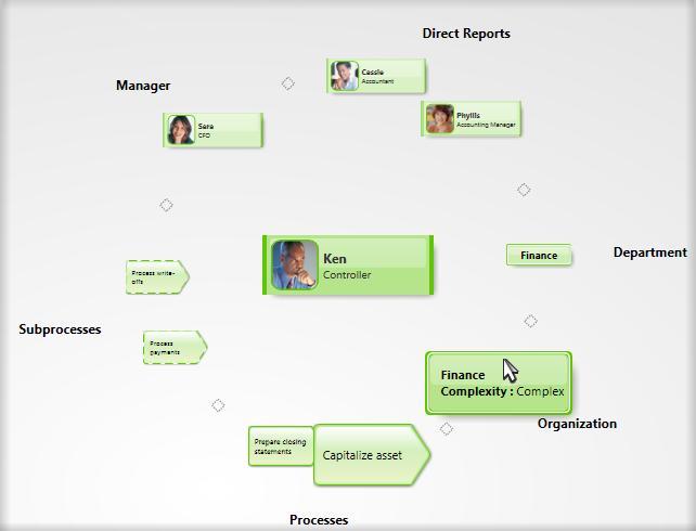
You may recall from the ICIQ Test (‘B’ is for Bet You Can’t Find Them All) that the application also contains a custom TreeGraph control. Technically, this control also qualifies as a ListBox (it derives from the ListBox class and then adds additional functionality to support custom item containers):
I guess while we’re on the topic of ListBox derivatives, it is worth noting that the native ListView control also derives from ListBox. So a ListView is actually a multi-columned ListBox:
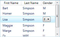
Wow! Since the control, itself, is lookless, we could essentially go on forever coming up with new looks for a ListBox. We are limited only by our imaginations and styling skills!

Since we have this great power, it is worth also mentioning the great responsibility that comes with the lookless control model. In the end, the look and feel of our controls should be driven by the desire to create the best user experience possible for the scenario at hand. I’ve already seen too many videos playing inside rotating buttons. We must avoid the temptation to do things just because we can. (Hearken back to the early days of WYSIWYG word processors, where so many documents came out looking like ransom letters… ’nuff said! 😉 )

The Items Panel

There is one element that you will almost always find within the template of an ItemsControl. It is called an ItemsPresenter. In ‘P’ is for Panel, we learned that an ItemsPresenter reserves real estate within the control’s template for the items host (a.k.a., the items panel). By including this ItemsPresenter element within the control template and specifying the ItemsPanelTemplate separately, it is possible to have a swappable items panel without having to retemplate the entire ItemsControl. The ItemsPanelTemplate will be inflated within the ItemsPresenter to create a panel to host the items of the ItemsControl.

Of course, as we also learned in ‘P’ is for Panel, it is not absolutely necessary to include an ItemsPresenter in the control template. Another approach is to simply include a panel in the template and set its IsItemsHost property to true. The drawback here is that the items panel is no longer swappable via the ItemsPanelTemplate property. In fact, ItemsPanelTemplate is completely disregarded in this scenario.

The ToolBar control is an example of one such ItemsControl that uses a hard coded items panel. If you examine the control template for ToolBar, you will see an element called ToolBarPanel that has IsItemsHost set to true. This was an intentional design decision for ToolBar. The control template basically tells us that a ToolBar cannot function without a ToolBarPanel. (The reason for this requirement is that a ToolBar has special support for overflow items… if the items cannot fit within the space available in the ToolBarPanel, they are arranged within a ToolBarOverflowPanel in a Popup control.)

I think its fine to derive custom ItemsControl classes like ToolBar that have special dependencies on known template elements. As a control developer, there are certain measures that you should take whenever you decide to go this route. First, you need to fully document the requirements of your control. By requiring specific elements in the template, you are reducing the lookless nature of your control. Designers will need to be aware of these limitations when they re-template your control.

Other Known Parts

While we’re on this topic of required template elements, it’s worth noting that an ItemsControl will sometimes have dependencies on other elements besides just the items panel. Let’s consider the ComboBox control…

A ComboBox is a single-select ItemsControl whose full list of available items is usually presented in a “dropdown list” below a textual representation of the selected item. The template for a ComboBox consists of a TextBox and a Popup (as well as several other visual elements). As you might expect, the TextBox displays the selected item and the Popup contains the ItemsPresenter so it naturally presents the available items in the dropdown list.

The ComboBox class contains certain logic that is very specific to the Popup control. Again, any such dependency on a known template element (also referred to as a “template part”) reduces the looklessness of the control, but that’s okay as long as the requirement for the part is well documented.

This naturally raises a question as to how the ComboBox can accurately identify the known part (the Popup) within its template and hook it up to the control’s logic. One approach might be to walk the visual elements in the control’s template and look for an element of type Popup. Of course, this might fail if a designer decides to re-template the control in a way that involves two Popup elements.

To deal with ambiguities like this, the framework uses a specific naming convention for the identification of known template parts. That convention is to name the element using the prefix “PART_”. In the case of the ComboBox template, the expected name for the Popup is “PART_Popup”. So within the template, you will see a Popup element like this:

<Popup Name="PART_Popup" AllowsTransparency="True" Placement="Bottom">
  ...
</Popup>

Alright, we have a well-known name for the Popup. Next we need to use this name to locate the element. But when and how do we perform this lookup? It turns out that the framework provides a method for this very purpose. By overriding OnApplyTemplate(), a control can be notified when it’s template is inflated and loaded into the visual tree. The GetTemplateChild() method can then be used to look up a template element by name, as shown here:

public override void OnApplyTemplate()
{
    base.OnApplyTemplate();
    _popup = GetTemplateChild("PART_Popup") as Popup;
}

The use of known parts within a control template clearly adds complexity for design tools that need to support re-templating the control. As such, you may be wondering how the known template parts are made discoverable to tools like Blend and Cider. Well, the framework actually leverages a custom TemplatePart attribute to decorate control classes with known parts. For example, the ComboBox class is decorated with the following attributes:

[TemplatePart(Name="PART_EditableTextBox",Type=typeof(TextBox))]
[TemplatePart(Name="PART_Popup",Type=typeof(Popup))]
public class ComboBox : Selector
{
    ...
}

Note that although we’ve been looking at the ComboBox class in the above example, this convention of using known template parts is really applicable to all controls within the framework. Anytime a designer wishes to re-template a control, they should take some time to familiarize themself with the known parts. If they need to re-template a control for which they do not already have a sample template, they can leverage a tool like .NET Reflector to disassemble the control class and view the TemplatePart attributes.

Keeping It Loose

I’d like to offer some advice specifically for the authors of custom controls. A well-written, lookless control will provide what I refer to as a “loose” contract between the control and its template. This means that the control does not blow up (throw an exception) when elements are missing from its template. Rather, it knows how to degrade gracefully.

This loose contract approach is used for the native ItemsControl classes in WPF. For example, you can re-template a ListBox and simply leave out its ItemsPresenter. The ListBox class never assumes that an items panel is present. As such, when you use your template, you will note that your app runs fine. Of course, no items are displayed within the ListBox because there is no items panel in which to present them. The important thing is that no exceptions are thrown either.

The same graceful scale back can be seen in the ComboBox control when you leave out a known template part like “PART_Popup”. The ComboBox class never assumes that a Popup is present. Instead, the class always checks its internal Popup reference to make sure its non-null prior to accessing it.

Testing your control against templates with missing elements is part of supporting a truly lookless control model. Users of your control will really appreciate your diligence in this matter because it means their designers will have full freedom to re- template the control as they see fit.

To Derive or Not To Derive

We’ve already seen that the lookless model provides the opportunity to reuse a single control class with many different visual representations. There will certainly be times when you need more than just a new look and feel. If a class does not provide all the functionality you need, you may actually need to derive a new control by extending an existing class.

The ListView control is a good example of an ItemsControl which has been thusly extended. The ListView class derives from ListBox and adds support for a broader concept of “Views”. (We won’t go into whether ListView is a well-contrived control… that is a much bigger conversation and this post is already too long!)

The most common view used within a ListView is called a GridView. This view allows each item to be presented as a row within a grid (or table). The columns in the grid each have their own header. In simple scenarios, a ListView can be used as a lightweight data grid (which was important in the initial release of the platform because there was no native DataGrid class). You can see the ListView class in action in ‘R’ is for Rob has a Customer.

Extending functionality is just one reason you might choose to derive a new control. Another reason might be that the existing control is not entirely lookless. In this case, you may wish to derive a new class and override specific functionality within the base class.

Consider the TreeView class. In ‘B’ is for Bet You Can’t Find Them All, we saw an example of a TreeView that had been re-templated to support a horizontal layout. This telescoping TreeView is displayed in the following image:
It turns out that creating this custom TreeView was not as simple as merely re-templating the TreeView class. The item container class, TreeViewItem, contains hardcoded support for keyboard navigation that assumes the tree expands vertically. (Pressing the Left and Right arrow keys on a TreeViewItem expands or collapses a branch in the tree, whereas pressing the Up and Down arrows navigates between nodes in the tree.) In order to create a horizontally expanding TreeView, it was necessary to swap the directional navigation keys. This required the derivation of a new TelescopingTreeView class from the native TreeView class as well as the derivation of a new TelescopingTreeViewItem class from the native TreeViewItem class.

Hopefully this can be a lesson to us all. Clearly, this TelescopingTreeView required a lot more work than would have been necessary if a truly lookless base class existed. It would have been nice if the native TreeViewItem added support for keyboard navigation via attached key bindings rather than hardcoded keyboard behaviors. (Note to self: Do a post on attached key bindings someday.) I certainly try to keep things like this in mind whenever I’m overriding specific input methods like OnKeyDown().

Coming Up Next

Congratulations! You made it through the longest post in this series (thus far :P). More importantly, you are now familiar with the lookless control model and the techniques for defining the look and feel of controls within this model. In the next post, ‘N’ is for Natural User Interface, we will learn that an infinite loop is not always a bad thing!