Archive for the ‘ItemsControl’ Category

ItemsControl: 'N' is for Natural User Interface

Wednesday, August 5th, 2009

Okay, this post isn’t really about creating a full blown Natural User Interface (NUI)… I just wanted to jump on the NUI bandwagon while it’s still the cool new thing! 😉 This post is actually about supporting a very specific natural user interaction within an ItemsControl.

Microsoft Surface was first publicly unveiled a couple of years ago. Since then, I have periodically been asked how one would go about creating a panel that behaves like the application launcher in Surface. If you have not seen the app launcher, I would describe the panel as simply a horizontal StackPanel that infinitely cycles its children.

I had some extra time this weekend, so I refactored one of my early looping panels into something that might be useful for a wider audience. This post also includes a simple demo showing how the LoopPanel can be used as the items host of a custom ListBox class. The LoopingListBox class supports dragging its items in a manner similar to the Surface app launcher. This demo brings the same type of natural user interaction to desktop WPF (via mouse) that you might find on Surface.

If you are actually developing for Surface, be sure to check out the Sidenote for Surface Developers section below for information on why you might prefer my panel over the sample supplied in the Surface documentation. 😛

If you have not yet read ‘P’ is for Panel, I would highly recommend it as a foundation for this article.

The LoopPanel Sample Application

To give you a better understanding of the panel examined within this post, you can run this ClickOnce LoopPanel sample application. (Yes, I could have published an XBAP sample, but I was not willing to give up the glow effect used for the selected character… which is, incidentally, achieved using a DropShadowEffect in the new effects pipeline.)

You can also download the entire project with full source code to build the demo yourself.

Sidenote and Tip: Even in the new pipeline, DropShadowEffect is a rather expensive effect because it requires multiple passes. The LoopPanel sample is very simple and is therefore not impacted much by the use of DropShadowEffect. If you experience poor performance using DropShadowEffect in a real app scenario, you can usually accomplish a very similar effect by applying a BlurEffect to a second copy of an element residing directly behind the original element.

The LoopPanel Layout Algorithm

Whenever I’m creating a new panel, I start by clearly defining its layout algorithm. This allows me to identify the exact properties that will be necessary to support the new layout.

In the LoopPanel class, I wanted to support both a horizontal and vertical orientation, just as StackPanel does. I also decided to use the same basic measuring algorithm as StackPanel, measuring each child to infinity in the stacking direction (the orientation direction) and measuring it to the panel’s available size in the nonstacking direction. (This just means a child can be whatever size it desires in the stacking direction, but it is constrained in the nonstacking direction.) To support these layout requirements, it was clear that I would need an Orientation property.

Of course, there are some key differences between a LoopPanel and a StackPanel. For example, a StackPanel arranges its children sequentially, beginning with the first child and stacking subsequent children one right after the other. However, a LoopPanel really eases the concept of a “first” child. There’s no reason that the nth child cannot appear first. So I needed a way to define the element that would be considered pivotal during a given layout pass. As such, I created the notion of a “pivotal child”.

The pivotal child is the element around which the remaining children are arranged. The pivotal child is placed first. Then its neighboring siblings (the subsequent and preceding members of the children collection) are placed, working away from the pivotal child in both directions until all remaining visible children are arranged. This allows for a balanced layout around the pivotal child. Nonvisible children (those that are outside the panel’s viewport) are then arranged using a layout rect with no size (both width and height are zero). This zero-sized rect provides a perf optimization (less layout processing and generated render data), especially for elements with elaborate subtrees, which you might have in an ItemsControl with a complex item template.

Obviously, any child could be the pivotal child. This meant I would need a property that could be used to identify the index of the pivotal child. I decided to call this the Offset property. The name might not make a lot of sense at first, but it should shortly. What might make even less sense is that the Offset property is of type double. So why would we need a double value to act as an index into a collection?

Actually, only the whole portion of the Offset value is considered when determining the index of the pivotal child. The fractional portion is then used to further offset that pivotal child. For example, given an Offset value of 6.25, the child at index 6 is the pivotal child and it is offset by 25% of its width (for a horizontally oriented LoopPanel) from the pivotal location. This means that if the Offset animates from 6 to 7, the child’s location animates by its entire extent. Then the child at index 7 becomes the pivotal child. Using this approach, the Offset property simply specifies the logical offset of the panel’s children.

Okay, shouldn’t the Offset value be constrained to only valid child indices? What happens when you animate the Offset from 6 to 7, but there are only 5 children? Well recall that the LoopPanel needs to cycle its children infinitely. To enable this infinite looping of children, the Offset property is completely unbounded. Any double value is valid. So to truly determine the index of the pivotal child, the Offset value is taken modulo the current count of children. So animating the Offset from 6 to 7 when you only have 5 children is equivalent to animating the Offset from 1 to 2.

The final layout issue was to determine exactly where to place the pivotal child within the panel’s available extent. More specifically, where is the pivotal location for the placement of the pivotal child. We could simply start at the beginning of the available space (similar to a StackPanel), but that is rather limiting, especially considering that the motivation for this panel is the app launcher in Surface, which puts the central focus at the center of the panel. To this end, I decided to allow the pivotal location to be specified using a RelativeOffset property on the LoopPanel.

RelativeOffset is a double value ranging from 0 to 1. A value of 0 (zero) means that the pivotal location is at the beginning of the panel’s available space. A value of 1 means the pivotal location is at the end of the panel’s available space. The default value is 0.5, which means the pivotal location is at the center of the panel.

That’s it for the description of the layout algorithm. We’ve identified three properties: Orientation, Offset, and RelativeOffset. To see how these properties are defined and actually used to implement the described layout algorithm, I refer you to the LoopPanel code within the sample project. As with every panel, the key methods that implement the layout are MeasureOverride() and ArrangeOverride().

Not a Typical ScrollViewer Paradigm

Once the LoopPanel has been implemented, the next logical question becomes how will we support scrolling its children? Clearly, we have an Offset property that can be used to this effect. The first inclination might be to leverage a ScrollViewer and use its horizontal or vertical offset to update the Offset property on the LoopPanel. There are a couple of problems with this approach.

First, a ScrollViewer measures its child to infinity in each of the scrollable directions (vertical and horizontal). In a typical ItemsControl scenario, this means that the items host gets to be whatever size it desires. The big problem here is that the LoopPanel doesn’t want to determine its own size in the non-orientation direction. Instead, it simply wants to layout its children using the space available.

The other big problem with using a ScrollViewer with the LoopPanel is that the native WPF ScrollViewer was designed to support scrolling across a finite range. In the LoopPanel, however, we want to support an infinite offset range in the orientation direction. As such, we must come up with a new method of looping through (scrolling) the children in our panel. The most logical choice is to allow a simple dragging gesture to update the Offset property. We will come back to this idea in a bit (see “Supporting Natural User Interactions” below).

Sidenote for Surface Developers

The latest Surface SDK documentation includes a topic called, “Creating a Continuously Panning List”. It demonstrates how you can build a panel similar to my LoopPanel that will work in conjunction with the SurfaceScrollViewer control. If you are developing exclusively for Surface, you might want to look at that sample.

For the record, I am not a fan of the layout logic used within that sample. The purpose of a panel is to provide layout for its children by arranging them within the panel. The sample panel provided in the Surface SDK actually applies a RenderTransform to itself to achieve a big piece of its layout. I strongly discourage developers from implementing controls that set their own RenderTransform or LayoutTransform properties. These properties do not belong to the control author. Rather, they belong to the person who is using the control. In the Surface sample, if someone tries to use the panel and they then apply their own RenderTransform to it, that transform will get trounced by the panel’s own layout logic.

I am also very partial to my own layout algorithm (go figure! :P), as it supports more options for aligning the children (left, right, center, or anywhere in between), it supports both vertical and horizontal looping of children, and it contains render optimizations by arranging nonvisible children using a zero-sized rect.

The approach described in this article will actually work well on both desktop PCs and on Surface. For the reasons outlined above, LoopPanel does not currently implement IScrollInfo or ISurfaceScrollInfo. (Well, the real reason is that I originally created the panel prior to the introduction of the ISurfaceScrollInfo interface.) However, it probably will support these interfaces in the future (see Potential Future Enhancements below).

Using the LoopPanel as an Items Host

Alright, our goal is to use our new panel as the items host for our custom LoopingListBox control. An ItemsControl, including our LoopingListBox, typically wraps its items host in a ScrollViewer. As we noted above, we don’t want our panel to be scrollable in the orientation direction. This means we need to customize the ScrollViewer within the template of the LoopingListBox to disable scrolling in the direction of the control’s orientation. The template below demonstrates how to achieve this:

<ControlTemplate TargetType="{x:Type dw:LoopingListBox}">
  <Border
      Background="{TemplateBinding Background}"
      BorderBrush="{TemplateBinding BorderBrush}"
      BorderThickness="{TemplateBinding BorderThickness}">
    <ScrollViewer x:Name="sv" Padding="{TemplateBinding Padding}"
        HorizontalScrollBarVisibility="Disabled"
        VerticalScrollBarVisibility="Auto">
      <dw:LoopPanel x:Name="lp" IsItemsHost="True"
          BringChildrenIntoView="True"
          Offset="{Binding Offset, Mode=TwoWay,
              RelativeSource={RelativeSource TemplatedParent}}"
          Orientation="{TemplateBinding Orientation}"
          RelativeOffset="{TemplateBinding RelativeOffset}" />
    </ScrollViewer>
  </Border>
  <ControlTemplate.Triggers>
    <Trigger Property="Orientation" Value="Vertical">
      <Setter TargetName="sv" Property="HorizontalScrollBarVisibility"
          Value="Auto" />
      <Setter TargetName="sv" Property="VerticalScrollBarVisibility"
          Value="Disabled" />
    </Trigger>
  </ControlTemplate.Triggers>
</ControlTemplate>

In this template, we have simply set the HorizontalScrollBarVisibility property to Disabled for a Horizontal LoopingListBox. If the Orientation is Vertical, we set the VerticalScrollBarVisibility property to Disabled. This achieves our aim.

Ensuring the Selection is Visible

Of course, there is another issue to consider. When an element within a ListBox becomes focused, the framework calls the BringIntoView() method on the element. This, in turn, raises a RequestBringIntoView event from the target element. Typically, this event bubbles up to the ScrollViewer, which handles it by calling the IScrollInfo.MakeVisible() method on the items host. If the items host implements IScrollInfo, it can then take the necessary action to scroll the element into view.

In our scenario, our panel does not implement IScrollInfo (see “Not a Typical ScrollViewer Paradigm”). As such, selecting an item that is not within the current view of the LoopPanel does not scroll it into view.

To make the LoopPanel class more useful, I have added an opt-in mechanism for it to directly handle the RequestBringIntoView event. If you set the BringChildrenIntoView property to true, then the panel will automatically update its Offset property when a descendant raises RequestBringIntoView. (In the template above, you’ll notice that BringChildrenIntoView is True on the LoopPanel.) This covers the typical ListBox usage scenario.

Supporting Dynamic Changes to the Children Collection

Another concern within our LoopPanel arises when you consider that the Children collection might dynamically change. Since the looping algorithm is built around the notion of an Offset property that positions other children around a single pivotal child, removing the pivotal child or adding/removing another child before the pivotal child will cause the visible children to shift positions (because the pivotal child changes).

This type of issue actually exists for all panels. Changing the Children collection causes a layout update. So whether you deal with this within the panel itself or leave it up to users of your panel to code around the issue is totally up to you.

In my usage scenario, I always wanted to prevent this layout jumping, so I modified the LoopPanel class, itself, by overriding its OnVisualChildrenChanged() method. When a child is added or removed, the Offset property is adjusted to keep the remaining elements in their current positions.

Supporting Natural User Interactions

Now for the fun part! We need to actually support a natural user experience that allows the panel to scroll its children by dragging them in the orientation direction.

There are a number of approaches that could be used here. I could have built the dragging (a.k.a. panning) support directly into the panel, but I’m kind of a purist when it comes to layout elements. A panel should do one thing… layout its children. In WPF, a panel does this by sizing and positioning (a.k.a., measuring and arranging) its children. A panel should not, in my humble opinion, respond directly to user input. For this reason, the LoopPanel does not directly support dragging by capturing or reacting to input events. It simply exposes a property called Offset that, as described earlier, provides an unbounded logical offset for the panel’s children.

In addition to the Offset property, the panel also provides a public method called Scroll(). The Scroll() method will internally update the logical offset to accommodate a specified delta of viewport units. This is important since most scrolling scenarios involve updating the panel’s offset using viewport units (e.g., pixels) rather than logical units. For example, you may want to pan the content 30 pixels in response to a drag delta of that distance. Our Offset property is not directly helpful in this case, since it refers to logical units. (30 logical units would represent 30 children, each with their own unique sizes.)

So if the LoopPanel does not respond directly to input events, how does it participate in the scrolling scenario? Well, as we’ve alluded to previously, a panel that needs to support scrolling typically does so by implementing IScrollInfo. This allows it to work in conjunction with a parent ScrollViewer. The ScrollViewer is the control that actually reacts to user input. As noted earlier, however, the concepts behind a ScrollViewer do not necessarily translate to our infinite scrolling scenario. And recall that when I first created this panel, the SurfaceScrollViewer did not yet exist, so implementing ISurfaceScrollInfo was not really an option. Even if it had been, I probably wouldn’t have opted for an approach that was limited to Surface.

Since I knew that I was going to use the LoopPanel as the items host of a ListBox, I decided to derive a custom LoopingListBox control that would interact directly with its items panel (the LoopPanel) to provide scrolling. The LoopingListBox class provides an attached behavior called IsDragHandle that can be attached to any UI element (a ListBoxItem, for example) within the subtree to make that element draggable. Dragging a drag handle causes the parent LoopingListBox to capture the Mouse (or Surface Contact) and update the scroll offset accordingly.

At a high level, the LoopingListBox supports a typical Windows drag operation. The input device (Mouse or Contact) is captured and subsequent changes are translated into deltas in the LoopPanel’s offset. This continues until the input device is released (the Mouse button is released, the Contact is lifted, or the device capture is otherwise lost). The mundane details can all be found in the provided sample code, so I won’t go over them here.

Using a LoopPanel on Surface

As mentioned previously, the LoopPanel class also works well on Surface. Since it does not yet support ISurfaceScrollViewer, I have derived a custom SurfaceLoopingListBox control from LoopingListBox. This class adds drag support for Surface input devices (a.k.a., Contact devices).

If you are lucky enough to have access to a Surface computer, feel free to download the Surface LoopPanel Sample here. If you have the Surface SDK installed, you can also simply run this sample within the Surface Simulator.

Potential Future Enhancements

There are a couple of enhancements that could make LoopPanel even more useful, including ScrollViewer support (via IScrollInfo) and UI virtualization (by deriving from VirtualizingPanel).

IScrollInfo and ISurfaceScrollInfo

At some point in the future, I will likely update LoopPanel to support IScrollInfo. I will also likely derive a new SurfaceLoopPanel class that implements the additional members of ISurfaceScrollInfo. These interfaces enable a clean separation between the panel and the controlling input element (the ScrollViewer or SurfaceScrollViewer). This should be a super simple upgrade, given the current LoopPanel design. I will certainly update this article with the new code, once the panel supports IScrollInfo and/or ISurfaceScrollInfo. 🙂

UI Virtualization

This panel is a very natural candidate for UI virtualization, since it already scrolls its children using logical units. (The Offset property can easily be thought of as a logical offset for the children.) In fact, I will likely use this panel as the basis for the upcoming ‘V’ is for Virtualization entry in this series, unless someone gives me a better idea.

I hope you find LoopPanel useful. As always, I welcome feedback and would love other ideas for improving the panel. If you find any scenarios where this panel does not meet your needs or where it simply misbehaves (a.k.a., bugs), please let me know!

ItemsControl: 'L' is for Lookless (a.k.a., "Styles, Templates, and Triggers… Oh My!")

Tuesday, May 12th, 2009

As we continue our series on ItemsControl, it probably makes sense to take a small detour and look at WPF controls in general. In this post, we will examine how WPF controls get their visual representation through styles and templates. Then we will look at how these techniques specifically apply to several ItemsControl classes.

This article is fairly long and covers a lot of really important information, including the following:

It is definitely worth taking your time to understand these concepts. Feel free to break the article up into more manageable pieces if you are time-constrained.

I would also encourage you to keep kaxaml up and running as you learn about styles and templates. I think you’ll find that it makes the content more meaningful when you directly interact with the samples. As such, this article contains a lot of kaxamples, which is my term for kaxaml-ready samples. When you see the kaxaml symbol, you know you can cut and paste the included markup snippet directly into kaxaml to interact with it live. Then you are free to tweak the markup and make a few cool new styles and templates of your own!

The Lookless Control Model

When developers first start learning WPF, they are often very surprised to learn that a WPF control does not include a hardcoded visual representation. Rather, the default visual representation is specified in XAML in a completely separate theme assembly from the class that implements the control’s logic. This separation of code-based logic from visual representation (the control’s look and feel) is what makes the WPF control model so powerful. We refer to this approach as a “lookless control model”.

Why, you may be asking, is such a model better than the traditional approach of defining the visuals as part of the control? I’ll give you two big reasons: design and reusability.

If you’ve studied WPF or Silverlight much, you have certainly heard about the new developer/designer workflow that these technologies enable. Namely, developers and designers can work side by side to simultaneously create powerful and visually stunning applications, with each person doing what they do best. A developer can implement an application’s logic at the same time that a designer creates the application’s look and feel. To a great degree, it is the lookless control model that enables this new workflow.

It turns out that left-brained developers don’t always come up with the most eye-pleasing visual designs, as can be seen by looking at the “battleship gray” user interfaces coming out of the Windows Forms world for the past decade. Now contrast these apps with the vibrant Flash-based web applications created in the same timeframe. The big difference is that most of the cool Flash applications were created by right-brained designers who take aesthetics very seriously. (Yes, I’m stereotyping with the whole left-brained/right-brained thing… some stereotypes are just true.)

By introducing a lookless control model where the visual representation of the control is specified apart from the control’s code, we are able to put the visual design into the hands of a qualified UX designer, where it belongs.

The second big reason for separating a control’s visuals from its code implementation is reusability. In the past, if you wanted to have two buttons with different visual appearances, you had to create two separate button classes with the correct rendering code baked into each class. Both classes contained the same basic button logic. They both provided a “click” event in response to the appropriate mouse or keyboard user interactions. The only difference between the button classes was in the rendering logic.

By moving the visual representation into XAML and out of the control class, we allow a single Button class to be reused wherever we need to support a Click interaction. The button can have whatever visual representation the designer wants to create. The developer no longer needs to be involved in the process of redefining a button’s visual representation.

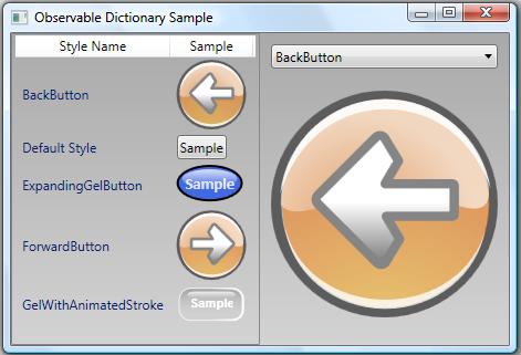
An example of this reusability can be seen in the following image (borrowed from my Observable Dictionary Sample) depicting a ListView in which each row contains a style name and a button. The only difference between each button is the “Style” used to define the button’s look and feel.

Introduction to Styles

We have already seen an example of how one might style and template an item container via the ItemContainerStyle property (see ‘I’ is for Item Container). Now it’s time to actually dig into the nitty gritty details of control styling and templating. If you are already familiar with styling and templating, you can skip ahead to the section entitled Templating an Items Control. (Of course, you might consider continuing on through the following sections as a refresher course and it’s possible you might even learn something new. :P)

A WPF style consists of a collection of property values that are applied to a framework element either explicitly (by setting its Style property) or implicitly (based on a resource lookup using the element’s default style key). These property values are applied using Setter objects. Thus, a style can be thought of as a collection of Setter objects. Here is a very simple example:

<Style TargetType="{x:Type Rectangle}">
  <Setter Property="Width" Value="50" />
  <Setter Property="Height" Value="50" />
</Style>

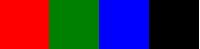
In this case, a style is created for a Rectangle. There are two setters in the style. These set the Width and Height properties of the Rectangle to 50.

So how do you actually use the style? Typically, you will give it a resource key and add it to a resource dictionary somewhere in your element hierarchy. Then you can use the resource key to apply the style to specific elements in the subtree. Here is a kaxample:

Kaxample: Try pasting the following markup snippet into kaxaml.

<Grid xmlns="http://schemas.microsoft.com/winfx/2006/xaml/presentation"
      xmlns:x="http://schemas.microsoft.com/winfx/2006/xaml">
  <Grid.Resources>
    <Style x:Key="MyRectangleStyle"
        TargetType="{x:Type Rectangle}">
      <Setter Property="Width" Value="50" />
      <Setter Property="Height" Value="50" />
    </Style>
  </Grid.Resources>
  <StackPanel Orientation="Horizontal">
    <Rectangle Style="{StaticResource MyRectangleStyle}" Fill="Red" />
    <Rectangle Style="{StaticResource MyRectangleStyle}" Fill="Green" />
    <Rectangle Style="{StaticResource MyRectangleStyle}" Fill="Blue" />
    <Rectangle Style="{StaticResource MyRectangleStyle}" Fill="Black" />
  </StackPanel>
</Grid>


In the above example, the style is explicitly applied to each Rectangle because we have set the Style property on the Rectangle elements. If we want the style to be applied implicitly to every Rectangle in the subtree, we can simply remove the x:Key attribute from the style declaration and then not specify the Style property on the Rectangle elements, as shown in this kaxample:

Kaxample: Try pasting the following markup snippet into kaxaml.

<Grid xmlns="http://schemas.microsoft.com/winfx/2006/xaml/presentation"
      xmlns:x="http://schemas.microsoft.com/winfx/2006/xaml">
  <Grid.Resources>
    <Style TargetType="{x:Type Rectangle}">
      <Setter Property="Width" Value="50" />
      <Setter Property="Height" Value="50" />
    </Style>
  </Grid.Resources>
  <StackPanel Orientation="Horizontal">
    <Rectangle Fill="Red" />
    <Rectangle Fill="Green" />
    <Rectangle Fill="Blue" />
    <Rectangle Fill="Black" />
  </StackPanel>
</Grid>

You may be curious as to why the above style is applied to all Rectangle elements in the subtree. The answer is hidden in the framework’s parsing routine for resource dictionaries. Each element added to a resource dictionary must have a key. It is noteworthy that the style above is conspicuously missing an x:Key attribute. It turns out that the XAML parser has special handling for Style objects that are added to a resource dictionary. If no key is specified, the parser uses the style’s TargetType as its key. So the above style declaration is actually equivalent to the following:

<Style x:Key="{x:Type Rectangle}" TargetType="{x:Type Rectangle}">
  <Setter Property="Width" Value="50" />
  <Setter Property="Height" Value="50" />
</Style>

There is a convention in WPF that an element’s type is used as its default style key. As mentioned earlier, if the Style property is not explicitly set on a framework element, a resource lookup takes place using this default style key (the element type) to find an appropriate style. Hence, in the example above, our style is applied to each Rectangle as a result of its default style key.

Now let’s take a look at a styling feature that even some of the most experienced designers may not know about…

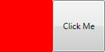
Our style above can only be applied to Rectangle elements. What if we want to create a more generic style that can be applied to any framework element? It’s actually possible to create such a generic style by simply not setting the TargetType property. Of course, this creates some ambiguity for the framework because without knowing the object type, WPF doesn’t necessarily know how to interpret the Property member of a Setter. To remove this ambiguity, we must specify the object type in each setter, as shown here:

<Style x:Key="SharedStyle">
  <Setter Property="FrameworkElement.Width" Value="50" />
  <Setter Property="FrameworkElement.Height" Value="50" />
  <Setter Property="Button.IsDefault" Value="True" />
</Style>

Now the style can be applied to elements of differing types. In fact, generic styles actually give us the ability to set properties that are not shared by all of the elements to which the styles are applied. For example, the style above can be applied to both a Rectangle and a Button even though the style contains a Setter for the Button.IsDefault property, as shown in this kaxample:

Kaxample: Try pasting the following markup snippet into kaxaml.

<Grid xmlns="http://schemas.microsoft.com/winfx/2006/xaml/presentation"
      xmlns:x="http://schemas.microsoft.com/winfx/2006/xaml">
  <Grid.Resources>
    <Style x:Key="SharedStyle">
      <Setter Property="FrameworkElement.Width" Value="50" />
      <Setter Property="FrameworkElement.Height" Value="50" />
      <Setter Property="Button.IsDefault" Value="True" />
    </Style>
  </Grid.Resources>
  <StackPanel Orientation="Horizontal">
    <Rectangle Style="{StaticResource SharedStyle}" Fill="Red" />
    <Button Style="{StaticResource SharedStyle}">Click Me</Button>
  </StackPanel>
</Grid>


There is a lot more that could be covered in this section on element styling (including things like “based on” styles, overriding style properties, declaring styles at the application and theme levels, etc), but this is an introductory look so let’s move on now to control templates…

Introduction to Control Templates

We first introduced the concept of templates in ‘D’ is for DataTemplate. At that time, we learned that a template is just a tree of visual elements (along with some resources and triggers) used to define the look and feel of a member of the logical tree. As it builds the logical tree, the framework watches for controls and data items that have corresponding templates. When such an element is encountered, the appropriate template is “inflated” into the actual visuals that represent the logical item and those visuals are inserted into the visual tree.

We’ve already learned that a DataTemplate is used to declare the visual representation of a data item that appears within an application’s logical tree. In ‘P’ is for Panel, we learned that an ItemsPanelTemplate is used to declare the items host used within an ItemsControl. (Note that an ItemsPanelTemplate is a special template whose visual tree must consist of only a single Panel element.) In this section, we will look at a third type of template… a ControlTemplate.

As the name implies, a ControlTemplate is used to declare the visual representation for a control. All native WPF controls have default control templates for each Windows theme. These templates give controls their default visual appearance.

It should come as no surprise that the visual representation of a control like a Button is composed of several other WPF elements, including a ContentPresenter and an element to render the outer and inner lines that give the Button a 3-dimensional appearance. These subelements which make up the control’s appearance are part of its ControlTemplate.

The nice thing about the lookless control model is that we have full control over the visual appearance of all WPF controls. We can either accept a control’s default appearance or we can change the control’s appearance by defining our own ControlTemplate. Below is an example of a ControlTemplate for a ListBox:

<ControlTemplate x:Key="MyListBoxTemplate" TargetType="{x:Type ListBox}">
  <Border Background="White" BorderBrush="Black"
      BorderThickness="1" CornerRadius="6">
    <ScrollViewer Margin="4">
      <ItemsPresenter />
    </ScrollViewer>
  </Border>
</ControlTemplate>

This template defines a visual tree for the ListBox that consists of a Border, a ScrollViewer, and an ItemsPresenter. The logic behind the ListBox is still defined within the ListBox class, but the appearance is defined by us.

Note that similar to a style, the ControlTemplate class exposes a TargetType property. This property must always be set. If you ever notice your template is not being applied as expected, be sure to verify that the TargetType matches the control type.

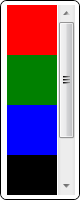
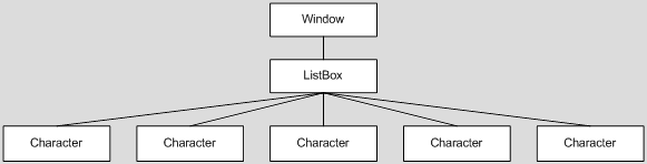
Now to apply our custom template to a ListBox, we simply set the Template property on the ListBox, as shown here:

<ListBox Width="80" Height="200"
    Template="{StaticResource MyListBoxTemplate}">
  <Rectangle Width="50" Height="50" Fill="Red" />
  <Rectangle Width="50" Height="50" Fill="Green" />
  <Rectangle Width="50" Height="50" Fill="Blue" />
  <Rectangle Width="50" Height="50" Fill="Black" />
</ListBox>

Setting the Template in a Style

In the previous example, we assigned a ControlTemplate to a ListBox by setting the Template property directly on the ListBox. This is not the most common scenario, though. Styles and templates were designed to go hand-in-hand. As such, templates are very often included as part of a style.

Remember that a style consists of a collection of Setter objects. For a control style, one of these Setter objects usually sets the Template property on the control, as shown in the following ListBox style:

<Style TargetType="{x:Type ListBox}">
  <Setter Property="Background" Value="LightGray" />
  <Setter Property="BorderThickness" Value="2" />
  <Setter Property="HorizontalContentAlignment" Value="Center" />
  <Setter Property="Padding" Value="5" />
  <Setter Property="Template">
    <Setter.Value>
      <ControlTemplate TargetType="{x:Type ListBox}">
        <Border Background="White" BorderBrush="Black"
            BorderThickness="1" CornerRadius="6">
          <ScrollViewer Margin="4">
            <ItemsPresenter />
          </ScrollViewer>
        </Border>
      </ControlTemplate>
    </Setter.Value>
  </Setter>
</Style>

Suppose we add the above style to our application’s resources. Note that this style is using the exact same control template as we presented earlier. And since we’ve only set the TargetType on this style, all ListBox elements in our application will implicitly use our control template. So now we can add the following ListBox to our UI:

<ListBox Width="100" Height="200">
  <Rectangle Width="50" Height="50" Fill="Red" />
  <Rectangle Width="50" Height="50" Fill="Green" />
  <Rectangle Width="50" Height="50" Fill="Blue" />
  <Rectangle Width="50" Height="50" Fill="Black" />
</ListBox>

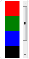
That looks pretty good, don’t you think? Well, upon closer inspection of our style, you might notice that a few things are not quite right. (Hint: Look at the first few Setter objects in the style.)

Clearly, we want our template and style to play nicely together. If we use a Setter in the style to set a property, we want the template to leverage that property. The problem in our example is that several property values (Background, BorderBrush, BorderThickness, Margin, etc) are hard coded on elements in our template. Other properties of the control are simply not bound to anything in the template. This clearly isn’t what we want. To fix these issues, we need to use something called a TemplateBinding within the template.

A TemplateBinding is a lightweight binding object used to link the value of a property on an element in the control template to the value of a property on the actual control that is being templated. In our ListBox example, we can add a few such bindings, as shown below, to achieve the desired result:

<Style TargetType="{x:Type ListBox}">
  <Setter Property="Background" Value="LightGray" />
  <Setter Property="BorderThickness" Value="2" />
  <Setter Property="HorizontalContentAlignment" Value="Center" />
  <Setter Property="Padding" Value="5" />
  <Setter Property="Template">
    <Setter.Value>
      <ControlTemplate TargetType="{x:Type ListBox}">
        <Border Background="{TemplateBinding Background}"
            BorderBrush="{TemplateBinding BorderBrush}"
            BorderThickness="{TemplateBinding BorderThickness}"
            CornerRadius="6">
          <ScrollViewer Margin="{TemplateBinding Padding}">
            <ItemsPresenter />
          </ScrollViewer>
        </Border>
      </ControlTemplate>
    </Setter.Value>
  </Setter>
</Style>

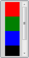
Now all of the properties being set within the style are connected to elements within the template. Thus, those properties are truly reflected in the control’s visual representation.

Introduction to Triggers

So far we’ve seen how to provide the look for a lookless control. Now let’s peek at the other half of the user experience… the feel. A control gets its look from the visuals. It gets its feel from how those visuals respond to state changes or user interactions. This is where triggers come into play.

A trigger is a collection of Setter objects (or animation actions) that get applied only when a given condition is true. WPF contains three main types of triggers: Trigger (also referred to as a property trigger), DataTrigger, and EventTrigger. It’s also possible to respond to multiple simultaneous conditions by using the related MultiTrigger and MultiDataTrigger objects.

There is a Triggers collection within each of the Style, ControlTemplate, and DataTemplate classes. This means that triggers can be used in both styles and templates, by adding them to the appropriate Triggers collection. (There is also a Triggers collection on FrameworkElement, but it can only contain event triggers… not property or data triggers.)

Let’s take a look at a very simple example. Here is a style for a Button:

<Style TargetType="{x:Type Button}">
  <Style.Triggers>
    <Trigger Property="IsMouseOver" Value="True">
      <Setter Property="Opacity" Value="0.7" />
      <Setter Property="TextBlock.FontWeight" Value="Bold" />
    </Trigger>
  </Style.Triggers>
</Style>

As you might expect, moving the mouse over a Button that is using this style causes the opacity of the Button to change to 0.7. It also changes the inherited FontWeight value for any contained TextBlock elements to Bold.

As the example above illustrates, triggers are fairly intuitive. You can pretty much understand how they work just by reading the markup. As such, we won’t spend too much time explaining their usage. Instead, we will just look at some tips and tricks for leveraging triggers in different scenarios.

A data trigger allows you to trigger off of a property on your data item by leveraging a Binding. This is most often used in the context of a DataTemplate, but don’t overlook the power of data triggers in other scenarios. For example, a data trigger is very handy for triggering off of a property on another object, as shown in this example:

<DataTemplate x:Key="MyItemTemplate">
  <Border x:Name="root" BorderThickness="2" CornerRadius="6">
    <TextBlock Margin="4" Text="{Binding XPath=@First}" />
  </Border>
  <DataTemplate.Triggers>
    <DataTrigger Value="True" Binding="{Binding Path=IsSelected,
        RelativeSource={RelativeSource AncestorType={x:Type ListBoxItem}}}">
      <Setter TargetName="root" Property="BorderBrush" Value="Pink" />
    </DataTrigger>
  </DataTemplate.Triggers>
</DataTemplate>

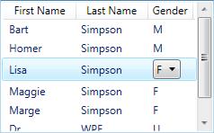
In this case, we are creating a DataTrigger that acts more like a property trigger by using a FindAncestor binding to get to a source object. Namely, we are triggering off of the IsSelected property on an ancestor ListBoxItem. This will allow us to draw a pink border around our template whenever it is selected. Now suppose our data item is a person and we only want a pink border when decorating a female. If the person is male, we instead want a blue border. We could achieve this by adding a second trigger, as shown in the following template:

<DataTemplate x:Key="MyItemTemplate">
  <Border x:Name="root" BorderThickness="2" CornerRadius="6">
    <TextBlock Margin="4" Text="{Binding XPath=@First}" />
  </Border>
  <DataTemplate.Triggers>
    <DataTrigger Value="True" Binding="{Binding Path=IsSelected,
        RelativeSource={RelativeSource AncestorType={x:Type ListBoxItem}}}">
      <Setter TargetName="root" Property="BorderBrush" Value="Pink" />
    </DataTrigger>
    <MultiDataTrigger>
      <MultiDataTrigger.Conditions>
        <Condition Binding="{Binding XPath=@Gender}" Value="Male" />
        <Condition Value="True" Binding="{Binding Path=IsSelected,
            RelativeSource={RelativeSource AncestorType={x:Type ListBoxItem}}}" />
      </MultiDataTrigger.Conditions>
      <Setter TargetName="root" Property="BorderBrush" Value="Blue" />
    </MultiDataTrigger>
  </DataTemplate.Triggers>
</DataTemplate>

Now we have added a MultiDataTrigger with two conditions. The first contains a Binding to a property on the data item that identifies the gender of the person. The second is the same binding we used earlier to get at the IsSelected property on the ancestor ListBoxItem. Now if the person is male and they are selected, the border will be blue.

The above example illustrates another important aspect of triggers and setters… namely that the order of triggers and setters is important. When multiple triggers evaluate to true, all of their setters are applied. More specifically, they are applied sequentially in the order that the triggers appear within the Triggers collection and in the order that the setters appear within each trigger. Here’s a simple way to think about this… if multiple setters target the same property, the last setter wins!

The final thing I will point out about this example is that it demonstrates how to combine both property triggers and data triggers by leveraging a MultiDataTrigger. At times, this can come in very handy. People tend to forget that a DataTrigger can always be used as a property trigger simply by setting the source of the binding appropriately.

There is one more type of trigger called an EventTrigger. An event trigger, as the name implies, can be used to start an action in response to an event. More specifically, an event trigger executes in response to a routed event. Here’s a kaxample of a Button that uses an event trigger to begin an opacity animation when the Button is first loaded:

Kaxample: Try pasting the following markup snippet into kaxaml.

<Canvas xmlns="http://schemas.microsoft.com/winfx/2006/xaml/presentation"
        xmlns:x="http://schemas.microsoft.com/winfx/2006/xaml">
  <Button Opacity="0" Content="My Button">
    <Button.Triggers>
      <EventTrigger RoutedEvent="FrameworkElement.Loaded">
        <BeginStoryboard Name="MyBeginAction">
          <Storyboard>
            <DoubleAnimation Storyboard.TargetProperty="Opacity"
                Duration="0:0:1" BeginTime="0:0:0.25" To="1.0" />
          </Storyboard>
        </BeginStoryboard>
      </EventTrigger>
    </Button.Triggers>
  </Button>
</Canvas>

In this example, the event trigger is added directly to the Triggers collection of the framework element (the Button), itself. Again, the FrameworkElement.Triggers collection can only contain event triggers. If you wish to use property or data triggers, they must be within the Triggers collection of a style or template.

Note that you cannot trigger off of a standard CLR event because the mechanism for supporting event triggers depends on the WPF event routing engine, which intelligently routes events to only the elements that have registered to receive them.

With a property or data trigger, the condition that causes the trigger to be applied is based on state. As such, the condition will be true for a period of time. As long as the condition evaluates to true, the setters are applied to their target properties. When the condition later becomes false, the setters are no longer applied and the target properties fall back to their untriggered values.

There is no such concept of state with an event trigger. An event is fleeting. The event fires and then it’s gone. Since the condition that invokes an event trigger is instantaneous, an EventTrigger does not contain a collection of setters. Rather, it contains actions which execute in response to the event. These actions allow you to control (start, stop, pause, resume, etc) the execution of storyboards. The example above uses a BeginStoryboard action in response to the FrameworkElement.Loaded event.

You may also want to set properties based on the firing of an event. Even though you don’t have setters, you can still use an EventTrigger to set property values. You achieve this by leveraging an object animation with a DiscreteObjectKeyFrame, as shown in this kaxample:

Kaxample: Try pasting the following markup snippet into kaxaml.

<Grid xmlns="http://schemas.microsoft.com/winfx/2006/xaml/presentation"
      xmlns:x="http://schemas.microsoft.com/winfx/2006/xaml"
      xmlns:sys="clr-namespace:System;assembly=mscorlib">
  <Grid.Triggers>
    <EventTrigger RoutedEvent="CheckBox.Checked">
      <EventTrigger.Actions>
        <BeginStoryboard>
          <Storyboard>
            <ObjectAnimationUsingKeyFrames Storyboard.TargetName="tb"
                Storyboard.TargetProperty="Text" Duration="0:0:0.1">
              <DiscreteObjectKeyFrame Value="Thanks!&#013;That felt great!!" />
            </ObjectAnimationUsingKeyFrames>
          </Storyboard>
        </BeginStoryboard>
      </EventTrigger.Actions>
    </EventTrigger>
    <EventTrigger RoutedEvent="CheckBox.Unchecked">
      <EventTrigger.Actions>
        <BeginStoryboard>
          <Storyboard>
            <ObjectAnimationUsingKeyFrames Duration="0:0:0.1"
                Storyboard.TargetName="tb"
                Storyboard.TargetProperty="Text">
              <DiscreteObjectKeyFrame Value="Oh yeah!&#013;I'm outta here!" />
            </ObjectAnimationUsingKeyFrames>
            <ObjectAnimationUsingKeyFrames Duration="0:0:0.1"
                Storyboard.TargetProperty="IsHitTestVisible">
              <DiscreteObjectKeyFrame>
                <DiscreteObjectKeyFrame.Value>
                  <sys:Boolean>False</sys:Boolean>
                </DiscreteObjectKeyFrame.Value>
              </DiscreteObjectKeyFrame>
            </ObjectAnimationUsingKeyFrames>
            <DoubleAnimation Duration="0:0:0.5" To="0"
                Storyboard.TargetProperty="Opacity"
                BeginTime="0:0:2" />
          </Storyboard>
        </BeginStoryboard>
      </EventTrigger.Actions>
    </EventTrigger>
  </Grid.Triggers>
  <ToggleButton Width="100" Height="100">
    <TextBlock x:Name="tb" Text="Toggle Me, Please!"
        TextAlignment="Center" TextWrapping="Wrap" />
  </ToggleButton>
</Grid>

Sidenote: This trick of using a discrete key frame animation to set a property value is actually a very useful thing to have in your arsenal… especially if you work a lot in Silverlight. Silverlight does not support property or data triggers. It does however support event triggers. As such, it is pretty common to use event triggers along with storyboards and discrete key frame animations in Silverlight to effectively set properties in response to events or visual state changes.

It’s worth noting that both property and data triggers can be used to launch actions too. You simply need to set the EnterActions (which execute when the trigger condition becomes true) and/or the ExitActions (which execute when the trigger condition becomes false). This is very handy for dealing with scenarios where there is no routed event off of which to trigger but there is a property. Here is a kaxample:

Kaxample: Try pasting the following markup snippet into kaxaml.

<StackPanel Orientation="Horizontal"
    xmlns="http://schemas.microsoft.com/winfx/2006/xaml/presentation"
    xmlns:x="http://schemas.microsoft.com/winfx/2006/xaml">
  <StackPanel.Resources>
    <Style TargetType="{x:Type TextBox}">
      <Setter Property="Template">
        <Setter.Value>
          <ControlTemplate TargetType="{x:Type TextBoxBase}">
            <Grid>
              <Rectangle Margin="1" Fill="#FFF" />
              <Rectangle Name="DisabledBackground" Margin="1"
                  Fill="#CCC" RenderTransformOrigin="1,0.5">
                <Rectangle.RenderTransform>
                  <ScaleTransform ScaleX="0" />
                </Rectangle.RenderTransform>
              </Rectangle>
              <Border Name="Border" CornerRadius="2" Padding="2"
                  BorderThickness="1" BorderBrush="#888">
                <ScrollViewer Margin="0" x:Name="PART_ContentHost" />
              </Border>
            </Grid>
            <ControlTemplate.Triggers>
              <Trigger Property="IsEnabled" Value="False">
                <Setter TargetName="Border" Property="BorderBrush" Value="#AAA"/>
                <Setter Property="Foreground" Value="#888"/>
                <Trigger.EnterActions>
                  <BeginStoryboard>
                    <Storyboard TargetName="DisabledBackground"
                        TargetProperty="RenderTransform.ScaleX">
                      <DoubleAnimation To="1" Duration="0:0:0.7"
                          DecelerationRatio="0.5" />
                    </Storyboard>
                  </BeginStoryboard>
                </Trigger.EnterActions>
                <Trigger.ExitActions>
                  <BeginStoryboard>
                    <Storyboard TargetName="DisabledBackground"
                        TargetProperty="RenderTransform.ScaleX">
                      <DoubleAnimation To="0" Duration="0:0:0.7"
                          DecelerationRatio="0.5" />
                    </Storyboard>
                  </BeginStoryboard>
                </Trigger.ExitActions>
              </Trigger>
            </ControlTemplate.Triggers>
          </ControlTemplate>
        </Setter.Value>
      </Setter>
    </Style>
  </StackPanel.Resources>
  <CheckBox Name="MyCheckBox" FontWeight="Bold" Margin="0,6,4,0"
      VerticalAlignment="Top" Content="Print To File:" />
  <TextBox VerticalAlignment="Top" Margin="0,3,0,0" Text="C:\MyFile.prn"
      Width="200" IsEnabled="{Binding IsChecked, ElementName=MyCheckBox}" />
</StackPanel>

In this example, when the TextBox becomes disabled, a dark background appears to slide shut over the control, letting the user know that they can no longer edit the control. When the control becomes enabled again, the dark background slides back out of the way. Since there is no event that fires on the TextBox when the control becomes disabled or enabled, we must instead leverage a property trigger’s EnterActions and ExitActions to begin the animations.

Windows Theme Files

Hopefully styles, templates, and triggers are starting to make a lot of sense. To really appreciate how this lookless model works, I would encourage you to spend some time looking at the styles and templates for the native WPF controls. All of the default control styles and templates are available in the theme files which ship as part of the Windows SDK or with Blend.

When installing the SDK, you must select the option to install the .NET Framework 3.0 Samples. Then you will be able to access the theme files by looking in the Core directory within the following archive: %ProgramFiles%\Microsoft SDKs\Windows\v6.0 \Samples\WPFSamples.zip. The theme files also ship with Blend in the following directory: “%ProgramFiles%\Microsoft Expression\Blend <version>\SystemThemes”.

If you have not installed the Windows SDK or Blend, you can still view the theme styles and templates using .NET Reflector with the BamlViewer Add-In. Simply reflect upon the theme assembly of your choice. For example, you could load the Aero theme assembly from “%ProgramFiles%\Reference Assemblies\Microsoft\Framework\v3.0\PresentationFramework.Aero”. Once loaded, select the assembly and then select “BAML Viewer” from the Tools menu.

It’s worth noting that Blend also includes a set of “Simple Styles”, which are basically reference samples of how you might style and template the most common framework controls. These styles tend to be much simpler (hence the name) than the actual theme styles. See “Working with simple styles” in the Blend help file for more details.

Templating an ItemsControl

This is an ItemsControl series, so I guess we should spend a little time examining the lookless nature of a few ItemsControl classes. The remainder of this article covers several different aspects of ItemsControl templates. As with the rest of this series, many of these concepts also apply to non-ItemsControl classes.

A Lookless Lesson Learned

There is a story I really like to tell when introducing the lookless control model to developers and designers…

The early WPF (well, Avalon) platform contained an ItemsControl that never actually made it into any released bits. It was called RadioButtonList. As you can probably guess from the name, this was simply a list of mutually exclusive options, each one selectable via a RadioButton control. At first blush, this probably sounds like a really useful control to have in the platform, right? That’s what we all thought too. In fact we used it all over the place in demos and POCs. Then someone pointed out that the platform already contained a control for selecting an item from a list of mutually exclusive options… namely, a single-select ListBox!

Doh! Clearly, if they were going to sell this lookless story, they needed to live by it, so soon thereafter, a breaking change email announced the removal of the RadioButtonList control. Each instance was replaced with a styled ListBox.

The moral of the story is that the lookless concept requires a little getting used to. Clearly, even the architects of this new control model struggled a bit with it in the early days.

For your convenience, below is a kaxample that demonstrates my typical RadioButtonList style. You will need to press F5 to execute this sample within kaxaml:

Kaxample: Try pasting the following markup snippet into kaxaml.

<Window Title="RadioButtonList Sample" Width="500" Height="180"
    xmlns="http://schemas.microsoft.com/winfx/2006/xaml/presentation"
    xmlns:x="http://schemas.microsoft.com/winfx/2006/xaml"
    xmlns:sys="clr-namespace:System;assembly=mscorlib"
    Topmost="{Binding SelectedItem, ElementName=TopmostSelector}"
    WindowStyle="{Binding SelectedItem, ElementName=WindowStyleSelector}">
  <Window.Resources>
    <ObjectDataProvider x:Key="WindowStyles" MethodName="GetValues"
        ObjectType="{x:Type sys:Enum}" >
      <ObjectDataProvider.MethodParameters>
        <x:Type TypeName="WindowStyle" />
      </ObjectDataProvider.MethodParameters>
    </ObjectDataProvider>
    <Style x:Key="RadioButtonList" TargetType="{x:Type ListBox}">
      <Setter Property="BorderBrush" Value="{x:Null}" />
      <Setter Property="BorderThickness" Value="0" />
      <Setter Property="Tag" Value="Vertical" />
      <Setter Property="ItemsPanel">
        <Setter.Value>
          <ItemsPanelTemplate>
            <StackPanel Orientation="{Binding Tag,
                RelativeSource={RelativeSource AncestorType={x:Type ListBox}}}" />
          </ItemsPanelTemplate>
        </Setter.Value>
      </Setter>
      <Setter Property="ItemContainerStyle">
        <Setter.Value>
          <Style TargetType="{x:Type ListBoxItem}">
            <Setter Property="Margin" Value="6,2" />
            <Setter Property="Template">
              <Setter.Value>
                <ControlTemplate TargetType="{x:Type ListBoxItem}">
                  <Border Background="Transparent">
                    <RadioButton Focusable="False"
                        IsHitTestVisible="False"
                        IsChecked="{TemplateBinding IsSelected}">
                      <ContentPresenter />
                    </RadioButton>
                  </Border>
                </ControlTemplate>
              </Setter.Value>
            </Setter>
          </Style>
        </Setter.Value>
      </Setter>
    </Style>
  </Window.Resources>
  <StackPanel Margin="10">
    <TextBlock FontWeight="Bold">Topmost:</TextBlock>
    <ListBox Name="TopmostSelector" SelectedIndex="1" Margin="10,0,0,20"
        Style="{StaticResource RadioButtonList}" Tag="Vertical">
      <sys:Boolean>True</sys:Boolean>
      <sys:Boolean>False</sys:Boolean>
    </ListBox>
    <TextBlock FontWeight="Bold">WindowStyle:</TextBlock>
    <ListBox Name="WindowStyleSelector" SelectedIndex="1" Margin="10,0,0,0"
        Style="{StaticResource RadioButtonList}" Tag="Horizontal"
        ItemsSource="{Binding Source={StaticResource WindowStyles}}" />
  </StackPanel>
</Window>

Notice that I leverage the Tag property on the ListBox and a property trigger to toggle between a vertical and horizontal layout for the radio buttons. This is merely for convenience. If you want a more readable solution, you can always declare your own attached property of type Orientation to trigger off of in the style.

The Many Faces of a ListBox

We’ve already seen that a ListBox can take on many different looks. There is the default look, as determined by the theme’s ListBox style and template. Then there is the look we just defined above for a list of radio buttons.

Just for fun, let’s review a few other styled ListBox examples. It should be clear by now that all of these different looks are enabled by this lookless control model which brings together the things covered in this article (styles, templates, and triggers) as well as several other concepts covered in previous articles, including item templates (‘D’ is for DataTemplate), container styles (‘I’ is for Item Container), and swappable items panels (‘P’ is for Panel).

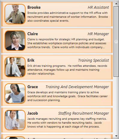
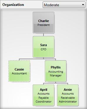
As we’ve done in the past, let’s borrow some images from the business modeling application used by the Microsoft Dynamics team. Here are a couple of more traditional styled ListBox examples, where the items are stacked vertically:

Naturally, that application also leverages a ListBox to present a list of radio buttons:

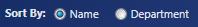
As described in ‘P’ is for Panel, the application uses a very slick custom panel within a ListBox to provide a pivot view for exploring entity relationships:

You may recall from the ICIQ Test (‘B’ is for Bet You Can’t Find Them All) that the application also contains a custom TreeGraph control. Technically, this control also qualifies as a ListBox (it derives from the ListBox class and then adds additional functionality to support custom item containers):

I guess while we’re on the topic of ListBox derivatives, it is worth noting that the native ListView control also derives from ListBox. So a ListView is actually a multi-columned ListBox:

Wow! Since the control, itself, is lookless, we could essentially go on forever coming up with new looks for a ListBox. We are limited only by our imaginations and styling skills!

Since we have this great power, it is worth also mentioning the great responsibility that comes with the lookless control model. In the end, the look and feel of our controls should be driven by the desire to create the best user experience possible for the scenario at hand. I’ve already seen too many videos playing inside rotating buttons. We must avoid the temptation to do things just because we can. (Hearken back to the early days of WYSIWYG word processors, where so many documents came out looking like ransom letters… ’nuff said! 😉 )

The Items Panel

There is one element that you will almost always find within the template of an ItemsControl. It is called an ItemsPresenter. In ‘P’ is for Panel, we learned that an ItemsPresenter reserves real estate within the control’s template for the items host (a.k.a., the items panel). By including this ItemsPresenter element within the control template and specifying the ItemsPanelTemplate separately, it is possible to have a swappable items panel without having to retemplate the entire ItemsControl. The ItemsPanelTemplate will be inflated within the ItemsPresenter to create a panel to host the items of the ItemsControl.

Of course, as we also learned in ‘P’ is for Panel, it is not absolutely necessary to include an ItemsPresenter in the control template. Another approach is to simply include a panel in the template and set its IsItemsHost property to true. The drawback here is that the items panel is no longer swappable via the ItemsPanelTemplate property. In fact, ItemsPanelTemplate is completely disregarded in this scenario.

The ToolBar control is an example of one such ItemsControl that uses a hard coded items panel. If you examine the control template for ToolBar, you will see an element called ToolBarPanel that has IsItemsHost set to true. This was an intentional design decision for ToolBar. The control template basically tells us that a ToolBar cannot function without a ToolBarPanel. (The reason for this requirement is that a ToolBar has special support for overflow items… if the items cannot fit within the space available in the ToolBarPanel, they are arranged within a ToolBarOverflowPanel in a Popup control.)

I think its fine to derive custom ItemsControl classes like ToolBar that have special dependencies on known template elements. As a control developer, there are certain measures that you should take whenever you decide to go this route. First, you need to fully document the requirements of your control. By requiring specific elements in the template, you are reducing the lookless nature of your control. Designers will need to be aware of these limitations when they re-template your control.

Other Known Parts

While we’re on this topic of required template elements, it’s worth noting that an ItemsControl will sometimes have dependencies on other elements besides just the items panel. Let’s consider the ComboBox control…

A ComboBox is a single-select ItemsControl whose full list of available items is usually presented in a “dropdown list” below a textual representation of the selected item. The template for a ComboBox consists of a TextBox and a Popup (as well as several other visual elements). As you might expect, the TextBox displays the selected item and the Popup contains the ItemsPresenter so it naturally presents the available items in the dropdown list.

The ComboBox class contains certain logic that is very specific to the Popup control. Again, any such dependency on a known template element (also referred to as a “template part”) reduces the looklessness of the control, but that’s okay as long as the requirement for the part is well documented.

This naturally raises a question as to how the ComboBox can accurately identify the known part (the Popup) within its template and hook it up to the control’s logic. One approach might be to walk the visual elements in the control’s template and look for an element of type Popup. Of course, this might fail if a designer decides to re-template the control in a way that involves two Popup elements.

To deal with ambiguities like this, the framework uses a specific naming convention for the identification of known template parts. That convention is to name the element using the prefix “PART_”. In the case of the ComboBox template, the expected name for the Popup is “PART_Popup”. So within the template, you will see a Popup element like this:

<Popup Name="PART_Popup" AllowsTransparency="True" Placement="Bottom">
  ...
</Popup>

Alright, we have a well-known name for the Popup. Next we need to use this name to locate the element. But when and how do we perform this lookup? It turns out that the framework provides a method for this very purpose. By overriding OnApplyTemplate(), a control can be notified when it’s template is inflated and loaded into the visual tree. The GetTemplateChild() method can then be used to look up a template element by name, as shown here:

public override void OnApplyTemplate()
{
    base.OnApplyTemplate();
    _popup = GetTemplateChild("PART_Popup") as Popup;
}

The use of known parts within a control template clearly adds complexity for design tools that need to support re-templating the control. As such, you may be wondering how the known template parts are made discoverable to tools like Blend and Cider. Well, the framework actually leverages a custom TemplatePart attribute to decorate control classes with known parts. For example, the ComboBox class is decorated with the following attributes:

[TemplatePart(Name="PART_EditableTextBox",Type=typeof(TextBox))]
[TemplatePart(Name="PART_Popup",Type=typeof(Popup))]
public class ComboBox : Selector
{
    ...
}

Note that although we’ve been looking at the ComboBox class in the above example, this convention of using known template parts is really applicable to all controls within the framework. Anytime a designer wishes to re-template a control, they should take some time to familiarize themself with the known parts. If they need to re-template a control for which they do not already have a sample template, they can leverage a tool like .NET Reflector to disassemble the control class and view the TemplatePart attributes.

Keeping It Loose

I’d like to offer some advice specifically for the authors of custom controls. A well-written, lookless control will provide what I refer to as a “loose” contract between the control and its template. This means that the control does not blow up (throw an exception) when elements are missing from its template. Rather, it knows how to degrade gracefully.

This loose contract approach is used for the native ItemsControl classes in WPF. For example, you can re-template a ListBox and simply leave out its ItemsPresenter. The ListBox class never assumes that an items panel is present. As such, when you use your template, you will note that your app runs fine. Of course, no items are displayed within the ListBox because there is no items panel in which to present them. The important thing is that no exceptions are thrown either.

The same graceful scale back can be seen in the ComboBox control when you leave out a known template part like “PART_Popup”. The ComboBox class never assumes that a Popup is present. Instead, the class always checks its internal Popup reference to make sure its non-null prior to accessing it.

Testing your control against templates with missing elements is part of supporting a truly lookless control model. Users of your control will really appreciate your diligence in this matter because it means their designers will have full freedom to re- template the control as they see fit.

To Derive or Not To Derive

We’ve already seen that the lookless model provides the opportunity to reuse a single control class with many different visual representations. There will certainly be times when you need more than just a new look and feel. If a class does not provide all the functionality you need, you may actually need to derive a new control by extending an existing class.

The ListView control is a good example of an ItemsControl which has been thusly extended. The ListView class derives from ListBox and adds support for a broader concept of “Views”. (We won’t go into whether ListView is a well-contrived control… that is a much bigger conversation and this post is already too long!)

The most common view used within a ListView is called a GridView. This view allows each item to be presented as a row within a grid (or table). The columns in the grid each have their own header. In simple scenarios, a ListView can be used as a lightweight data grid (which was important in the initial release of the platform because there was no native DataGrid class). You can see the ListView class in action in ‘R’ is for Rob has a Customer.

Extending functionality is just one reason you might choose to derive a new control. Another reason might be that the existing control is not entirely lookless. In this case, you may wish to derive a new class and override specific functionality within the base class.

Consider the TreeView class. In ‘B’ is for Bet You Can’t Find Them All, we saw an example of a TreeView that had been re-templated to support a horizontal layout. This telescoping TreeView is displayed in the following image:

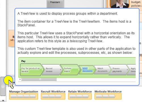
It turns out that creating this custom TreeView was not as simple as merely re-templating the TreeView class. The item container class, TreeViewItem, contains hardcoded support for keyboard navigation that assumes the tree expands vertically. (Pressing the Left and Right arrow keys on a TreeViewItem expands or collapses a branch in the tree, whereas pressing the Up and Down arrows navigates between nodes in the tree.) In order to create a horizontally expanding TreeView, it was necessary to swap the directional navigation keys. This required the derivation of a new TelescopingTreeView class from the native TreeView class as well as the derivation of a new TelescopingTreeViewItem class from the native TreeViewItem class.

Hopefully this can be a lesson to us all. Clearly, this TelescopingTreeView required a lot more work than would have been necessary if a truly lookless base class existed. It would have been nice if the native TreeViewItem added support for keyboard navigation via attached key bindings rather than hardcoded keyboard behaviors. (Note to self: Do a post on attached key bindings someday.) I certainly try to keep things like this in mind whenever I’m overriding specific input methods like OnKeyDown().

Coming Up Next

Congratulations! You made it through the longest post in this series (thus far :P). More importantly, you are now familiar with the lookless control model and the techniques for defining the look and feel of controls within this model. In the next post, ‘N’ is for Natural User Interface, we will learn that an infinite loop is not always a bad thing!

ItemsControl: 'E' is for Editable Collection

Monday, October 20th, 2008

Dear Dr. WPF,

As of late, a serein has come upon me in the world of wpf and databinding, hence I’m writing to you in my desperate search for some kind of remedy before there will be a hey rube.

Whilst having an ObservableCollection of “Person” objects, and creating a collectionview for this and also adding a SortDescription on a “Name” property on the “Person” object, I noticed that if I change the “Name” property on one of the objects (they are shown in a listbox, having the “Name” property databound to a textblock), and thereafter calling Refresh() on the CollectionView, the refresh will actually take more than a second with only about 50 items.

Ok, if I measure the call to Refresh() it doesn’t take more than 100 ms or so, but like the call sets in motion alot of other things that will happen after my method has exited, which is understandable since the documentation states that the whole view is recreated and therefore I assume the whole tree of items of the visualtree concerned is re-created too.

If I instead just remove the item, and just re-insert it, it’s as close as I can get to instantaneous. perfect! BUT! Since I’m a quidnunc I won’t be satisfied with this! So I’m asking the great Dr, that has given us all such great in depth knowledge in the past, what can we do about this in a more generic fashion? Can we speed up the “Refresh()” somehow? What would you suggest I do if I have a collection of a type that I don’t know about at compile time? How can I remove / add an item then!

Or am I simply lost in my path to enlightenment ?

I shall not dissert anymore, but hope to hear from the good Dr, perhaps in a blogpost touching this subject as I feel it to be of greater interest to the public health in the land of wpf.

Best regards,
Patient-X


Dear Patient-X,

I’ve been wondering what I could file under the letter ‘E’ in this series, and now you’ve afforded me the perfect opportunity! 🙂

No, you are not lost in your path to enlightenment. The true path will lead you to a new feature in .NET 3.5 SP1 called an “editable” collection view. More on that momentarily… First, let’s examine exactly what is happening in your scenario.

Understanding the ListCollectionView Class

You are binding to a list of items. More specifically, you are binding to a collection of Person objects (namely an ObservableCollection<Person>) that, in turn, implements the IList interface. The binding engine will automatically generate a ListCollectionView for such a collection. The ListCollectionView class provides support for sorting, grouping, and filtering your collection when it is the ItemsSource for an ItemsControl. (See ‘C’ is for Collection for more information.)

For the purposes of this discussion, let’s look at a similar scenario using the following collection of Character objects (borrowed from ‘I’ is for Item Container):

    <src:CharacterCollection x:Key="Characters">
      <src:Character First="Homer" Last="Simpson"
          Gender="Male" Image="images/homer.png" />
      <src:Character First="Marge" Last="Bouvier"
          Gender="Female" Image="images/marge.png" />
      <src:Character First="Bart" Last="Simpson"
          Gender="Male" Image="images/bart.png" />
      <src:Character First="Lisa" Last="Bouvier"
          Gender="Female" Image="images/lisa.png" />
      <src:Character First="Maggie" Last="Simpson"
          Gender="Female" Image="images/maggie.png" />
    </src:CharacterCollection>

To demonstrate grouping and sorting for our collection, we can define a CollectionViewSource object in markup, as shown below:

    <CollectionViewSource x:Key="CharacterCollectionView"
        Source="{Binding Source={StaticResource Characters}}">
      <CollectionViewSource.GroupDescriptions>
        <PropertyGroupDescription PropertyName="Gender"/>
      </CollectionViewSource.GroupDescriptions>
      <CollectionViewSource.SortDescriptions>
        <cm:SortDescription PropertyName="First" />
      </CollectionViewSource.SortDescriptions>
    </CollectionViewSource>

When this CollectionViewSource is set as the ItemsSource of a ListBox, it will yield a view of the collection (namely, a ListCollectionView) in which the characters are grouped by gender and sorted by first name. Here is what the ListBox declaration might look like:

  <ListBox Name="lb" HorizontalAlignment="Center" VerticalAlignment="Center"
      ItemsPanel="{StaticResource HorizontalItemsPanel}"
      ItemsSource="{Binding Source={StaticResource CharacterCollectionView}}"
      ItemContainerStyle="{StaticResource CharacterContainerStyle}">
    <ListBox.GroupStyle>
      <GroupStyle Panel="{StaticResource HorizontalItemsPanel}" />
    </ListBox.GroupStyle>
  </ListBox>

The image below depicts our ListBox with grouping and sorting.

You can download the sample for this post to see the complete item template, item container style, and group item style.

Dynamically Updating Items is Problematic

Ideally, applying a sort order to a CollectionView would result in a grouped and sorted view of the collection that is fully maintained even when items within the collection are changed. Unfortunately, a ListCollectionView only groups and sorts its items when the view is first created (or when new items are added to the source collection, assuming that the source collection is observable). A ListCollectionView will *not* monitor changes to properties on each existing item within the collection.

For example, if you execute code at runtime to dynamically change Bart’s name to “Mandy”, the ListCollectionView will be unaware of that change and the item will not appear in its proper sorted location after the change. Furthermore, if Bart finally gets the operation he deserves (and secretly desires) and his gender is updated accordingly, the changed item will not move to its proper group. Here is some simple code to perform these changes:

    Character bart = lb.Items[0] as Character;
    bart.First = "Mandy";
    bart.Gender = Gender.Female;

The image below depicts the sorting and grouping errors that are present after these changes:

Note, that the item template did indeed update according to the name and gender change (because the Character object raises the appropriate change notifications for these properties), but the ListCollectionView did not update its view of the items. As a result, the changed item is no longer in the correct sort location or group.

Refreshing a CollectionView

If you are using .NET 3.5 or earlier, you can force a CollectionView to be updated at runtime by calling its Refresh() method. Then the items will once again be properly grouped and sorted. Here is a routine that includes the Refresh() call:

    Character bart = lb.Items[0] as Character;
    bart.First = "Mandy";
    bart.Gender = Gender.Female;
    (lb.ItemsSource as ListCollectionView).Refresh();

After calling Refresh(), the modified character now appears in the correct group and sort location, as shown here:

Unfortunately, the Refresh() method results in a complete regeneration of the view. It is a rather drastic operation, to say the least. Furthermore, when a Refresh() occurs within the view, it raises a CollectionChanged notification and supplies the Action as “Reset”. The ItemContainerGenerator for the ListBox receives this notification and responds by discarding all the existing visuals for the items. It then completely regenerates new item containers and visuals. (See ‘I’ is for Item Container and ‘G’ is for Generator for more information on item containers and container generation.) Again, this is a drastic (and often very expensive) operation.

Increasing Refresh Performance is Difficult

You raised the question, “Can we speed up the “Refresh()” somehow?”

Unfortunately, the very nature of the refresh operation makes this difficult. For the mundane reasons, keep reading… otherwise, feel free to skip ahead to A Better Option.

Theoretically, you could derive your own custom collection view from the ListCollectionView class and override its Refresh() method. Then you could perhaps implement a routine that intelligently regenerates the view in a minimalistic manner by comparing the source collection to the view collection.

Such a routine would need to move existing items to their new locations in the view, add items that were not previously present, and remove items that should no longer be present. All of these changes would need to be made per the view’s sorting, grouping, and filter criteria. For each change, the view would need to raise a very specific CollectionChanged notification (Add, Remove, or Move) for consumption by the ItemContainerGenerator of the owning ItemsControl.

Not only would such a synchronization routine be complex, but it is also likely to be even more expensive than simply resetting the entire collection. There will be some number, n, where discrete Add, Remove, and Move change notifications for n or fewer changes is indeed more performant than a single Reset notification. Unfortunately, it will be very difficult to heuristically determine the appropriate value for n.

A Better Option: Remove and Re-Add

A better approach, especially if you are stuck on pre-3.5 SP1 bits, is to do precisely what you describe in your email. Namely, do not call Refresh() at all, but instead, remove the target item from the observable collection, modify its properties, and then re-add it to the collection, as shown here:

    Character bart = lb.Items[0] as Character;
    CharacterCollection characters = FindResource("Characters") as CharacterCollection;
    characters.Remove(bart);
    bart.First = "Mandy";
    bart.Gender = Gender.Female;
    characters.Add(bart);

The ListCollectionView will detect the removal of the old item and raise the appropriate Remove notification so that the ItemContainerGenerator can remove the associated container and visuals. It will also detect the addition of the modified item and insert it at the correct location within its view of the source collection (again, per the grouping, sorting, and filter criteria). Then it will raise the necessary Add notification so that a new item container and item visuals can be generated.

This solution is obviously not perfect! One problem that may not be immediately evident is that adding and removing an item from the source collection effects the ListCollectionView’s notion of currency (“current item”). For example, if the Bart character was the current item before it was removed from the collection, that state will be lost. If this is important to your scenario, you must add additional code around the remove/re-add routine to save and restore currency.

An Even Better Option: IEditableObject

As mentioned earlier, .NET 3.5 SP1 enables an even better approach that solves many of the problems present in the Refresh() and Remove/Re-Add solutions. Namely, it allows you to implement an IEditableObject interface on your datamodel objects (or on your viewmodel objects, if you are using the model-view-viewmodel pattern). This new interface allows for transactional changes (edit, cancel, and commit) on the object.

The framework supports the transactional model by implementing another new interface called IEditableCollectionView on the existing list-based CollectionView classes (ListCollectionView and BindingListCollectionView). This interface works in conjunction with collection items that implement the IEditableObject interface.

In this new approach, when you need to change an item, you can first call the EditItem() method of the collection view, then make the required changes to the item, and finally, call the CommitEdit() method of the collection view. If you decide that you don’t want to commit the changes, you can call the CancelEdit() method of the collection view.

It is worth noting that the ItemCollection class also implements the IEditableCollectionView interface. Since the Items property of an ItemsControl is of type ItemCollection (see ‘C’ is for Collection), it provides handy access to the methods of IEditableCollectionView. As long as you know the source collection is an IList, you can safely call the IEditableCollectionView methods directly on the Items property and the ItemCollection class will delegate the call to the appropriate underlying collection view.

How it Works

In practice, the properties of an “editable” object will rarely be updated directly in code behind. Rather, these properties will be updated via bindings to properties on controls within the UI.

In WPF, it is fairly common to present data using a “view template”. Such a template will often present a readonly view of the data using elements like TextBlock, Image, etc. Then, when it is necessary to edit the data, the view will switch to an “edit template” that contains editable controls like TextBox, ComboBox, CheckBox, etc.

The IEditableObject interface provides three transactional methods: BeginEdit(), CancelEdit(), and EndEdit(). I prefer to expose an additional readonly property on the editable object called IsInEditMode that can be used as a trigger for swapping between the view template and the edit template.

Below is my typical implementation of IEditableObject, as it would be implemented on the Character class in our example:

    #region IEditableObject support

    public Character _cachedCopy = null;

    public void BeginEdit()
    {
        // save object state before entering edit mode
        _cachedCopy = new Character();
        _cachedCopy._first = _first;
        _cachedCopy._last = _last;
        _cachedCopy._image = _image;
        _cachedCopy._gender = _gender;

        // ensure edit mode flag is set
        IsInEditMode = true;
    }

    public void CancelEdit()
    {
        // restore original object state
        if (_cachedCopy != null)
        {
            First = _cachedCopy._first;
            Last = _cachedCopy._last;
            Image = _cachedCopy._image;
            Gender = _cachedCopy._gender;
        }

        // clear cached data
        _cachedCopy = null;

        // ensure edit mode flag is unset
        IsInEditMode = false;
    }

    public void EndEdit()
    {
        // clear cached data
        _cachedCopy = null;

        // ensure edit mode flag is unset
        IsInEditMode = false;
    }

    private bool _isInEditMode = false;
    public bool IsInEditMode
    {
        get { return _isInEditMode; }
        private set
        {
            if (_isInEditMode != value)
            {
                _isInEditMode = value;
                RaisePropertyChanged("IsInEditMode");
            }
        }
    }

    #endregion

Download the Sample

You can download the complete sample for this post to see the IEditableObject and IEditableCollectionView interfaces in action. When you run the sample, simply double-click an item (or press F2) to enter edit mode.

If you do not wish to commit your changes, press Escape. If you do wish to commit your changes, press Enter or simply select another character. When the changes are committed, you will notice that the item immediately moves to its proper location within the view.

Is IEditableObject Absolutely Required?

You posed the question, “What would you suggest I do if I have a collection of a type that I don’t know about at compile time?”

First, I would advise you to avoid that situation if at all possible. The model-view-viewmodel pattern typically involves wrapping or replicating items (and collections) of known types within observable classes (classes that provide change notifications like INotifyPropertyChanged and INotifyCollectionChanged) and adding additional interfaces (like IEditableObject) to either the data model objects or the viewmodel objects to allow them to play nicely with the view. That is always my preferred approach.

Having said that, there are certainly times when you may not have the option of modifying the entity within your collection. If you simply cannot add the IEditableObject interface to the data model or viewmodel class, you needn’t fret. The IEditableCollectionView interface is still your friend (as long as you are targeting .NET 3.5 SP1, of course). You won’t get all of the transactional goodness of IEditableObject, but you can still call EditItem() followed by CommitEdit() to update the view’s notion of a specific item.

Consider the earlier example where the characters were not correctly sorted or grouped after changing Bart’s name and gender. It turns out that you can simply add the lines below to cause that specific item to be moved to the correct location within the view:

    Character bart = lb.Items[0] as Character;
    bart.First = "Mandy";
    bart.Gender = Gender.Female;
    (lb.Items as IEditableCollectionView).EditItem(bart);
    (lb.Items as IEditableCollectionView).CommitEdit();

Voîla! There is no longer a need to explicitly refresh the entire view!

Order now and receive these bonus gifts!

The downloadable sample included with this post covers the specific questions posed by Patient-X, but there is more to IEditableCollectionView. It also provides a convenient way to add and commit new items to the source collection. You can even use it to remove existing items from the source collection. By leveraging members of the IEditableCollectionView interface for such changes, you can ensure that your view of the collection will remain accurate with respect to grouping, sorting, and filtering.

To see some of the other features of IEditableCollectionView, check out Vincent Sibal’s introduction to IEditableCollectionView, He also includes a nice code sample with his post.

Cheers,
Dr. WPF

P.S. For anyone who is hoping to get a published response to a WPF question, you should note (as Patient-X has) that the doctor is easily manipulated by wordsmithery. If you use lots of obscure terms like serein and hey rube, there is a much greater chance you will receive a public response, as it appeals to my invented persona’s inflated sense of perspicacity! 😉

ItemsControl: 'G' is for Generator

Sunday, July 20th, 2008

In ‘I’ is for Item Container, we learned that each item within an ItemsControl is represented by visuals hosted within a container element. The type of this “item container” is specific to the type of the ItemsControl. For example, the container for an item in a ListBox is the ListBoxItem element. Similarly, the container for an item in a ComboBox is the ComboBoxItem element. (A complete list of the native ItemsControl classes and their respective item containers can be found at the end of ‘I’ is for Item Container.)

In this episode, we examine the mechanism by which item containers come into existence.

Where did these containers come from?

In the previous examples in this series, the item containers have mysteriously (or perhaps magically) been created without our knowledge. All we typically do is set a binding on the ItemsSource property for the control. Consider the following ListBox example (again, from ‘I’ is for Item Container):

<ListBox ItemsSource="{Binding Source={StaticResource Characters}}"
    ItemContainerStyle="{StaticResource CharacterContainerStyle}">
  <ListBox.ItemsPanel>
    <ItemsPanelTemplate>
      <Canvas />
    </ItemsPanelTemplate>
  </ListBox.ItemsPanel>
</ListBox>
 

We know that each item in the ListBox is contained within a ListBoxItem. What we don’t know is who created that ListBoxItem. It is logical to assume that the ItemsControl, itself, created the ListBoxItems, but as we’ll see moving forward, this is not the case.

Introduction to the ItemContainerGenerator class

It turns out that every ItemsControl has its own instance of an ItemContainerGenerator object. This generator is accessible via an appropriately named ItemContainerGenerator property.

As the class name implies, an ItemContainerGenerator provides methods by which item containers can be generated for items within an ItemsControl. Specifically, an ItemContainerGenerator knows how to create a container and link it to the item it will contain. It also knows how to remove a container that is no longer needed. Finally, the ItemContainerGenerator class contains several invaluable methods for mapping existing items within an ItemsControl to their containers and vice versa.

Who really holds the reigns of the generator?

An ItemContainerGenerator knows how to create a container and link it to an item, but who actually gets to decide when this container generation occurs? You might think that the generator, itself, should get to decide when to do its job, but actually, it intentionally remains “hands off” in these matters.

The ItemContainerGenerator does, however, monitor the collection view of its associated items collection (via a weak event listener for the INotifyCollectionChanged events). It uses the change notifications to know when to unlink an existing container from an item that is removed, but it never makes a decision on its own to generate a container for an added item. It just quietly maintains a record of all the items within the collection so that it is poised to create a container at a moment’s notice.

If it’s not the ItemContainerGenerator, then it must be the ItemsControl, right? Well, no, the ItemsControl does not directly generate the containers either, but it definitely plays some key roles in the process. Namely, it creates and owns the “generator” of containers (the ItemContainerGenerator instance) and it gets to decide the type of containers that will be created.

Okay, then who else could possibly be responsible for deciding when containers will be generated?

If you’ve been following this series for a while, it should be pretty obvious that neither the ItemsControl nor the ItemContainerGenerator can be the sole decision makers in the process because the ItemsControl class supports something called UI virtualization (wherein only visible UI elements are instantiated and added to the element tree).

In ‘P’ is for Panel, we learned that the items host (a.k.a., the items panel) of an ItemsControl is dynamic. As such, there is no way for the ItemsControl or its ItemContainerGenerator to generically know when containers will be visible. Clearly, the items panel must be directly involved in container generation. After all, the item containers are direct visual children of the items panel. Since the panel knows precisely where to place these children, it is very logical that it would be the one holding the proverbial reigns of the ItemContainerGenerator and telling it when to generate the containers.

How does the generator know what type of container to generate?

When it is time to generate a container, you might be wondering how the ItemContainerGenerator knows what type of object to instantiate. Well, really, it doesn’t know at all. Each ItemsControl gets to specify its own type of item container. The generator simply defers this container creation to its associated ItemsControl by calling its GetContainerForItem() method. This method is responsible for creating and returning a new container for an item.

What happens if the item is already the same type as the container?

We’ve previously looked at examples like the following in which a ListBoxItem is added directly to a ListBox:

<ListBox SelectedIndex="0" Width="100">
  <ListBoxItem>Item 1</ListBoxItem>
  <ListBoxItem>Item 2</ListBoxItem>
  <ListBoxItem>Item 3</ListBoxItem>
  <ListBoxItem>Item 4</ListBoxItem>
  <ListBoxItem>Item 5</ListBoxItem>
</ListBox>

You may be wondering what the ItemContainerGenerator does in this case, since the item, itself, is already a container. Will it create a new ListBoxItem as the container for the specified ListBoxItem? The answer is no, it will not. Before the ItemContainerGenerator creates a new container, it first checks to see whether the item, itself, is already a container. It does this by calling the IsItemItsOwnContainer() method on the associated ItemsControl.

How can we specify our own container type for a custom ItemsControl?

Suppose we wish to create a custom ForceDirectedItemsControl class that will use a physics-aware items panel to host its children. To enable this scenario, we decide that each container will need to be an instance of a custom ForceDirectedItem class that will support the extra physics-based properties that control item layout in our custom panel (like friction, spring, repulsion, etc). How can we ensure that our custom ForceDirectedItemsControl class creates the ForceDirectedItem containers?

Well, it turns out that this is pretty easy… we just need to override two virtual methods in our ItemsControl class: IsItemItsOwnContainerOverride() and GetContainerForItemOverride().

The following is a typical implementation of a custom ItemsControl class with a custom item container:

  public class ForceDirectedItemsControl : ItemsControl
  {
      protected override bool IsItemItsOwnContainerOverride(object item)
      {
          return (item is ForceDirectedItem);
      }

      protected override DependencyObject GetContainerForItemOverride()
      {
          return new ForceDirectedItem();
      }
  }

Using the above class, when the ItemContainerGenerator is asked to generate a container for an item, it will first check to see if the item is already a ForceDirectedItem. If not, it will ask the ItemsControl to create a container by deferring to its GetContainerForItemOverride().

Caution: You should never assume there to be a constant tie between an item and its container. The GetContainerForItemOverride() method intentionally does not supply the item that will be hosted within the container. It is the responsibility of the ItemContainerGenerator to link an item to its container. When a virtualizing panel is hosting containers, it is common to link one item to a container and later link a completely different item to that same container. This provides a nice perf optimization.

How does UI virtualization work in an ItemsControl?

I previously promised that this episode would include a high level look at exactly how an ItemsControl supports this concept of UI virtualization. Feel free to skip ahead if you are not curious about the finer details of virtualization.

There are really only two noteworthy panel classes in the framework that take control of the ItemContainerGenerator and instruct it to generate containers: Panel and VirtualizingStackPanel.

Sidenote: There is actually a third native class, called ToolBarPanel, that uses the ItemContainerGenerator to generate items for a ToolBar. We won’t really spend any time looking at the ToolBar class in this series, since in many ways it breaks the traditional ItemsControl conventions. For more, see the note marked “**” at the end of ‘I’ is for Item Container.

The abstract Panel base class contains what we can consider the default container generation code for panels. This default logic is simply to generate containers for every item in the collection. So by default, there is no UI virtualization whatsoever.

The framework contains an abstract class called VirtualizingPanel which derives from Panel and then overrides the default container generation code to replace it with… well… nothing. So if you derive a panel from VirtualizingPanel, it will not generate any containers on its own. Instead, you will be responsible for implementing the code that leverages the ItemContainerGenerator to generate the containers.

There is only one virtualizing panel included in the early releases of the framework (.NET 3.0 and 3.5). It is called VirtualizingStackPanel. And if you paid attention to the chart at the end of ‘I’ is for Item Container, you know that VirtualizingStackPanel is the default items host for ListBox and ListView. So we get UI virtualization thrown in for free when we use these controls with their default items panel.

A VirtualizingStackPanel, like any other panel, is responsible for sizing and positioning its children (the item containers). As such, it knows exactly which children are visible within the viewport of the ItemsControl at any given time. It uses this knowledge to create, or “realize”, only the visible children (plus a few extra on either side of the viewport to enable keyboard navigation to work as expected). When a realized child is scrolled out of the viewport, the VirtualizingStackPanel queues that container to be removed, or “virtualized”, so that its resources can be reclaimed.

If you are writing a custom virtualizing panel, you will also need to implement the logic for realizing visible containers and virtualizing non-visible containers. Realization consists of generating the container (generator.GenerateNext()) and preparing it to host its item (generator.PrepareItemContainer()). Virtualization consists of removing the container (generator.Remove()).

We will go deeper into UI virtualization in a future article entitled ‘V’ is for Virtualization. In the meantime, if you are anxious to get started writing a virtualizing panel, you should check out Dan Crevier’s series on creating a virtualizing panel.

Tying It All Together

We’ve already covered many different aspects of an ItemsControl in this series and they all come into play in this process of item container generation. There is a very intricate dance involving an ItemsControl, its items host (‘P’ is for Panel), its Items collection (‘C’ is for Collection), and its ItemContainerGenerator (‘G’ is for Generator… this article). This dance results in the creation of item containers (‘I’ is for Item Container) that will host the items directly or host a visual representation of the items, as specified via an item template (‘D’ is for DataTemplate).

Finding Template Elements by Mapping Items to Containers

A very common question in the WPF Forum is, “How can I get a reference to a specific element in my item template at runtime?”

Sidenote: In most scenarios, you shouldn’t need to do this. Typically, the reason a person wants to do this is so they can programmatically change a property on some element in the template. If one carefully develops their view model (which will contain the data items represented within the ItemsControl), this type of property update can be handled via a binding to a property on a data item.

There are certainly a few scenarios where it is necessary to drill into an item’s visual subtree to get a specific element. For these scenarios, we can leverage a couple of nifty methods of the ItemContainerGenerator: ContainerFromIndex() and ContainerFromItem(). Once you have the container for the desired item, you can locate the element within its visual tree using a recursive routine like the GetDescendantByName() or GetDescendantByType() routines shown here:

  public static Visual GetDescendantByName(Visual element, string name)
  {
      if (element == null) return null;

      if (element is FrameworkElement
          && (element as FrameworkElement).Name == name) return element;

      Visual result = null;

      if (element is FrameworkElement)
          (element as FrameworkElement).ApplyTemplate();

      for (int i = 0; i < VisualTreeHelper.GetChildrenCount(element); i++)
      {
          Visual visual = VisualTreeHelper.GetChild(element, i) as Visual;
          result = GetDescendantByName(visual, name);
          if (result != null)
              break;
      }

      return result;
  }

  public static Visual GetDescendantByType(Visual element, Type type)
  {
      if (element.GetType() == type) return element;

      Visual foundElement = null;

      if (element is FrameworkElement)
          (element as FrameworkElement).ApplyTemplate();

      for (int i = 0;
          i < VisualTreeHelper.GetChildrenCount(element); i++)
      {
          Visual visual = VisualTreeHelper.GetChild(element, i) as Visual;
          foundElement = GetDescendantByType(visual, type);
          if (foundElement != null)
              break;
      }

      return foundElement;
  }
 

Finding the Container Associated with a Template Element

Similarly, there are times when you will want to handle an event on a specific template element and then locate the ancestor item container for the element. One option is to walk the ancestors looking for the element by type with the following GetAncestorByType() routine:

  public static DependencyObject GetAncestorByType(
      DependencyObject element, Type type)
  {
      if (element == null) return null;

      if (element.GetType() == type) return element;

      return GetAncestorByType(VisualTreeHelper.GetParent(element), type);
  }

Another perfectly viable approach is to leverage a little fact that we learned in ‘I’ is for Item Container… namely, that the DataContext of the container is the very item that it contains. In most scenarios, this same DataContext will be inherited by all framework elements within the item template. So you can typically cast the original source of the event to a FrameworkElement and use the DataContext property to get the item that is represented by the template. You can then use the ContainerFromItem() method of the ItemContainerGenerator to get the container.

Most of these tricks work great for a simple ItemsControl, but then get a little tricky with a HeaderedItemsControl like a TreeView or MenuItem. For these cases, I strongly recommend leveraging the view model, commanding, and bindings to handle property updates within the view and to respond to user actions within the view model. We’ll explore these things further in future episodes.

Dealing with Asynchronous Container Generation

Alright, clearly the ItemContainerGenerator class provides some very handy, and even essential, methods for mapping items to containers and vice versa. There is still one very important thing to add to the whole equation… that is the timing of container generation.

Suppose you have a ListBox named CharacterListBox bound to an observable collection named Characters. You might be tempted to write code like the following:

  private void AddScooby()
  {
      Character scooby = new Character("Scooby Doo");
      Characters.Add(scooby);
      ListBoxItem lbi = CharacterListBox.ItemContainerGenerator
          .ContainerFromItem(scooby) as ListBoxItem;
      lbi.IsSelected = true;
  }

This code will actually result in an exception because the lbi member will be null. The reason is that containers are generated in a separate dispatcher operation. As a result, simply setting the ItemsSource property or modifying the bound collection does not cause containers to be created immediately.

The key point here is that we must always think of container generation as an asynchronous operation. So how can we add an item and then safely locate its container after it has been generated? For this very purpose, the ItemContainerGenerator class provides a Status property along with change notifications for the status. If we need to programmatically access containers after they are generated, we can subscribe to the StatusChanged event, as shown in the following code:

  private void AddScooby()
  {
      _scooby = new Character("Scooby Doo");
      Characters.Add(_scooby);
      CharacterListBox.ItemContainerGenerator.StatusChanged
          += OnStatusChanged;
  }

  private void OnStatusChanged(object sender, EventArgs e)
  {
      if (CharacterListBox.ItemContainerGenerator.Status
          == GeneratorStatus.ContainersGenerated)
      {
          CharacterListBox.ItemContainerGenerator.StatusChanged
              -= OnStatusChanged;
          ListBoxItem lbi = CharacterListBox.ItemContainerGenerator
              .ContainerFromItem(_scooby) as ListBoxItem;
          if (lbi != null)
          {
              lbi.IsSelected = true;
          }
      }
  }

There are a couple of important things to notice about this code. First, the OnStatusChanged() method immediately checks the current status of the generator. This is important because the status could have changed to one of four different possible values: NotStarted, GeneratingContainers, ContainersGenerated, or Error. We should always specifically check for the status that we care about.

Second, as soon as the containers have been generated, the handler removes itself so that it will not be called when subsequent changes to the Items collection cause the generator’s status to change.

Bonus Tidbit: FindAncestor Bindings are Very Handy in Item Templates

This is really just an extra tidbit that I’m tagging onto this topic because of its usefulness. It is not really specific to container generation.

Recall that in ‘D’ is for DataTemplate, we learned how to provide a template of visuals to represent the items in an Items collection. When dealing with a Selector like ListBox, ListView, TreeView, etc, it is quite common to want to trigger a change in the visuals based on whether an item is selected. We now know that the concept of selection for these controls is based on the IsSelected property of their respective item containers. Any element in the item template can be bound to a property of the item container using a FindAncestor binding.

Below is a typical data trigger that might be found in a DataTemplate for an item within a ListBox:

<DataTrigger Binding="{Binding RelativeSource={RelativeSource FindAncestor,
    AncestorType={x:Type ListBoxItem}}, Path=IsSelected}" Value="True">
  <Setter Property="Foreground" Value="#A1927E" TargetName="tb" />
</DataTrigger>

Up Next

In the next episode of this series, I plan to examine the “lookless” nature of ItemsControls. Please stay tuned!

ItemsControl: 'R' is for Rob has a Customer

Friday, March 28th, 2008

Rob Relyea has a customer (I wonder if it’s Kevin’s Mom?) who is looking for an implementation of this Views menu that is used in Vista’s Explorer window. 

Since I haven’t seen anyone respond, I put together a little app to demonstrate how you might do this in WPF.  (Yes, I’ll use any excuse to knock off another letter of the alphabet in this series!)

This really does qualify for the ItemsControl series.  Not only is a ContextMenu an ItemsControl, but I also demonstrate how to use the menu to control another ItemsControl… a ListView.  In total, this sample demonstrates binding to a collection (‘C’ is for Collection), creating a dynamic item template (‘D’ is for DataTemplate), and using triggers to adjust properties on a custom items panel (‘P’ is for Panel).

One would typically implement a user control for a menu like this because the control is really a collection of several other controls (in this case, a slider, several menu items, and a popup) with well-defined, static visuals.  However, because I wanted several behaviors that come for free with a context menu, I just took a shortcut and derived directly from ContextMenu.  I used the control’s template to define the visuals.  Make no mistake… this is not a "custom control" in the WPF lookless sense of the term.  The implementation is very much tied to the visual elements in the template.

Disclaimer:  This is just an example of how such a menu could be constructed.  I readily admit that I didn’t spend much time on it and there are lots of improvements that could be made.  Also, there are some interesting behaviors within the Views menu in Vista.  For example, the menu is always opened such that the slider’s thumb is directly under the mouse.  I implemented this feature and some of the others that I noticed, but I didn’t spend a lot of time trying to precisely imitate all the behaviors.  There’s certainly still some cleaning up to be done if you require pixel perfection in sizing, iconography, etc.

Download the complete sample here. 

ItemsControl: 'I' is for Item Container

Tuesday, March 25th, 2008

Oh look… I did it again! I promised to write ‘G’ is for Generator and then I come out with ‘I’ is for Item Container. I’m like a bad TV series that just keeps leading you on… Then just when you think you’re about to discover the true identity of the evil mastermind, the plot takes an unexpected turn. Please tune in next time when we’ll unveil… The Generator!

Okay, this episode isn’t really a departure from the plan. I simply realized that I had too much content for a single post, so I broke our look at item containers and item container generation into two separate issues. If it makes you feel better, you can think of this as ‘G’ is for Generator, Part I. Although we won’t actually talk about container “generation” in this episode, we will lay the groundwork by talking about the containers that get “generated”.

In our last episode, ‘P’ is for Panel, we discovered that an ItemsControl leverages a panel to layout its children. We call this panel the items host (or the items panel). It seems quite appropriate to use a panel to layout the items, since that is exactly the purpose for which a panel is designed… namely, to size and position a collection of visual children.

In an earlier article, ‘D’ is for DataTemplate, we saw that a data template can be used to specify the visuals that represent an item within the Items collection of an ItemsControl. And since any object can belong to the Items collection, this architecture allows for a diverse and disparate collection of visuals within an ItemsControl.

A Motley Crew of Items

Consider the following example:

  <ItemsControl HorizontalAlignment="Left">
    <TextBox Name="tb" Margin="2" Text="Test" />
    <sys:String>http://drwpf.com/blog/</sys:String>
    <sys:String>http://forums.microsoft.com/MSDN/</sys:String>
    <x:Static Member="ApplicationCommands.Copy" />
    <x:Static Member="ApplicationCommands.Cut" />
    <x:Static Member="ApplicationCommands.Paste" />
    <x:Static Member="ApplicationCommands.SelectAll" />
  </ItemsControl>

This ItemsControl has 7 items explicitly added to its Items collection: one TextBox, two strings, and four routed commands. You could easily define a data template for the String type to display the strings as hyperlinks and another data template for the RoutedUICommand type to display the commands as buttons. Then the ItemsControl might have the visual representation shown here.

Since a StackPanel is the default items host for an ItemsControl, the children are nicely stacked. If you’d like to observe this example in Kaxaml (or XamlPad if you’re old school), the very simple markup is available here.

Some Common Problems to Consider

Below are several common problems that need to be considered when working with an ItemsControl in WPF. We should keep these in mind as we look at item containers in this post and item container generators in the next episode.

Problem 1: Custom Child Placement

A panel is capable of arranging all types of UI elements, so it can certainly handle such a motley crew of children, but imagine that the panel is a Canvas and you want to provide custom placement of the items within your collection. In this case, you would need to set the attached Canvas properties (Canvas.Left, Canvas.Top, etc) on all of the differing elements in your collection of children. This could be a real hassle to maintain with so many different types of visuals.

Problem 2: Mappings between Items and Visuals

And remember that the actual items may simply be string or command objects. These objects have no inherent visual representation without their data templates. Once a data template has been inflated for an item and the visuals have been added to your ItemsControl, how do you map the visuals back to the items and vice versa?

Problem 3: UI Virtualization

What if there are thousands of items in your ItemsControl? Unless the items are very small, they will not all appear within the viewport of the control at the same time. We definitely do not want to pay a high performance penalty for instantiating visuals for items that are not visible. How can we make sure that only visuals for the visible items (give or take a few) are in memory at any given moment?

Problem 4: Consistent Item Chrome

Another thing that you might want to do in an ItemsControl is provide a common “chrome” for each item. Since the items themselves can be quite diverse and the items panel might not be something as predictable as a StackPanel, an ItemsControl might sometimes appear haphazard. One way to bring a sense of uniformity to such a collection is to provide a consistent background or chrome for each item. Is it possible to do this without directly adding the chrome to the item’s data template?

Problem 5: Visible Selection State

Finally, if the ItemsControl is a Selector (e.g., ListBox, ListView, TreeView, ComboBox, etc), how would you go about showing a uniform selection state for all of the differing children?

It would certainly be a lot easier to deal with all of the above issues if the children of the items panel were all the same type of element. Enter the item container

What is an item container?

An item container is an automatically generated “wrapper” element for items within an ItemsControl. It is called an item container because it actually “contains” an item from the Items collection. More specifically, the container is the control which contains the visual representation for an item. If the item has a data template, the container is the control into which that data template is inflated.

Let’s revisit a simple ListBox example that we saw earlier in ‘D’ is for DataTemplate. Here is a ListBox that displays a collection of Characters:

  <ListBox ItemsSource="{Binding Source={StaticResource Characters}}" />

Note that we’re using a ListBox in ItemsSource Mode (see ‘C’ is for Collection). The collection of characters is the same as before:

  <src:CharacterCollection x:Key="Characters">
    <src:Character First="Bart" Last="Simpson" Age="10"
        Gender="Male" Image="images/bart.png" />
    <src:Character First="Homer" Last="Simpson" Age="38"
        Gender="Male" Image="images/homer.png" />
    <src:Character First="Lisa" Last="Bouvier" Age="8"
        Gender="Female" Image="images/lisa.png" />
    <src:Character First="Maggie" Last="Simpson" Age="0"
        Gender="Female" Image="images/maggie.png" />
    <src:Character First="Marge" Last="Bouvier" Age="38"
        Gender="Female" Image="images/marge.png" />
  </src:CharacterCollection>

We can define a very simple data template to display the characters:

  <DataTemplate DataType=" {x:Type src:Character} ">
    <StackPanel Orientation="Vertical" Margin="5">
      <TextBlock FontWeight="Bold" Text="{Binding First}"
          TextAlignment="Center" />
      <Image Margin="0,5,0,0" Source="{Binding Image}" />
    </StackPanel>
  </DataTemplate>

This gives us the ListBox at the right.

Where’s the container?

Supposedly, the visuals for each of the characters in this example are wrapped within an item container. But I don’t see a container! Where is the container? More importantly, what is the container? The answer to that question actually depends on the ItemsControl. In this case, the ItemsControl is a ListBox. The item container for a ListBox happens to be a control called ListBoxItem.

You may not think you see a ListBoxItem in the control, but if you select an item, you will notice that the background of the entire selected item becomes blue and the TextBlock within the selected item shows up with a white Foreground (see the image below). The blue that you are seeing here is the background of the item container.

These visual changes happen automatically without any changes to our Character data template. They are the result of the template within the default style for ListBoxItem, (along with some triggers in that template).

Wow! The container has a pretty important role in this scenario, especially if you think you might like to alter the visuals used to depict item selection. Clearly, this merits further investigation…

Understanding the Item Container and its Style

As just mentioned, the selection state for a ListBoxItem is defined within the control’s style and template. Anytime you are working with an ItemsControl, I strongly recommend that you take time to understand the control’s item container as well as the default style for that container. So let’s just take a moment to look at some aspects of ListBoxItem and the default ListBoxItem style, as defined for the Vista Aero theme (from Aero.NormalColor.xaml).

  1. The Background of the ListBoxItem is set to Transparent. This is important. By using a Transparent brush rather than the default null brush, the ListBoxItem becomes hittable (or visible to hittesting by input devices). In other words, a mouse hittest will find the item, thereby allowing it to be selected when the transparent portion is clicked.
  2. HorizontalContentAlignment and VerticalContentAlignment on the ListBoxItem are data bound to the properties of the same names on ListBox. As such, if you’d like all ListBoxItems to left-align their content, you can simply set HorizontalContentAlignment to Left on the ListBox itself. This is very handy to know and you probably wouldn’t know it without looking at the style.
  3. The default template for ListBoxItem consists of nothing more than a ContentPresenter within a Border.
  4. ListBoxItem exposes a dependency property called IsSelected. This is pretty common for the item container of a Selector control. In fact, the Selector class is where the IsSelected property is originally registered with the property engine. ListBoxItem and other containers simply add themselves as owners for the property. As such, Selector.IsSelected provides a useful trigger property for showing that a container is selected.
  5. There are indeed several triggers within the control template that alter the container’s appearance based on whether it is selected, active, and/or enabled.

Sidenote: If you are new to styling and templating in WPF, recognize that all of the native control styles and templates are available in theme files that ship as part of the framework SDK or with Blend. There are actually many different ways you can view these styles, as I describe in this forum post. Designers often go straight to a tool like Blend, when they want to explore/modify a control template. This is certainly fine too, but I prefer going to the theme file so I can see both the style and template declarations together.

The ItemContainerStyle Property

That’s great! Now we understand the default style and template. What can we do with this knowledge? Well, quite a bit, actually. It turns out that it’s very easy to define our own item container style. We simply need to set the ItemContainerStyle property of the ItemsControl, as shown here:

  <ListBox ItemsSource="{Binding Source={StaticResource Characters}}"
      ItemContainerStyle="{StaticResource CharacterContainerStyle}" />

Next, we need to define the style. We will use the container style to add some standard chrome to the items in our ListBox by redefining the ListBoxItem’s template, as shown below. You don’t need to get too wrapped up in the nitty gritty of this style (unless that’s your thing). Just note that there are a handful of properties being set, and one of them happens to be the Template property.

  <Style x:Key="CharacterContainerStyle" TargetType="{x:Type ListBoxItem}">
    <Setter Property="Background" Value="#FF3B0031" />
    <Setter Property="FocusVisualStyle" Value="{x:Null}" />
    <Setter Property="Width" Value="75" />
    <Setter Property="Margin" Value="5,2" />
    <Setter Property="Padding" Value="3" />
    <Setter Property="Template">
      <Setter.Value>
        <ControlTemplate TargetType="{x:Type ListBoxItem}">
          <Grid>
            <Rectangle StrokeThickness="1" Stroke="Transparent"
                RadiusX="5" RadiusY="5" Fill="White"  />
            <Grid>
              <Rectangle x:Name="BackgroundRect" Opacity="0.5" StrokeThickness="1"
                  Stroke="Transparent" RadiusX="5" RadiusY="5"
                  Fill=" {TemplateBinding Background} " />
              <Rectangle StrokeThickness="1" Stroke="Black" RadiusX="3" RadiusY="3" >
                <Rectangle.Fill>
                  <LinearGradientBrush StartPoint="-0.51,0.41" EndPoint="1.43,0.41">
                    <LinearGradientBrush.GradientStops>
                      <GradientStop Color="Transparent" Offset="0"/>
                      <GradientStop Color="#60FFFFFF" Offset="1"/>
                    </LinearGradientBrush.GradientStops>
                  </LinearGradientBrush>
                </Rectangle.Fill>
              </Rectangle>
              <Grid>
                <Grid.RowDefinitions>
                  <RowDefinition Height="0.6*"/>
                  <RowDefinition Height="0.4*"/>
                </Grid.RowDefinitions>
                <Rectangle RadiusX="3" RadiusY="3" Margin="3"
                    Grid.RowSpan="1" Grid.Row="0"  >
                  <Rectangle.Fill>
                    <LinearGradientBrush  EndPoint="0,0" StartPoint="0,1">
                      <GradientStop Color="#44FFFFFF" Offset="0"/>
                      <GradientStop Color="#66FFFFFF" Offset="1"/>
                    </LinearGradientBrush>
                  </Rectangle.Fill>
                </Rectangle>
              </Grid>
              <ContentPresenter x:Name="ContentHost" Margin="{TemplateBinding Padding}"
                  HorizontalAlignment="{TemplateBinding HorizontalContentAlignment}"
                  VerticalAlignment="{TemplateBinding VerticalContentAlignment}" />
              <Rectangle Fill="{x:Null}" Stroke="#FFFFFFFF"
                  RadiusX="3" RadiusY="3" Margin="1" />
            </Grid>
          </Grid>
        </ControlTemplate>
      </Setter.Value>
    </Setter>
  </Style>

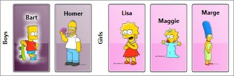
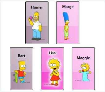
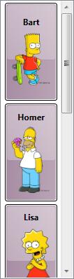
With the above item container style, our ListBox now renders as shown here.

Notice that in this style we have added a setter to explicitly set the Width of the ListBoxItem to 75 device independent pixels. Previously, the item containers were sizing to their content, which meant that each item would render as big as necessary to display the characters name and the image of that character at its natural size (the size stored in the image file).

The container style is a great place to apply sizing because it allows us to provide a consistent size for all items in the ListBox. We could certainly hard code this size into the Character data template, but keep in mind that we may be using the same data template in other places within the application. By putting a Width setter in the container style, rather than explicitly setting the width in the data template, we keep the data template dynamic.

So now we have some consistent chrome and it is nicely defined in the container’s template rather than in the item’s data template. Unfortunately, there is a big problem with this template. When I snapped this image of the ListBox, the selected item was Homer. Of course, you will have to take my word for it, since there is clearly nothing in the visual appearance that can be used to verify I’m telling the truth.

Recall that the default ListBoxItem template is what gave us visual cues for things like selection state. Since we have defined our own ListBoxItem template, we need to do likewise in our template. So let’s just add the following Triggers to our control template:

  <ControlTemplate.Triggers>
    <Trigger Property="Selector.IsSelected" Value="True">
      <Setter TargetName="BackgroundRect" Property="Opacity" Value="1" />
      <Setter TargetName="ContentHost" Property="BitmapEffect">
        <Setter.Value>
          <OuterGlowBitmapEffect GlowColor="White" GlowSize="9" />
        </Setter.Value>
      </Setter>
      <Setter TargetName="BackgroundRect" Property="Opacity" Value="1" />
    </Trigger>
  </ControlTemplate.Triggers>

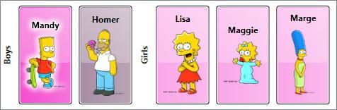
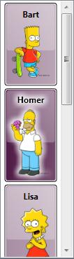
Now when we select Homer, the chrome around him darkens and he glows like an angel (or maybe like he’s radioactive, which is actually more appropriate given his line of work).

The Container’s Data Context is the Item

In ‘D’ is for DataTemplate, we learned that the data context for the root element of the data template is actually the data item that the template represents. And since the DataContext is inherited through the element tree, each child element in the template also has this same data context. This makes establishing bindings on elements in the template very easy. For example, in our Character template, the Text property of the TextBlock is bound to the character’s name by simply doing this:

  <TextBlock Text="{Binding First}" />

Well, now we can explain how this actually works. When the item container is generated, the framework sets its data context to the item that the container contains. It then inflates the data template as the content of the container. The elements in the container then naturally inherit their data contexts from the container.

Armed with this knowledge that the DataContext of the item container is the item it contains, we might want to add a data trigger to our style to show the female characters with a pink background color. We do live in a stereotyped world, after all! The following trigger should work nicely:

  <Style.Triggers>
    <DataTrigger Binding="{Binding Gender} " Value="Female">
      <Setter Property="Background" Value="#FFF339CB" />
    </DataTrigger>
  </Style.Triggers>

Custom Placement of Items within an ItemsControl

Now let’s make just one more change to this sample. It is actually pretty common to add extra metadata to the view model of a WPF application to help position and visualize data. Suppose we modify the Character item in our view model to allow each character to expose its own notion of where it should be positioned in x-y space. To do this, we will add the following Location property to the Character class:

  private Point _location = new Point();
  public Point Location
  {
      get { return _location; }
      set
      {
          _location = value;
          RaisePropertyChanged ("Location");
      }
  }

Similarly, we’ll modify our data collection to set the position of the characters:

  <src:CharacterCollection x:Key="Characters">
    <src:Character First="Bart" Last="Simpson" Age="10"
        Gender="Male" Image="images/bart.png" Location="25,150" />
    <src:Character First="Homer" Last="Simpson" Age="38"
        Gender="Male" Image="images/homer.png" Location="75,0" />
    <src:Character First="Lisa" Last="Bouvier" Age="8"
        Gender="Female" Image="images/lisa.png" Location="125,150" />
    <src:Character First="Maggie" Last="Simpson" Age="0"
        Gender="Female" Image="images/maggie.png" Location="225,150" />
    <src:Character First="Marge" Last="Bouvier" Age="38"
        Gender="Female" Image="images/marge.png" Location="175,0" />
  </src:CharacterCollection>

The default items host for a ListBox is a panel called VirtualizingStackPanel. This works great when you want a traditionally stacked layout with the added benefits of UI virtualization, but what if you want a custom layout? In ‘P’ is for Panel, we learned that we can actually choose any panel to serve as the items host for our data items.

Since our Character item now provides its own (x, y) location, a Canvas is the logical choice for an items panel:

  <ListBox ItemsSource="{Binding Source={StaticResource Characters}}"
      ItemContainerStyle="{StaticResource CharacterContainerStyle}">
    <ListBox.ItemsPanel>
      <ItemsPanelTemplate>
        <Canvas />
      </ItemsPanelTemplate>
    </ListBox.ItemsPanel>
  </ListBox>

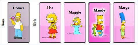
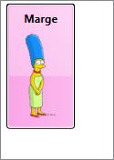
Hmmm… Now when we run this sample, we see just Marge. Oops! There are still 5 items, but they are all positioned in the same (0, 0) location, so we only see the topmost item. We really want each item to be positioned according to its Location property. That is, we want the Canvas.Left and Canvas.Top properties of each item to be bound to Location.X and Location.Y on each character.

This is where knowing that each item is wrapped in a ListBoxItem container comes in very handy! Since the items panel actually hosts these containers, we just need to modify the container style to bind the Canvas attached properties to the Location properties on the contained item. This can be done by adding the following setters to our style.

  <Setter Property="Canvas.Left" Value="{Binding Location.X}" />
  <Setter Property="Canvas.Top" Value="{Binding Location.Y} " />

Voîla! Now when we run the code, we see the expected result (now with Lisa selected):

Okay, you might have noticed that I modified a couple of other style properties to provide consistent heights and vertical alignment for the children. The complete sample can be downloaded here.

Common Problems (Revisited)

Remember the common problems we talked about toward the beginning of this article?

  1. Custom Child Placement
  2. Mappings between Items and Visuals
  3. UI Virtualization
  4. Consistent Item Chrome
  5. Visible Selection State

We have actually tackled items 1, 4, and 5 already. Our items have custom placement due to bindings on the Canvas attached properties on the item container. We have also defined a custom template within the item container style to give the items a consistent chrome. And finally, we added triggers to that template to show the selected item.

In the next episode, we will talk about how the item container generator can be used to tackle the remaining issues. (No, we will not implement UI virtualization in that article… that will be a separate post later in the series. But we will talk about how the generator enables this virtualization.)

Default Items Hosts and Containers

For your convenience, here is a list of the native ItemsControl classes in WPF, along with their default items hosts and item container types:

ItemsControl Type Default Items Host Default Item Container
ComboBox StackPanel ComboBoxItem
ContextMenu StackPanel MenuItem
HeaderedItemsControl StackPanel ContentPresenter
ItemsControl StackPanel ContentPresenter or any UIElement*
ListBox VirtualizingStackPanel ListBoxItem
ListView VirtualizingStackPanel ListViewItem
Menu WrapPanel MenuItem
MenuItem StackPanel MenuItem
StatusBar DockPanel StatusBarItem
TabControl TabPanel TabItem
ToolBar** not used none
TreeView StackPanel TreeViewItem
TreeViewItem StackPanel TreeViewItem

* If a UIElement is added to the Items collection of an explicit ItemsControl instance (as opposed to an instance of a derived class like ListBox), it will become a direct child of the items panel. If a non-UIElement is added, it will be wrapped within a ContentPresenter.

** Note that I’ve included the ToolBar control in this list because technically, it is an ItemsControl. However, it should be noted that it has certain hardcoded behaviors that diverge from the other ItemsControl classes. It does not wrap its items in an item container and it is hard coded to layout its items in a special ToolBarPanel class. Setting the ItemsPanel property on a ToolBar will not change this behavior. The control template for a ToolBar must include a ToolBarPanel within its visual tree. If the panel is not present, the framework will throw an exception. (Bad form, framework! Shame on you!)

ItemsControl: 'P' is for Panel

Sunday, February 10th, 2008

Let’s continue our exploration of WPF through the medium of the ItemsControl class. I know I promised to write ‘G’ is for Generator next, but after giving it more consideration, I’ve decided that it makes more sense to introduce the concept of an “items panel” first. This should give us more context when we finally do look at item containers and container generators.

To support this diversion, I’m giving this “ItemsControl: A to Z” series a new subtitle of “(but not necessarily in that order)”. 😉

How did we get here?

Let’s just recap a couple of things before we get started… In ‘C’ is for Collection, we learned that an ItemsControl surfaces a collection of items in a very predictable way (namely, as a CollectionView). Then in ‘D’ is for DataTemplate, we learned that an item within the collection can be any CLR object and the visual representation of the item is defined using a template of visual elements (called a DataTemplate).

The next question that logically arises is, “where do we put these visuals?” More specifically, once the data template for an item has been inflated, where should its visuals be positioned? To answer this question, we will now examine how “layout” is handled for items within an ItemsControl.

This particular episode begins by covering a few WPF concepts that are only indirectly related to the ItemsControl class. Some of the material is of a more technical nature. I have clearly marked these sections as “200 Level” material. Feel free to skip over these sections if you are only interested in ItemsControl or if you just aren’t in the mood to get your geek on. 😉

What is layout?

In WPF, the term “layout” refers to the sizing and positioning of visual elements within the user interface.

How does layout work?

In some cases, an element may know exactly what size it should be (because it’s Width and Height properties have been explicitly set). But very often, the size of an element is determined by its content. To enable this “size to content” feature, the WPF layout engine uses a 2-pass layout cycle to size and position visual elements:

1. First a measure pass is used to determine the desired size of each element.

2. Then an arrange pass is used to explicitly size and position each element.

The measure pass involves a recursive drilldown into the UI’s visual tree to measure each element. During this pass, an element is basically asked what size it wants to be. To determine an answer to this question, the element turns around and measures each of its own children by asking them what size they want to be. This recursion continues until all visual children in the subtree have been measured. At this point, each element can answer this question regarding its desired size.

The arrange pass involves another recursive drilldown into the visual tree to arrange each element. During this pass, the element is basically told what size it gets to be. In an ideal world, each element would get to be the size that it wants to be… but we all know life doesn’t work that way! The parent Panel has ultimate control over how much real estate each child gets and where that real estate is located.

The Nitty Gritty of Measure (200 Level)

During the measure pass, the question of “What size do you want to be?” is posed to an element in the form of a method named MeasureOverride(), so named because you will override this method on a framework element whenever you wish to implement custom sizing logic for the element. The size parameter received within MeasureOverride() represents a constraint for the element. It is the parent’s way of saying, “You have this much space to work with… with that in mind, what size do you want to be?”

Before answering this question, the element first asks its children what size they want to be by executing the Measure() method of each child. When you call Measure() on a child, this indirectly executes the MeasureOverride() of that child… hence the recursion for the measure pass.

After measuring its children, an element should be able to determine its desired size. The value returned from MeasureOverride() becomes the value of the element’s DesiredSize property.

The Nitty Gritty of Arrange (200 Level)

The sequence is very much the same during the arrange pass. In this case, the “Here’s what size you get to be” message is delivered in the form of a method named ArrangeOverride(). You will override this method on a framework element anytime you need to provide custom positioning logic for child elements. The size parameter received within ArrangeOverride() represents the real estate allotted for the element and its children.

Note that a position is not supplied to an element within ArrangeOverride(). This is because an element does not get to decide where it will be positioned. It can provide hints by setting some of its layout properties (HorizontalAlignment, VerticalAlignment, etc), but ultimately, the parent is responsible for respecting those properties and positioning the child.

Although the element cannot control its own position, it does get to control the position of each of its children, relative to itself. This process is called arranging the children and it happens when the element calls the Arrange() method on each child. The Arrange() method takes a Rect as a parameter. The position of the Rect represents the position of the child relative to the parent. The size of the Rect represents the size of the child within the coordinate space of the parent.

As with measuring, when you call Arrange() on a child, this indirectly executes the ArrangeOverride() of that child… hence the recursion for the arrange pass.

After arranging its children, an element should know its actual size. The value returned from ArrangeOverride() becomes the value of the element’s RenderSize property (and consequently, the values of the ActualWidth and ActualHeight properties).

Dispatcher Priority for Layout and Rendering (200 Level)

The WPF threading model dictates that all code execution will occur within a succinct execution block. We call these blocks dispatcher operations. Each dispatcher operation is queued for execution at a specific priority. The queue is continuously processed by executing the highest priority operations first. The available dispatcher priorities are given by the following enum:

    public enum DispatcherPriority
    {
        Invalid          = -1,
        Inactive         = 0,
        SystemIdle       = 1,
        ApplicationIdle  = 2,
        ContextIdle      = 3,
        Background       = 4,
        Input            = 5,
        Loaded           = 6,
        Render           = 7,
        DataBind         = 8,
        Normal           = 9,
        Send             = 10
    }

Layout and rendering go hand in hand. After the 2-pass layout cycle, the element tree is rendered. As a result, you may hear the terms “render pass” and “layout pass” used interchangeably. And indeed, the layout cycle and UI rendering actually occur within the same dispatcher operation. This operation typically occurs at Render priority. The exception to this rule is that the initial layout cycle and rendering (when a Page or Window is first loaded) actually occur at Loaded priority.

When a render operation executes, the visual tree is first walked to size any elements that need to be measured (IsMeasureValid == false). The tree is then walked again to position any elements that need to be arranged (IsArrangeValid == false). Finally, the updated scene is rendered.

Keeping this in mind, if you ever change a property that affects layout and you want to delay some processing until after the layout has been updated, you can use BeginInvoke() to queue that additional work at Loaded priority. This will typically cause it to execute within the next dispatcher operation after the render pass.

What is a panel?

Typically, when we talk about layout in WPF, we tend to focus on a particular category of elements called panels (so named because they descend from an abstract Panel class). You may recall from our earlier look at different WPF content models that a panel is a special element whose visual children are UIElements.

The reason we tend to focus on panels so much when talking about layout is because layout is really all a panel does. Its sole purpose is to arrange its children at their proper sizes and positions.

Specifically, a panel does three things:

  1. It maintains a collection of child elements (UIElements)
  2. It sizes those elements
  3. It positions those elements

It is important to note that layout in WPF is certainly not restricted to panels. In fact, every framework element actively participates in the layout system. More specifically, every framework element has a MeasureOverride() implementation to measure itself and its children and an ArrangeOverride() implementation to arrange itself and its children.

Non-panel elements typically have no more than one child, and often they have no children at all. The non-panel elements that do have a child rarely do anything interesting with respect to the placement of that child. Typically, the child is simply arranged within the entire rectangular area of the parent.

Panels, on the other hand, almost always do something interesting with their children. A Canvas, for example, positions its children precisely where they want to be according to the Canvas-related attached properties on each child (Canvas.Top, Canvas.Left, etc).

A Grid positions its children within conceptual rows and columns according to the Grid-related attached properties on each child (Grid.Row, Grid.Column, Grid.RowSpan, Grid.ColumnSpan, etc).

A StackPanel stacks its children vertically or horizontally, based on the Orientation property of the StackPanel.

A WrapPanel stacks its children vertically or horizontally until it runs out of room and then it starts a new stack adjacent to or below the previous stack, again depending on the Orientation property of the WrapPanel.

A lot more time could be spent explaining how the native panels implement their respective layout algorithms, but before we get too far off track…

Why are we talking about panels in this ItemsControl series?

Oh yeah… because an ItemsControl is a control that manages a collection of logical children (its “Items”) and a panel is an element that lays out a collection of visual children. Since each logical child in the ItemsControl will have some visual representation, it would make sense to use a panel to lay out these visuals. And indeed, that is how layout works for an ItemsControl. Namely, an ItemsControl uses an “items panel” (a.k.a., an “items host”) to arrange its children.

In WPF, we often describe controls as “lookless”, which means the control itself, is just a bag of functionality and the visual representation for the control (including certain visual behaviors) is defined separately using a Style and ControlTemplate. (This will be covered in more detail in a future post called ‘L’ is for Lookless.) With this dynamic approach that separates the design of a control from its implementation, we are no longer restricted to a stock layout for a control like ListBox.

As an example, in ‘B’ is for Bet You Can’t Find Them All, we saw the standard ListBox examples shown below.


In both of these examples, the items panel is simply a StackPanel, so the items appear stacked vertically, as one might expect when coming from earlier control paradigms like those in Win32 and Windows Forms.

Note that each ListBox specifies its own ItemTemplate to create a different look for items. The first ListBox contains a description for each persona, whereas the second ListBox does not include this description. If you’d like a refresher on how this works, you can revisit ‘D’ is for DataTemplate.

But we also saw the following list of radio buttons in that exercise. This control is also just a ListBox, only now the StackPanel has its Orientation set to Horizontal so that the items are stacked horizontally.

Well perhaps you don’t want the items stacked at all. You can actually use any panel as the items host for an ItemsControl. Imagine that you would really like to have the unselected items spread out radially around a selected item. The Microsoft Dynamics application actually supports this layout:

This image shows a feature of the application where the user can explore entity relationships within the business model in a very ad-hoc fashion. In this case, a “fish eye” binding allows the user to view the details of any related entity by simply moving the mouse over it. Selecting an entity causes it to animate to the center while all of its “relatives” animate into place around it. This creates a very sleek and dynamic way to explore relationships and it really makes the data come to life!

But how is this achieved? Well, believe it or not, this is all done by simply using a ListBox with a custom RadialPanel set as its items panel. (Admittedly, it’s a sleek panel that provides some cool animations, but nonetheless, it’s just a ListBox with a different items panel.)

How do you change the items panel?

There are a couple of ways to change the items panel for an ItemsControl. The first method involves setting the ItemsPanel property on the control using something called an ItemsPanelTemplate.

Recall that in WPF, a template is just a tree of visual elements that gets inflated inline to visually represent some other element. The ItemsPanelTemplate is probably the simplest template class, as it can only contain a single child and that child must be a Panel. Here is a very simple example in which the items panel of a ListBox is set to a WrapPanel:

    <ListBox Width="328" Height="260" Padding="1"
        ScrollViewer.HorizontalScrollBarVisibility="Disabled">
      <ListBox.ItemsPanel>
        <ItemsPanelTemplate>
          <WrapPanel />
        </ItemsPanelTemplate>
      </ListBox.ItemsPanel>
      <Ellipse Fill="Red" Width="100" Height="100" />
      <Ellipse Fill="Green" Width="100" Height="100" />
      <Ellipse Fill="Blue" Width="100" Height="100" />
      <Ellipse Fill="Yellow" Width="100" Height="100" />
      <Ellipse Fill="Cyan" Width="100" Height="100" />
      <Ellipse Fill="Magenta" Width="100" Height="100" />
      <Ellipse Fill="Black" Width="100" Height="100" />
      <Ellipse Fill="Gray" Width="100" Height="100" />
    </ListBox>

This yields the following ListBox in which the Ellipse items are wrapped:

What does the ItemsPanelTemplate class actually template?

We know that a template is a visual representation for something. In the case of the ItemsPanelTemplate, you may reasonably wonder, “What is it that we are templating?” We will answer this question more completely in a future episode called ‘L’ is for Lookless. In the meantime, I will try to give a satisfactory interim answer…

We’ve already seen that a DataTemplate is used to template an item of data. And we mentioned earlier that something called a ControlTemplate is used to template a control. The answer to the ItemsPanelTemplate question is related to the ControlTemplate of the ItemsControl. Somewhere within this ControlTemplate, you will typically find an element called an ItemsPresenter. This element reserves real estate within the template for the items panel. So the ItemsPresenter is the element that we are templating with the ItemsPanelTemplate. Or another way to say it is that the ItemsPanelTemplate is inflated within the ItemsPresenter, thereby creating a panel for the layout of the ItemsControl’s items.

An Alternate Method for Specifying the Items Panel

I mentioned before that there are actually a couple of ways to change the items panel for an ItemsControl. The second method actually involves re-templating the ItemsControl. Only this time, instead of including an ItemsPresenter within the template, we can include an items panel directly in the template and set its IsItemsHost property to true.

CAUTION: In this method, the ItemsPanel property on the control is essentially useless. Without an ItemsPresenter in the template, there is nowhere to inflate an ItemsPanelTemplate. As such, a designer can no longer easily swap out the items panel by setting the ItemsPanel property. If they need to do this, they will have to re-template the entire control.

Here is the markup to create the exact same ListBox as shown earlier using the IsItemsHost property to specify the items panel:

    <ListBox Width="328" Height="260" Padding="1"
        ScrollViewer.HorizontalScrollBarVisibility="Disabled">
      <ListBox.Template>
        <ControlTemplate TargetType="{x:Type ListBox}">
          <Border BorderBrush="{TemplateBinding BorderBrush}"
              BorderThickness="{TemplateBinding BorderThickness}"
              Background="{TemplateBinding Background}">
            <ScrollViewer Padding="{TemplateBinding Padding}">
              <WrapPanel IsItemsHost="True" />
            </ScrollViewer>
          </Border>
        </ControlTemplate>
      </ListBox.Template>
      <Ellipse Fill="Red" Width="100" Height="100" />
      <Ellipse Fill="Green" Width="100" Height="100" />
      <Ellipse Fill="Blue" Width="100" Height="100" />
      <Ellipse Fill="Yellow" Width="100" Height="100" />
      <Ellipse Fill="Cyan" Width="100" Height="100" />
      <Ellipse Fill="Magenta" Width="100" Height="100" />
      <Ellipse Fill="Black" Width="100" Height="100" />
      <Ellipse Fill="Gray" Width="100" Height="100" />
    </ListBox>

Hopefully this ControlTemplate approach at least makes some sense now, just based on what we’ve learned about other templates. If not, it will once we dive into control templates.

A Technical Note about Virtualization (200 Level)

A special panel called VirtualizingStackPanel serves as the default items panel for a ListBox (and consequently, a ListView, which derives from ListBox). This panel behaves very much like a StackPanel in that it stacks its children vertically or horizontally, based on its Orientation property. The big difference is that only the visible visuals are instantiated (plus or minus a few items on either side of the viewport, which are created to support keyboard navigation). Furthermore, once visuals are scrolled out of the viewport, they’re references are released and they are available for garbage collection.

It is this VirtualizingStackPanel element that allows a ListBox to be databound in a performant manner to a collection with thousands of items. Since the visuals only exist while they are within the viewport, the application does not pay the performance penalty required to create and maintain thousands of visual elements. However, the ItemsControl instance does still pay the price of maintaining a collection with thousands of logical children. To avoid this cost, you would have to include logic within your application to only bind to a small subset of the entire collection. Typically, this work is offloaded as much as possible to a performant data engine like SQL Server (or the lighter weight SQL Express).

We will eventually explore these concepts of “UI virtualization” and “data virtualization” in detail in ‘V’ is for Virtualization. In the meantime, if you wish to learn more, I would highly recommend that you check out these posts (one, two, and three) in Bea’s blog, which cover different approaches to virtualization for hierarchical data. This is one area where the .NET 3.0/3.5 releases do not provide a native solution.

And if you’re insane enough to want to write your own virtualizing panel, you can start with Dan Crevier’s 4-part series (one, two, three, and four). Unfortunately, you will also need to combine it with Ben Constable’s 4-part series on implementing IScrollInfo (one, two, three, and four). Having done this on more than one occasion myself, I can only warn you that it’s not for the faint of heart! I don’t think it’s particularly difficult, per se; just extremely involved.

Has your ICIQ improved?

It might now be a good time to revisit The ICIQ Test to review the panels that are used as items hosts by different ItemsControl classes. Not only will you get the satisfaction of realizing that you are an ItemsControl expert, but you will also have a much better understanding of the different explanations at the end of the test. (You know… the part of the test that you skipped the first time… the educational part where you were supposed to explore and learn about the controls after getting your score… okay, you’re gone now, aren’t you?)

Next Up: Item Container Generation

No, really. I promise that the next article really will be ‘G’ is for Generator (unless I change my mind again, of course).

Just to whet your appetite, an item container is the actual child element that gets arranged within an items panel. Each visible item in an ItemsControl has a corresponding item container. If the item also has a data template, that template is inflated and the visuals are placed within the item container. But the real question is… where does the container come from in the first place? Hmmm…

ItemsControl: 'D' is for DataTemplate

Thursday, January 3rd, 2008

The term “rich content model” is sometimes thrown around in WPF circles. In this post, we examine this content model, especially as it pertains to items controls.

The WPF Content Model

In WPF, different classes of elements are categorized based on the type and number of their logical children. We also refer to these logical children as the “content” of the control. WPF defines several different “content models” for various different classes of elements.

The controls that can contain a single item (single logical child of type Object) are called “content controls”. These controls derive from the ContentControl base class. Controls that can contain a collection of items (many logical children of type Object) are called “items controls”. These controls derive from the ItemsControl base class. (These are the controls that we are focusing on in this ItemsControl series, so I’ll come back to them shortly…)

If you took time to explore the different items controls at the end of The ICIQ Test, you know that there are also controls that contain a single header item plus a collection of content items. These controls are called “headered items controls” and derive from the HeaderedItemsControl base class. Similarly, there are controls that contain a single header item plus a single content item called “headered content controls” (which, of course, derive from the HeaderedContentControl base class).

Just to be complete, I should note that there are several other types of elements that have their own content models. For example, a TextBlock can contain a collection of Inline items, which are text elements that derive from the Inline base class and are used to create flowing, formatted text. A Decorator is an adorning element that can contain a single child of type UIElement. A Panel is a layout element that contains a collection of UIElement items and is responsible for sizing and positioning those children.

The ItemsControl Content Model

So what’s so special about the content model of ItemsControl? Primarily, it allows the logical children of an ItemsControl to be any CLR objects. This is fairly remarkable, if you think about it. Traditionally, Windows developers have built up user interfaces by composing visual elements like buttons, labels, combo boxes, text boxes, etc. But using WPF’s rich content model (especially as it applies to the ContentControl and ItemsControl classes), it is now possible to build up a logical UI composed of both visual elements and data items.

To better understand this, consider the following simple example:

<Window x:Class="HomersListBox.Window1"
    xmlns:x="http://schemas.microsoft.com/winfx/2006/xaml"
    xmlns="http://schemas.microsoft.com/winfx/2006/xaml/presentation"
    xmlns:src="clr-namespace:HomersListBox"
    Title="Homer's ListBox" Width="300" Height="400">
  <ListBox Width="200" Height="300">
    <src:Character First="Bart" Last="Simpson" Age="10"
        Gender="Male" Image="images/bart.png" />
    <src:Character First="Homer" Last="Simpson" Age="38"
        Gender="Male" Image="images/homer.png" />
    <src:Character First="Lisa" Last="Simpson" Age="8"
        Gender="Female" Image="images/lisa.png" />
    <src:Character First="Maggie" Last="Simpson" Age="0"
        Gender="Female" Image="images/maggie.png" />
    <src:Character First="Marge" Last="Simpson" Age="38"
        Gender="Female" Image="images/marge.png" />
  </ListBox>
</Window>

In this example, the logical tree looks like this:

The Character object is a very simple CLR object with properties that identify characteristics of a cartoon character, such as strings to represent a first and last name, an int value to represent an age (normally, a person’s age would be represented by a calculation performed on their date of birth, but most cartoon characters never actually age :)), an enum value to represent a gender, and a string value that indicates a path to an image of the character.

When you run this little sample, you see the window shown here.

As you can see, the visual representation of the Character object is just a string. If WPF does not know how to visually represent an object, it merely calls the ToString() method of the object to get a semi-meaningful textual representation of the item.

If you were to examine the element tree of the above sample using Snoop or Mole, you would see that WPF has conveniently inserted a TextBlock into the visual tree to display the string representation of the Character. (Note that the TextBlock is part of the visual tree of elements, but it is not a member of the logical tree. The visual tree consists solely of visual elements, whereas, the logical tree may consist of both visual and non-visual objects.)

This automatic TextBlock creation is the framework’s default behavior whenever it needs to display string content within a ContentControl. In this example, the ContentControl is a ListBoxItem (the item container for a ListBox).

In scenarios where you only want to present textual data, you can simply override ToString() in your data class and return an appropriate text description. In our example, we could rewrite the Character class to return the character’s name from its ToString() override, as follows:

    public override string ToString()
    {
        return _first + " " + _last;
    }

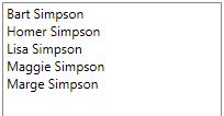
Then at least the text in our ListBox would be a little more representative of the data, as shown here.

But, of course, we want something a little better than just text. Ideally, we’d like to have some formatted text along with an image of the character. This is where a template comes in handy…

What is a Template?

In WPF, a template is just a tree of visual elements (along with some resources and triggers) used to define the look (and often behaviors) of a member of the logical tree. As it builds the element tree, the framework watches for controls and data items that have corresponding templates. When such an element is encountered, the appropriate template is “inflated” into the actual visuals that represent the logical item and those visuals are inserted into the visual tree.

There are different kinds of templates, each of which derives from the FrameworkTemplate base class. The most common template classes are ControlTemplate and DataTemplate. The ControlTemplate class is used to provide the visual representation for a control (like a ListBox). This is the mechanism that enables the WPF lookless control model.

The DataTemplate class is used to provide the visual representation for a data item (like an item within the Items collection of a ListBox). This is the template class we will use to define the visual appearance of our Character items.

Defining a DataTemplate

The first step is to actually define the DataTemplate. In most cases, you will define it as a resource somewhere within your application. For our example, let’s just define it as follows in Window.Resources:

  <Window.Resources>
    <DataTemplate x:Key="CharacterTemplate">
      <Grid>
        <Grid.ColumnDefinitions>
          <ColumnDefinition Width="100" />
          <ColumnDefinition Width="*" />
        </Grid.ColumnDefinitions>
        <Image Margin="5" Source="{Binding Image}" />
        <StackPanel Grid.Column="1" Margin="5">
          <TextBlock FontWeight="Bold" Text="{Binding First}" />
        </StackPanel>
      </Grid>
    </DataTemplate>
  </Window.Resources>

Notice that our template tree consists of a root element (a Grid) containing several other visual elements. Some of these visuals, like the Image and the TextBlock, contain properties with bindings set on them. The notation to establish the binding is actually very simple. It merely contains a path to a property of our Character object.

One important thing to notice is that we don’t need to explicitly set a source for bindings within our data template (as long as we are binding to properties of the data item). Since our template represents an actual item of data (a Character), WPF will automatically set that data item as the DataContext of the item container in which the template is inflated. The root element of the template, and consequently, all descendants within the template, will inherit this data context. In this manner, the data context is said to be implicit for elements in the DataTemplate. Namely, the data context is the specific data item that the template represents.

Sidenote: One of the most common questions I see in the WPF Forum is, “How do I get the corresponding data item when someone clicks a button within my data template?” The answer should now be fairly obvious… just look at the DataContext of the original source of the routed event:

    private void OnButtonClick(object sender, RoutedEventArgs e)
    {
        object item = (e.OriginalSource as FrameworkElement).DataContext;
        . . .
    }

Using a DataTemplate with an ItemsControl

Now that we’ve defined a template, we need to somehow instruct our ItemsControl to use it for the data items within its Items collection. There are actually several ways to do this. The simplest approach is to explicitly set the template as the value of the ItemTemplate property of the ItemsControl, as shown here:

  <ListBox Width="200" Height="300"
      ItemTemplate="{StaticResource CharacterTemplate}">
    . . .
  </ListBox>

Now when we run our application, we see that our template is indeed being used to display each data item, as shown here.

Presto! We now have a very simple example that uses a DataTemplate to define the visual representation of items within an ItemsControl. Feel free to download this working sample, if you’d like to play with it and define a more impressive template! 🙂

Using a Type-Specific Data Template

In the example depicted here, we explicitly set the ItemTemplate for our ItemsControl. Using this approach, every item within the Items collection will be displayed using the same template. This is great for collections of similar objects, but what if you have a collection of disparate objects, as shown in the following markup?

<Page
    xmlns:x="http://schemas.microsoft.com/winfx/2006/xaml"
    xmlns="http://schemas.microsoft.com/winfx/2006/xaml/presentation"
    xmlns:sys="clr-namespace:System;assembly=mscorlib">
  <ItemsControl Width="100" Height="100">
    <sys:Int32>30</sys:Int32>
    <sys:DateTime>12/16/1970</sys:DateTime>
    <sys:Boolean>True</sys:Boolean>
    <sys:Boolean>False</sys:Boolean>
    <sys:String>Foo</sys:String>
  </ItemsControl>
</Page>

This results in the following visual representation shown below:

Now suppose you want to use one template to display the Boolean values and a completely different template to display the other value types. To enable this scenario, WPF allows you to specify a type-specific data template.

For example, you might decide that you want each Boolean value to be displayed as a checkbox, rather than the string “True” or “False”. To define such a type-specific data template, simply specify the DataType member on the DataTemplate declaration, as follows:

<Page
    xmlns:x="http://schemas.microsoft.com/winfx/2006/xaml"
    xmlns="http://schemas.microsoft.com/winfx/2006/xaml/presentation"
    xmlns:sys="clr-namespace:System;assembly=mscorlib">
  <Page.Resources>
    <DataTemplate DataType="{x:Type sys:Boolean}">
      <CheckBox IsChecked="{Binding Mode=OneWay}" />
    </DataTemplate>
  </Page.Resources>
  <ItemsControl Width="100" Height="100">
    <sys:Int32>30</sys:Int32>
    <sys:DateTime>12/16/1970</sys:DateTime>
    <sys:Boolean>True</sys:Boolean>
    <sys:Boolean>False</sys:Boolean>
    <sys:String>Foo</sys:String>
  </ItemsControl>
</Page>

Now the ItemsControl is displayed as follows:

Notice that we did not specify an ItemTemplate at all in the above scenario. Instead, when the framework needed to display a Boolean value in the ItemsControl, it performed a resource lookup for a type-specific template matching the Boolean type. Since it found our template containing the CheckBox, it used it. Without the template, it would have fallen back to the earlier observed behavior of calling ToString() on the object to get a textual representation for the Boolean value.

Defining a Default Template for a Given CLR Data Type

In our earlier example, we defined the Character template using a resource key (x:Key=”CharacterTemplate”). We could have defined a default data template by instead using a DataType declaration, as follows:

  <DataTemplate DataType="{x:Type src:Character}">
    <Grid>
      <Grid.ColumnDefinitions>
        <ColumnDefinition Width="100" />
        <ColumnDefinition Width="*" />
      </Grid.ColumnDefinitions>
      <Image Margin="5" Source="{Binding Image}" />
      <StackPanel Grid.Column="1" Margin="5">
        <TextBlock FontWeight="Bold" Text="{Binding First}" />
      </StackPanel>
    </Grid>
  </DataTemplate>

This produces a default visual representation for all Character objects that appear in the logical tree lower than the template declaration. As such, if we do not specify the ItemTemplate property on the ListBox, this template will still be used to display the Character objects. Furthermore, if we include a Character object as the content of a Button (or any other ContentControl), the same template will be used to represent the Character:

  <Button HorizontalAlignment="Center" VerticalAlignment="Center">
    <src:Character First="Maggie" Image="images/maggie.png" />
  </Button>

Sidenote: If you’re curious as to whether you can change the default template for all CLR objects, you cannot. WPF specifically disallows data templates with DataType=”{x:Type sys:Object}”. As such, you are stuck with the ToString() behavior for untemplated CLR objects.

Using a DataTemplateSelector

Assigning a default template based on data type is clearly very powerful. Nonetheless, there may even be times when this does not give you the flexibility you need to select a data template for an item. For example, suppose you want to use one template to represent characters under the age of 21 and a different template to represent those 21 and over.

(Okay, this age-based template selector is probably not a great example for cartoon characters… perhaps a different data template for girls and boys would be better… but honestly, that’s too easy to achieve using a single data template with a data trigger… so humor me and let’s just go with the age thing… ;))

For even more flexibility in selecting an item template, you can implement a custom data template selector. A template selector is a class that derives from DataTemplateSelector and overrides the SelectTemplate method to return a template based on custom code execution. Here is a very simple example to meet the needs described above:

public class CharacterTemplateSelector : DataTemplateSelector
{
    private DataTemplate _childTemplate = null;
    public DataTemplate ChildTemplate
    {
        get { return _childTemplate; }
        set { _childTemplate = value; }
    }

    private DataTemplate _adultTemplate = null;
    public DataTemplate AdultTemplate
    {
        get { return _adultTemplate; }
        set { _adultTemplate = value; }
    }

    public override DataTemplate SelectTemplate(object item,
        DependencyObject container)
    {
        if (item is Character)
        {
            return (item as Character).Age >= 21
                ? _adultTemplate : _childTemplate;
        }
        return base.SelectTemplate(item, container);
    }
}

Now to use the template selector, we simply declare an instance as a resource and set the ChildTemplate and AdultTemplate properties appropriately:

  <src:CharacterTemplateSelector x:Key="CharacterTemplateSelector"
      ChildTemplate="{StaticResource CharacterTemplate}"
      AdultTemplate="{StaticResource AdultCharacterTemplate}" />

Then we set the ItemTemplateSelector property on the ItemsControl using a resource reference, as follows:

  <ListBox Width="200" Height="300"
      ItemTemplateSelector="{StaticResource CharacterTemplateSelector}">
    . . .
  </ListBox>

This custom data template selector is also included in the downloadable sample for this article.

What’s next?

This ends our discussion on data templates and the WPF content model for the ItemsControl classes. In the next episode, ‘G’ is for Generator, we will look at item containers and item container generators. (And yes, I realize we’re skipping a couple of letters, but you don’t really want 26 posts on ItemsControl, do you?)

ItemsControl: 'C' is for Collection

Monday, November 5th, 2007

The series continues…

An ItemsControl would be nothing without its collection of Items. In this post, we investigate the “Items” of an ItemsControl, looking at each of the following areas:

If I were rating the technical level of each post in this series, I would put this particular post somewhere in the range of moderate to advanced (but still very approachable :)).

The Items Collection (a.k.a, the ItemCollection)

The “Items” property of an ItemsControl provides access to a collection of objects, or data items, that make up the logical content of the control. The type of this property is ItemCollection. (I will use the terms “Items collection” and “ItemCollection” interchangeably.) The “Type” of each item within the Items collection is Object. So literally any CLR object can be added to an ItemCollection.

We will look at the ItemCollection class, itself, in more detail momentarily, but first, there are a couple of things to note about the Items property declaration on ItemsControl.

1) The Items property is a read-only CLR property.

This means that the collection exposed via the Items property must be instantiated by the control itself. In fact, the ItemCollection class does not even provide a public constructor.

2) The Items property is not backed by a dependency property.

This means that you cannot set a binding directly on the Items property. However, you can definitely bind an ItemsControl to a collection of items. We will look at how this works shortly, but before we do, we should look at the simpler, non-databound (or direct) scenario…

ItemCollection Modes: Direct and ItemsSource

Although the Items property is read only, the provided collection is not necessarily read only. In fact, in earlier posts, we’ve already seen that you can directly add items to an ItemsControl:

<ListBox>
  <sys:String>Item 1</sys:String>
  <sys:String>Item 2</sys:String>
  <sys:String>Item 3</sys:String>
</ListBox>

Because items are added directly to the ListBox, this is an example of using an ItemCollection in “direct mode”. This is by far the simplest mode to use conceptually. In direct mode, the ItemCollection class works exactly like every other .NET collection. You can directly access all of the expected members of an indexed collection: Add(), Insert(), Remove(), RemoveAt(), IndexOf(), Items[index], Count, etc.

The other mode for an ItemCollection is called “ItemsSource mode”. In ItemsSource mode, the items in the ItemCollection correspond to items in a source collection. That source collection is specified via a separate property on the ItemsControl that is appropriately named “ItemsSource”.

The following shows a typical scenario of an ItemsControl using ItemsSource mode:

<ListView ItemsSource="{Binding Path=Characters}">
  <ListView.View>
    <GridView>
      <GridViewColumn Width="100"
        DisplayMemberBinding="{Binding Last}"
        Header="Last Name" />
      <GridViewColumn Width="100"
        DisplayMemberBinding="{Binding First}"
        Header="First Name" />
      <GridViewColumn Width="60"
        DisplayMemberBinding="{Binding Gender}"
        Header="Gender" />
    </GridView>
  </ListView.View>
</ListView>

The ItemsSource property is a dependency property of type IEnumerable. This tells us two important things:

1) The source collection can be any enumerable collection.

2) The ItemsSource property can be established using a binding.

As such, it is the ItemsSource property (in conjunction with the ItemsSource mode of an ItemCollection) that enables an ItemsControl to be databound to a collection.

Sidenote: Although you will most often see the ItemsSource property of an ItemsControl set via a binding, there is no reason that the ItemsSource property cannot be directly set to an enumerable collection, as shown here:

<ListBox ItemsSource="{StaticResource Characters}" />

The Modes are Mutually Exclusive

It should be noted that direct mode and ItemsSource mode are mutually exclusive. An ItemCollection is either in direct mode or in ItemsSource mode, but never both.

Once Items have been explicitly added to the Items collection, it is in direct mode. A subsequent attempt to set the ItemsSource property after entering direct mode will result in an exception.

Similarly, once the ItemsSource property has been set, the Items collection is in ItemsSource mode. A subsequent attempt to directly modify the Items collection (using Add(), Insert(), Remove(), etc) will result in an exception.

The only way to change modes at runtime is to either 1) clear the Items collection via the Clear method (if in direct mode) prior to setting the ItemsSource property, or 2) set the ItemsSource property to null (if in ItemsSource mode) prior to calling the direct access methods of ItemCollection.

Observable Collections Support Dynamic Updates

As noted earlier, in direct mode, changes to the Items collection are made through direct access methods of the ItemCollection class. Any such direct changes made at runtime will cause the visuals to be updated immediately.

But what about dynamic collection changes in ItemsSource mode? How could the Items collection possibly know about changes to the source collection?

The answer is that the ItemCollection cannot know about any such changes unless the source collection chooses to announce those changes by providing change notifications. The way a source collection does this is by fully implementing and supporting the INotifyCollectionChanged interface. Any collection that provides these change notifications is said to be observable.

Dynamic changes to an observable collection will be immediately reflected in the Items collection of any ItemsControl that is bound to the collection. Consequently, these changes will be immediately reflected in the user interface.

The INotifyCollectionChanged interface is not super complex, but ensuring proper implementation does place an extra burden on the source collection. If developers had to implement this interface anytime they wanted to bind to a collection, it would be a huge inconvenience. Luckily, the .NET framework provides a very handy generic template class called ObservableCollection<T>. By creating an instance of this class, you automatically get all of the change notifications without having to do any extra work.

Typically, you will see a collection class derive from ObservableCollection<T>, to create a strongly typed collection, as follows:

    public class StringCollection : ObservableCollection<string>
    {
    }

Any instance of this StringCollection class is fully observable and will serve well as the ItemsSource of an ItemsControl. It can be used exactly like an instance of Collection<string>.

So what if the collection is not observable? Can it still serve as an ItemsSource?

Absolutely. As noted earlier, any enumerable collection can serve as the source of an Items collection. The only caveat is that the Items collection will not be updated dynamically if the source collection changes at runtime. Rather, the collection will be enumerated once and its members will be added to the Items collection when the ItemsSource property is first established. Thereafter, if you want the Items collection to be updated, you must explicitly call the Refresh() method of ItemCollection.

CollectionView: “The Great Equalizer”

If you’ve worked with ItemsControl much, you probably know that sorting, grouping, and filtering are supported via the CollectionView class. This class also supports the notion of currency, which means a CollectionView maintains a current item pointer that can be accessed and moved using methods on the CollectionView.

Every enumerable collection in WPF has a default view. The collection may have multiple other views, each with its own sorting, grouping, and filtering parameters. A common way to establish a view of a collection in markup is to leverage the CollectionViewSource class, as shown here:

<CollectionViewSource x:Key="characterView"
    Source="{StaticResource Characters} ">
  <CollectionViewSource.SortDescriptions>
    <componentModel:SortDescription PropertyName="First" />
  </CollectionViewSource.SortDescriptions>
  <CollectionViewSource.GroupDescriptions>
    <dat:PropertyGroupDescription PropertyName="Last" />
  </CollectionViewSource.GroupDescriptions>
</CollectionViewSource>

This CollectionViewSource can then be specified as the ItemsSource of an ItemsControl, thereby causing its associated view of the collection to serve as the CollectionView for the control.

“But Dad, I don’t WANT a CollectionView!”

“I didn’t ask what you WANT… As long as you’re living under my roof, you’ll use a CollectionView!”

With WPF, sometimes it’s not as much about what you want, as it is about what the framework needs. The CollectionView class is a classic example. When it comes to binding controls to a collection of data items, the framework needs a way to treat all collections in a consistent manner.

Unfortunately, not all enumerable collections were created equal. For example, IList provides direct index-based access to items, whereas IEnumerable requires that you enumerate all items starting from the beginning of the collection until you come to the index you care about. For another example, consider a collection class that supports the INotifyCollectionChanged interface to provide collection change notifications versus a simple Collection<T> class that provides no such notifications.

The framework architects wanted to support binding to as many different types of collections as possible. But imagine how ugly the code for the ItemsControl class would be if it had to account for differences among collection types with conditional code blocks… if it’s an observable collection, do this, or if it’s an IList, do this, or if it’s an IEnumerable, do this, etc.

Enter the CollectionView class…

To deal with this challenge of disparate collections, WPF introduces the CollectionView class to serve as the great equalizer of enumerable collections. It is the CollectionView class that internally looks at a collection’s supported interfaces and determines how best to deal with the collection. It then surfaces a view of the collection through a well-defined set of properties, methods, and events. Essentially, it allows all collections to be treated by the ItemsControl class as equals.

So whether or not you care about currency, grouping, sorting, filtering, change notifications, etc., the Items collection of an ItemsControl is always maintained internally using a CollectionView. In fact, the ItemCollection class is a CollectionView.

Although true, that last statement is a little misleading since really, ItemCollection is just a wrapper class for an internal CollectionView member. The type of the internal CollectionView is determined by the type of the source collection and the mode of the ItemCollection. In Direct mode, it is always of type InnerItemCollectionView (an internal class designed specifically for direct mode views). In ItemsSource mode, it will be of type CollectionView for an IEnumerable source, ListCollectionView for an IList source, or BindingListCollectionView for an IBindingList or IBindingListView source.

So you’re observable… Who cares?

CollectionView does. We’ve already noted that dynamic changes to observable collections are immediately reflected in the Items collection. It is the CollectionView class that actually listens to the events raised by the collection. So if you’ve ever wondered exactly who is monitoring these events, get a life! Sorry… I meant to say, it’s CollectionView. Now you know.

Performance Considerations around Bound Collections

Keeping in mind that CollectionView serves as the great equalizer of collections, we should look at some performance considerations around binding to collections. We’ve already acknowledged that not all collections support the same features. Often, CollectionView must perform extra work to support its common interface for collections.

One of the major features provided by CollectionView is indexing for an enumerable collection. That is, CollectionView provides direct access to members of the collection by an integer-based index. This means it must support properties like this[int index] and Count, as well as methods like Contains() and IndexOf().

If the source collection already supports indexing, you will see much better performance when binding to the collection. This means that the best candidates for a source collection are those that support the IList interface. It should be noted that ObservableCollection<T> implements IList, so it’s a great choice.

If the source collection does not support index-based access (ICollection or IEnumerable, for example), then CollectionView must do a lot more work to surface the view as an indexed collection. In order to support a property like Count, it may be necessary to enumerate the entire collection. And some methods like Contains(), IndexOf(), and GetItemAt() can be super expensive, since the performance of the algorithm to support these operations is directly proportional to the size of the collection.

So the key perf takeaway is that the source collection should support IList whenever possible.

Items and the Element Trees

The items within the Items collection make up the logical children of the ItemsControl. They are said to be members of the logical tree. For a HeaderedItemsControl, the headers associated with each item will also be logical children of the ItemsControl. (Btw, if you’re not sure what a HeaderedItemsControl is, you should revisit The ICIQ Test and spend a little more time exploring the tooltips after receiving your score.)

If the items in the Items collection happen to be visuals, then they will also be members of the visual tree. If they are not visuals, they will instead be represented visually using an inflated template of visuals. Since the template represents data items, it is called a DataTemplate. For more on that, please tune in for the next episode in this series… ‘D’ is for DataTemplate.

ItemsControl: 'B' is for Bet You Can't Find Them All!

Monday, October 22nd, 2007

This is Part B in my “ItemsControl: A to Z” series.  Part A served mostly as an introduction to the ItemsControl class (one of the most abundant classes in many WPF applications).  We looked at several common ItemsControl samples involving controls like ListBox, ListView, TreeView, etc.  In this post, we will build on that introduction in what I hope will be a fun challenge and a good learning experience. 

What’s your ICIQ?

You will shortly be presented with a small, interactive quiz called “The ItemsControl Intelligence Quotient (ICIQ) Test”.  The purpose of “The ICIQ Test” is to see how well you can recognize different ItemsControl instances in a real WPF application.  You will be shown a screenshot of a WPF application that is used internally by the Microsoft Dynamics Team to build and visualize customer models.  (Special thanks to Microsoft for providing me with the image!)

Full Disclosure:  It’s Rigged!

Despite the name, “The ICIQ Test” does not really measure intelligence… rather, it measures your observational and deductive reasoning skills regarding the usage of items controls.  And yes, this test is completely unfair!  Even for the seasoned WPF developer, there will be some visuals in the snapshot that could go either way.  You’ve been warned!

It’s Intended to be a Learning Experience

Ultimately, I hope you will approach this as a learning experience.  (Well, unless you happen to get a really high score, in which case you should run around the office gloating about your extremely high ICIQ and immediately demand a raise from your boss!) 

This test should help reinforce some core concepts regarding the lookless nature of WPF controls and the power of templating to present native controls in ways that are visually meaningful.

When you complete the test, you will have an opportunity to further explore the different ItemsControl examples in the application, as shown below: 

Learning Tips

If you are new to WPF, some of the terms like “items host” and “item container” may not make sense yet.  All of these concepts will be covered in detail as this series progresses. 

“Enough already!  Let me take the test!”

Go for it!  Here’s your official link to “The ICIQ Test“.  I look forward to hearing how unfair it was!!  😉

And don’t forget to come back for the next installment in this series:  ‘C’ is for Collection.

Cheers,
Dr. WPF