While cleaning out my inbox, I came across a few old emails that I missed during a recent crunchtime. I think one question merits a public (albeit rather late) reply, as I’ve seen it crop up in other scenarios in the past:
Hi Dr WPF
When an element receives keyboard focus, it seems to get a dashed border indicating the focus by default. However, if I subsequently adjust the RenderTransform of the container, this keyboard-focus rectangle doesn’t move accordingly.
Can you explain what’s happening, and possibly suggest solutions?
Thanks
David
Hi David,
The dotted line that you are seeing is called the “focus visual” for the control. If the keyboard is used to focus an element, then its focus visual will be rendered within the nearest parent adorner layer. More on that in a moment.
Focus Visual Styles
Most controls simply use the default focus visual style which you’ve described in your email. All themes (Aero, Classic, Luna Homestead, Luna Metallic, Luna NormalColor) define the exact same default focus visual style:
<Style x:Key="{x:Static SystemParameters.FocusVisualStyleKey}">
  <Setter Property="Control.Template">
    <Setter.Value>
      <ControlTemplate>
        <Rectangle StrokeThickness="1" Stroke="Black"
            StrokeDashArray="1 2" SnapsToDevicePixels="true" />
      </ControlTemplate>
    </Setter.Value>
  </Setter>
</Style>
This provides a dotted line around the control that has keyboard focus. If you want something more elaborate, you can give an element a custom focus visual by setting its FocusVisualStyle property.
Focus Visuals are Rendered within an Adorner
The important thing to note is that a focus visual is not part of the target control’s subelement tree. Rather, it is the child of a special adorner (FocusVisualAdorner) that is dynamically created by the keyboard navigation manager. This adorner is added to the adorner layer of the nearest parent AdornerDecorator element. As such, the focus visual is rendered over the top of the target control, but in a separate subtree of a larger visual tree.
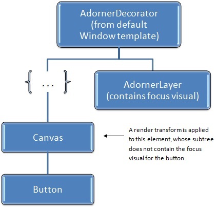
Most of the time, the nearest parent AdornerDecorator will be the one declared as part of the parent Window control’s template. This is nearly at the top of the visual tree. This can lead to the problem you’ve described. Namely, if the focus visual is rendered and then you subsequently adjust the RenderTransform on the focused control, the focus visual will not automatically be rerendered in the correct location.
Consider the following simple scene:
<Canvas>
  <Canvas.RenderTransform>
    <TransformGroup>
      <TranslateTransform x:Name="translateTransform" />
      <ScaleTransform ScaleX="2" ScaleY="2" />
    </TransformGroup>
  </Canvas.RenderTransform>
  <Button x:Name="button">Click Me</Button>
</Canvas>
Suppose we focus the button and then subsequently change the translate transform, as follows:
translateTransform.X += 25;
This can lead to a broken visual appearance:
![]()
In this case, we have translated the canvas that contains our button after the focus visual has already been rendered at the button’s original location.
The following diagram depicts the problem showing the relevant elements of the visual tree:

A Simple Workaround
In the above scenario, if we were to cause a layout pass, perhaps by adding a call to button.InvalidateArrange(), the focus visual would suddenly pop into the correct position. This is because the framework uses the layout pass to update adorner positions to match their target elements.
So here is one way to work around the issue:
    translateTransform.X += 25;
    button.InvalidateArrange();
Shouldn’t changing the RenderTransform automatically affect focus visuals?
Arguably, it would have been nice of the framework developers to solve this problem for us. But that would have had an associated performance cost.
The great benefit of using a RenderTransform is that it does not incur a layout pass. The element only needs to measure, arrange, and render itself once. At that point, it has handed its render data to the MIL (Media Integration Layer) so that it can be quickly drawn to the screen. Any changes to the render transform from that point forward will cause a very performant redraw of the subtree using the existing render data with the appropriate matrix math applied.
To make things even more complex, the render transform that is affecting the focused element may appear anywhere in the parent tree. The framework could certainly track all this (and maybe it should), but it would add overhead so its easy to see why it does not.
An Alternative Workaround that Doesn’t Require Code
The real problem in this scenario is that the subtree containing the focused control is being affected by the render transfom while the the adorner layer containing the focus visual is not. As such, another solution is to simply add a closer adorner layer directly within the transformed subtree.
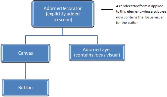
In the previous example, we were applying a render transform to the canvas that contained the button. We can give this canvas its own adorner layer by simply wrapping it with an AdornerDecorator element. Then we can apply our render transform directly to that new AdornerDecorator, as follows:
<AdornerDecorator>
  <AdornerDecorator.RenderTransform>
   <TransformGroup>
      <TranslateTransform x:Name="translateTransform" />
      <ScaleTransform ScaleX="2" ScaleY="2" />
    </TransformGroup>
  </AdornerDecorator.RenderTransform>
  <Canvas>
    <Button x:Name="button">Click Me</Button>
  </Canvas>
</AdornerDecorator>
The visual tree for this scene now looks like this:

Since the render transform is now on the AdornerDecorator, it affects this entire tree (the AdornerDecorator and all of its descendants) so dynamically updating it causes all render data, including the data for the focus visual, to be updated.
Tip of the Day: If you are going to apply a render transform to a tree that contains focusable controls, you might consider wrapping that tree in an AdornerDecorator and applying the render transform to the decorator instead. Voîla! Problem solved. 🙂
Hope this helps!
Cheers,
Dr. WPF

