The term “rich content model” is sometimes thrown around in WPF circles. In this post, we examine this content model, especially as it pertains to items controls.
The WPF Content Model
In WPF, different classes of elements are categorized based on the type and number of their logical children. We also refer to these logical children as the “content” of the control. WPF defines several different “content models” for various different classes of elements.
The controls that can contain a single item (single logical child of type Object) are called “content controls”. These controls derive from the ContentControl base class. Controls that can contain a collection of items (many logical children of type Object) are called “items controls”. These controls derive from the ItemsControl base class. (These are the controls that we are focusing on in this ItemsControl series, so I’ll come back to them shortly…)
If you took time to explore the different items controls at the end of The ICIQ Test, you know that there are also controls that contain a single header item plus a collection of content items. These controls are called “headered items controls” and derive from the HeaderedItemsControl base class. Similarly, there are controls that contain a single header item plus a single content item called “headered content controls” (which, of course, derive from the HeaderedContentControl base class).
Just to be complete, I should note that there are several other types of elements that have their own content models. For example, a TextBlock can contain a collection of Inline items, which are text elements that derive from the Inline base class and are used to create flowing, formatted text. A Decorator is an adorning element that can contain a single child of type UIElement. A Panel is a layout element that contains a collection of UIElement items and is responsible for sizing and positioning those children.
The ItemsControl Content Model
So what’s so special about the content model of ItemsControl? Primarily, it allows the logical children of an ItemsControl to be any CLR objects. This is fairly remarkable, if you think about it. Traditionally, Windows developers have built up user interfaces by composing visual elements like buttons, labels, combo boxes, text boxes, etc. But using WPF’s rich content model (especially as it applies to the ContentControl and ItemsControl classes), it is now possible to build up a logical UI composed of both visual elements and data items.
To better understand this, consider the following simple example:
<Window x:Class="HomersListBox.Window1"
    xmlns:x="http://schemas.microsoft.com/winfx/2006/xaml"
    xmlns="http://schemas.microsoft.com/winfx/2006/xaml/presentation"
    xmlns:src="clr-namespace:HomersListBox"
    Title="Homer's ListBox" Width="300" Height="400">
  <ListBox Width="200" Height="300">
    <src:Character First="Bart" Last="Simpson" Age="10"
        Gender="Male" Image="images/bart.png" />
    <src:Character First="Homer" Last="Simpson" Age="38"
        Gender="Male" Image="images/homer.png" />
    <src:Character First="Lisa" Last="Simpson" Age="8"
        Gender="Female" Image="images/lisa.png" />
    <src:Character First="Maggie" Last="Simpson" Age="0"
        Gender="Female" Image="images/maggie.png" />
    <src:Character First="Marge" Last="Simpson" Age="38"
        Gender="Female" Image="images/marge.png" />
  </ListBox>
</Window>
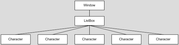
In this example, the logical tree looks like this:
The Character object is a very simple CLR object with properties that identify characteristics of a cartoon character, such as strings to represent a first and last name, an int value to represent an age (normally, a person’s age would be represented by a calculation performed on their date of birth, but most cartoon characters never actually age :)), an enum value to represent a gender, and a string value that indicates a path to an image of the character.
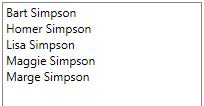
 When you run this little sample, you see the window shown here.
As you can see, the visual representation of the Character object is just a string. If WPF does not know how to visually represent an object, it merely calls the ToString() method of the object to get a semi-meaningful textual representation of the item.
If you were to examine the element tree of the above sample using Snoop or Mole, you would see that WPF has conveniently inserted a TextBlock into the visual tree to display the string representation of the Character. (Note that the TextBlock is part of the visual tree of elements, but it is not a member of the logical tree. The visual tree consists solely of visual elements, whereas, the logical tree may consist of both visual and non-visual objects.)
This automatic TextBlock creation is the framework’s default behavior whenever it needs to display string content within a ContentControl. In this example, the ContentControl is a ListBoxItem (the item container for a ListBox).
In scenarios where you only want to present textual data, you can simply override ToString() in your data class and return an appropriate text description. In our example, we could rewrite the Character class to return the character’s name from its ToString() override, as follows:
    public override string ToString()
    {
        return _first + " " + _last;
    }
 Then at least the text in our ListBox would be a little more representative of the data, as shown here.
But, of course, we want something a little better than just text. Ideally, we’d like to have some formatted text along with an image of the character. This is where a template comes in handy…
What is a Template?
In WPF, a template is just a tree of visual elements (along with some resources and triggers) used to define the look (and often behaviors) of a member of the logical tree. As it builds the element tree, the framework watches for controls and data items that have corresponding templates. When such an element is encountered, the appropriate template is “inflated” into the actual visuals that represent the logical item and those visuals are inserted into the visual tree.
There are different kinds of templates, each of which derives from the FrameworkTemplate base class. The most common template classes are ControlTemplate and DataTemplate. The ControlTemplate class is used to provide the visual representation for a control (like a ListBox). This is the mechanism that enables the WPF lookless control model.
The DataTemplate class is used to provide the visual representation for a data item (like an item within the Items collection of a ListBox). This is the template class we will use to define the visual appearance of our Character items.
Defining a DataTemplate
The first step is to actually define the DataTemplate. In most cases, you will define it as a resource somewhere within your application. For our example, let’s just define it as follows in Window.Resources:
  <Window.Resources>
    <DataTemplate x:Key="CharacterTemplate">
      <Grid>
        <Grid.ColumnDefinitions>
          <ColumnDefinition Width="100" />
          <ColumnDefinition Width="*" />
        </Grid.ColumnDefinitions>
        <Image Margin="5" Source="{Binding Image}" />
        <StackPanel Grid.Column="1" Margin="5">
          <TextBlock FontWeight="Bold" Text="{Binding First}" />
        </StackPanel>
      </Grid>
    </DataTemplate>
  </Window.Resources>
Notice that our template tree consists of a root element (a Grid) containing several other visual elements. Some of these visuals, like the Image and the TextBlock, contain properties with bindings set on them. The notation to establish the binding is actually very simple. It merely contains a path to a property of our Character object.
One important thing to notice is that we don’t need to explicitly set a source for bindings within our data template (as long as we are binding to properties of the data item). Since our template represents an actual item of data (a Character), WPF will automatically set that data item as the DataContext of the item container in which the template is inflated. The root element of the template, and consequently, all descendants within the template, will inherit this data context. In this manner, the data context is said to be implicit for elements in the DataTemplate. Namely, the data context is the specific data item that the template represents.
Sidenote: One of the most common questions I see in the WPF Forum is, “How do I get the corresponding data item when someone clicks a button within my data template?” The answer should now be fairly obvious… just look at the DataContext of the original source of the routed event:
    private void OnButtonClick(object sender, RoutedEventArgs e)
    {
        object item = (e.OriginalSource as FrameworkElement).DataContext;
        . . .
    }
Using a DataTemplate with an ItemsControl
Now that we’ve defined a template, we need to somehow instruct our ItemsControl to use it for the data items within its Items collection. There are actually several ways to do this. The simplest approach is to explicitly set the template as the value of the ItemTemplate property of the ItemsControl, as shown here:
  <ListBox Width="200" Height="300"
      ItemTemplate="{StaticResource CharacterTemplate}">
    . . .
  </ListBox>
 Now when we run our application, we see that our template is indeed being used to display each data item, as shown here.
Presto! We now have a very simple example that uses a DataTemplate to define the visual representation of items within an ItemsControl. Feel free to download this working sample, if you’d like to play with it and define a more impressive template! 🙂
Using a Type-Specific Data Template
In the example depicted here, we explicitly set the ItemTemplate for our ItemsControl. Using this approach, every item within the Items collection will be displayed using the same template. This is great for collections of similar objects, but what if you have a collection of disparate objects, as shown in the following markup?
<Page
    xmlns:x="http://schemas.microsoft.com/winfx/2006/xaml"
    xmlns="http://schemas.microsoft.com/winfx/2006/xaml/presentation"
    xmlns:sys="clr-namespace:System;assembly=mscorlib">
  <ItemsControl Width="100" Height="100">
    <sys:Int32>30</sys:Int32>
    <sys:DateTime>12/16/1970</sys:DateTime>
    <sys:Boolean>True</sys:Boolean>
    <sys:Boolean>False</sys:Boolean>
    <sys:String>Foo</sys:String>
  </ItemsControl>
</Page>
This results in the following visual representation shown below:

Now suppose you want to use one template to display the Boolean values and a completely different template to display the other value types. To enable this scenario, WPF allows you to specify a type-specific data template.
For example, you might decide that you want each Boolean value to be displayed as a checkbox, rather than the string “True” or “False”. To define such a type-specific data template, simply specify the DataType member on the DataTemplate declaration, as follows:
<Page
    xmlns:x="http://schemas.microsoft.com/winfx/2006/xaml"
    xmlns="http://schemas.microsoft.com/winfx/2006/xaml/presentation"
    xmlns:sys="clr-namespace:System;assembly=mscorlib">
  <Page.Resources>
    <DataTemplate DataType="{x:Type sys:Boolean}">
      <CheckBox IsChecked="{Binding Mode=OneWay}" />
    </DataTemplate>
  </Page.Resources>
  <ItemsControl Width="100" Height="100">
    <sys:Int32>30</sys:Int32>
    <sys:DateTime>12/16/1970</sys:DateTime>
    <sys:Boolean>True</sys:Boolean>
    <sys:Boolean>False</sys:Boolean>
    <sys:String>Foo</sys:String>
  </ItemsControl>
</Page>
Now the ItemsControl is displayed as follows:

Notice that we did not specify an ItemTemplate at all in the above scenario. Instead, when the framework needed to display a Boolean value in the ItemsControl, it performed a resource lookup for a type-specific template matching the Boolean type. Since it found our template containing the CheckBox, it used it. Without the template, it would have fallen back to the earlier observed behavior of calling ToString() on the object to get a textual representation for the Boolean value.
Defining a Default Template for a Given CLR Data Type
In our earlier example, we defined the Character template using a resource key (x:Key=”CharacterTemplate”). We could have defined a default data template by instead using a DataType declaration, as follows:
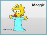
  <DataTemplate DataType="{x:Type src:Character}">
    <Grid>
      <Grid.ColumnDefinitions>
        <ColumnDefinition Width="100" />
        <ColumnDefinition Width="*" />
      </Grid.ColumnDefinitions>
      <Image Margin="5" Source="{Binding Image}" />
      <StackPanel Grid.Column="1" Margin="5">
        <TextBlock FontWeight="Bold" Text="{Binding First}" />
      </StackPanel>
    </Grid>
  </DataTemplate>
This produces a default visual representation for all Character objects that appear in the logical tree lower than the template declaration. As such, if we do not specify the ItemTemplate property on the ListBox, this template will still be used to display the Character objects. Furthermore, if we include a Character object as the content of a Button (or any other ContentControl), the same template will be used to represent the Character:
  <Button HorizontalAlignment="Center" VerticalAlignment="Center">
    <src:Character First="Maggie" Image="images/maggie.png" />
  </Button>
Sidenote: If you’re curious as to whether you can change the default template for all CLR objects, you cannot. WPF specifically disallows data templates with DataType=”{x:Type sys:Object}”. As such, you are stuck with the ToString() behavior for untemplated CLR objects.
Using a DataTemplateSelector
Assigning a default template based on data type is clearly very powerful. Nonetheless, there may even be times when this does not give you the flexibility you need to select a data template for an item. For example, suppose you want to use one template to represent characters under the age of 21 and a different template to represent those 21 and over.
(Okay, this age-based template selector is probably not a great example for cartoon characters… perhaps a different data template for girls and boys would be better… but honestly, that’s too easy to achieve using a single data template with a data trigger… so humor me and let’s just go with the age thing… ;))
For even more flexibility in selecting an item template, you can implement a custom data template selector. A template selector is a class that derives from DataTemplateSelector and overrides the SelectTemplate method to return a template based on custom code execution. Here is a very simple example to meet the needs described above:
public class CharacterTemplateSelector : DataTemplateSelector
{
    private DataTemplate _childTemplate = null;
    public DataTemplate ChildTemplate
    {
        get { return _childTemplate; }
        set { _childTemplate = value; }
    }

    private DataTemplate _adultTemplate = null;
    public DataTemplate AdultTemplate
    {
        get { return _adultTemplate; }
        set { _adultTemplate = value; }
    }

    public override DataTemplate SelectTemplate(object item,
        DependencyObject container)
    {
        if (item is Character)
        {
            return (item as Character).Age >= 21
                ? _adultTemplate : _childTemplate;
        }
        return base.SelectTemplate(item, container);
    }
}
Now to use the template selector, we simply declare an instance as a resource and set the ChildTemplate and AdultTemplate properties appropriately:
  <src:CharacterTemplateSelector x:Key="CharacterTemplateSelector"
      ChildTemplate="{StaticResource CharacterTemplate}"
      AdultTemplate="{StaticResource AdultCharacterTemplate}" />
Then we set the ItemTemplateSelector property on the ItemsControl using a resource reference, as follows:
  <ListBox Width="200" Height="300"
      ItemTemplateSelector="{StaticResource CharacterTemplateSelector}">
    . . .
  </ListBox>
This custom data template selector is also included in the downloadable sample for this article.
What’s next?
This ends our discussion on data templates and the WPF content model for the ItemsControl classes. In the next episode, ‘G’ is for Generator, we will look at item containers and item container generators. (And yes, I realize we’re skipping a couple of letters, but you don’t really want 26 posts on ItemsControl, do you?)