Let’s continue our exploration of WPF through the medium of the ItemsControl class. I know I promised to write ‘G’ is for Generator next, but after giving it more consideration, I’ve decided that it makes more sense to introduce the concept of an “items panel” first. This should give us more context when we finally do look at item containers and container generators.
To support this diversion, I’m giving this “ItemsControl: A to Z” series a new subtitle of “(but not necessarily in that order)”. 😉
How did we get here?
Let’s just recap a couple of things before we get started… In ‘C’ is for Collection, we learned that an ItemsControl surfaces a collection of items in a very predictable way (namely, as a CollectionView). Then in ‘D’ is for DataTemplate, we learned that an item within the collection can be any CLR object and the visual representation of the item is defined using a template of visual elements (called a DataTemplate).
The next question that logically arises is, “where do we put these visuals?” More specifically, once the data template for an item has been inflated, where should its visuals be positioned? To answer this question, we will now examine how “layout” is handled for items within an ItemsControl.
This particular episode begins by covering a few WPF concepts that are only indirectly related to the ItemsControl class. Some of the material is of a more technical nature. I have clearly marked these sections as “200 Level” material. Feel free to skip over these sections if you are only interested in ItemsControl or if you just aren’t in the mood to get your geek on. 😉
What is layout?
In WPF, the term “layout” refers to the sizing and positioning of visual elements within the user interface.
How does layout work?
In some cases, an element may know exactly what size it should be (because it’s Width and Height properties have been explicitly set). But very often, the size of an element is determined by its content. To enable this “size to content” feature, the WPF layout engine uses a 2-pass layout cycle to size and position visual elements:
1. First a measure pass is used to determine the desired size of each element.
2. Then an arrange pass is used to explicitly size and position each element.
The measure pass involves a recursive drilldown into the UI’s visual tree to measure each element. During this pass, an element is basically asked what size it wants to be. To determine an answer to this question, the element turns around and measures each of its own children by asking them what size they want to be. This recursion continues until all visual children in the subtree have been measured. At this point, each element can answer this question regarding its desired size.
The arrange pass involves another recursive drilldown into the visual tree to arrange each element. During this pass, the element is basically told what size it gets to be. In an ideal world, each element would get to be the size that it wants to be… but we all know life doesn’t work that way! The parent Panel has ultimate control over how much real estate each child gets and where that real estate is located.
The Nitty Gritty of Measure (200 Level)
During the measure pass, the question of “What size do you want to be?” is posed to an element in the form of a method named MeasureOverride(), so named because you will override this method on a framework element whenever you wish to implement custom sizing logic for the element. The size parameter received within MeasureOverride() represents a constraint for the element. It is the parent’s way of saying, “You have this much space to work with… with that in mind, what size do you want to be?”
Before answering this question, the element first asks its children what size they want to be by executing the Measure() method of each child. When you call Measure() on a child, this indirectly executes the MeasureOverride() of that child… hence the recursion for the measure pass.
After measuring its children, an element should be able to determine its desired size. The value returned from MeasureOverride() becomes the value of the element’s DesiredSize property.
The Nitty Gritty of Arrange (200 Level)
The sequence is very much the same during the arrange pass. In this case, the “Here’s what size you get to be” message is delivered in the form of a method named ArrangeOverride(). You will override this method on a framework element anytime you need to provide custom positioning logic for child elements. The size parameter received within ArrangeOverride() represents the real estate allotted for the element and its children.
Note that a position is not supplied to an element within ArrangeOverride(). This is because an element does not get to decide where it will be positioned. It can provide hints by setting some of its layout properties (HorizontalAlignment, VerticalAlignment, etc), but ultimately, the parent is responsible for respecting those properties and positioning the child.
Although the element cannot control its own position, it does get to control the position of each of its children, relative to itself. This process is called arranging the children and it happens when the element calls the Arrange() method on each child. The Arrange() method takes a Rect as a parameter. The position of the Rect represents the position of the child relative to the parent. The size of the Rect represents the size of the child within the coordinate space of the parent.
As with measuring, when you call Arrange() on a child, this indirectly executes the ArrangeOverride() of that child… hence the recursion for the arrange pass.
After arranging its children, an element should know its actual size. The value returned from ArrangeOverride() becomes the value of the element’s RenderSize property (and consequently, the values of the ActualWidth and ActualHeight properties).
Dispatcher Priority for Layout and Rendering (200 Level)
The WPF threading model dictates that all code execution will occur within a succinct execution block. We call these blocks dispatcher operations. Each dispatcher operation is queued for execution at a specific priority. The queue is continuously processed by executing the highest priority operations first. The available dispatcher priorities are given by the following enum:
    public enum DispatcherPriority
    {
        Invalid          = -1,
        Inactive         = 0,
        SystemIdle       = 1,
        ApplicationIdle  = 2,
        ContextIdle      = 3,
        Background       = 4,
        Input            = 5,
        Loaded           = 6,
        Render           = 7,
        DataBind         = 8,
        Normal           = 9,
        Send             = 10
    }
Layout and rendering go hand in hand. After the 2-pass layout cycle, the element tree is rendered. As a result, you may hear the terms “render pass” and “layout pass” used interchangeably. And indeed, the layout cycle and UI rendering actually occur within the same dispatcher operation. This operation typically occurs at Render priority. The exception to this rule is that the initial layout cycle and rendering (when a Page or Window is first loaded) actually occur at Loaded priority.
When a render operation executes, the visual tree is first walked to size any elements that need to be measured (IsMeasureValid == false). The tree is then walked again to position any elements that need to be arranged (IsArrangeValid == false). Finally, the updated scene is rendered.
Keeping this in mind, if you ever change a property that affects layout and you want to delay some processing until after the layout has been updated, you can use BeginInvoke() to queue that additional work at Loaded priority. This will typically cause it to execute within the next dispatcher operation after the render pass.
What is a panel?
Typically, when we talk about layout in WPF, we tend to focus on a particular category of elements called panels (so named because they descend from an abstract Panel class). You may recall from our earlier look at different WPF content models that a panel is a special element whose visual children are UIElements.
The reason we tend to focus on panels so much when talking about layout is because layout is really all a panel does. Its sole purpose is to arrange its children at their proper sizes and positions.
Specifically, a panel does three things:
- It maintains a collection of child elements (UIElements)
- It sizes those elements
- It positions those elements
It is important to note that layout in WPF is certainly not restricted to panels. In fact, every framework element actively participates in the layout system. More specifically, every framework element has a MeasureOverride() implementation to measure itself and its children and an ArrangeOverride() implementation to arrange itself and its children.
Non-panel elements typically have no more than one child, and often they have no children at all. The non-panel elements that do have a child rarely do anything interesting with respect to the placement of that child. Typically, the child is simply arranged within the entire rectangular area of the parent.
Panels, on the other hand, almost always do something interesting with their children. A Canvas, for example, positions its children precisely where they want to be according to the Canvas-related attached properties on each child (Canvas.Top, Canvas.Left, etc).
A Grid positions its children within conceptual rows and columns according to the Grid-related attached properties on each child (Grid.Row, Grid.Column, Grid.RowSpan, Grid.ColumnSpan, etc).
A StackPanel stacks its children vertically or horizontally, based on the Orientation property of the StackPanel.
A WrapPanel stacks its children vertically or horizontally until it runs out of room and then it starts a new stack adjacent to or below the previous stack, again depending on the Orientation property of the WrapPanel.
A lot more time could be spent explaining how the native panels implement their respective layout algorithms, but before we get too far off track…
Why are we talking about panels in this ItemsControl series?
Oh yeah… because an ItemsControl is a control that manages a collection of logical children (its “Items”) and a panel is an element that lays out a collection of visual children. Since each logical child in the ItemsControl will have some visual representation, it would make sense to use a panel to lay out these visuals. And indeed, that is how layout works for an ItemsControl. Namely, an ItemsControl uses an “items panel” (a.k.a., an “items host”) to arrange its children.
In WPF, we often describe controls as “lookless”, which means the control itself, is just a bag of functionality and the visual representation for the control (including certain visual behaviors) is defined separately using a Style and ControlTemplate. (This will be covered in more detail in a future post called ‘L’ is for Lookless.) With this dynamic approach that separates the design of a control from its implementation, we are no longer restricted to a stock layout for a control like ListBox.
As an example, in ‘B’ is for Bet You Can’t Find Them All, we saw the standard ListBox examples shown below.
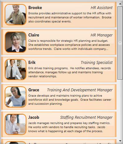
In both of these examples, the items panel is simply a StackPanel, so the items appear stacked vertically, as one might expect when coming from earlier control paradigms like those in Win32 and Windows Forms.
Note that each ListBox specifies its own ItemTemplate to create a different look for items. The first ListBox contains a description for each persona, whereas the second ListBox does not include this description. If you’d like a refresher on how this works, you can revisit ‘D’ is for DataTemplate.
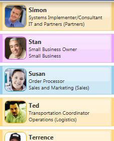
But we also saw the following list of radio buttons in that exercise. This control is also just a ListBox, only now the StackPanel has its Orientation set to Horizontal so that the items are stacked horizontally.

Well perhaps you don’t want the items stacked at all. You can actually use any panel as the items host for an ItemsControl. Imagine that you would really like to have the unselected items spread out radially around a selected item. The Microsoft Dynamics application actually supports this layout:
This image shows a feature of the application where the user can explore entity relationships within the business model in a very ad-hoc fashion. In this case, a “fish eye” binding allows the user to view the details of any related entity by simply moving the mouse over it. Selecting an entity causes it to animate to the center while all of its “relatives” animate into place around it. This creates a very sleek and dynamic way to explore relationships and it really makes the data come to life!
But how is this achieved? Well, believe it or not, this is all done by simply using a ListBox with a custom RadialPanel set as its items panel. (Admittedly, it’s a sleek panel that provides some cool animations, but nonetheless, it’s just a ListBox with a different items panel.)
How do you change the items panel?
There are a couple of ways to change the items panel for an ItemsControl. The first method involves setting the ItemsPanel property on the control using something called an ItemsPanelTemplate.
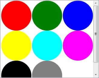
Recall that in WPF, a template is just a tree of visual elements that gets inflated inline to visually represent some other element. The ItemsPanelTemplate is probably the simplest template class, as it can only contain a single child and that child must be a Panel. Here is a very simple example in which the items panel of a ListBox is set to a WrapPanel:
    <ListBox Width="328" Height="260" Padding="1"
        ScrollViewer.HorizontalScrollBarVisibility="Disabled">
      <ListBox.ItemsPanel>
        <ItemsPanelTemplate>
          <WrapPanel />
        </ItemsPanelTemplate>
      </ListBox.ItemsPanel>
      <Ellipse Fill="Red" Width="100" Height="100" />
      <Ellipse Fill="Green" Width="100" Height="100" />
      <Ellipse Fill="Blue" Width="100" Height="100" />
      <Ellipse Fill="Yellow" Width="100" Height="100" />
      <Ellipse Fill="Cyan" Width="100" Height="100" />
      <Ellipse Fill="Magenta" Width="100" Height="100" />
      <Ellipse Fill="Black" Width="100" Height="100" />
      <Ellipse Fill="Gray" Width="100" Height="100" />
    </ListBox>
This yields the following ListBox in which the Ellipse items are wrapped:
What does the ItemsPanelTemplate class actually template?
We know that a template is a visual representation for something. In the case of the ItemsPanelTemplate, you may reasonably wonder, “What is it that we are templating?” We will answer this question more completely in a future episode called ‘L’ is for Lookless. In the meantime, I will try to give a satisfactory interim answer…
We’ve already seen that a DataTemplate is used to template an item of data. And we mentioned earlier that something called a ControlTemplate is used to template a control. The answer to the ItemsPanelTemplate question is related to the ControlTemplate of the ItemsControl. Somewhere within this ControlTemplate, you will typically find an element called an ItemsPresenter. This element reserves real estate within the template for the items panel. So the ItemsPresenter is the element that we are templating with the ItemsPanelTemplate. Or another way to say it is that the ItemsPanelTemplate is inflated within the ItemsPresenter, thereby creating a panel for the layout of the ItemsControl’s items.
An Alternate Method for Specifying the Items Panel
I mentioned before that there are actually a couple of ways to change the items panel for an ItemsControl. The second method actually involves re-templating the ItemsControl. Only this time, instead of including an ItemsPresenter within the template, we can include an items panel directly in the template and set its IsItemsHost property to true.
CAUTION: In this method, the ItemsPanel property on the control is essentially useless. Without an ItemsPresenter in the template, there is nowhere to inflate an ItemsPanelTemplate. As such, a designer can no longer easily swap out the items panel by setting the ItemsPanel property. If they need to do this, they will have to re-template the entire control.
Here is the markup to create the exact same ListBox as shown earlier using the IsItemsHost property to specify the items panel:
    <ListBox Width="328" Height="260" Padding="1"
        ScrollViewer.HorizontalScrollBarVisibility="Disabled">
      <ListBox.Template>
        <ControlTemplate TargetType="{x:Type ListBox}">
          <Border BorderBrush="{TemplateBinding BorderBrush}"
              BorderThickness="{TemplateBinding BorderThickness}"
              Background="{TemplateBinding Background}">
            <ScrollViewer Padding="{TemplateBinding Padding}">
              <WrapPanel IsItemsHost="True" />
            </ScrollViewer>
          </Border>
        </ControlTemplate>
      </ListBox.Template>
      <Ellipse Fill="Red" Width="100" Height="100" />
      <Ellipse Fill="Green" Width="100" Height="100" />
      <Ellipse Fill="Blue" Width="100" Height="100" />
      <Ellipse Fill="Yellow" Width="100" Height="100" />
      <Ellipse Fill="Cyan" Width="100" Height="100" />
      <Ellipse Fill="Magenta" Width="100" Height="100" />
      <Ellipse Fill="Black" Width="100" Height="100" />
      <Ellipse Fill="Gray" Width="100" Height="100" />
    </ListBox>
Hopefully this ControlTemplate approach at least makes some sense now, just based on what we’ve learned about other templates. If not, it will once we dive into control templates.
A Technical Note about Virtualization (200 Level)
A special panel called VirtualizingStackPanel serves as the default items panel for a ListBox (and consequently, a ListView, which derives from ListBox). This panel behaves very much like a StackPanel in that it stacks its children vertically or horizontally, based on its Orientation property. The big difference is that only the visible visuals are instantiated (plus or minus a few items on either side of the viewport, which are created to support keyboard navigation). Furthermore, once visuals are scrolled out of the viewport, they’re references are released and they are available for garbage collection.
It is this VirtualizingStackPanel element that allows a ListBox to be databound in a performant manner to a collection with thousands of items. Since the visuals only exist while they are within the viewport, the application does not pay the performance penalty required to create and maintain thousands of visual elements. However, the ItemsControl instance does still pay the price of maintaining a collection with thousands of logical children. To avoid this cost, you would have to include logic within your application to only bind to a small subset of the entire collection. Typically, this work is offloaded as much as possible to a performant data engine like SQL Server (or the lighter weight SQL Express).
We will eventually explore these concepts of “UI virtualization” and “data virtualization” in detail in ‘V’ is for Virtualization. In the meantime, if you wish to learn more, I would highly recommend that you check out these posts (one, two, and three) in Bea’s blog, which cover different approaches to virtualization for hierarchical data. This is one area where the .NET 3.0/3.5 releases do not provide a native solution.
And if you’re insane enough to want to write your own virtualizing panel, you can start with Dan Crevier’s 4-part series (one, two, three, and four). Unfortunately, you will also need to combine it with Ben Constable’s 4-part series on implementing IScrollInfo (one, two, three, and four). Having done this on more than one occasion myself, I can only warn you that it’s not for the faint of heart! I don’t think it’s particularly difficult, per se; just extremely involved.
Has your ICIQ improved?
It might now be a good time to revisit The ICIQ Test to review the panels that are used as items hosts by different ItemsControl classes. Not only will you get the satisfaction of realizing that you are an ItemsControl expert, but you will also have a much better understanding of the different explanations at the end of the test. (You know… the part of the test that you skipped the first time… the educational part where you were supposed to explore and learn about the controls after getting your score… okay, you’re gone now, aren’t you?)
Next Up: Item Container Generation
No, really. I promise that the next article really will be ‘G’ is for Generator (unless I change my mind again, of course).
Just to whet your appetite, an item container is the actual child element that gets arranged within an items panel. Each visible item in an ItemsControl has a corresponding item container. If the item also has a data template, that template is inflated and the visuals are placed within the item container. But the real question is… where does the container come from in the first place? Hmmm…
 As usual, it’s been a crazy few weeks leading up to Mix, but I swear I can hear Phantom music everytime I step into an elevator, so we must be really close now!