Archive for the ‘Item Containers’ Category

ItemsControl: 'G' is for Generator

Sunday, July 20th, 2008

In ‘I’ is for Item Container, we learned that each item within an ItemsControl is represented by visuals hosted within a container element. The type of this “item container” is specific to the type of the ItemsControl. For example, the container for an item in a ListBox is the ListBoxItem element. Similarly, the container for an item in a ComboBox is the ComboBoxItem element. (A complete list of the native ItemsControl classes and their respective item containers can be found at the end of ‘I’ is for Item Container.)

In this episode, we examine the mechanism by which item containers come into existence.

Where did these containers come from?

In the previous examples in this series, the item containers have mysteriously (or perhaps magically) been created without our knowledge. All we typically do is set a binding on the ItemsSource property for the control. Consider the following ListBox example (again, from ‘I’ is for Item Container):

<ListBox ItemsSource="{Binding Source={StaticResource Characters}}"
    ItemContainerStyle="{StaticResource CharacterContainerStyle}">
  <ListBox.ItemsPanel>
    <ItemsPanelTemplate>
      <Canvas />
    </ItemsPanelTemplate>
  </ListBox.ItemsPanel>
</ListBox>
 

We know that each item in the ListBox is contained within a ListBoxItem. What we don’t know is who created that ListBoxItem. It is logical to assume that the ItemsControl, itself, created the ListBoxItems, but as we’ll see moving forward, this is not the case.

Introduction to the ItemContainerGenerator class

It turns out that every ItemsControl has its own instance of an ItemContainerGenerator object. This generator is accessible via an appropriately named ItemContainerGenerator property.

As the class name implies, an ItemContainerGenerator provides methods by which item containers can be generated for items within an ItemsControl. Specifically, an ItemContainerGenerator knows how to create a container and link it to the item it will contain. It also knows how to remove a container that is no longer needed. Finally, the ItemContainerGenerator class contains several invaluable methods for mapping existing items within an ItemsControl to their containers and vice versa.

Who really holds the reigns of the generator?

An ItemContainerGenerator knows how to create a container and link it to an item, but who actually gets to decide when this container generation occurs? You might think that the generator, itself, should get to decide when to do its job, but actually, it intentionally remains “hands off” in these matters.

The ItemContainerGenerator does, however, monitor the collection view of its associated items collection (via a weak event listener for the INotifyCollectionChanged events). It uses the change notifications to know when to unlink an existing container from an item that is removed, but it never makes a decision on its own to generate a container for an added item. It just quietly maintains a record of all the items within the collection so that it is poised to create a container at a moment’s notice.

If it’s not the ItemContainerGenerator, then it must be the ItemsControl, right? Well, no, the ItemsControl does not directly generate the containers either, but it definitely plays some key roles in the process. Namely, it creates and owns the “generator” of containers (the ItemContainerGenerator instance) and it gets to decide the type of containers that will be created.

Okay, then who else could possibly be responsible for deciding when containers will be generated?

If you’ve been following this series for a while, it should be pretty obvious that neither the ItemsControl nor the ItemContainerGenerator can be the sole decision makers in the process because the ItemsControl class supports something called UI virtualization (wherein only visible UI elements are instantiated and added to the element tree).

In ‘P’ is for Panel, we learned that the items host (a.k.a., the items panel) of an ItemsControl is dynamic. As such, there is no way for the ItemsControl or its ItemContainerGenerator to generically know when containers will be visible. Clearly, the items panel must be directly involved in container generation. After all, the item containers are direct visual children of the items panel. Since the panel knows precisely where to place these children, it is very logical that it would be the one holding the proverbial reigns of the ItemContainerGenerator and telling it when to generate the containers.

How does the generator know what type of container to generate?

When it is time to generate a container, you might be wondering how the ItemContainerGenerator knows what type of object to instantiate. Well, really, it doesn’t know at all. Each ItemsControl gets to specify its own type of item container. The generator simply defers this container creation to its associated ItemsControl by calling its GetContainerForItem() method. This method is responsible for creating and returning a new container for an item.

What happens if the item is already the same type as the container?

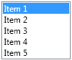
We’ve previously looked at examples like the following in which a ListBoxItem is added directly to a ListBox:

<ListBox SelectedIndex="0" Width="100">
  <ListBoxItem>Item 1</ListBoxItem>
  <ListBoxItem>Item 2</ListBoxItem>
  <ListBoxItem>Item 3</ListBoxItem>
  <ListBoxItem>Item 4</ListBoxItem>
  <ListBoxItem>Item 5</ListBoxItem>
</ListBox>

You may be wondering what the ItemContainerGenerator does in this case, since the item, itself, is already a container. Will it create a new ListBoxItem as the container for the specified ListBoxItem? The answer is no, it will not. Before the ItemContainerGenerator creates a new container, it first checks to see whether the item, itself, is already a container. It does this by calling the IsItemItsOwnContainer() method on the associated ItemsControl.

How can we specify our own container type for a custom ItemsControl?

Suppose we wish to create a custom ForceDirectedItemsControl class that will use a physics-aware items panel to host its children. To enable this scenario, we decide that each container will need to be an instance of a custom ForceDirectedItem class that will support the extra physics-based properties that control item layout in our custom panel (like friction, spring, repulsion, etc). How can we ensure that our custom ForceDirectedItemsControl class creates the ForceDirectedItem containers?

Well, it turns out that this is pretty easy… we just need to override two virtual methods in our ItemsControl class: IsItemItsOwnContainerOverride() and GetContainerForItemOverride().

The following is a typical implementation of a custom ItemsControl class with a custom item container:

  public class ForceDirectedItemsControl : ItemsControl
  {
      protected override bool IsItemItsOwnContainerOverride(object item)
      {
          return (item is ForceDirectedItem);
      }

      protected override DependencyObject GetContainerForItemOverride()
      {
          return new ForceDirectedItem();
      }
  }

Using the above class, when the ItemContainerGenerator is asked to generate a container for an item, it will first check to see if the item is already a ForceDirectedItem. If not, it will ask the ItemsControl to create a container by deferring to its GetContainerForItemOverride().

Caution: You should never assume there to be a constant tie between an item and its container. The GetContainerForItemOverride() method intentionally does not supply the item that will be hosted within the container. It is the responsibility of the ItemContainerGenerator to link an item to its container. When a virtualizing panel is hosting containers, it is common to link one item to a container and later link a completely different item to that same container. This provides a nice perf optimization.

How does UI virtualization work in an ItemsControl?

I previously promised that this episode would include a high level look at exactly how an ItemsControl supports this concept of UI virtualization. Feel free to skip ahead if you are not curious about the finer details of virtualization.

There are really only two noteworthy panel classes in the framework that take control of the ItemContainerGenerator and instruct it to generate containers: Panel and VirtualizingStackPanel.

Sidenote: There is actually a third native class, called ToolBarPanel, that uses the ItemContainerGenerator to generate items for a ToolBar. We won’t really spend any time looking at the ToolBar class in this series, since in many ways it breaks the traditional ItemsControl conventions. For more, see the note marked “**” at the end of ‘I’ is for Item Container.

The abstract Panel base class contains what we can consider the default container generation code for panels. This default logic is simply to generate containers for every item in the collection. So by default, there is no UI virtualization whatsoever.

The framework contains an abstract class called VirtualizingPanel which derives from Panel and then overrides the default container generation code to replace it with… well… nothing. So if you derive a panel from VirtualizingPanel, it will not generate any containers on its own. Instead, you will be responsible for implementing the code that leverages the ItemContainerGenerator to generate the containers.

There is only one virtualizing panel included in the early releases of the framework (.NET 3.0 and 3.5). It is called VirtualizingStackPanel. And if you paid attention to the chart at the end of ‘I’ is for Item Container, you know that VirtualizingStackPanel is the default items host for ListBox and ListView. So we get UI virtualization thrown in for free when we use these controls with their default items panel.

A VirtualizingStackPanel, like any other panel, is responsible for sizing and positioning its children (the item containers). As such, it knows exactly which children are visible within the viewport of the ItemsControl at any given time. It uses this knowledge to create, or “realize”, only the visible children (plus a few extra on either side of the viewport to enable keyboard navigation to work as expected). When a realized child is scrolled out of the viewport, the VirtualizingStackPanel queues that container to be removed, or “virtualized”, so that its resources can be reclaimed.

If you are writing a custom virtualizing panel, you will also need to implement the logic for realizing visible containers and virtualizing non-visible containers. Realization consists of generating the container (generator.GenerateNext()) and preparing it to host its item (generator.PrepareItemContainer()). Virtualization consists of removing the container (generator.Remove()).

We will go deeper into UI virtualization in a future article entitled ‘V’ is for Virtualization. In the meantime, if you are anxious to get started writing a virtualizing panel, you should check out Dan Crevier’s series on creating a virtualizing panel.

Tying It All Together

We’ve already covered many different aspects of an ItemsControl in this series and they all come into play in this process of item container generation. There is a very intricate dance involving an ItemsControl, its items host (‘P’ is for Panel), its Items collection (‘C’ is for Collection), and its ItemContainerGenerator (‘G’ is for Generator… this article). This dance results in the creation of item containers (‘I’ is for Item Container) that will host the items directly or host a visual representation of the items, as specified via an item template (‘D’ is for DataTemplate).

Finding Template Elements by Mapping Items to Containers

A very common question in the WPF Forum is, “How can I get a reference to a specific element in my item template at runtime?”

Sidenote: In most scenarios, you shouldn’t need to do this. Typically, the reason a person wants to do this is so they can programmatically change a property on some element in the template. If one carefully develops their view model (which will contain the data items represented within the ItemsControl), this type of property update can be handled via a binding to a property on a data item.

There are certainly a few scenarios where it is necessary to drill into an item’s visual subtree to get a specific element. For these scenarios, we can leverage a couple of nifty methods of the ItemContainerGenerator: ContainerFromIndex() and ContainerFromItem(). Once you have the container for the desired item, you can locate the element within its visual tree using a recursive routine like the GetDescendantByName() or GetDescendantByType() routines shown here:

  public static Visual GetDescendantByName(Visual element, string name)
  {
      if (element == null) return null;

      if (element is FrameworkElement
          && (element as FrameworkElement).Name == name) return element;

      Visual result = null;

      if (element is FrameworkElement)
          (element as FrameworkElement).ApplyTemplate();

      for (int i = 0; i < VisualTreeHelper.GetChildrenCount(element); i++)
      {
          Visual visual = VisualTreeHelper.GetChild(element, i) as Visual;
          result = GetDescendantByName(visual, name);
          if (result != null)
              break;
      }

      return result;
  }

  public static Visual GetDescendantByType(Visual element, Type type)
  {
      if (element.GetType() == type) return element;

      Visual foundElement = null;

      if (element is FrameworkElement)
          (element as FrameworkElement).ApplyTemplate();

      for (int i = 0;
          i < VisualTreeHelper.GetChildrenCount(element); i++)
      {
          Visual visual = VisualTreeHelper.GetChild(element, i) as Visual;
          foundElement = GetDescendantByType(visual, type);
          if (foundElement != null)
              break;
      }

      return foundElement;
  }
 

Finding the Container Associated with a Template Element

Similarly, there are times when you will want to handle an event on a specific template element and then locate the ancestor item container for the element. One option is to walk the ancestors looking for the element by type with the following GetAncestorByType() routine:

  public static DependencyObject GetAncestorByType(
      DependencyObject element, Type type)
  {
      if (element == null) return null;

      if (element.GetType() == type) return element;

      return GetAncestorByType(VisualTreeHelper.GetParent(element), type);
  }

Another perfectly viable approach is to leverage a little fact that we learned in ‘I’ is for Item Container… namely, that the DataContext of the container is the very item that it contains. In most scenarios, this same DataContext will be inherited by all framework elements within the item template. So you can typically cast the original source of the event to a FrameworkElement and use the DataContext property to get the item that is represented by the template. You can then use the ContainerFromItem() method of the ItemContainerGenerator to get the container.

Most of these tricks work great for a simple ItemsControl, but then get a little tricky with a HeaderedItemsControl like a TreeView or MenuItem. For these cases, I strongly recommend leveraging the view model, commanding, and bindings to handle property updates within the view and to respond to user actions within the view model. We’ll explore these things further in future episodes.

Dealing with Asynchronous Container Generation

Alright, clearly the ItemContainerGenerator class provides some very handy, and even essential, methods for mapping items to containers and vice versa. There is still one very important thing to add to the whole equation… that is the timing of container generation.

Suppose you have a ListBox named CharacterListBox bound to an observable collection named Characters. You might be tempted to write code like the following:

  private void AddScooby()
  {
      Character scooby = new Character("Scooby Doo");
      Characters.Add(scooby);
      ListBoxItem lbi = CharacterListBox.ItemContainerGenerator
          .ContainerFromItem(scooby) as ListBoxItem;
      lbi.IsSelected = true;
  }

This code will actually result in an exception because the lbi member will be null. The reason is that containers are generated in a separate dispatcher operation. As a result, simply setting the ItemsSource property or modifying the bound collection does not cause containers to be created immediately.

The key point here is that we must always think of container generation as an asynchronous operation. So how can we add an item and then safely locate its container after it has been generated? For this very purpose, the ItemContainerGenerator class provides a Status property along with change notifications for the status. If we need to programmatically access containers after they are generated, we can subscribe to the StatusChanged event, as shown in the following code:

  private void AddScooby()
  {
      _scooby = new Character("Scooby Doo");
      Characters.Add(_scooby);
      CharacterListBox.ItemContainerGenerator.StatusChanged
          += OnStatusChanged;
  }

  private void OnStatusChanged(object sender, EventArgs e)
  {
      if (CharacterListBox.ItemContainerGenerator.Status
          == GeneratorStatus.ContainersGenerated)
      {
          CharacterListBox.ItemContainerGenerator.StatusChanged
              -= OnStatusChanged;
          ListBoxItem lbi = CharacterListBox.ItemContainerGenerator
              .ContainerFromItem(_scooby) as ListBoxItem;
          if (lbi != null)
          {
              lbi.IsSelected = true;
          }
      }
  }

There are a couple of important things to notice about this code. First, the OnStatusChanged() method immediately checks the current status of the generator. This is important because the status could have changed to one of four different possible values: NotStarted, GeneratingContainers, ContainersGenerated, or Error. We should always specifically check for the status that we care about.

Second, as soon as the containers have been generated, the handler removes itself so that it will not be called when subsequent changes to the Items collection cause the generator’s status to change.

Bonus Tidbit: FindAncestor Bindings are Very Handy in Item Templates

This is really just an extra tidbit that I’m tagging onto this topic because of its usefulness. It is not really specific to container generation.

Recall that in ‘D’ is for DataTemplate, we learned how to provide a template of visuals to represent the items in an Items collection. When dealing with a Selector like ListBox, ListView, TreeView, etc, it is quite common to want to trigger a change in the visuals based on whether an item is selected. We now know that the concept of selection for these controls is based on the IsSelected property of their respective item containers. Any element in the item template can be bound to a property of the item container using a FindAncestor binding.

Below is a typical data trigger that might be found in a DataTemplate for an item within a ListBox:

<DataTrigger Binding="{Binding RelativeSource={RelativeSource FindAncestor,
    AncestorType={x:Type ListBoxItem}}, Path=IsSelected}" Value="True">
  <Setter Property="Foreground" Value="#A1927E" TargetName="tb" />
</DataTrigger>

Up Next

In the next episode of this series, I plan to examine the “lookless” nature of ItemsControls. Please stay tuned!

ItemsControl: 'I' is for Item Container

Tuesday, March 25th, 2008

Oh look… I did it again! I promised to write ‘G’ is for Generator and then I come out with ‘I’ is for Item Container. I’m like a bad TV series that just keeps leading you on… Then just when you think you’re about to discover the true identity of the evil mastermind, the plot takes an unexpected turn. Please tune in next time when we’ll unveil… The Generator!

Okay, this episode isn’t really a departure from the plan. I simply realized that I had too much content for a single post, so I broke our look at item containers and item container generation into two separate issues. If it makes you feel better, you can think of this as ‘G’ is for Generator, Part I. Although we won’t actually talk about container “generation” in this episode, we will lay the groundwork by talking about the containers that get “generated”.

In our last episode, ‘P’ is for Panel, we discovered that an ItemsControl leverages a panel to layout its children. We call this panel the items host (or the items panel). It seems quite appropriate to use a panel to layout the items, since that is exactly the purpose for which a panel is designed… namely, to size and position a collection of visual children.

In an earlier article, ‘D’ is for DataTemplate, we saw that a data template can be used to specify the visuals that represent an item within the Items collection of an ItemsControl. And since any object can belong to the Items collection, this architecture allows for a diverse and disparate collection of visuals within an ItemsControl.

A Motley Crew of Items

Consider the following example:

  <ItemsControl HorizontalAlignment="Left">
    <TextBox Name="tb" Margin="2" Text="Test" />
    <sys:String>http://drwpf.com/blog/</sys:String>
    <sys:String>http://forums.microsoft.com/MSDN/</sys:String>
    <x:Static Member="ApplicationCommands.Copy" />
    <x:Static Member="ApplicationCommands.Cut" />
    <x:Static Member="ApplicationCommands.Paste" />
    <x:Static Member="ApplicationCommands.SelectAll" />
  </ItemsControl>

This ItemsControl has 7 items explicitly added to its Items collection: one TextBox, two strings, and four routed commands. You could easily define a data template for the String type to display the strings as hyperlinks and another data template for the RoutedUICommand type to display the commands as buttons. Then the ItemsControl might have the visual representation shown here.

Since a StackPanel is the default items host for an ItemsControl, the children are nicely stacked. If you’d like to observe this example in Kaxaml (or XamlPad if you’re old school), the very simple markup is available here.

Some Common Problems to Consider

Below are several common problems that need to be considered when working with an ItemsControl in WPF. We should keep these in mind as we look at item containers in this post and item container generators in the next episode.

Problem 1: Custom Child Placement

A panel is capable of arranging all types of UI elements, so it can certainly handle such a motley crew of children, but imagine that the panel is a Canvas and you want to provide custom placement of the items within your collection. In this case, you would need to set the attached Canvas properties (Canvas.Left, Canvas.Top, etc) on all of the differing elements in your collection of children. This could be a real hassle to maintain with so many different types of visuals.

Problem 2: Mappings between Items and Visuals

And remember that the actual items may simply be string or command objects. These objects have no inherent visual representation without their data templates. Once a data template has been inflated for an item and the visuals have been added to your ItemsControl, how do you map the visuals back to the items and vice versa?

Problem 3: UI Virtualization

What if there are thousands of items in your ItemsControl? Unless the items are very small, they will not all appear within the viewport of the control at the same time. We definitely do not want to pay a high performance penalty for instantiating visuals for items that are not visible. How can we make sure that only visuals for the visible items (give or take a few) are in memory at any given moment?

Problem 4: Consistent Item Chrome

Another thing that you might want to do in an ItemsControl is provide a common “chrome” for each item. Since the items themselves can be quite diverse and the items panel might not be something as predictable as a StackPanel, an ItemsControl might sometimes appear haphazard. One way to bring a sense of uniformity to such a collection is to provide a consistent background or chrome for each item. Is it possible to do this without directly adding the chrome to the item’s data template?

Problem 5: Visible Selection State

Finally, if the ItemsControl is a Selector (e.g., ListBox, ListView, TreeView, ComboBox, etc), how would you go about showing a uniform selection state for all of the differing children?

It would certainly be a lot easier to deal with all of the above issues if the children of the items panel were all the same type of element. Enter the item container

What is an item container?

An item container is an automatically generated “wrapper” element for items within an ItemsControl. It is called an item container because it actually “contains” an item from the Items collection. More specifically, the container is the control which contains the visual representation for an item. If the item has a data template, the container is the control into which that data template is inflated.

Let’s revisit a simple ListBox example that we saw earlier in ‘D’ is for DataTemplate. Here is a ListBox that displays a collection of Characters:

  <ListBox ItemsSource="{Binding Source={StaticResource Characters}}" />

Note that we’re using a ListBox in ItemsSource Mode (see ‘C’ is for Collection). The collection of characters is the same as before:

  <src:CharacterCollection x:Key="Characters">
    <src:Character First="Bart" Last="Simpson" Age="10"
        Gender="Male" Image="images/bart.png" />
    <src:Character First="Homer" Last="Simpson" Age="38"
        Gender="Male" Image="images/homer.png" />
    <src:Character First="Lisa" Last="Bouvier" Age="8"
        Gender="Female" Image="images/lisa.png" />
    <src:Character First="Maggie" Last="Simpson" Age="0"
        Gender="Female" Image="images/maggie.png" />
    <src:Character First="Marge" Last="Bouvier" Age="38"
        Gender="Female" Image="images/marge.png" />
  </src:CharacterCollection>

We can define a very simple data template to display the characters:

  <DataTemplate DataType=" {x:Type src:Character} ">
    <StackPanel Orientation="Vertical" Margin="5">
      <TextBlock FontWeight="Bold" Text="{Binding First}"
          TextAlignment="Center" />
      <Image Margin="0,5,0,0" Source="{Binding Image}" />
    </StackPanel>
  </DataTemplate>

This gives us the ListBox at the right.

Where’s the container?

Supposedly, the visuals for each of the characters in this example are wrapped within an item container. But I don’t see a container! Where is the container? More importantly, what is the container? The answer to that question actually depends on the ItemsControl. In this case, the ItemsControl is a ListBox. The item container for a ListBox happens to be a control called ListBoxItem.

You may not think you see a ListBoxItem in the control, but if you select an item, you will notice that the background of the entire selected item becomes blue and the TextBlock within the selected item shows up with a white Foreground (see the image below). The blue that you are seeing here is the background of the item container.

These visual changes happen automatically without any changes to our Character data template. They are the result of the template within the default style for ListBoxItem, (along with some triggers in that template).

Wow! The container has a pretty important role in this scenario, especially if you think you might like to alter the visuals used to depict item selection. Clearly, this merits further investigation…

Understanding the Item Container and its Style

As just mentioned, the selection state for a ListBoxItem is defined within the control’s style and template. Anytime you are working with an ItemsControl, I strongly recommend that you take time to understand the control’s item container as well as the default style for that container. So let’s just take a moment to look at some aspects of ListBoxItem and the default ListBoxItem style, as defined for the Vista Aero theme (from Aero.NormalColor.xaml).

  1. The Background of the ListBoxItem is set to Transparent. This is important. By using a Transparent brush rather than the default null brush, the ListBoxItem becomes hittable (or visible to hittesting by input devices). In other words, a mouse hittest will find the item, thereby allowing it to be selected when the transparent portion is clicked.
  2. HorizontalContentAlignment and VerticalContentAlignment on the ListBoxItem are data bound to the properties of the same names on ListBox. As such, if you’d like all ListBoxItems to left-align their content, you can simply set HorizontalContentAlignment to Left on the ListBox itself. This is very handy to know and you probably wouldn’t know it without looking at the style.
  3. The default template for ListBoxItem consists of nothing more than a ContentPresenter within a Border.
  4. ListBoxItem exposes a dependency property called IsSelected. This is pretty common for the item container of a Selector control. In fact, the Selector class is where the IsSelected property is originally registered with the property engine. ListBoxItem and other containers simply add themselves as owners for the property. As such, Selector.IsSelected provides a useful trigger property for showing that a container is selected.
  5. There are indeed several triggers within the control template that alter the container’s appearance based on whether it is selected, active, and/or enabled.

Sidenote: If you are new to styling and templating in WPF, recognize that all of the native control styles and templates are available in theme files that ship as part of the framework SDK or with Blend. There are actually many different ways you can view these styles, as I describe in this forum post. Designers often go straight to a tool like Blend, when they want to explore/modify a control template. This is certainly fine too, but I prefer going to the theme file so I can see both the style and template declarations together.

The ItemContainerStyle Property

That’s great! Now we understand the default style and template. What can we do with this knowledge? Well, quite a bit, actually. It turns out that it’s very easy to define our own item container style. We simply need to set the ItemContainerStyle property of the ItemsControl, as shown here:

  <ListBox ItemsSource="{Binding Source={StaticResource Characters}}"
      ItemContainerStyle="{StaticResource CharacterContainerStyle}" />

Next, we need to define the style. We will use the container style to add some standard chrome to the items in our ListBox by redefining the ListBoxItem’s template, as shown below. You don’t need to get too wrapped up in the nitty gritty of this style (unless that’s your thing). Just note that there are a handful of properties being set, and one of them happens to be the Template property.

  <Style x:Key="CharacterContainerStyle" TargetType="{x:Type ListBoxItem}">
    <Setter Property="Background" Value="#FF3B0031" />
    <Setter Property="FocusVisualStyle" Value="{x:Null}" />
    <Setter Property="Width" Value="75" />
    <Setter Property="Margin" Value="5,2" />
    <Setter Property="Padding" Value="3" />
    <Setter Property="Template">
      <Setter.Value>
        <ControlTemplate TargetType="{x:Type ListBoxItem}">
          <Grid>
            <Rectangle StrokeThickness="1" Stroke="Transparent"
                RadiusX="5" RadiusY="5" Fill="White"  />
            <Grid>
              <Rectangle x:Name="BackgroundRect" Opacity="0.5" StrokeThickness="1"
                  Stroke="Transparent" RadiusX="5" RadiusY="5"
                  Fill=" {TemplateBinding Background} " />
              <Rectangle StrokeThickness="1" Stroke="Black" RadiusX="3" RadiusY="3" >
                <Rectangle.Fill>
                  <LinearGradientBrush StartPoint="-0.51,0.41" EndPoint="1.43,0.41">
                    <LinearGradientBrush.GradientStops>
                      <GradientStop Color="Transparent" Offset="0"/>
                      <GradientStop Color="#60FFFFFF" Offset="1"/>
                    </LinearGradientBrush.GradientStops>
                  </LinearGradientBrush>
                </Rectangle.Fill>
              </Rectangle>
              <Grid>
                <Grid.RowDefinitions>
                  <RowDefinition Height="0.6*"/>
                  <RowDefinition Height="0.4*"/>
                </Grid.RowDefinitions>
                <Rectangle RadiusX="3" RadiusY="3" Margin="3"
                    Grid.RowSpan="1" Grid.Row="0"  >
                  <Rectangle.Fill>
                    <LinearGradientBrush  EndPoint="0,0" StartPoint="0,1">
                      <GradientStop Color="#44FFFFFF" Offset="0"/>
                      <GradientStop Color="#66FFFFFF" Offset="1"/>
                    </LinearGradientBrush>
                  </Rectangle.Fill>
                </Rectangle>
              </Grid>
              <ContentPresenter x:Name="ContentHost" Margin="{TemplateBinding Padding}"
                  HorizontalAlignment="{TemplateBinding HorizontalContentAlignment}"
                  VerticalAlignment="{TemplateBinding VerticalContentAlignment}" />
              <Rectangle Fill="{x:Null}" Stroke="#FFFFFFFF"
                  RadiusX="3" RadiusY="3" Margin="1" />
            </Grid>
          </Grid>
        </ControlTemplate>
      </Setter.Value>
    </Setter>
  </Style>

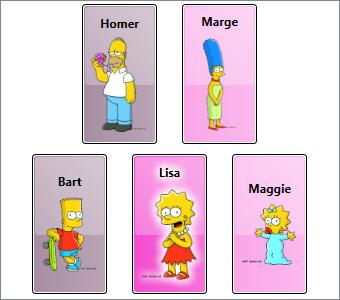
With the above item container style, our ListBox now renders as shown here.

Notice that in this style we have added a setter to explicitly set the Width of the ListBoxItem to 75 device independent pixels. Previously, the item containers were sizing to their content, which meant that each item would render as big as necessary to display the characters name and the image of that character at its natural size (the size stored in the image file).

The container style is a great place to apply sizing because it allows us to provide a consistent size for all items in the ListBox. We could certainly hard code this size into the Character data template, but keep in mind that we may be using the same data template in other places within the application. By putting a Width setter in the container style, rather than explicitly setting the width in the data template, we keep the data template dynamic.

So now we have some consistent chrome and it is nicely defined in the container’s template rather than in the item’s data template. Unfortunately, there is a big problem with this template. When I snapped this image of the ListBox, the selected item was Homer. Of course, you will have to take my word for it, since there is clearly nothing in the visual appearance that can be used to verify I’m telling the truth.

Recall that the default ListBoxItem template is what gave us visual cues for things like selection state. Since we have defined our own ListBoxItem template, we need to do likewise in our template. So let’s just add the following Triggers to our control template:

  <ControlTemplate.Triggers>
    <Trigger Property="Selector.IsSelected" Value="True">
      <Setter TargetName="BackgroundRect" Property="Opacity" Value="1" />
      <Setter TargetName="ContentHost" Property="BitmapEffect">
        <Setter.Value>
          <OuterGlowBitmapEffect GlowColor="White" GlowSize="9" />
        </Setter.Value>
      </Setter>
      <Setter TargetName="BackgroundRect" Property="Opacity" Value="1" />
    </Trigger>
  </ControlTemplate.Triggers>

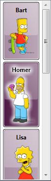
Now when we select Homer, the chrome around him darkens and he glows like an angel (or maybe like he’s radioactive, which is actually more appropriate given his line of work).

The Container’s Data Context is the Item

In ‘D’ is for DataTemplate, we learned that the data context for the root element of the data template is actually the data item that the template represents. And since the DataContext is inherited through the element tree, each child element in the template also has this same data context. This makes establishing bindings on elements in the template very easy. For example, in our Character template, the Text property of the TextBlock is bound to the character’s name by simply doing this:

  <TextBlock Text="{Binding First}" />

Well, now we can explain how this actually works. When the item container is generated, the framework sets its data context to the item that the container contains. It then inflates the data template as the content of the container. The elements in the container then naturally inherit their data contexts from the container.

Armed with this knowledge that the DataContext of the item container is the item it contains, we might want to add a data trigger to our style to show the female characters with a pink background color. We do live in a stereotyped world, after all! The following trigger should work nicely:

  <Style.Triggers>
    <DataTrigger Binding="{Binding Gender} " Value="Female">
      <Setter Property="Background" Value="#FFF339CB" />
    </DataTrigger>
  </Style.Triggers>

Custom Placement of Items within an ItemsControl

Now let’s make just one more change to this sample. It is actually pretty common to add extra metadata to the view model of a WPF application to help position and visualize data. Suppose we modify the Character item in our view model to allow each character to expose its own notion of where it should be positioned in x-y space. To do this, we will add the following Location property to the Character class:

  private Point _location = new Point();
  public Point Location
  {
      get { return _location; }
      set
      {
          _location = value;
          RaisePropertyChanged ("Location");
      }
  }

Similarly, we’ll modify our data collection to set the position of the characters:

  <src:CharacterCollection x:Key="Characters">
    <src:Character First="Bart" Last="Simpson" Age="10"
        Gender="Male" Image="images/bart.png" Location="25,150" />
    <src:Character First="Homer" Last="Simpson" Age="38"
        Gender="Male" Image="images/homer.png" Location="75,0" />
    <src:Character First="Lisa" Last="Bouvier" Age="8"
        Gender="Female" Image="images/lisa.png" Location="125,150" />
    <src:Character First="Maggie" Last="Simpson" Age="0"
        Gender="Female" Image="images/maggie.png" Location="225,150" />
    <src:Character First="Marge" Last="Bouvier" Age="38"
        Gender="Female" Image="images/marge.png" Location="175,0" />
  </src:CharacterCollection>

The default items host for a ListBox is a panel called VirtualizingStackPanel. This works great when you want a traditionally stacked layout with the added benefits of UI virtualization, but what if you want a custom layout? In ‘P’ is for Panel, we learned that we can actually choose any panel to serve as the items host for our data items.

Since our Character item now provides its own (x, y) location, a Canvas is the logical choice for an items panel:

  <ListBox ItemsSource="{Binding Source={StaticResource Characters}}"
      ItemContainerStyle="{StaticResource CharacterContainerStyle}">
    <ListBox.ItemsPanel>
      <ItemsPanelTemplate>
        <Canvas />
      </ItemsPanelTemplate>
    </ListBox.ItemsPanel>
  </ListBox>

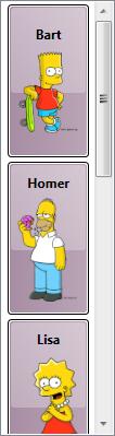
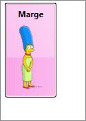
Hmmm… Now when we run this sample, we see just Marge. Oops! There are still 5 items, but they are all positioned in the same (0, 0) location, so we only see the topmost item. We really want each item to be positioned according to its Location property. That is, we want the Canvas.Left and Canvas.Top properties of each item to be bound to Location.X and Location.Y on each character.

This is where knowing that each item is wrapped in a ListBoxItem container comes in very handy! Since the items panel actually hosts these containers, we just need to modify the container style to bind the Canvas attached properties to the Location properties on the contained item. This can be done by adding the following setters to our style.

  <Setter Property="Canvas.Left" Value="{Binding Location.X}" />
  <Setter Property="Canvas.Top" Value="{Binding Location.Y} " />

Voîla! Now when we run the code, we see the expected result (now with Lisa selected):

Okay, you might have noticed that I modified a couple of other style properties to provide consistent heights and vertical alignment for the children. The complete sample can be downloaded here.

Common Problems (Revisited)

Remember the common problems we talked about toward the beginning of this article?

  1. Custom Child Placement
  2. Mappings between Items and Visuals
  3. UI Virtualization
  4. Consistent Item Chrome
  5. Visible Selection State

We have actually tackled items 1, 4, and 5 already. Our items have custom placement due to bindings on the Canvas attached properties on the item container. We have also defined a custom template within the item container style to give the items a consistent chrome. And finally, we added triggers to that template to show the selected item.

In the next episode, we will talk about how the item container generator can be used to tackle the remaining issues. (No, we will not implement UI virtualization in that article… that will be a separate post later in the series. But we will talk about how the generator enables this virtualization.)

Default Items Hosts and Containers

For your convenience, here is a list of the native ItemsControl classes in WPF, along with their default items hosts and item container types:

ItemsControl Type Default Items Host Default Item Container
ComboBox StackPanel ComboBoxItem
ContextMenu StackPanel MenuItem
HeaderedItemsControl StackPanel ContentPresenter
ItemsControl StackPanel ContentPresenter or any UIElement*
ListBox VirtualizingStackPanel ListBoxItem
ListView VirtualizingStackPanel ListViewItem
Menu WrapPanel MenuItem
MenuItem StackPanel MenuItem
StatusBar DockPanel StatusBarItem
TabControl TabPanel TabItem
ToolBar** not used none
TreeView StackPanel TreeViewItem
TreeViewItem StackPanel TreeViewItem

* If a UIElement is added to the Items collection of an explicit ItemsControl instance (as opposed to an instance of a derived class like ListBox), it will become a direct child of the items panel. If a non-UIElement is added, it will be wrapped within a ContentPresenter.

** Note that I’ve included the ToolBar control in this list because technically, it is an ItemsControl. However, it should be noted that it has certain hardcoded behaviors that diverge from the other ItemsControl classes. It does not wrap its items in an item container and it is hard coded to layout its items in a special ToolBarPanel class. Setting the ItemsPanel property on a ToolBar will not change this behavior. The control template for a ToolBar must include a ToolBarPanel within its visual tree. If the panel is not present, the framework will throw an exception. (Bad form, framework! Shame on you!)