Archive for the ‘Panels’ Category

ItemsControl: 'N' is for Natural User Interface

Wednesday, August 5th, 2009

Okay, this post isn’t really about creating a full blown Natural User Interface (NUI)… I just wanted to jump on the NUI bandwagon while it’s still the cool new thing! ๐Ÿ˜‰ This post is actually about supporting a very specific natural user interaction within an ItemsControl.

Microsoft Surface was first publicly unveiled a couple of years ago. Since then, I have periodically been asked how one would go about creating a panel that behaves like the application launcher in Surface. If you have not seen the app launcher, I would describe the panel as simply a horizontal StackPanel that infinitely cycles its children.

I had some extra time this weekend, so I refactored one of my early looping panels into something that might be useful for a wider audience. This post also includes a simple demo showing how the LoopPanel can be used as the items host of a custom ListBox class. The LoopingListBox class supports dragging its items in a manner similar to the Surface app launcher. This demo brings the same type of natural user interaction to desktop WPF (via mouse) that you might find on Surface.

If you are actually developing for Surface, be sure to check out the Sidenote for Surface Developers section below for information on why you might prefer my panel over the sample supplied in the Surface documentation. ๐Ÿ˜›

If you have not yet read ‘P’ is for Panel, I would highly recommend it as a foundation for this article.

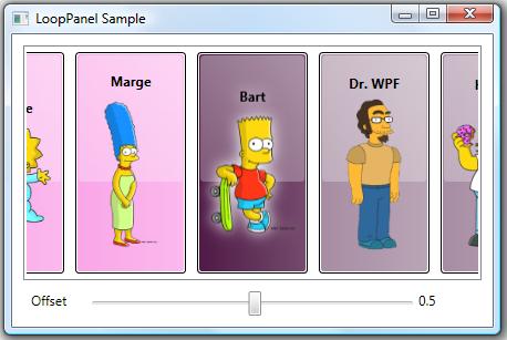
The LoopPanel Sample Application

To give you a better understanding of the panel examined within this post, you can run this ClickOnce LoopPanel sample application. (Yes, I could have published an XBAP sample, but I was not willing to give up the glow effect used for the selected character… which is, incidentally, achieved using a DropShadowEffect in the new effects pipeline.)

You can also download the entire project with full source code to build the demo yourself.

Sidenote and Tip: Even in the new pipeline, DropShadowEffect is a rather expensive effect because it requires multiple passes. The LoopPanel sample is very simple and is therefore not impacted much by the use of DropShadowEffect. If you experience poor performance using DropShadowEffect in a real app scenario, you can usually accomplish a very similar effect by applying a BlurEffect to a second copy of an element residing directly behind the original element.

The LoopPanel Layout Algorithm

Whenever I’m creating a new panel, I start by clearly defining its layout algorithm. This allows me to identify the exact properties that will be necessary to support the new layout.

In the LoopPanel class, I wanted to support both a horizontal and vertical orientation, just as StackPanel does. I also decided to use the same basic measuring algorithm as StackPanel, measuring each child to infinity in the stacking direction (the orientation direction) and measuring it to the panel’s available size in the nonstacking direction. (This just means a child can be whatever size it desires in the stacking direction, but it is constrained in the nonstacking direction.) To support these layout requirements, it was clear that I would need an Orientation property.

Of course, there are some key differences between a LoopPanel and a StackPanel. For example, a StackPanel arranges its children sequentially, beginning with the first child and stacking subsequent children one right after the other. However, a LoopPanel really eases the concept of a “first” child. There’s no reason that the nth child cannot appear first. So I needed a way to define the element that would be considered pivotal during a given layout pass. As such, I created the notion of a “pivotal child”.

The pivotal child is the element around which the remaining children are arranged. The pivotal child is placed first. Then its neighboring siblings (the subsequent and preceding members of the children collection) are placed, working away from the pivotal child in both directions until all remaining visible children are arranged. This allows for a balanced layout around the pivotal child. Nonvisible children (those that are outside the panel’s viewport) are then arranged using a layout rect with no size (both width and height are zero). This zero-sized rect provides a perf optimization (less layout processing and generated render data), especially for elements with elaborate subtrees, which you might have in an ItemsControl with a complex item template.

Obviously, any child could be the pivotal child. This meant I would need a property that could be used to identify the index of the pivotal child. I decided to call this the Offset property. The name might not make a lot of sense at first, but it should shortly. What might make even less sense is that the Offset property is of type double. So why would we need a double value to act as an index into a collection?

Actually, only the whole portion of the Offset value is considered when determining the index of the pivotal child. The fractional portion is then used to further offset that pivotal child. For example, given an Offset value of 6.25, the child at index 6 is the pivotal child and it is offset by 25% of its width (for a horizontally oriented LoopPanel) from the pivotal location. This means that if the Offset animates from 6 to 7, the child’s location animates by its entire extent. Then the child at index 7 becomes the pivotal child. Using this approach, the Offset property simply specifies the logical offset of the panel’s children.

Okay, shouldn’t the Offset value be constrained to only valid child indices? What happens when you animate the Offset from 6 to 7, but there are only 5 children? Well recall that the LoopPanel needs to cycle its children infinitely. To enable this infinite looping of children, the Offset property is completely unbounded. Any double value is valid. So to truly determine the index of the pivotal child, the Offset value is taken modulo the current count of children. So animating the Offset from 6 to 7 when you only have 5 children is equivalent to animating the Offset from 1 to 2.

The final layout issue was to determine exactly where to place the pivotal child within the panel’s available extent. More specifically, where is the pivotal location for the placement of the pivotal child. We could simply start at the beginning of the available space (similar to a StackPanel), but that is rather limiting, especially considering that the motivation for this panel is the app launcher in Surface, which puts the central focus at the center of the panel. To this end, I decided to allow the pivotal location to be specified using a RelativeOffset property on the LoopPanel.

RelativeOffset is a double value ranging from 0 to 1. A value of 0 (zero) means that the pivotal location is at the beginning of the panel’s available space. A value of 1 means the pivotal location is at the end of the panel’s available space. The default value is 0.5, which means the pivotal location is at the center of the panel.

That’s it for the description of the layout algorithm. We’ve identified three properties: Orientation, Offset, and RelativeOffset. To see how these properties are defined and actually used to implement the described layout algorithm, I refer you to the LoopPanel code within the sample project. As with every panel, the key methods that implement the layout are MeasureOverride() and ArrangeOverride().

Not a Typical ScrollViewer Paradigm

Once the LoopPanel has been implemented, the next logical question becomes how will we support scrolling its children? Clearly, we have an Offset property that can be used to this effect. The first inclination might be to leverage a ScrollViewer and use its horizontal or vertical offset to update the Offset property on the LoopPanel. There are a couple of problems with this approach.

First, a ScrollViewer measures its child to infinity in each of the scrollable directions (vertical and horizontal). In a typical ItemsControl scenario, this means that the items host gets to be whatever size it desires. The big problem here is that the LoopPanel doesn’t want to determine its own size in the non-orientation direction. Instead, it simply wants to layout its children using the space available.

The other big problem with using a ScrollViewer with the LoopPanel is that the native WPF ScrollViewer was designed to support scrolling across a finite range. In the LoopPanel, however, we want to support an infinite offset range in the orientation direction. As such, we must come up with a new method of looping through (scrolling) the children in our panel. The most logical choice is to allow a simple dragging gesture to update the Offset property. We will come back to this idea in a bit (see “Supporting Natural User Interactions” below).

Sidenote for Surface Developers

The latest Surface SDK documentation includes a topic called, “Creating a Continuously Panning List”. It demonstrates how you can build a panel similar to my LoopPanel that will work in conjunction with the SurfaceScrollViewer control. If you are developing exclusively for Surface, you might want to look at that sample.

For the record, I am not a fan of the layout logic used within that sample. The purpose of a panel is to provide layout for its children by arranging them within the panel. The sample panel provided in the Surface SDK actually applies a RenderTransform to itself to achieve a big piece of its layout. I strongly discourage developers from implementing controls that set their own RenderTransform or LayoutTransform properties. These properties do not belong to the control author. Rather, they belong to the person who is using the control. In the Surface sample, if someone tries to use the panel and they then apply their own RenderTransform to it, that transform will get trounced by the panel’s own layout logic.

I am also very partial to my own layout algorithm (go figure! :P), as it supports more options for aligning the children (left, right, center, or anywhere in between), it supports both vertical and horizontal looping of children, and it contains render optimizations by arranging nonvisible children using a zero-sized rect.

The approach described in this article will actually work well on both desktop PCs and on Surface. For the reasons outlined above, LoopPanel does not currently implement IScrollInfo or ISurfaceScrollInfo. (Well, the real reason is that I originally created the panel prior to the introduction of the ISurfaceScrollInfo interface.) However, it probably will support these interfaces in the future (see Potential Future Enhancements below).

Using the LoopPanel as an Items Host

Alright, our goal is to use our new panel as the items host for our custom LoopingListBox control. An ItemsControl, including our LoopingListBox, typically wraps its items host in a ScrollViewer. As we noted above, we don’t want our panel to be scrollable in the orientation direction. This means we need to customize the ScrollViewer within the template of the LoopingListBox to disable scrolling in the direction of the control’s orientation. The template below demonstrates how to achieve this:

<ControlTemplate TargetType="{x:Type dw:LoopingListBox}">
  <Border
      Background="{TemplateBinding Background}"
      BorderBrush="{TemplateBinding BorderBrush}"
      BorderThickness="{TemplateBinding BorderThickness}">
    <ScrollViewer x:Name="sv" Padding="{TemplateBinding Padding}"
        HorizontalScrollBarVisibility="Disabled"
        VerticalScrollBarVisibility="Auto">
      <dw:LoopPanel x:Name="lp" IsItemsHost="True"
          BringChildrenIntoView="True"
          Offset="{Binding Offset, Mode=TwoWay,
              RelativeSource={RelativeSource TemplatedParent}}"
          Orientation="{TemplateBinding Orientation}"
          RelativeOffset="{TemplateBinding RelativeOffset}" />
    </ScrollViewer>
  </Border>
  <ControlTemplate.Triggers>
    <Trigger Property="Orientation" Value="Vertical">
      <Setter TargetName="sv" Property="HorizontalScrollBarVisibility"
          Value="Auto" />
      <Setter TargetName="sv" Property="VerticalScrollBarVisibility"
          Value="Disabled" />
    </Trigger>
  </ControlTemplate.Triggers>
</ControlTemplate>

In this template, we have simply set the HorizontalScrollBarVisibility property to Disabled for a Horizontal LoopingListBox. If the Orientation is Vertical, we set the VerticalScrollBarVisibility property to Disabled. This achieves our aim.

Ensuring the Selection is Visible

Of course, there is another issue to consider. When an element within a ListBox becomes focused, the framework calls the BringIntoView() method on the element. This, in turn, raises a RequestBringIntoView event from the target element. Typically, this event bubbles up to the ScrollViewer, which handles it by calling the IScrollInfo.MakeVisible() method on the items host. If the items host implements IScrollInfo, it can then take the necessary action to scroll the element into view.

In our scenario, our panel does not implement IScrollInfo (see “Not a Typical ScrollViewer Paradigm”). As such, selecting an item that is not within the current view of the LoopPanel does not scroll it into view.

To make the LoopPanel class more useful, I have added an opt-in mechanism for it to directly handle the RequestBringIntoView event. If you set the BringChildrenIntoView property to true, then the panel will automatically update its Offset property when a descendant raises RequestBringIntoView. (In the template above, you’ll notice that BringChildrenIntoView is True on the LoopPanel.) This covers the typical ListBox usage scenario.

Supporting Dynamic Changes to the Children Collection

Another concern within our LoopPanel arises when you consider that the Children collection might dynamically change. Since the looping algorithm is built around the notion of an Offset property that positions other children around a single pivotal child, removing the pivotal child or adding/removing another child before the pivotal child will cause the visible children to shift positions (because the pivotal child changes).

This type of issue actually exists for all panels. Changing the Children collection causes a layout update. So whether you deal with this within the panel itself or leave it up to users of your panel to code around the issue is totally up to you.

In my usage scenario, I always wanted to prevent this layout jumping, so I modified the LoopPanel class, itself, by overriding its OnVisualChildrenChanged() method. When a child is added or removed, the Offset property is adjusted to keep the remaining elements in their current positions.

Supporting Natural User Interactions

Now for the fun part! We need to actually support a natural user experience that allows the panel to scroll its children by dragging them in the orientation direction.

There are a number of approaches that could be used here. I could have built the dragging (a.k.a. panning) support directly into the panel, but I’m kind of a purist when it comes to layout elements. A panel should do one thing… layout its children. In WPF, a panel does this by sizing and positioning (a.k.a., measuring and arranging) its children. A panel should not, in my humble opinion, respond directly to user input. For this reason, the LoopPanel does not directly support dragging by capturing or reacting to input events. It simply exposes a property called Offset that, as described earlier, provides an unbounded logical offset for the panel’s children.

In addition to the Offset property, the panel also provides a public method called Scroll(). The Scroll() method will internally update the logical offset to accommodate a specified delta of viewport units. This is important since most scrolling scenarios involve updating the panel’s offset using viewport units (e.g., pixels) rather than logical units. For example, you may want to pan the content 30 pixels in response to a drag delta of that distance. Our Offset property is not directly helpful in this case, since it refers to logical units. (30 logical units would represent 30 children, each with their own unique sizes.)

So if the LoopPanel does not respond directly to input events, how does it participate in the scrolling scenario? Well, as we’ve alluded to previously, a panel that needs to support scrolling typically does so by implementing IScrollInfo. This allows it to work in conjunction with a parent ScrollViewer. The ScrollViewer is the control that actually reacts to user input. As noted earlier, however, the concepts behind a ScrollViewer do not necessarily translate to our infinite scrolling scenario. And recall that when I first created this panel, the SurfaceScrollViewer did not yet exist, so implementing ISurfaceScrollInfo was not really an option. Even if it had been, I probably wouldn’t have opted for an approach that was limited to Surface.

Since I knew that I was going to use the LoopPanel as the items host of a ListBox, I decided to derive a custom LoopingListBox control that would interact directly with its items panel (the LoopPanel) to provide scrolling. The LoopingListBox class provides an attached behavior called IsDragHandle that can be attached to any UI element (a ListBoxItem, for example) within the subtree to make that element draggable. Dragging a drag handle causes the parent LoopingListBox to capture the Mouse (or Surface Contact) and update the scroll offset accordingly.

At a high level, the LoopingListBox supports a typical Windows drag operation. The input device (Mouse or Contact) is captured and subsequent changes are translated into deltas in the LoopPanel’s offset. This continues until the input device is released (the Mouse button is released, the Contact is lifted, or the device capture is otherwise lost). The mundane details can all be found in the provided sample code, so I won’t go over them here.

Using a LoopPanel on Surface

As mentioned previously, the LoopPanel class also works well on Surface. Since it does not yet support ISurfaceScrollViewer, I have derived a custom SurfaceLoopingListBox control from LoopingListBox. This class adds drag support for Surface input devices (a.k.a., Contact devices).

If you are lucky enough to have access to a Surface computer, feel free to download the Surface LoopPanel Sample here. If you have the Surface SDK installed, you can also simply run this sample within the Surface Simulator.

Potential Future Enhancements

There are a couple of enhancements that could make LoopPanel even more useful, including ScrollViewer support (via IScrollInfo) and UI virtualization (by deriving from VirtualizingPanel).

IScrollInfo and ISurfaceScrollInfo

At some point in the future, I will likely update LoopPanel to support IScrollInfo. I will also likely derive a new SurfaceLoopPanel class that implements the additional members of ISurfaceScrollInfo. These interfaces enable a clean separation between the panel and the controlling input element (the ScrollViewer or SurfaceScrollViewer). This should be a super simple upgrade, given the current LoopPanel design. I will certainly update this article with the new code, once the panel supports IScrollInfo and/or ISurfaceScrollInfo. ๐Ÿ™‚

UI Virtualization

This panel is a very natural candidate for UI virtualization, since it already scrolls its children using logical units. (The Offset property can easily be thought of as a logical offset for the children.) In fact, I will likely use this panel as the basis for the upcoming ‘V’ is for Virtualization entry in this series, unless someone gives me a better idea.

I hope you find LoopPanel useful. As always, I welcome feedback and would love other ideas for improving the panel. If you find any scenarios where this panel does not meet your needs or where it simply misbehaves (a.k.a., bugs), please let me know!

Ten reasons to check out the new Blendables Layout Mix

Friday, September 19th, 2008

Yes, this is a plug for some new WPF goodness from a third party. If you’re simply not interested in third-party products, you can stop reading now. ๐Ÿ™‚

The good folks at IdentityMine have just released two new “mixes” of WPF controls under their blendables brand (as well as an updated version of their essentials mix). Both of the new products deal with layout… one targets 2D layout and one targets 3D layout. I haven’t played much with the 3D mix yet, but I have tinkered with the CTP version of the 2D layout mix quite a bit and it contains some definite WPF goodness. For those who are interested in seeing these products in action, a free trial version can be downloaded from blendables.com, including a suite of samples.

Partial Disclosure

Some have insinuated that I might be in the employment of the aforementioned IdentityMine. It is my policy to neither confirm nor deny any speculation regarding Mine Identity, but to instead encourage all rumors both near fetched and far (and I’ve heard some good ones!). Meanwhile, I try to keep my blog focused on WPF goodness, and there is definitely plenty in the newest products from IdentityMine.

In the interest of partial disclosure, I must admit that I know some members of the IdentityMine team, and depending on my mood, I might even call them friends. They may or may not have encouraged me to review the product. They certainly did not give me any remuneration for doing so! (C’mon… shouldn’t I at least get a free copy, guys? ;))

Now for the WPF goodness…

1. Animation Panels

The layout mix includes more than a dozen panels that can be used for laying out your WPF UI. These are not just ordinary panels though. They all derive from a custom AnimationPanel base class. This base class provides support for animating children of the panel to their appropriate sizes and positions. As such, if you resize a wrap panel, for example, the children will automatically animate to their new layout positions. The type and behavior of the animation is easily configured (or even disabled, if desired).

2. Full Set of Native Panels

The blendables layout mix includes its own implementation of the most common native WPF panels (Canvas, StackPanel, WrapPanel, DockPanel, and Grid). These panels work exactly like their native counterparts, but since they derive from AnimationPanel, they bring all of the animation goodness to the table.

3. Some Cool New Panels

In addition to the native panels, there are some cool new panels including AnimatedTimelinePanel, AutoStretchStackPanel, CameraPanel, Carousel, RadialPanel, RandomPanel, RelativeCanvas, and StackedStackPanel. Some of these are self explanatory. For those that are not, I’d encourage you to look at the samples included with the layout mix to see them in action. Again, all of these derive from the AnimationPanel base class and provide support for all the animation features in the product.

4. Enter and Exit Animations

One of the questions I receive a lot is, “How do I add enter and exit animations to items in my databound ItemsControl?” The answer is always that enter animations are easy, but exit animations are rather tricky. Once an item is removed from the databound collection, its corresponding visuals are automatically removed from the element tree. This means that there is nothing left to animate out.

The blendables layout mix magically solves this problem by coordinating the lifetime of its children on your behalf. All you have to do is set the ExitAnimator, ExitAnimationRate, and ExitTo properties (or optionally handle the ChildExiting event and set an exit location in your handler). There are similar properties for simplifying enter animations.

5. Layout-to-Layout Animations

Another big question since the introduction of the WPF platform is, “How do I implement layout-to-layout animations?” Again, this is not easily done using the native panels because a child element can only have a single parent. There is no way to animate a child from one parent to another. I describe the typical way of simulating layout-to-layout animations in this article.

The Layout Mix offers the first real solution to the layout-to-layout problem by introducing a new panel called SwitchPanel. This panel exposes a Layouts collection which can contain any number of the other animation panels. At any given moment, one layout is active. To switch to another layout, simply change the ActiveLayoutIndex property. The children of the SwitchPanel will automatically animate to their new positions as determined by the new active layout. The animation is configurable via the SwitchAnimator and SwitchAnimationRate properties. This is very cool!

6. Layout-Specific Templates

Each layout specified in the Layouts collection of a SwitchPanel can have its own associated data template. This is really handy when using the SwitchPanel as the items host for an ItemsControl. You simply set the SwitchTemplate property on the animation panel. When that layout becomes active, any SwitchPresenter element within the subtree will be represented using the visuals in the specified SwitchTemplate.

7. Penner Easing Equations

The layout animations, enter and exit animations, and switch animations all leverage a simplified animation model. You simply set the appropriate “Animator” property using what is referred to in the product as an “iterative animator”. This is simply a frame-based animation class that is used to animate from one value to another value over a given duration or at a specified rate.

The cool thing about the iterative animator approach is that it easily supports Robert Penner’s easing equations to drive the animators. The Penner equations are familiar and appealing to designers that come from the flash world. Both the layout mix and the 3D mix provide the full set of Penner equations via a static PennerEquations class and the equations can easily be referenced by name in markup. It looks like this:

<blendables:WrapPanel LayoutAnimator="BounceEaseIn" ... />

8. Extensible Animation Model

You can define your own iterative animators too. I noticed that the layout mix includes support for all the equations created by Robert Penner, himself. For example, it contains all 3 of the “bounce” equations: BounceEaseIn, BounceEaseOut, and BounceEaseOutIn. However, other developers have gone a step further and defined a BounceEaseInOut version, as shown in this google code project.

I was able to create a similar animator for use in the layout mix by defining my own iterative equation:

public class BounceEaseOutInEquation : IterativeEquation<double>
{
    public override double Evaluate(TimeSpan currentTime,
        double from, double to, TimeSpan duration)
    {
        return ( currentTime.TotalSeconds < duration.TotalSeconds / 2 )
            ? PennerEquations.BounceEaseOut.Evaluate(currentTime, from, to, duration)
            : PennerEquations.BounceEaseIn.Evaluate(currentTime, from, to, duration);
    }
}

Then, I simply needed to define a DoubleAnimator class that used my iterative equation:

public class BounceEaseOutInAnimator : DoubleAnimator
{
    public BounceEaseOutInAnimator()
        : base(new BounceEaseOutInEquation()) {}
}

To specify my animator for use in an animation panel, I simply define an instance of the animator class as a resource and refer to it using a StaticResource reference, as shown here:

<Page.Resources>
  <src:BounceEaseInOutAnimator x:Key="BounceEaseInOut" />
</Page.Resources>
  <blendables:SwitchPanel SwitchAnimator="{StaticResource BounceEaseInOut}" ... />

9. Extensible Panel Model

Not only is the animation model extensible, but the panel model itself is also easily extended. Writing a custom animation panel is very similar to writing any other WPF panel. In fact, I was able to transform several of my own panels into animation panels very quickly with only a few minor changes. First, instead of deriving from Panel, I derived from AnimationPanel. Then, instead of overriding MeasureOverride() and ArrangeOverride(), I overrode MeasureChildrenOverride() and ArrangeChildrenOverride(). Within the latter function, instead of calling the Arrange() method on each child, I called the ArrangeChild() method of the base class and supplied the child as a parameter. Voรฎla! I had a custom animation panel.

10. SimpleBinding and EvalBinding

Some who have seen my responses in the WPF Forum may have noticed that I’m a big fan of a feature called EvalBinding that was part of the blendables essentials mix when it released a couple of years ago. I’m happy to see that you also get the SimpleBinding and EvalBinding markup extensions as part of the layout mix (and even the 3D mix).

EvalBinding lets you include code expressions in markup as part of a binding. For the nitty gritty details, you can check out the EvalBinding whitepaper on the blendables site.

The Emancipation of Visual Children

Monday, April 7th, 2008

hen in the course of elemental events it becomes necessary for one collection [of children] to dissolve the visual bands which have connected them with another and to assume among the powers of the framework, the separate and equal station to which the Laws of WPF and of WPF’s Disciples entitle them, a decent respect to the opinions of element-kind requires that they should declare the causes which impel them to the separation.

We hold these truths to be self-evident, that all elements are created equal, that they are endowed by their Parser with certain inalienable Rights, that among these are… well, pretty much just Liberty.

And the same thing goes for Logical children!


Okay, it’s very possible that I’m enjoying the HBO miniseries on John Adams just a little too much.  ๐Ÿ˜‰

Why am I declaring independence for visual and logical children?

Because of the coolness that it enables in WPF!   If you’d like to know more about my epic struggle to free the visuals, please check out the article that I published this past weekend on The Code Project:

     Conceptual Children:  A powerful new concept in WPF

A few people have suggested that I should write a book called "Hacking WPF."   (Okay, certainly no publishers have suggested such a thing… just some of the folks I work with.)  I’m sure someone is already working on the book and I don’t think I could ever reconcile the book title with my view of what I do for a living.  I like to think of myself as a moderately sophisticated developer (rather than a hacker) that embraces and leverages the strengths of the platform.  BUT…  If I ever were to write such a book, this would definitely be the type of article it would include!

Warning:  It’s pretty geeky and perhaps on the advanced side of intermediate.

ItemsControl: 'P' is for Panel

Sunday, February 10th, 2008

Let’s continue our exploration of WPF through the medium of the ItemsControl class. I know I promised to write ‘G’ is for Generator next, but after giving it more consideration, I’ve decided that it makes more sense to introduce the concept of an “items panel” first. This should give us more context when we finally do look at item containers and container generators.

To support this diversion, I’m giving this “ItemsControl: A to Z” series a new subtitle of “(but not necessarily in that order)”. ๐Ÿ˜‰

How did we get here?

Let’s just recap a couple of things before we get started… In ‘C’ is for Collection, we learned that an ItemsControl surfaces a collection of items in a very predictable way (namely, as a CollectionView). Then in ‘D’ is for DataTemplate, we learned that an item within the collection can be any CLR object and the visual representation of the item is defined using a template of visual elements (called a DataTemplate).

The next question that logically arises is, “where do we put these visuals?” More specifically, once the data template for an item has been inflated, where should its visuals be positioned? To answer this question, we will now examine how “layout” is handled for items within an ItemsControl.

This particular episode begins by covering a few WPF concepts that are only indirectly related to the ItemsControl class. Some of the material is of a more technical nature. I have clearly marked these sections as “200 Level” material. Feel free to skip over these sections if you are only interested in ItemsControl or if you just aren’t in the mood to get your geek on. ๐Ÿ˜‰

What is layout?

In WPF, the term “layout” refers to the sizing and positioning of visual elements within the user interface.

How does layout work?

In some cases, an element may know exactly what size it should be (because it’s Width and Height properties have been explicitly set). But very often, the size of an element is determined by its content. To enable this “size to content” feature, the WPF layout engine uses a 2-pass layout cycle to size and position visual elements:

1. First a measure pass is used to determine the desired size of each element.

2. Then an arrange pass is used to explicitly size and position each element.

The measure pass involves a recursive drilldown into the UI’s visual tree to measure each element. During this pass, an element is basically asked what size it wants to be. To determine an answer to this question, the element turns around and measures each of its own children by asking them what size they want to be. This recursion continues until all visual children in the subtree have been measured. At this point, each element can answer this question regarding its desired size.

The arrange pass involves another recursive drilldown into the visual tree to arrange each element. During this pass, the element is basically told what size it gets to be. In an ideal world, each element would get to be the size that it wants to be… but we all know life doesn’t work that way! The parent Panel has ultimate control over how much real estate each child gets and where that real estate is located.

The Nitty Gritty of Measure (200 Level)

During the measure pass, the question of “What size do you want to be?” is posed to an element in the form of a method named MeasureOverride(), so named because you will override this method on a framework element whenever you wish to implement custom sizing logic for the element. The size parameter received within MeasureOverride() represents a constraint for the element. It is the parent’s way of saying, “You have this much space to work with… with that in mind, what size do you want to be?”

Before answering this question, the element first asks its children what size they want to be by executing the Measure() method of each child. When you call Measure() on a child, this indirectly executes the MeasureOverride() of that child… hence the recursion for the measure pass.

After measuring its children, an element should be able to determine its desired size. The value returned from MeasureOverride() becomes the value of the element’s DesiredSize property.

The Nitty Gritty of Arrange (200 Level)

The sequence is very much the same during the arrange pass. In this case, the “Here’s what size you get to be” message is delivered in the form of a method named ArrangeOverride(). You will override this method on a framework element anytime you need to provide custom positioning logic for child elements. The size parameter received within ArrangeOverride() represents the real estate allotted for the element and its children.

Note that a position is not supplied to an element within ArrangeOverride(). This is because an element does not get to decide where it will be positioned. It can provide hints by setting some of its layout properties (HorizontalAlignment, VerticalAlignment, etc), but ultimately, the parent is responsible for respecting those properties and positioning the child.

Although the element cannot control its own position, it does get to control the position of each of its children, relative to itself. This process is called arranging the children and it happens when the element calls the Arrange() method on each child. The Arrange() method takes a Rect as a parameter. The position of the Rect represents the position of the child relative to the parent. The size of the Rect represents the size of the child within the coordinate space of the parent.

As with measuring, when you call Arrange() on a child, this indirectly executes the ArrangeOverride() of that child… hence the recursion for the arrange pass.

After arranging its children, an element should know its actual size. The value returned from ArrangeOverride() becomes the value of the element’s RenderSize property (and consequently, the values of the ActualWidth and ActualHeight properties).

Dispatcher Priority for Layout and Rendering (200 Level)

The WPF threading model dictates that all code execution will occur within a succinct execution block. We call these blocks dispatcher operations. Each dispatcher operation is queued for execution at a specific priority. The queue is continuously processed by executing the highest priority operations first. The available dispatcher priorities are given by the following enum:

    public enum DispatcherPriority
    {
        Invalid          = -1,
        Inactive         = 0,
        SystemIdle       = 1,
        ApplicationIdle  = 2,
        ContextIdle      = 3,
        Background       = 4,
        Input            = 5,
        Loaded           = 6,
        Render           = 7,
        DataBind         = 8,
        Normal           = 9,
        Send             = 10
    }

Layout and rendering go hand in hand. After the 2-pass layout cycle, the element tree is rendered. As a result, you may hear the terms “render pass” and “layout pass” used interchangeably. And indeed, the layout cycle and UI rendering actually occur within the same dispatcher operation. This operation typically occurs at Render priority. The exception to this rule is that the initial layout cycle and rendering (when a Page or Window is first loaded) actually occur at Loaded priority.

When a render operation executes, the visual tree is first walked to size any elements that need to be measured (IsMeasureValid == false). The tree is then walked again to position any elements that need to be arranged (IsArrangeValid == false). Finally, the updated scene is rendered.

Keeping this in mind, if you ever change a property that affects layout and you want to delay some processing until after the layout has been updated, you can use BeginInvoke() to queue that additional work at Loaded priority. This will typically cause it to execute within the next dispatcher operation after the render pass.

What is a panel?

Typically, when we talk about layout in WPF, we tend to focus on a particular category of elements called panels (so named because they descend from an abstract Panel class). You may recall from our earlier look at different WPF content models that a panel is a special element whose visual children are UIElements.

The reason we tend to focus on panels so much when talking about layout is because layout is really all a panel does. Its sole purpose is to arrange its children at their proper sizes and positions.

Specifically, a panel does three things:

  1. It maintains a collection of child elements (UIElements)
  2. It sizes those elements
  3. It positions those elements

It is important to note that layout in WPF is certainly not restricted to panels. In fact, every framework element actively participates in the layout system. More specifically, every framework element has a MeasureOverride() implementation to measure itself and its children and an ArrangeOverride() implementation to arrange itself and its children.

Non-panel elements typically have no more than one child, and often they have no children at all. The non-panel elements that do have a child rarely do anything interesting with respect to the placement of that child. Typically, the child is simply arranged within the entire rectangular area of the parent.

Panels, on the other hand, almost always do something interesting with their children. A Canvas, for example, positions its children precisely where they want to be according to the Canvas-related attached properties on each child (Canvas.Top, Canvas.Left, etc).

A Grid positions its children within conceptual rows and columns according to the Grid-related attached properties on each child (Grid.Row, Grid.Column, Grid.RowSpan, Grid.ColumnSpan, etc).

A StackPanel stacks its children vertically or horizontally, based on the Orientation property of the StackPanel.

A WrapPanel stacks its children vertically or horizontally until it runs out of room and then it starts a new stack adjacent to or below the previous stack, again depending on the Orientation property of the WrapPanel.

A lot more time could be spent explaining how the native panels implement their respective layout algorithms, but before we get too far off track…

Why are we talking about panels in this ItemsControl series?

Oh yeah… because an ItemsControl is a control that manages a collection of logical children (its “Items”) and a panel is an element that lays out a collection of visual children. Since each logical child in the ItemsControl will have some visual representation, it would make sense to use a panel to lay out these visuals. And indeed, that is how layout works for an ItemsControl. Namely, an ItemsControl uses an “items panel” (a.k.a., an “items host”) to arrange its children.

In WPF, we often describe controls as “lookless”, which means the control itself, is just a bag of functionality and the visual representation for the control (including certain visual behaviors) is defined separately using a Style and ControlTemplate. (This will be covered in more detail in a future post called ‘L’ is for Lookless.) With this dynamic approach that separates the design of a control from its implementation, we are no longer restricted to a stock layout for a control like ListBox.

As an example, in ‘B’ is for Bet You Can’t Find Them All, we saw the standard ListBox examples shown below.


In both of these examples, the items panel is simply a StackPanel, so the items appear stacked vertically, as one might expect when coming from earlier control paradigms like those in Win32 and Windows Forms.

Note that each ListBox specifies its own ItemTemplate to create a different look for items. The first ListBox contains a description for each persona, whereas the second ListBox does not include this description. If you’d like a refresher on how this works, you can revisit ‘D’ is for DataTemplate.

But we also saw the following list of radio buttons in that exercise. This control is also just a ListBox, only now the StackPanel has its Orientation set to Horizontal so that the items are stacked horizontally.

Well perhaps you don’t want the items stacked at all. You can actually use any panel as the items host for an ItemsControl. Imagine that you would really like to have the unselected items spread out radially around a selected item. The Microsoft Dynamics application actually supports this layout:

This image shows a feature of the application where the user can explore entity relationships within the business model in a very ad-hoc fashion. In this case, a “fish eye” binding allows the user to view the details of any related entity by simply moving the mouse over it. Selecting an entity causes it to animate to the center while all of its “relatives” animate into place around it. This creates a very sleek and dynamic way to explore relationships and it really makes the data come to life!

But how is this achieved? Well, believe it or not, this is all done by simply using a ListBox with a custom RadialPanel set as its items panel. (Admittedly, itโ€™s a sleek panel that provides some cool animations, but nonetheless, it’s just a ListBox with a different items panel.)

How do you change the items panel?

There are a couple of ways to change the items panel for an ItemsControl. The first method involves setting the ItemsPanel property on the control using something called an ItemsPanelTemplate.

Recall that in WPF, a template is just a tree of visual elements that gets inflated inline to visually represent some other element. The ItemsPanelTemplate is probably the simplest template class, as it can only contain a single child and that child must be a Panel. Here is a very simple example in which the items panel of a ListBox is set to a WrapPanel:

    <ListBox Width="328" Height="260" Padding="1"
        ScrollViewer.HorizontalScrollBarVisibility="Disabled">
      <ListBox.ItemsPanel>
        <ItemsPanelTemplate>
          <WrapPanel />
        </ItemsPanelTemplate>
      </ListBox.ItemsPanel>
      <Ellipse Fill="Red" Width="100" Height="100" />
      <Ellipse Fill="Green" Width="100" Height="100" />
      <Ellipse Fill="Blue" Width="100" Height="100" />
      <Ellipse Fill="Yellow" Width="100" Height="100" />
      <Ellipse Fill="Cyan" Width="100" Height="100" />
      <Ellipse Fill="Magenta" Width="100" Height="100" />
      <Ellipse Fill="Black" Width="100" Height="100" />
      <Ellipse Fill="Gray" Width="100" Height="100" />
    </ListBox>

This yields the following ListBox in which the Ellipse items are wrapped:

What does the ItemsPanelTemplate class actually template?

We know that a template is a visual representation for something. In the case of the ItemsPanelTemplate, you may reasonably wonder, “What is it that we are templating?” We will answer this question more completely in a future episode called ‘L’ is for Lookless. In the meantime, I will try to give a satisfactory interim answer…

We’ve already seen that a DataTemplate is used to template an item of data. And we mentioned earlier that something called a ControlTemplate is used to template a control. The answer to the ItemsPanelTemplate question is related to the ControlTemplate of the ItemsControl. Somewhere within this ControlTemplate, you will typically find an element called an ItemsPresenter. This element reserves real estate within the template for the items panel. So the ItemsPresenter is the element that we are templating with the ItemsPanelTemplate. Or another way to say it is that the ItemsPanelTemplate is inflated within the ItemsPresenter, thereby creating a panel for the layout of the ItemsControl’s items.

An Alternate Method for Specifying the Items Panel

I mentioned before that there are actually a couple of ways to change the items panel for an ItemsControl. The second method actually involves re-templating the ItemsControl. Only this time, instead of including an ItemsPresenter within the template, we can include an items panel directly in the template and set its IsItemsHost property to true.

CAUTION: In this method, the ItemsPanel property on the control is essentially useless. Without an ItemsPresenter in the template, there is nowhere to inflate an ItemsPanelTemplate. As such, a designer can no longer easily swap out the items panel by setting the ItemsPanel property. If they need to do this, they will have to re-template the entire control.

Here is the markup to create the exact same ListBox as shown earlier using the IsItemsHost property to specify the items panel:

    <ListBox Width="328" Height="260" Padding="1"
        ScrollViewer.HorizontalScrollBarVisibility="Disabled">
      <ListBox.Template>
        <ControlTemplate TargetType="{x:Type ListBox}">
          <Border BorderBrush="{TemplateBinding BorderBrush}"
              BorderThickness="{TemplateBinding BorderThickness}"
              Background="{TemplateBinding Background}">
            <ScrollViewer Padding="{TemplateBinding Padding}">
              <WrapPanel IsItemsHost="True" />
            </ScrollViewer>
          </Border>
        </ControlTemplate>
      </ListBox.Template>
      <Ellipse Fill="Red" Width="100" Height="100" />
      <Ellipse Fill="Green" Width="100" Height="100" />
      <Ellipse Fill="Blue" Width="100" Height="100" />
      <Ellipse Fill="Yellow" Width="100" Height="100" />
      <Ellipse Fill="Cyan" Width="100" Height="100" />
      <Ellipse Fill="Magenta" Width="100" Height="100" />
      <Ellipse Fill="Black" Width="100" Height="100" />
      <Ellipse Fill="Gray" Width="100" Height="100" />
    </ListBox>

Hopefully this ControlTemplate approach at least makes some sense now, just based on what we’ve learned about other templates. If not, it will once we dive into control templates.

A Technical Note about Virtualization (200 Level)

A special panel called VirtualizingStackPanel serves as the default items panel for a ListBox (and consequently, a ListView, which derives from ListBox). This panel behaves very much like a StackPanel in that it stacks its children vertically or horizontally, based on its Orientation property. The big difference is that only the visible visuals are instantiated (plus or minus a few items on either side of the viewport, which are created to support keyboard navigation). Furthermore, once visuals are scrolled out of the viewport, they’re references are released and they are available for garbage collection.

It is this VirtualizingStackPanel element that allows a ListBox to be databound in a performant manner to a collection with thousands of items. Since the visuals only exist while they are within the viewport, the application does not pay the performance penalty required to create and maintain thousands of visual elements. However, the ItemsControl instance does still pay the price of maintaining a collection with thousands of logical children. To avoid this cost, you would have to include logic within your application to only bind to a small subset of the entire collection. Typically, this work is offloaded as much as possible to a performant data engine like SQL Server (or the lighter weight SQL Express).

We will eventually explore these concepts of “UI virtualization” and “data virtualization” in detail in ‘V’ is for Virtualization. In the meantime, if you wish to learn more, I would highly recommend that you check out these posts (one, two, and three) in Bea’s blog, which cover different approaches to virtualization for hierarchical data. This is one area where the .NET 3.0/3.5 releases do not provide a native solution.

And if you’re insane enough to want to write your own virtualizing panel, you can start with Dan Crevier’s 4-part series (one, two, three, and four). Unfortunately, you will also need to combine it with Ben Constable’s 4-part series on implementing IScrollInfo (one, two, three, and four). Having done this on more than one occasion myself, I can only warn you that it’s not for the faint of heart! I don’t think it’s particularly difficult, per se; just extremely involved.

Has your ICIQ improved?

It might now be a good time to revisit The ICIQ Test to review the panels that are used as items hosts by different ItemsControl classes. Not only will you get the satisfaction of realizing that you are an ItemsControl expert, but you will also have a much better understanding of the different explanations at the end of the test. (You know… the part of the test that you skipped the first time… the educational part where you were supposed to explore and learn about the controls after getting your score… okay, you’re gone now, aren’t you?)

Next Up: Item Container Generation

No, really. I promise that the next article really will be ‘G’ is for Generator (unless I change my mind again, of course).

Just to whet your appetite, an item container is the actual child element that gets arranged within an items panel. Each visible item in an ItemsControl has a corresponding item container. If the item also has a data template, that template is inflated and the visuals are placed within the item container. But the real question is… where does the container come from in the first place? Hmmm…