Archive for the ‘ItemsControl’ Category

ToolTip Positioning

Tuesday, October 16th, 2007

Hi Dr. WPF,

I have a Window which is filled with multiple images shown on it side-by-side and I have a need to show a popup window when somebody hover overs an image element. Please note that it is not really a new window but somewhat like a tooltip (but not exactly that). The popup will contain a bigger version of the image they hovered over originally and if they move their mouse over another image, the popup will contain that image at that time and will move over the image the user last hovered over.

Can you please help me with this? I have tried playing with the “Popup” element and the “Tooltip” element but have not found a workable solution yet – I was not able to place the tooltip at the location I wanted (it always appeared a little below the mouse cursor).

Thanks,
Paras


Hi Paras,

I couldn’t resist the opportunity to answer your question online, since the sample I came up with fits so nicely with the ItemsControl series I just started, ItemsControl:  A to Z.  (Yeah, I know thats not the point of your question, but still…)

Here are the key properties to use when you are positioning a Popup:

  • Placement
  • PlacementTarget
  • PlacementRectangle
  • VerticalOffset
  • HorizontalOffset

These are explained fairly well in this article in the docs.  There are also a couple of application samples in the docs you can download here and here.  But since you just want something quick…

Below you will find a very simple sample that implements the scenario you describe above using a ToolTip.  You should be able to paste the XAML directly into XamlPad.  Note that the popups may be slow since the images are being pulled across the web.  For a more performant version, you can update the strings in the Items collection to point at local files on your hard drive. 

This example uses the Placement property on the ToolTip with a value of “Bottom” combined with the HorizontalOffset and VerticalOffset properties to further displace the ToolTip.  You can play with the values in XamlPad until you find what you like.


<Grid xmlns:x="http://schemas.microsoft.com/winfx/2006/xaml"
    xmlns="http://schemas.microsoft.com/winfx/2006/xaml/presentation"
    xmlns:sys="clr-namespace:System;assembly=mscorlib">
 
  <Grid.Resources>

    <ControlTemplate x:Key="ICWithScrollingWrapPanel"
        TargetType="{x:Type ItemsControl}">
      <Border Background="{TemplateBinding Background}"
          BorderBrush="{TemplateBinding BorderBrush}"
          BorderThickness="{TemplateBinding BorderThickness}">
        <ScrollViewer Margin="{TemplateBinding Padding}">
          <WrapPanel IsItemsHost="True" />
        </ScrollViewer>
      </Border>
    </ControlTemplate>

    <ToolTip x:Key="ImageToolTip" Placement="Bottom"
        HorizontalOffset="20" VerticalOffset="5">
      <Grid Background="Gray">
        <Image Source="{Binding}" />
      </Grid>
    </ToolTip>

    <DataTemplate x:Key="ImageTemplate">
      <Image Width="100" MaxHeight="100" Margin="5"
          ToolTip="{StaticResource ImageToolTip}"
          Source="{Binding}" />
    </DataTemplate>

  </Grid.Resources>

  <ItemsControl Width="355" Height="200" Background="LightGray"
      BorderBrush="Black" BorderThickness="1" Padding="2"
      Template="{StaticResource ICWithScrollingWrapPanel}"
      ItemTemplate="{StaticResource ImageTemplate}">
    <sys:String>http://www.microsoft.com/presspass/images/gallery/campus/bldg10_flags_web.jpg</sys:String>
    <sys:String>http://techfreep.com/images/googleplex.jpg</sys:String>
    <sys:String>http://www.sfgate.com/c/pictures/2006/12/24/bu_earns_yahoo_ny.jpg</sys:String>
    <sys:String>http://img.groundspeak.com/waymarking/b696fde2-62b8-426c-81dd-4e3ae6836402.jpg</sys:String>
    <sys:String>http://www.svdaily.com/applehq.jpg</sys:String>
    <sys:String>http://www.nextcomputers.org/NeXTfiles/Images/History/NeXT_Buildings/redwood02.jpg</sys:String>
    <sys:String>http://explorer.altopix.com/uploads/hz166e.jpg</sys:String>
    <sys:String>http://www.ti.com/corp/graphics/press/image/on_line/co1772.jpg</sys:String>
    <sys:String>http://www.freefotoexchange.netsons.org/data/510/61121758627-1.jpg</sys:String>
  </ItemsControl>

</Grid>

 
Hope this helps!

Best regards,
Dr. WPF

ItemsControl: 'A' is for Abundance

Monday, October 15th, 2007

This is the first post in a series I’m calling, “ItemsControl: A to Z”.

I’ve received quite a few questions lately that were either directly or indirectly related to the ItemsControl class. It’s noteworthy that often, the questioner did not even realize they were asking an ItemsControl question.

So it occurs to me that there may be a general need for better information about this class, including its usages, nuances, idiosyncrasies, as well as all the WPF goodness that can be had through styling and templating an ItemsControl and binding a collection to it.

(And let me just say up front that it’s highly unlikely I’ll make it all the way to Z without skipping a few letters. J)

But first things first… I suppose we should start with the basics.

What is an ItemsControl?

Quite simply, an ItemsControl is a control that presents a collection of items.

The ItemsControl is one of the most abundant controls in the user interface of just about any WPF application. It is the base class of every native WPF control that presents a collection of items, including but not limited to the following:


ComboBox
<ComboBox SelectedIndex="0">
  <ComboBoxItem>Item 1</ComboBoxItem>
  <ComboBoxItem>Item 2</ComboBoxItem>
  <ComboBoxItem>Item 3</ComboBoxItem>
</ComboBox>
 
ContextMenu
Menu
MenuItem
<ContextMenu>
  <MenuItem Header="New"/>
  <MenuItem Header="Open"/>
  <Separator/>
  <MenuItem Header="Submenu">
    <MenuItem Header="Submenu Item 1"/>
    <MenuItem Header="Submenu Item 2"/>
  </MenuItem>
</ContextMenu>
 
ListBox
<ListBox SelectedIndex="0" Width="100">
  <ListBoxItem>Item 1</ListBoxItem>
  <ListBoxItem>Item 2</ListBoxItem>
  <ListBoxItem>Item 3</ListBoxItem>
  <ListBoxItem>Item 4</ListBoxItem>
  <ListBoxItem>Item 5</ListBoxItem>
</ListBox>
 
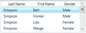
ListView
<ListView SelectedIndex="0" Height="110"
    ItemsSource="{StaticResource Characters}">
  <ListView.View>
    <GridView>
      <GridViewColumn Width="100"
        DisplayMemberBinding="{Binding Last}"
        Header="Last Name" />
      <GridViewColumn Width="100"
        DisplayMemberBinding="{Binding First}"
        Header="First Name" />
      <GridViewColumn Width="60"
        DisplayMemberBinding="{Binding Gender}"
        Header="Gender" />
    </GridView>
  </ListView.View>
</ListView>
 
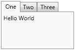
TabControl
<TabControl Width="150" Height="100">
  <TabItem Header="One">
    <TextBlock>Hello World</TextBlock>
  </TabItem>
  <TabItem Header="Two" />
  <TabItem Header="Three" />
</TabControl>
 
ToolBar
<ToolBar Margin="2">
  <Button Command="ApplicationCommands.Open"
      Height="40" Width="40"
      Background="{StaticResource OpenIcon}" />
  <Button Command="ApplicationCommands.Save"
      Height="40" Width="40"
      Background="{StaticResource SaveIcon}" />
</ToolBar>
 
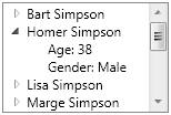
TreeView
TreeViewItem
<TreeView Width="150" Height="100"
    ItemsSource="{StaticResource Characters}">
  <TreeView.Resources>
    <HierarchicalDataTemplate
        DataType="{x:Type src:Character}"
        ItemsSource ="{Binding Fact}">
      <TextBlock Text="{Binding Name}" />
    </HierarchicalDataTemplate>
    <DataTemplate DataType="{x:Type src:Fact}">
      <StackPanel Orientation="Horizontal">
        <TextBlock Text="{Binding Name}" />
        <TextBlock Text=": " />
        <TextBlock Text="{Binding Value}" />
      </StackPanel>
    </DataTemplate>
  </TreeView.Resources>
</TreeView>

A Control in its Own Right

The controls listed above are most often used because of the additional features they provide on top of the base ItemsControl class. However, it should also be noted that an ItemsControl may be instantiated and used directly, as shown in the following example:

<Grid xmlns:x="http://schemas.microsoft.com/winfx/2006/xaml"
    xmlns="http://schemas.microsoft.com/winfx/2006/xaml/presentation">
  <Grid.RowDefinitions>
    <RowDefinition Height="Auto" />
    <RowDefinition />
  </Grid.RowDefinitions>
  <ItemsControl VerticalAlignment="Top">
    <ItemsControl.ItemTemplate>
      <DataTemplate>
        <Button Command="{Binding}" Content="{Binding}"
          CommandTarget="{Binding ElementName=EditRegion}" />
      </DataTemplate>
    </ItemsControl.ItemTemplate>
    <ItemsControl.ItemsPanel>
      <ItemsPanelTemplate>
        <StackPanel Orientation="Horizontal" />
      </ItemsPanelTemplate>
    </ItemsControl.ItemsPanel>
    <x:Static Member="ApplicationCommands.Cut" />
    <x:Static Member="ApplicationCommands.Copy" />
    <x:Static Member="ApplicationCommands.Paste" />
  </ItemsControl>
  <TextBox Name="EditRegion" Grid.Row="1" />
</Grid>

This markup creates what you might call a poor man’s toolbar. (No, it’s not a very likely real-world scenario.) In future posts, we will explore reasons why you might choose to use an ItemsControl directly, rather than, say, a ListBox.

Is a Panel an ItemsControl?

No. The logical children of a panel are UIElements, whereas the logical children of an ItemsControl (its Items) can be any CLR objects.

Sidebar: So what is a panel? The main role of a panel is to provide layout support for its children. Although a panel does maintain a collection of child elements, it is not technically a WPF “control”… That is, it does not derive from the Control base class and it does not support the WPF notion of templating. Instead, it is a single element with a single purpose… namely, to size and position (a.k.a., measure and arrange) its children.

Why should I care about the ItemsControl class?

Since it’s such an abundant control, it will pay dividends to take time now to understand the basic principles that apply to the ItemsControl class and its descendants. Once you understand these concepts as they pertain to one ItemsControl variant, perhaps a ListBox, it will be very easy to apply that same knowledge to other variants.

And suppose you should someday stumble upon a declaration like this:

<dw:Graph ItemsSource="{Binding Source={StaticResource OrgChartItems}}"
    ItemContainerStyle="{StaticResource NodeStyle}"
    ItemTemplate="{StaticResource EmployeeTemplate}"
    ItemsPanel="{StaticResource TreeGraphPanelTemplate}" />

Armed with your existing knowledge, you won’t panic in the least. You will simply recognize that this Graph object is a custom ItemsControl and you will immediately understand how to use the majority of its features.

What will be covered?

In future posts in this series, I hope to cover each of the topics below in some detail. I’m sure this is not an exhaustive list, but it should give you a general feel for the direction of the series.

  • The Item Collection: Items vs. ItemsSource
  • Recognizing when to use an ItemsControl
  • Item Templates
  • Item Containers
  • Item Container Generation
  • The Items Host (or ItemsPanel)
  • Styling and Templating an ItemsControl
  • Traversing Container and Template Trees
  • The HeaderedItemsControl
  • Styling and Templating a Headered ItemsControl
  • Building a Custom ItemsControl and Item Containers
  • UI Virtualization

Please let me know what other topics you’d like me to add to the list. And please stay tuned for the next topic in this series… “B is for Bet You Can’t Find Them All!”

Can I bind my ItemsControl to a dictionary?

Sunday, September 16th, 2007

I’ve seen a number of forum posts lately expressing a desire for an observable dictionary.  Here are links to a couple of them:

Thread 1: Observable Dictionary, problem with Remove

Thread 2: Bind observable dictionary

As promised in my response to the latter thread, I am now providing a sample demonstrating how one might implement an observable dictionary.  You can download the sample here.

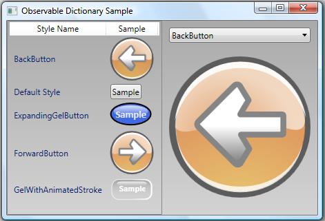
The Observable Dictionary Sample

In this sample, I demonstrate how to bind to a dictionary of button styles.  The styles are sorted based on their Key values in the observable dictionary.  (Clearly, this should be treated as a nonsensical illustration for demonstration purposes only.)

On the left side of the window is a ListView that is bound to the observable dictionary.  If you click an odd-indexed button in the ListView, its corresponding entry is removed from the dictionary.  If you click an even-indexed button, its entry is duplicated in the dictionary.

On the right side of the window is a ComboBox whose items are bound to the same dictionary.  Beneath the ComboBox is a Button whose style is bound to the selected value of the ComboBox.  If you click this button, the dictionary will be cleared and reloaded.

As you click around, you will notice that the bound controls respond appropriately to any changes in the observable dictionary.

So why would someone want to do this?

Dictionaries are easy to work with in code.  Perhaps you’ve already written an application that leverages a dictionary to store and retrieve in-memory data.  You may now want to provide a view of the dictionary entries in your user interface. 

Unfortunately, to provide a dynamic view of your dictionary data, you would need to do a lot of extra work.  Namely, you would need to write code to synchronize some observable collection with your dictionary whenever you modify it. 

Wouldn’t it be nice if the dictionary, itself, were observable?

The Observable Dictionary Class

What we clearly need is an “observable” dictionary class.  You will find an example of such a class in the ObservableDictionary.cs file in the provided sample.  What does it mean for a dictionary to be observable?  In WPF, an observable class is simply a collection class that provides change notifications whenever its collection changes.  It does this by implementing the INotifyPropertyChanged and INotifyCollectionChanged interfaces.  This allows it to serve as the “ItemsSource” of a collection control (like a ListBox, ComboBox, or any other ItemsControl).  These controls know how to monitor the collection for changes.

For a detailed explanation of how binding to a collection works, see the MSDN documentation.  Here is a good starting point.

So how do you implement an observable dictionary?

Dictionaries basically work by aggregating an internal collection of key-value pairs.  People often start by trying to derive a class from Dictionary<TKey, TValue> or by trying to implement IDictionary<TKey, TValue> in a class that aggregates a dictionary.  The idea is that they could then add the requisite INotifyPropertyChanged and INotifyCollectionChanged interfaces and have an observable dictionary.

There’s a major problem with this approach.  Observable collections are indexed by integer.  In order to fire the necessary collection change notifications, you must know the index of an entry when it changes.  Unfortunately, none of the interfaces exposed by the Dictionary<TKey, TValue> class are indexed by integer.  And if you derive directly from Dictionary<TKey, TValue>, you do not have access to the underlying collection.  As a result, an attempt to create an observable dictionary by deriving from or aggregating a dictionary won’t work.

To truly create an observable dictionary, you need to aggregate your own collection (usually of type KeyedCollection<TKey, TValue>).  Then you must implement a whole slew of interfaces on top of the collection, as shown in the following class declaration:

    public class ObservableDictionary <TKey, TValue> :
        IDictionary<TKey, TValue>,
        ICollection<KeyValuePair<TKey, TValue>>,
        IEnumerable<KeyValuePair<TKey, TValue>>,
        IDictionary,
        ICollection,
        IEnumerable,
        ISerializable,
        IDeserializationCallback,
        INotifyCollectionChanged,
        INotifyPropertyChanged

By implementing all of the above interfaces, you ensure that your dictionary class can be used interchangeably with the CLR’s Dictionary class.  You should only need to change the declaration from Dictionary<TKey, TValue> to ObservableDictionary<TKey, TValue> in your code.

Pros and Cons

The benefit to using an observable dictionary, of course, is that the dictionary can serve as the ItemsSource for a databound control and you can still access the dictionary in code the same way you access any other dictionary.  It is truly an indexed dictionary of objects.

There are certainly some limitations inherent in the very idea of making a dictionary observable.  Dictionaries are built for speed.  When you impose the behaviors of an observable collection on a dictionary so that the framework can bind to it, you add overhead.

Also, a dictionary exposes its Values and Keys collections through separate properties of the same name.  These collections are of types Dictionary<TKey, TValue>.ValueCollection and Dictionary<TKey, TValue>.KeyCollection, respectively.  These CLR-defined collections are not observable.  As such, you cannot bind to the Values collection or to the Keys collection directly and expect to receive dynamic collection change notifications.  You must instead bind directly to the observable dictionary.

The Observable Sorted Dictionary Class

Another thing to note is that a dictionary doesn’t typically store its data in a deterministic order.  When binding to an observable dictionary, you cannot simply apply a sort order via a CollectionView because the exposed interfaces do not support sorting.  For this reason, I include an ObservableSortedDictionary class in the attached sample.

Binding to an Observable Dictionary

When you bind to an observable dictionary, you are really binding to a collection of KeyValuePair objects. A KeyValuePair is an object which makes the entry’s key available via an appropriately named Key property and its value available via a Value property.  Your item templates must take this into consideration and provide the appropriate binding paths.  The provided sample illustrates how to do this.

All the Standard Caveats Apply

As always, this sample is provided “as is”.  It has not been heavily tested and there are probably lots of improvements that could be made.  Use it and modify it as you see fit.  Let me know how it works for you, what improvements you make, what bugs you find, etc.

Cheers,
Dr. WPF