ItemsControl: 'E' is for Editable Collection

October 20th, 2008

Dear Dr. WPF,

As of late, a serein has come upon me in the world of wpf and databinding, hence I’m writing to you in my desperate search for some kind of remedy before there will be a hey rube.

Whilst having an ObservableCollection of “Person” objects, and creating a collectionview for this and also adding a SortDescription on a “Name” property on the “Person” object, I noticed that if I change the “Name” property on one of the objects (they are shown in a listbox, having the “Name” property databound to a textblock), and thereafter calling Refresh() on the CollectionView, the refresh will actually take more than a second with only about 50 items.

Ok, if I measure the call to Refresh() it doesn’t take more than 100 ms or so, but like the call sets in motion alot of other things that will happen after my method has exited, which is understandable since the documentation states that the whole view is recreated and therefore I assume the whole tree of items of the visualtree concerned is re-created too.

If I instead just remove the item, and just re-insert it, it’s as close as I can get to instantaneous. perfect! BUT! Since I’m a quidnunc I won’t be satisfied with this! So I’m asking the great Dr, that has given us all such great in depth knowledge in the past, what can we do about this in a more generic fashion? Can we speed up the “Refresh()” somehow? What would you suggest I do if I have a collection of a type that I don’t know about at compile time? How can I remove / add an item then!

Or am I simply lost in my path to enlightenment ?

I shall not dissert anymore, but hope to hear from the good Dr, perhaps in a blogpost touching this subject as I feel it to be of greater interest to the public health in the land of wpf.

Best regards,
Patient-X


Dear Patient-X,

I’ve been wondering what I could file under the letter ‘E’ in this series, and now you’ve afforded me the perfect opportunity! 🙂

No, you are not lost in your path to enlightenment. The true path will lead you to a new feature in .NET 3.5 SP1 called an “editable” collection view. More on that momentarily… First, let’s examine exactly what is happening in your scenario.

Understanding the ListCollectionView Class

You are binding to a list of items. More specifically, you are binding to a collection of Person objects (namely an ObservableCollection<Person>) that, in turn, implements the IList interface. The binding engine will automatically generate a ListCollectionView for such a collection. The ListCollectionView class provides support for sorting, grouping, and filtering your collection when it is the ItemsSource for an ItemsControl. (See ‘C’ is for Collection for more information.)

For the purposes of this discussion, let’s look at a similar scenario using the following collection of Character objects (borrowed from ‘I’ is for Item Container):

    <src:CharacterCollection x:Key="Characters">
      <src:Character First="Homer" Last="Simpson"
          Gender="Male" Image="images/homer.png" />
      <src:Character First="Marge" Last="Bouvier"
          Gender="Female" Image="images/marge.png" />
      <src:Character First="Bart" Last="Simpson"
          Gender="Male" Image="images/bart.png" />
      <src:Character First="Lisa" Last="Bouvier"
          Gender="Female" Image="images/lisa.png" />
      <src:Character First="Maggie" Last="Simpson"
          Gender="Female" Image="images/maggie.png" />
    </src:CharacterCollection>

To demonstrate grouping and sorting for our collection, we can define a CollectionViewSource object in markup, as shown below:

    <CollectionViewSource x:Key="CharacterCollectionView"
        Source="{Binding Source={StaticResource Characters}}">
      <CollectionViewSource.GroupDescriptions>
        <PropertyGroupDescription PropertyName="Gender"/>
      </CollectionViewSource.GroupDescriptions>
      <CollectionViewSource.SortDescriptions>
        <cm:SortDescription PropertyName="First" />
      </CollectionViewSource.SortDescriptions>
    </CollectionViewSource>

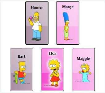
When this CollectionViewSource is set as the ItemsSource of a ListBox, it will yield a view of the collection (namely, a ListCollectionView) in which the characters are grouped by gender and sorted by first name. Here is what the ListBox declaration might look like:

  <ListBox Name="lb" HorizontalAlignment="Center" VerticalAlignment="Center"
      ItemsPanel="{StaticResource HorizontalItemsPanel}"
      ItemsSource="{Binding Source={StaticResource CharacterCollectionView}}"
      ItemContainerStyle="{StaticResource CharacterContainerStyle}">
    <ListBox.GroupStyle>
      <GroupStyle Panel="{StaticResource HorizontalItemsPanel}" />
    </ListBox.GroupStyle>
  </ListBox>

The image below depicts our ListBox with grouping and sorting.

You can download the sample for this post to see the complete item template, item container style, and group item style.

Dynamically Updating Items is Problematic

Ideally, applying a sort order to a CollectionView would result in a grouped and sorted view of the collection that is fully maintained even when items within the collection are changed. Unfortunately, a ListCollectionView only groups and sorts its items when the view is first created (or when new items are added to the source collection, assuming that the source collection is observable). A ListCollectionView will *not* monitor changes to properties on each existing item within the collection.

For example, if you execute code at runtime to dynamically change Bart’s name to “Mandy”, the ListCollectionView will be unaware of that change and the item will not appear in its proper sorted location after the change. Furthermore, if Bart finally gets the operation he deserves (and secretly desires) and his gender is updated accordingly, the changed item will not move to its proper group. Here is some simple code to perform these changes:

    Character bart = lb.Items[0] as Character;
    bart.First = "Mandy";
    bart.Gender = Gender.Female;

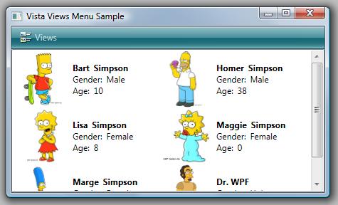
The image below depicts the sorting and grouping errors that are present after these changes:

Note, that the item template did indeed update according to the name and gender change (because the Character object raises the appropriate change notifications for these properties), but the ListCollectionView did not update its view of the items. As a result, the changed item is no longer in the correct sort location or group.

Refreshing a CollectionView

If you are using .NET 3.5 or earlier, you can force a CollectionView to be updated at runtime by calling its Refresh() method. Then the items will once again be properly grouped and sorted. Here is a routine that includes the Refresh() call:

    Character bart = lb.Items[0] as Character;
    bart.First = "Mandy";
    bart.Gender = Gender.Female;
    (lb.ItemsSource as ListCollectionView).Refresh();

After calling Refresh(), the modified character now appears in the correct group and sort location, as shown here:

Unfortunately, the Refresh() method results in a complete regeneration of the view. It is a rather drastic operation, to say the least. Furthermore, when a Refresh() occurs within the view, it raises a CollectionChanged notification and supplies the Action as “Reset”. The ItemContainerGenerator for the ListBox receives this notification and responds by discarding all the existing visuals for the items. It then completely regenerates new item containers and visuals. (See ‘I’ is for Item Container and ‘G’ is for Generator for more information on item containers and container generation.) Again, this is a drastic (and often very expensive) operation.

Increasing Refresh Performance is Difficult

You raised the question, “Can we speed up the “Refresh()” somehow?”

Unfortunately, the very nature of the refresh operation makes this difficult. For the mundane reasons, keep reading… otherwise, feel free to skip ahead to A Better Option.

Theoretically, you could derive your own custom collection view from the ListCollectionView class and override its Refresh() method. Then you could perhaps implement a routine that intelligently regenerates the view in a minimalistic manner by comparing the source collection to the view collection.

Such a routine would need to move existing items to their new locations in the view, add items that were not previously present, and remove items that should no longer be present. All of these changes would need to be made per the view’s sorting, grouping, and filter criteria. For each change, the view would need to raise a very specific CollectionChanged notification (Add, Remove, or Move) for consumption by the ItemContainerGenerator of the owning ItemsControl.

Not only would such a synchronization routine be complex, but it is also likely to be even more expensive than simply resetting the entire collection. There will be some number, n, where discrete Add, Remove, and Move change notifications for n or fewer changes is indeed more performant than a single Reset notification. Unfortunately, it will be very difficult to heuristically determine the appropriate value for n.

A Better Option: Remove and Re-Add

A better approach, especially if you are stuck on pre-3.5 SP1 bits, is to do precisely what you describe in your email. Namely, do not call Refresh() at all, but instead, remove the target item from the observable collection, modify its properties, and then re-add it to the collection, as shown here:

    Character bart = lb.Items[0] as Character;
    CharacterCollection characters = FindResource("Characters") as CharacterCollection;
    characters.Remove(bart);
    bart.First = "Mandy";
    bart.Gender = Gender.Female;
    characters.Add(bart);

The ListCollectionView will detect the removal of the old item and raise the appropriate Remove notification so that the ItemContainerGenerator can remove the associated container and visuals. It will also detect the addition of the modified item and insert it at the correct location within its view of the source collection (again, per the grouping, sorting, and filter criteria). Then it will raise the necessary Add notification so that a new item container and item visuals can be generated.

This solution is obviously not perfect! One problem that may not be immediately evident is that adding and removing an item from the source collection effects the ListCollectionView’s notion of currency (“current item”). For example, if the Bart character was the current item before it was removed from the collection, that state will be lost. If this is important to your scenario, you must add additional code around the remove/re-add routine to save and restore currency.

An Even Better Option: IEditableObject

As mentioned earlier, .NET 3.5 SP1 enables an even better approach that solves many of the problems present in the Refresh() and Remove/Re-Add solutions. Namely, it allows you to implement an IEditableObject interface on your datamodel objects (or on your viewmodel objects, if you are using the model-view-viewmodel pattern). This new interface allows for transactional changes (edit, cancel, and commit) on the object.

The framework supports the transactional model by implementing another new interface called IEditableCollectionView on the existing list-based CollectionView classes (ListCollectionView and BindingListCollectionView). This interface works in conjunction with collection items that implement the IEditableObject interface.

In this new approach, when you need to change an item, you can first call the EditItem() method of the collection view, then make the required changes to the item, and finally, call the CommitEdit() method of the collection view. If you decide that you don’t want to commit the changes, you can call the CancelEdit() method of the collection view.

It is worth noting that the ItemCollection class also implements the IEditableCollectionView interface. Since the Items property of an ItemsControl is of type ItemCollection (see ‘C’ is for Collection), it provides handy access to the methods of IEditableCollectionView. As long as you know the source collection is an IList, you can safely call the IEditableCollectionView methods directly on the Items property and the ItemCollection class will delegate the call to the appropriate underlying collection view.

How it Works

In practice, the properties of an “editable” object will rarely be updated directly in code behind. Rather, these properties will be updated via bindings to properties on controls within the UI.

In WPF, it is fairly common to present data using a “view template”. Such a template will often present a readonly view of the data using elements like TextBlock, Image, etc. Then, when it is necessary to edit the data, the view will switch to an “edit template” that contains editable controls like TextBox, ComboBox, CheckBox, etc.

The IEditableObject interface provides three transactional methods: BeginEdit(), CancelEdit(), and EndEdit(). I prefer to expose an additional readonly property on the editable object called IsInEditMode that can be used as a trigger for swapping between the view template and the edit template.

Below is my typical implementation of IEditableObject, as it would be implemented on the Character class in our example:

    #region IEditableObject support

    public Character _cachedCopy = null;

    public void BeginEdit()
    {
        // save object state before entering edit mode
        _cachedCopy = new Character();
        _cachedCopy._first = _first;
        _cachedCopy._last = _last;
        _cachedCopy._image = _image;
        _cachedCopy._gender = _gender;

        // ensure edit mode flag is set
        IsInEditMode = true;
    }

    public void CancelEdit()
    {
        // restore original object state
        if (_cachedCopy != null)
        {
            First = _cachedCopy._first;
            Last = _cachedCopy._last;
            Image = _cachedCopy._image;
            Gender = _cachedCopy._gender;
        }

        // clear cached data
        _cachedCopy = null;

        // ensure edit mode flag is unset
        IsInEditMode = false;
    }

    public void EndEdit()
    {
        // clear cached data
        _cachedCopy = null;

        // ensure edit mode flag is unset
        IsInEditMode = false;
    }

    private bool _isInEditMode = false;
    public bool IsInEditMode
    {
        get { return _isInEditMode; }
        private set
        {
            if (_isInEditMode != value)
            {
                _isInEditMode = value;
                RaisePropertyChanged("IsInEditMode");
            }
        }
    }

    #endregion

Download the Sample

You can download the complete sample for this post to see the IEditableObject and IEditableCollectionView interfaces in action. When you run the sample, simply double-click an item (or press F2) to enter edit mode.

If you do not wish to commit your changes, press Escape. If you do wish to commit your changes, press Enter or simply select another character. When the changes are committed, you will notice that the item immediately moves to its proper location within the view.

Is IEditableObject Absolutely Required?

You posed the question, “What would you suggest I do if I have a collection of a type that I don’t know about at compile time?”

First, I would advise you to avoid that situation if at all possible. The model-view-viewmodel pattern typically involves wrapping or replicating items (and collections) of known types within observable classes (classes that provide change notifications like INotifyPropertyChanged and INotifyCollectionChanged) and adding additional interfaces (like IEditableObject) to either the data model objects or the viewmodel objects to allow them to play nicely with the view. That is always my preferred approach.

Having said that, there are certainly times when you may not have the option of modifying the entity within your collection. If you simply cannot add the IEditableObject interface to the data model or viewmodel class, you needn’t fret. The IEditableCollectionView interface is still your friend (as long as you are targeting .NET 3.5 SP1, of course). You won’t get all of the transactional goodness of IEditableObject, but you can still call EditItem() followed by CommitEdit() to update the view’s notion of a specific item.

Consider the earlier example where the characters were not correctly sorted or grouped after changing Bart’s name and gender. It turns out that you can simply add the lines below to cause that specific item to be moved to the correct location within the view:

    Character bart = lb.Items[0] as Character;
    bart.First = "Mandy";
    bart.Gender = Gender.Female;
    (lb.Items as IEditableCollectionView).EditItem(bart);
    (lb.Items as IEditableCollectionView).CommitEdit();

Voîla! There is no longer a need to explicitly refresh the entire view!

Order now and receive these bonus gifts!

The downloadable sample included with this post covers the specific questions posed by Patient-X, but there is more to IEditableCollectionView. It also provides a convenient way to add and commit new items to the source collection. You can even use it to remove existing items from the source collection. By leveraging members of the IEditableCollectionView interface for such changes, you can ensure that your view of the collection will remain accurate with respect to grouping, sorting, and filtering.

To see some of the other features of IEditableCollectionView, check out Vincent Sibal’s introduction to IEditableCollectionView, He also includes a nice code sample with his post.

Cheers,
Dr. WPF

P.S. For anyone who is hoping to get a published response to a WPF question, you should note (as Patient-X has) that the doctor is easily manipulated by wordsmithery. If you use lots of obscure terms like serein and hey rube, there is a much greater chance you will receive a public response, as it appeals to my invented persona’s inflated sense of perspicacity! 😉

My WPF Code Snippets… now available for Visual Basic

September 22nd, 2008

I first published my C# WPF code snippets last December in this post.  Due to increasing demand for VB versions of these snippets, I spent this past weekend porting them to VB.  They are now available for both languages. You can download the snippet installer here.

Updated October 1, 2008: 

I just updated the snippets to play nicely with the Strict option in VB.  Grab the latest installer to get a version of the VB snippets that properly casts the result of the CLR get accessors based on the DP type.

All 65 snippets are supported in both C# and VB.NET now.  The shortcuts for the VB versions are slightly different because the VB code editor does not provide the same level of support for snippets as the C# editor  (see rant below). 

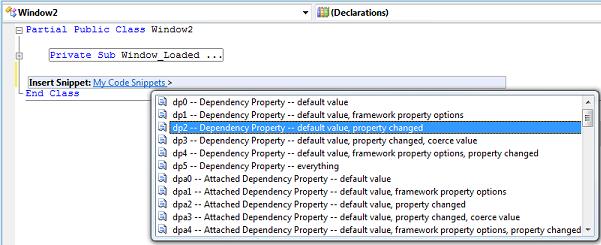
In VB, for example, you cannot just type "dp" and hit tab twice to get a list of my dependency property snippets.  Instead, you must type the entire unique shortcut (e.g., "dp2") and then hit tab to expand that specific snippet.  It is probably easier to install all of the snippets within a single category (like "My Code Snippets") and then select the desired snippet from a list, as shown here:

I hope the VB snippets are helpful to a few of you!  Let me know if you find any problems with the ported code.

Cheers,
Dr. WPF

Small Rant Regarding VB Snippet Support

In my earlier post, I talked about how I am looking forward to a day when Visual Studio code snippets will support more advanced macro-like functionality.  After spending some time working with snippets in VB, I realize just how lucky I am to work primarily in C#.  On a scale of Classic Pong to XBox 360, the C# snippet support is probably somewhere around a PS2, whereas the VB.NET snippet support is barely a Nintendo 64!

Come on, Microsoft…  show a little love for that monster base of VB developers you created in the 90’s!  At a minimum, at least give them snippet parity with C#.  Here are a few of my complaints:

  • Intellisense should provide snippet hints.
  • The user should not have to tab through every field in the snippet… just the unique fields.
  • There should be support for functions like ClassName().
  • The $end$ tag should be supported.
  • Pressing ‘Enter’ should take the snippet out of edit mode and place the cursor at the $end$ tag.
  • If there are multiple snippets with the same shortcut, typing the shortcut should provide a filtered list of descriptions for the matching snippets.

Okay, I’m sure most VB developers know how to deal with all these limitations, and since I’m not really part of that constituency, my voice probably doesn’t hold much sway in this argument…  so I’m done now.  Enjoy the snippets!

Ten reasons to check out the new Blendables Layout Mix

September 19th, 2008

Yes, this is a plug for some new WPF goodness from a third party. If you’re simply not interested in third-party products, you can stop reading now. 🙂

The good folks at IdentityMine have just released two new “mixes” of WPF controls under their blendables brand (as well as an updated version of their essentials mix). Both of the new products deal with layout… one targets 2D layout and one targets 3D layout. I haven’t played much with the 3D mix yet, but I have tinkered with the CTP version of the 2D layout mix quite a bit and it contains some definite WPF goodness. For those who are interested in seeing these products in action, a free trial version can be downloaded from blendables.com, including a suite of samples.

Partial Disclosure

Some have insinuated that I might be in the employment of the aforementioned IdentityMine. It is my policy to neither confirm nor deny any speculation regarding Mine Identity, but to instead encourage all rumors both near fetched and far (and I’ve heard some good ones!). Meanwhile, I try to keep my blog focused on WPF goodness, and there is definitely plenty in the newest products from IdentityMine.

In the interest of partial disclosure, I must admit that I know some members of the IdentityMine team, and depending on my mood, I might even call them friends. They may or may not have encouraged me to review the product. They certainly did not give me any remuneration for doing so! (C’mon… shouldn’t I at least get a free copy, guys? ;))

Now for the WPF goodness…

1. Animation Panels

The layout mix includes more than a dozen panels that can be used for laying out your WPF UI. These are not just ordinary panels though. They all derive from a custom AnimationPanel base class. This base class provides support for animating children of the panel to their appropriate sizes and positions. As such, if you resize a wrap panel, for example, the children will automatically animate to their new layout positions. The type and behavior of the animation is easily configured (or even disabled, if desired).

2. Full Set of Native Panels

The blendables layout mix includes its own implementation of the most common native WPF panels (Canvas, StackPanel, WrapPanel, DockPanel, and Grid). These panels work exactly like their native counterparts, but since they derive from AnimationPanel, they bring all of the animation goodness to the table.

3. Some Cool New Panels

In addition to the native panels, there are some cool new panels including AnimatedTimelinePanel, AutoStretchStackPanel, CameraPanel, Carousel, RadialPanel, RandomPanel, RelativeCanvas, and StackedStackPanel. Some of these are self explanatory. For those that are not, I’d encourage you to look at the samples included with the layout mix to see them in action. Again, all of these derive from the AnimationPanel base class and provide support for all the animation features in the product.

4. Enter and Exit Animations

One of the questions I receive a lot is, “How do I add enter and exit animations to items in my databound ItemsControl?” The answer is always that enter animations are easy, but exit animations are rather tricky. Once an item is removed from the databound collection, its corresponding visuals are automatically removed from the element tree. This means that there is nothing left to animate out.

The blendables layout mix magically solves this problem by coordinating the lifetime of its children on your behalf. All you have to do is set the ExitAnimator, ExitAnimationRate, and ExitTo properties (or optionally handle the ChildExiting event and set an exit location in your handler). There are similar properties for simplifying enter animations.

5. Layout-to-Layout Animations

Another big question since the introduction of the WPF platform is, “How do I implement layout-to-layout animations?” Again, this is not easily done using the native panels because a child element can only have a single parent. There is no way to animate a child from one parent to another. I describe the typical way of simulating layout-to-layout animations in this article.

The Layout Mix offers the first real solution to the layout-to-layout problem by introducing a new panel called SwitchPanel. This panel exposes a Layouts collection which can contain any number of the other animation panels. At any given moment, one layout is active. To switch to another layout, simply change the ActiveLayoutIndex property. The children of the SwitchPanel will automatically animate to their new positions as determined by the new active layout. The animation is configurable via the SwitchAnimator and SwitchAnimationRate properties. This is very cool!

6. Layout-Specific Templates

Each layout specified in the Layouts collection of a SwitchPanel can have its own associated data template. This is really handy when using the SwitchPanel as the items host for an ItemsControl. You simply set the SwitchTemplate property on the animation panel. When that layout becomes active, any SwitchPresenter element within the subtree will be represented using the visuals in the specified SwitchTemplate.

7. Penner Easing Equations

The layout animations, enter and exit animations, and switch animations all leverage a simplified animation model. You simply set the appropriate “Animator” property using what is referred to in the product as an “iterative animator”. This is simply a frame-based animation class that is used to animate from one value to another value over a given duration or at a specified rate.

The cool thing about the iterative animator approach is that it easily supports Robert Penner’s easing equations to drive the animators. The Penner equations are familiar and appealing to designers that come from the flash world. Both the layout mix and the 3D mix provide the full set of Penner equations via a static PennerEquations class and the equations can easily be referenced by name in markup. It looks like this:

<blendables:WrapPanel LayoutAnimator="BounceEaseIn" ... />

8. Extensible Animation Model

You can define your own iterative animators too. I noticed that the layout mix includes support for all the equations created by Robert Penner, himself. For example, it contains all 3 of the “bounce” equations: BounceEaseIn, BounceEaseOut, and BounceEaseOutIn. However, other developers have gone a step further and defined a BounceEaseInOut version, as shown in this google code project.

I was able to create a similar animator for use in the layout mix by defining my own iterative equation:

public class BounceEaseOutInEquation : IterativeEquation<double>
{
    public override double Evaluate(TimeSpan currentTime,
        double from, double to, TimeSpan duration)
    {
        return ( currentTime.TotalSeconds < duration.TotalSeconds / 2 )
            ? PennerEquations.BounceEaseOut.Evaluate(currentTime, from, to, duration)
            : PennerEquations.BounceEaseIn.Evaluate(currentTime, from, to, duration);
    }
}

Then, I simply needed to define a DoubleAnimator class that used my iterative equation:

public class BounceEaseOutInAnimator : DoubleAnimator
{
    public BounceEaseOutInAnimator()
        : base(new BounceEaseOutInEquation()) {}
}

To specify my animator for use in an animation panel, I simply define an instance of the animator class as a resource and refer to it using a StaticResource reference, as shown here:

<Page.Resources>
  <src:BounceEaseInOutAnimator x:Key="BounceEaseInOut" />
</Page.Resources>
  <blendables:SwitchPanel SwitchAnimator="{StaticResource BounceEaseInOut}" ... />

9. Extensible Panel Model

Not only is the animation model extensible, but the panel model itself is also easily extended. Writing a custom animation panel is very similar to writing any other WPF panel. In fact, I was able to transform several of my own panels into animation panels very quickly with only a few minor changes. First, instead of deriving from Panel, I derived from AnimationPanel. Then, instead of overriding MeasureOverride() and ArrangeOverride(), I overrode MeasureChildrenOverride() and ArrangeChildrenOverride(). Within the latter function, instead of calling the Arrange() method on each child, I called the ArrangeChild() method of the base class and supplied the child as a parameter. Voîla! I had a custom animation panel.

10. SimpleBinding and EvalBinding

Some who have seen my responses in the WPF Forum may have noticed that I’m a big fan of a feature called EvalBinding that was part of the blendables essentials mix when it released a couple of years ago. I’m happy to see that you also get the SimpleBinding and EvalBinding markup extensions as part of the layout mix (and even the 3D mix).

EvalBinding lets you include code expressions in markup as part of a binding. For the nitty gritty details, you can check out the EvalBinding whitepaper on the blendables site.

One year ago today…

August 13th, 2008

… Dr. WPF was born!

(Yes, I am a year old now… but I like to think of myself as a very mature 1 year old!)

I can’t really think of anything technical to say, but I didn’t want this day to go by completely unacknowledged because it’s been such a great year, so forgive the rather “social” post.

When I dawned donned (thanks mike! :)) my imaginary stethoscope and entered the WPF healing scene (with this post) a year ago, I had no idea what a vibrant community I was entering!  I hope I’ve at least helped a few folks along in their quest to conquer WPF — the coolest client platform ever created!

I want to say a sincere thanks to my WPF community cohorts who have made this adventure a ton of fun thus far! 🙂

In addition to hanging out virtually with WPF disciples, I get quite a few emails each week with WPF questions.  I certainly try to respond to as many as possible (although the last several months have been super busy, so I apologize to anyone I’ve missed).  It’s encouraging to see how many people are doing cool stuff with WPF.  I originally thought I would be posting more answers publicly, but due to time constraints and the specific nature of the questions lately, I often just find myself responding via email.  But it’s all good.

Please keep these questions coming.  If you have general questions, you should definitely post them in the WPF forum first, as you will likely get a response much quicker.  But if you don’t get an answer, send me a query and I’m happy to help where I can.  And I know I’ve been absent from the forum for a while, but hopefully my schedule is going to allow me to hang out there a bit more in the near term.

I’ll just leave you with a couple of my favorite posts that people have sent me regarding “Dr. WPF”, the character.  (I don’t know why, but things like this make me really happy.)

Lots of great info. No offense to the Dr, but the formatting and layout is a bit rough. I prefer to read this one in my RSS reader. (^) 

No offense taken!  Thanks for the kudos.  The Dr. kinda agrees with you on the formatting.  But hey, with so many great RSS readers out there… 😉

Dr. WPF’s blog entry on that bullshit is exactly why I hate blogs… This guy is worse than a thousand “hay i webprogram blogs” trolls. (^)

Okay… the Dr. doesn’t really get it… but it certainly made him smile!  😀

Any more of these?  Please send me links!  Afterall, if you can’t laugh at your imaginary self, who can you laugh at?

And for anyone who really needs something technical to chew on, note that the .NET 3.5 SP1 documentation is now live on MSDN.  Go crazy!

Airspace Shmairspace

August 11th, 2008

With today’s release of .NET 3.5 Service Pack 1, a whole new level of support for DirectX interop is now possible in WPF.  Using the new D3DImage feature in WPF, a custom DirectX scene can now be composed with a WPF scene without the irritating airspace restrictions from medieval days of yore.  🙂

To help developers get started with D3DImage, I have published the following article on Code Project:

     Introduction to D3DImage

This truly is a cool new feature and definitely worth a look! 

ItemsControl: 'G' is for Generator

July 20th, 2008

In ‘I’ is for Item Container, we learned that each item within an ItemsControl is represented by visuals hosted within a container element. The type of this “item container” is specific to the type of the ItemsControl. For example, the container for an item in a ListBox is the ListBoxItem element. Similarly, the container for an item in a ComboBox is the ComboBoxItem element. (A complete list of the native ItemsControl classes and their respective item containers can be found at the end of ‘I’ is for Item Container.)

In this episode, we examine the mechanism by which item containers come into existence.

Where did these containers come from?

In the previous examples in this series, the item containers have mysteriously (or perhaps magically) been created without our knowledge. All we typically do is set a binding on the ItemsSource property for the control. Consider the following ListBox example (again, from ‘I’ is for Item Container):

<ListBox ItemsSource="{Binding Source={StaticResource Characters}}"
    ItemContainerStyle="{StaticResource CharacterContainerStyle}">
  <ListBox.ItemsPanel>
    <ItemsPanelTemplate>
      <Canvas />
    </ItemsPanelTemplate>
  </ListBox.ItemsPanel>
</ListBox>
 

We know that each item in the ListBox is contained within a ListBoxItem. What we don’t know is who created that ListBoxItem. It is logical to assume that the ItemsControl, itself, created the ListBoxItems, but as we’ll see moving forward, this is not the case.

Introduction to the ItemContainerGenerator class

It turns out that every ItemsControl has its own instance of an ItemContainerGenerator object. This generator is accessible via an appropriately named ItemContainerGenerator property.

As the class name implies, an ItemContainerGenerator provides methods by which item containers can be generated for items within an ItemsControl. Specifically, an ItemContainerGenerator knows how to create a container and link it to the item it will contain. It also knows how to remove a container that is no longer needed. Finally, the ItemContainerGenerator class contains several invaluable methods for mapping existing items within an ItemsControl to their containers and vice versa.

Who really holds the reigns of the generator?

An ItemContainerGenerator knows how to create a container and link it to an item, but who actually gets to decide when this container generation occurs? You might think that the generator, itself, should get to decide when to do its job, but actually, it intentionally remains “hands off” in these matters.

The ItemContainerGenerator does, however, monitor the collection view of its associated items collection (via a weak event listener for the INotifyCollectionChanged events). It uses the change notifications to know when to unlink an existing container from an item that is removed, but it never makes a decision on its own to generate a container for an added item. It just quietly maintains a record of all the items within the collection so that it is poised to create a container at a moment’s notice.

If it’s not the ItemContainerGenerator, then it must be the ItemsControl, right? Well, no, the ItemsControl does not directly generate the containers either, but it definitely plays some key roles in the process. Namely, it creates and owns the “generator” of containers (the ItemContainerGenerator instance) and it gets to decide the type of containers that will be created.

Okay, then who else could possibly be responsible for deciding when containers will be generated?

If you’ve been following this series for a while, it should be pretty obvious that neither the ItemsControl nor the ItemContainerGenerator can be the sole decision makers in the process because the ItemsControl class supports something called UI virtualization (wherein only visible UI elements are instantiated and added to the element tree).

In ‘P’ is for Panel, we learned that the items host (a.k.a., the items panel) of an ItemsControl is dynamic. As such, there is no way for the ItemsControl or its ItemContainerGenerator to generically know when containers will be visible. Clearly, the items panel must be directly involved in container generation. After all, the item containers are direct visual children of the items panel. Since the panel knows precisely where to place these children, it is very logical that it would be the one holding the proverbial reigns of the ItemContainerGenerator and telling it when to generate the containers.

How does the generator know what type of container to generate?

When it is time to generate a container, you might be wondering how the ItemContainerGenerator knows what type of object to instantiate. Well, really, it doesn’t know at all. Each ItemsControl gets to specify its own type of item container. The generator simply defers this container creation to its associated ItemsControl by calling its GetContainerForItem() method. This method is responsible for creating and returning a new container for an item.

What happens if the item is already the same type as the container?

We’ve previously looked at examples like the following in which a ListBoxItem is added directly to a ListBox:

<ListBox SelectedIndex="0" Width="100">
  <ListBoxItem>Item 1</ListBoxItem>
  <ListBoxItem>Item 2</ListBoxItem>
  <ListBoxItem>Item 3</ListBoxItem>
  <ListBoxItem>Item 4</ListBoxItem>
  <ListBoxItem>Item 5</ListBoxItem>
</ListBox>

You may be wondering what the ItemContainerGenerator does in this case, since the item, itself, is already a container. Will it create a new ListBoxItem as the container for the specified ListBoxItem? The answer is no, it will not. Before the ItemContainerGenerator creates a new container, it first checks to see whether the item, itself, is already a container. It does this by calling the IsItemItsOwnContainer() method on the associated ItemsControl.

How can we specify our own container type for a custom ItemsControl?

Suppose we wish to create a custom ForceDirectedItemsControl class that will use a physics-aware items panel to host its children. To enable this scenario, we decide that each container will need to be an instance of a custom ForceDirectedItem class that will support the extra physics-based properties that control item layout in our custom panel (like friction, spring, repulsion, etc). How can we ensure that our custom ForceDirectedItemsControl class creates the ForceDirectedItem containers?

Well, it turns out that this is pretty easy… we just need to override two virtual methods in our ItemsControl class: IsItemItsOwnContainerOverride() and GetContainerForItemOverride().

The following is a typical implementation of a custom ItemsControl class with a custom item container:

  public class ForceDirectedItemsControl : ItemsControl
  {
      protected override bool IsItemItsOwnContainerOverride(object item)
      {
          return (item is ForceDirectedItem);
      }

      protected override DependencyObject GetContainerForItemOverride()
      {
          return new ForceDirectedItem();
      }
  }

Using the above class, when the ItemContainerGenerator is asked to generate a container for an item, it will first check to see if the item is already a ForceDirectedItem. If not, it will ask the ItemsControl to create a container by deferring to its GetContainerForItemOverride().

Caution: You should never assume there to be a constant tie between an item and its container. The GetContainerForItemOverride() method intentionally does not supply the item that will be hosted within the container. It is the responsibility of the ItemContainerGenerator to link an item to its container. When a virtualizing panel is hosting containers, it is common to link one item to a container and later link a completely different item to that same container. This provides a nice perf optimization.

How does UI virtualization work in an ItemsControl?

I previously promised that this episode would include a high level look at exactly how an ItemsControl supports this concept of UI virtualization. Feel free to skip ahead if you are not curious about the finer details of virtualization.

There are really only two noteworthy panel classes in the framework that take control of the ItemContainerGenerator and instruct it to generate containers: Panel and VirtualizingStackPanel.

Sidenote: There is actually a third native class, called ToolBarPanel, that uses the ItemContainerGenerator to generate items for a ToolBar. We won’t really spend any time looking at the ToolBar class in this series, since in many ways it breaks the traditional ItemsControl conventions. For more, see the note marked “**” at the end of ‘I’ is for Item Container.

The abstract Panel base class contains what we can consider the default container generation code for panels. This default logic is simply to generate containers for every item in the collection. So by default, there is no UI virtualization whatsoever.

The framework contains an abstract class called VirtualizingPanel which derives from Panel and then overrides the default container generation code to replace it with… well… nothing. So if you derive a panel from VirtualizingPanel, it will not generate any containers on its own. Instead, you will be responsible for implementing the code that leverages the ItemContainerGenerator to generate the containers.

There is only one virtualizing panel included in the early releases of the framework (.NET 3.0 and 3.5). It is called VirtualizingStackPanel. And if you paid attention to the chart at the end of ‘I’ is for Item Container, you know that VirtualizingStackPanel is the default items host for ListBox and ListView. So we get UI virtualization thrown in for free when we use these controls with their default items panel.

A VirtualizingStackPanel, like any other panel, is responsible for sizing and positioning its children (the item containers). As such, it knows exactly which children are visible within the viewport of the ItemsControl at any given time. It uses this knowledge to create, or “realize”, only the visible children (plus a few extra on either side of the viewport to enable keyboard navigation to work as expected). When a realized child is scrolled out of the viewport, the VirtualizingStackPanel queues that container to be removed, or “virtualized”, so that its resources can be reclaimed.

If you are writing a custom virtualizing panel, you will also need to implement the logic for realizing visible containers and virtualizing non-visible containers. Realization consists of generating the container (generator.GenerateNext()) and preparing it to host its item (generator.PrepareItemContainer()). Virtualization consists of removing the container (generator.Remove()).

We will go deeper into UI virtualization in a future article entitled ‘V’ is for Virtualization. In the meantime, if you are anxious to get started writing a virtualizing panel, you should check out Dan Crevier’s series on creating a virtualizing panel.

Tying It All Together

We’ve already covered many different aspects of an ItemsControl in this series and they all come into play in this process of item container generation. There is a very intricate dance involving an ItemsControl, its items host (‘P’ is for Panel), its Items collection (‘C’ is for Collection), and its ItemContainerGenerator (‘G’ is for Generator… this article). This dance results in the creation of item containers (‘I’ is for Item Container) that will host the items directly or host a visual representation of the items, as specified via an item template (‘D’ is for DataTemplate).

Finding Template Elements by Mapping Items to Containers

A very common question in the WPF Forum is, “How can I get a reference to a specific element in my item template at runtime?”

Sidenote: In most scenarios, you shouldn’t need to do this. Typically, the reason a person wants to do this is so they can programmatically change a property on some element in the template. If one carefully develops their view model (which will contain the data items represented within the ItemsControl), this type of property update can be handled via a binding to a property on a data item.

There are certainly a few scenarios where it is necessary to drill into an item’s visual subtree to get a specific element. For these scenarios, we can leverage a couple of nifty methods of the ItemContainerGenerator: ContainerFromIndex() and ContainerFromItem(). Once you have the container for the desired item, you can locate the element within its visual tree using a recursive routine like the GetDescendantByName() or GetDescendantByType() routines shown here:

  public static Visual GetDescendantByName(Visual element, string name)
  {
      if (element == null) return null;

      if (element is FrameworkElement
          && (element as FrameworkElement).Name == name) return element;

      Visual result = null;

      if (element is FrameworkElement)
          (element as FrameworkElement).ApplyTemplate();

      for (int i = 0; i < VisualTreeHelper.GetChildrenCount(element); i++)
      {
          Visual visual = VisualTreeHelper.GetChild(element, i) as Visual;
          result = GetDescendantByName(visual, name);
          if (result != null)
              break;
      }

      return result;
  }

  public static Visual GetDescendantByType(Visual element, Type type)
  {
      if (element.GetType() == type) return element;

      Visual foundElement = null;

      if (element is FrameworkElement)
          (element as FrameworkElement).ApplyTemplate();

      for (int i = 0;
          i < VisualTreeHelper.GetChildrenCount(element); i++)
      {
          Visual visual = VisualTreeHelper.GetChild(element, i) as Visual;
          foundElement = GetDescendantByType(visual, type);
          if (foundElement != null)
              break;
      }

      return foundElement;
  }
 

Finding the Container Associated with a Template Element

Similarly, there are times when you will want to handle an event on a specific template element and then locate the ancestor item container for the element. One option is to walk the ancestors looking for the element by type with the following GetAncestorByType() routine:

  public static DependencyObject GetAncestorByType(
      DependencyObject element, Type type)
  {
      if (element == null) return null;

      if (element.GetType() == type) return element;

      return GetAncestorByType(VisualTreeHelper.GetParent(element), type);
  }

Another perfectly viable approach is to leverage a little fact that we learned in ‘I’ is for Item Container… namely, that the DataContext of the container is the very item that it contains. In most scenarios, this same DataContext will be inherited by all framework elements within the item template. So you can typically cast the original source of the event to a FrameworkElement and use the DataContext property to get the item that is represented by the template. You can then use the ContainerFromItem() method of the ItemContainerGenerator to get the container.

Most of these tricks work great for a simple ItemsControl, but then get a little tricky with a HeaderedItemsControl like a TreeView or MenuItem. For these cases, I strongly recommend leveraging the view model, commanding, and bindings to handle property updates within the view and to respond to user actions within the view model. We’ll explore these things further in future episodes.

Dealing with Asynchronous Container Generation

Alright, clearly the ItemContainerGenerator class provides some very handy, and even essential, methods for mapping items to containers and vice versa. There is still one very important thing to add to the whole equation… that is the timing of container generation.

Suppose you have a ListBox named CharacterListBox bound to an observable collection named Characters. You might be tempted to write code like the following:

  private void AddScooby()
  {
      Character scooby = new Character("Scooby Doo");
      Characters.Add(scooby);
      ListBoxItem lbi = CharacterListBox.ItemContainerGenerator
          .ContainerFromItem(scooby) as ListBoxItem;
      lbi.IsSelected = true;
  }

This code will actually result in an exception because the lbi member will be null. The reason is that containers are generated in a separate dispatcher operation. As a result, simply setting the ItemsSource property or modifying the bound collection does not cause containers to be created immediately.

The key point here is that we must always think of container generation as an asynchronous operation. So how can we add an item and then safely locate its container after it has been generated? For this very purpose, the ItemContainerGenerator class provides a Status property along with change notifications for the status. If we need to programmatically access containers after they are generated, we can subscribe to the StatusChanged event, as shown in the following code:

  private void AddScooby()
  {
      _scooby = new Character("Scooby Doo");
      Characters.Add(_scooby);
      CharacterListBox.ItemContainerGenerator.StatusChanged
          += OnStatusChanged;
  }

  private void OnStatusChanged(object sender, EventArgs e)
  {
      if (CharacterListBox.ItemContainerGenerator.Status
          == GeneratorStatus.ContainersGenerated)
      {
          CharacterListBox.ItemContainerGenerator.StatusChanged
              -= OnStatusChanged;
          ListBoxItem lbi = CharacterListBox.ItemContainerGenerator
              .ContainerFromItem(_scooby) as ListBoxItem;
          if (lbi != null)
          {
              lbi.IsSelected = true;
          }
      }
  }

There are a couple of important things to notice about this code. First, the OnStatusChanged() method immediately checks the current status of the generator. This is important because the status could have changed to one of four different possible values: NotStarted, GeneratingContainers, ContainersGenerated, or Error. We should always specifically check for the status that we care about.

Second, as soon as the containers have been generated, the handler removes itself so that it will not be called when subsequent changes to the Items collection cause the generator’s status to change.

Bonus Tidbit: FindAncestor Bindings are Very Handy in Item Templates

This is really just an extra tidbit that I’m tagging onto this topic because of its usefulness. It is not really specific to container generation.

Recall that in ‘D’ is for DataTemplate, we learned how to provide a template of visuals to represent the items in an Items collection. When dealing with a Selector like ListBox, ListView, TreeView, etc, it is quite common to want to trigger a change in the visuals based on whether an item is selected. We now know that the concept of selection for these controls is based on the IsSelected property of their respective item containers. Any element in the item template can be bound to a property of the item container using a FindAncestor binding.

Below is a typical data trigger that might be found in a DataTemplate for an item within a ListBox:

<DataTrigger Binding="{Binding RelativeSource={RelativeSource FindAncestor,
    AncestorType={x:Type ListBoxItem}}, Path=IsSelected}" Value="True">
  <Setter Property="Foreground" Value="#A1927E" TargetName="tb" />
</DataTrigger>

Up Next

In the next episode of this series, I plan to examine the “lookless” nature of ItemsControls. Please stay tuned!

Leveraging Freezables to Provide an Inheritance Context for Bindings

May 22nd, 2008

Mike Hillberg has some great observations about WPF application architecture as it pertains to model interaction in his “Model See Model Do” post.  I am very much in agreement with Mike on this subject.

And let me also say that I’m very happy to see Mike posting a bit more on WPF recently.  🙂

There is another thing definitely worth highlighting in Mike’s latest post… In his code sample, he uses a little trick to ensure that bindings on his command and argument objects resolve correctly.  Namely, he derives them from Freezable:

    public class MethodArgument
        : Freezable // Enable ElementName and DataContext bindings

Normally, ElementName and DataContext bindings are resolved based on the target dependency object’s position within the element tree (or the namescope to which the target dependency object belongs).  But in this case, the target dependency object is not actually in the tree.  Instead, it is just a property value on another object.  That other object may or may not be in the tree.

The reason the Freezable trick works is because a Freezable object has its own notion of “inheritance context”.  When the property engine sets the effective value of a dependency property, it looks at that new value to determine whether it is a dependency object that would like to be part of a special inheritance tree.  A Freezable is one such object that always wants to be in the inheritance tree when not frozen.  As such, when the Command property on Button is set to a Freezable in Mike’s example (below), the framework adds the Button itself as the inheritance context of the Freezable.

    <Button Content="Rename"> 
      <Button.Command>
        <mc:MethodCommand MethodName="Rename">
          <mc:MethodArgument Value="{Binding Text, ElementName=_renameTextBox}" />
        </mc:MethodCommand> 
      </Button.Command>
    </Button>

The MethodCommand object above will now have the Button as its inheritance context. As such, even though MethodCommand is not a FrameworkElement with a tree-inherited DataContext property, it still effectively inherits the data context of the Button.  A binding on any property of the MethodCommand object will use its inheritance context to arrive at an implicit binding source (which will be the DataContext of the Button in this case).

The same construct is used to pass the inheritance context from a MethodCommand to its MethodArgument objects, so that their bound properties, too, can be resolved.

(Note that a Freezable can also have more than one inheritance context, but I’ll leave the discussion of how multiple inheritance contexts are handled for a future post.)

In addition to the above scenario (where a freezable is set as a dependency property value on a dependency object), it is this enhanced notion of an inheritance tree and inheritance context that allows bindings on brushes, animations, and other freezable objects to work when those objects are placed within a resource dictionary.

Mike’s approach is definitely a cool trick and I’ve used it myself on occasion.  Of course, there are scenarios where inheriting from Freezable is not really an option.  In such situations, the hack I find most useful for enabling bindings on non-freezable objects is to artificially add such objects to the logical tree.  But I would love to see Microsoft publicly expose the ability to control an object’s inheritance context so that all these hacks could just go away.  (Hint, hint! ;))

I've been Pixel8ed!

May 15th, 2008

If you are tired of reading my occasional ramblings, you now have the option of "listening" to me expound on the merits of WPF!  😀

Craig Shoemaker has just published this podcast on the Infragistics Pixel8 site.  I probably reveal a bit too much about myself in this interview, so if you want to preserve the mystery and romance of our relationship, maybe you shouldn’t listen to it!   

(What do you mean, you’re not feeling the romance anymore?)

The Emancipation of Visual Children

April 7th, 2008

hen in the course of elemental events it becomes necessary for one collection [of children] to dissolve the visual bands which have connected them with another and to assume among the powers of the framework, the separate and equal station to which the Laws of WPF and of WPF’s Disciples entitle them, a decent respect to the opinions of element-kind requires that they should declare the causes which impel them to the separation.
We hold these truths to be self-evident, that all elements are created equal, that they are endowed by their Parser with certain inalienable Rights, that among these are… well, pretty much just Liberty.

And the same thing goes for Logical children!


Okay, it’s very possible that I’m enjoying the HBO miniseries on John Adams just a little too much.  😉

Why am I declaring independence for visual and logical children?

Because of the coolness that it enables in WPF!   If you’d like to know more about my epic struggle to free the visuals, please check out the article that I published this past weekend on The Code Project:

     Conceptual Children:  A powerful new concept in WPF

A few people have suggested that I should write a book called "Hacking WPF."   (Okay, certainly no publishers have suggested such a thing… just some of the folks I work with.)  I’m sure someone is already working on the book and I don’t think I could ever reconcile the book title with my view of what I do for a living.  I like to think of myself as a moderately sophisticated developer (rather than a hacker) that embraces and leverages the strengths of the platform.  BUT…  If I ever were to write such a book, this would definitely be the type of article it would include!

Warning:  It’s pretty geeky and perhaps on the advanced side of intermediate.

ItemsControl: 'R' is for Rob has a Customer

March 28th, 2008

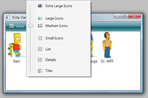
Rob Relyea has a customer (I wonder if it’s Kevin’s Mom?) who is looking for an implementation of this Views menu that is used in Vista’s Explorer window. 

Since I haven’t seen anyone respond, I put together a little app to demonstrate how you might do this in WPF.  (Yes, I’ll use any excuse to knock off another letter of the alphabet in this series!)

This really does qualify for the ItemsControl series.  Not only is a ContextMenu an ItemsControl, but I also demonstrate how to use the menu to control another ItemsControl… a ListView.  In total, this sample demonstrates binding to a collection (‘C’ is for Collection), creating a dynamic item template (‘D’ is for DataTemplate), and using triggers to adjust properties on a custom items panel (‘P’ is for Panel).

One would typically implement a user control for a menu like this because the control is really a collection of several other controls (in this case, a slider, several menu items, and a popup) with well-defined, static visuals.  However, because I wanted several behaviors that come for free with a context menu, I just took a shortcut and derived directly from ContextMenu.  I used the control’s template to define the visuals.  Make no mistake… this is not a "custom control" in the WPF lookless sense of the term.  The implementation is very much tied to the visual elements in the template.

Disclaimer:  This is just an example of how such a menu could be constructed.  I readily admit that I didn’t spend much time on it and there are lots of improvements that could be made.  Also, there are some interesting behaviors within the Views menu in Vista.  For example, the menu is always opened such that the slider’s thumb is directly under the mouse.  I implemented this feature and some of the others that I noticed, but I didn’t spend a lot of time trying to precisely imitate all the behaviors.  There’s certainly still some cleaning up to be done if you require pixel perfection in sizing, iconography, etc.

Download the complete sample here.