ItemsControl: 'I' is for Item Container

March 25th, 2008

Oh look… I did it again! I promised to write ‘G’ is for Generator and then I come out with ‘I’ is for Item Container. I’m like a bad TV series that just keeps leading you on… Then just when you think you’re about to discover the true identity of the evil mastermind, the plot takes an unexpected turn. Please tune in next time when we’ll unveil… The Generator!

Okay, this episode isn’t really a departure from the plan. I simply realized that I had too much content for a single post, so I broke our look at item containers and item container generation into two separate issues. If it makes you feel better, you can think of this as ‘G’ is for Generator, Part I. Although we won’t actually talk about container “generation” in this episode, we will lay the groundwork by talking about the containers that get “generated”.

In our last episode, ‘P’ is for Panel, we discovered that an ItemsControl leverages a panel to layout its children. We call this panel the items host (or the items panel). It seems quite appropriate to use a panel to layout the items, since that is exactly the purpose for which a panel is designed… namely, to size and position a collection of visual children.

In an earlier article, ‘D’ is for DataTemplate, we saw that a data template can be used to specify the visuals that represent an item within the Items collection of an ItemsControl. And since any object can belong to the Items collection, this architecture allows for a diverse and disparate collection of visuals within an ItemsControl.

A Motley Crew of Items

Consider the following example:

  <ItemsControl HorizontalAlignment="Left">
    <TextBox Name="tb" Margin="2" Text="Test" />
    <sys:String>http://drwpf.com/blog/</sys:String>
    <sys:String>http://forums.microsoft.com/MSDN/</sys:String>
    <x:Static Member="ApplicationCommands.Copy" />
    <x:Static Member="ApplicationCommands.Cut" />
    <x:Static Member="ApplicationCommands.Paste" />
    <x:Static Member="ApplicationCommands.SelectAll" />
  </ItemsControl>

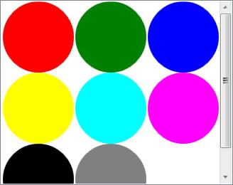
This ItemsControl has 7 items explicitly added to its Items collection: one TextBox, two strings, and four routed commands. You could easily define a data template for the String type to display the strings as hyperlinks and another data template for the RoutedUICommand type to display the commands as buttons. Then the ItemsControl might have the visual representation shown here.

Since a StackPanel is the default items host for an ItemsControl, the children are nicely stacked. If you’d like to observe this example in Kaxaml (or XamlPad if you’re old school), the very simple markup is available here.

Some Common Problems to Consider

Below are several common problems that need to be considered when working with an ItemsControl in WPF. We should keep these in mind as we look at item containers in this post and item container generators in the next episode.

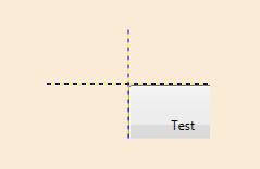
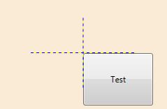
Problem 1: Custom Child Placement

A panel is capable of arranging all types of UI elements, so it can certainly handle such a motley crew of children, but imagine that the panel is a Canvas and you want to provide custom placement of the items within your collection. In this case, you would need to set the attached Canvas properties (Canvas.Left, Canvas.Top, etc) on all of the differing elements in your collection of children. This could be a real hassle to maintain with so many different types of visuals.

Problem 2: Mappings between Items and Visuals

And remember that the actual items may simply be string or command objects. These objects have no inherent visual representation without their data templates. Once a data template has been inflated for an item and the visuals have been added to your ItemsControl, how do you map the visuals back to the items and vice versa?

Problem 3: UI Virtualization

What if there are thousands of items in your ItemsControl? Unless the items are very small, they will not all appear within the viewport of the control at the same time. We definitely do not want to pay a high performance penalty for instantiating visuals for items that are not visible. How can we make sure that only visuals for the visible items (give or take a few) are in memory at any given moment?

Problem 4: Consistent Item Chrome

Another thing that you might want to do in an ItemsControl is provide a common “chrome” for each item. Since the items themselves can be quite diverse and the items panel might not be something as predictable as a StackPanel, an ItemsControl might sometimes appear haphazard. One way to bring a sense of uniformity to such a collection is to provide a consistent background or chrome for each item. Is it possible to do this without directly adding the chrome to the item’s data template?

Problem 5: Visible Selection State

Finally, if the ItemsControl is a Selector (e.g., ListBox, ListView, TreeView, ComboBox, etc), how would you go about showing a uniform selection state for all of the differing children?

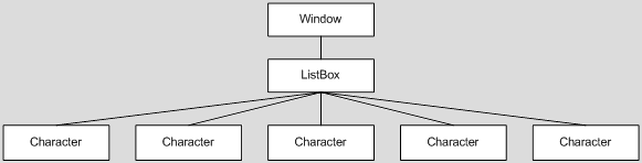
It would certainly be a lot easier to deal with all of the above issues if the children of the items panel were all the same type of element. Enter the item container

What is an item container?

An item container is an automatically generated “wrapper” element for items within an ItemsControl. It is called an item container because it actually “contains” an item from the Items collection. More specifically, the container is the control which contains the visual representation for an item. If the item has a data template, the container is the control into which that data template is inflated.

Let’s revisit a simple ListBox example that we saw earlier in ‘D’ is for DataTemplate. Here is a ListBox that displays a collection of Characters:

  <ListBox ItemsSource="{Binding Source={StaticResource Characters}}" />

Note that we’re using a ListBox in ItemsSource Mode (see ‘C’ is for Collection). The collection of characters is the same as before:

  <src:CharacterCollection x:Key="Characters">
    <src:Character First="Bart" Last="Simpson" Age="10"
        Gender="Male" Image="images/bart.png" />
    <src:Character First="Homer" Last="Simpson" Age="38"
        Gender="Male" Image="images/homer.png" />
    <src:Character First="Lisa" Last="Bouvier" Age="8"
        Gender="Female" Image="images/lisa.png" />
    <src:Character First="Maggie" Last="Simpson" Age="0"
        Gender="Female" Image="images/maggie.png" />
    <src:Character First="Marge" Last="Bouvier" Age="38"
        Gender="Female" Image="images/marge.png" />
  </src:CharacterCollection>

We can define a very simple data template to display the characters:

  <DataTemplate DataType=" {x:Type src:Character} ">
    <StackPanel Orientation="Vertical" Margin="5">
      <TextBlock FontWeight="Bold" Text="{Binding First}"
          TextAlignment="Center" />
      <Image Margin="0,5,0,0" Source="{Binding Image}" />
    </StackPanel>
  </DataTemplate>

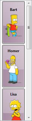
This gives us the ListBox at the right.

Where’s the container?

Supposedly, the visuals for each of the characters in this example are wrapped within an item container. But I don’t see a container! Where is the container? More importantly, what is the container? The answer to that question actually depends on the ItemsControl. In this case, the ItemsControl is a ListBox. The item container for a ListBox happens to be a control called ListBoxItem.

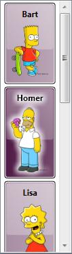
You may not think you see a ListBoxItem in the control, but if you select an item, you will notice that the background of the entire selected item becomes blue and the TextBlock within the selected item shows up with a white Foreground (see the image below). The blue that you are seeing here is the background of the item container.

These visual changes happen automatically without any changes to our Character data template. They are the result of the template within the default style for ListBoxItem, (along with some triggers in that template).

Wow! The container has a pretty important role in this scenario, especially if you think you might like to alter the visuals used to depict item selection. Clearly, this merits further investigation…

Understanding the Item Container and its Style

As just mentioned, the selection state for a ListBoxItem is defined within the control’s style and template. Anytime you are working with an ItemsControl, I strongly recommend that you take time to understand the control’s item container as well as the default style for that container. So let’s just take a moment to look at some aspects of ListBoxItem and the default ListBoxItem style, as defined for the Vista Aero theme (from Aero.NormalColor.xaml).

  1. The Background of the ListBoxItem is set to Transparent. This is important. By using a Transparent brush rather than the default null brush, the ListBoxItem becomes hittable (or visible to hittesting by input devices). In other words, a mouse hittest will find the item, thereby allowing it to be selected when the transparent portion is clicked.
  2. HorizontalContentAlignment and VerticalContentAlignment on the ListBoxItem are data bound to the properties of the same names on ListBox. As such, if you’d like all ListBoxItems to left-align their content, you can simply set HorizontalContentAlignment to Left on the ListBox itself. This is very handy to know and you probably wouldn’t know it without looking at the style.
  3. The default template for ListBoxItem consists of nothing more than a ContentPresenter within a Border.
  4. ListBoxItem exposes a dependency property called IsSelected. This is pretty common for the item container of a Selector control. In fact, the Selector class is where the IsSelected property is originally registered with the property engine. ListBoxItem and other containers simply add themselves as owners for the property. As such, Selector.IsSelected provides a useful trigger property for showing that a container is selected.
  5. There are indeed several triggers within the control template that alter the container’s appearance based on whether it is selected, active, and/or enabled.

Sidenote: If you are new to styling and templating in WPF, recognize that all of the native control styles and templates are available in theme files that ship as part of the framework SDK or with Blend. There are actually many different ways you can view these styles, as I describe in this forum post. Designers often go straight to a tool like Blend, when they want to explore/modify a control template. This is certainly fine too, but I prefer going to the theme file so I can see both the style and template declarations together.

The ItemContainerStyle Property

That’s great! Now we understand the default style and template. What can we do with this knowledge? Well, quite a bit, actually. It turns out that it’s very easy to define our own item container style. We simply need to set the ItemContainerStyle property of the ItemsControl, as shown here:

  <ListBox ItemsSource="{Binding Source={StaticResource Characters}}"
      ItemContainerStyle="{StaticResource CharacterContainerStyle}" />

Next, we need to define the style. We will use the container style to add some standard chrome to the items in our ListBox by redefining the ListBoxItem’s template, as shown below. You don’t need to get too wrapped up in the nitty gritty of this style (unless that’s your thing). Just note that there are a handful of properties being set, and one of them happens to be the Template property.

  <Style x:Key="CharacterContainerStyle" TargetType="{x:Type ListBoxItem}">
    <Setter Property="Background" Value="#FF3B0031" />
    <Setter Property="FocusVisualStyle" Value="{x:Null}" />
    <Setter Property="Width" Value="75" />
    <Setter Property="Margin" Value="5,2" />
    <Setter Property="Padding" Value="3" />
    <Setter Property="Template">
      <Setter.Value>
        <ControlTemplate TargetType="{x:Type ListBoxItem}">
          <Grid>
            <Rectangle StrokeThickness="1" Stroke="Transparent"
                RadiusX="5" RadiusY="5" Fill="White"  />
            <Grid>
              <Rectangle x:Name="BackgroundRect" Opacity="0.5" StrokeThickness="1"
                  Stroke="Transparent" RadiusX="5" RadiusY="5"
                  Fill=" {TemplateBinding Background} " />
              <Rectangle StrokeThickness="1" Stroke="Black" RadiusX="3" RadiusY="3" >
                <Rectangle.Fill>
                  <LinearGradientBrush StartPoint="-0.51,0.41" EndPoint="1.43,0.41">
                    <LinearGradientBrush.GradientStops>
                      <GradientStop Color="Transparent" Offset="0"/>
                      <GradientStop Color="#60FFFFFF" Offset="1"/>
                    </LinearGradientBrush.GradientStops>
                  </LinearGradientBrush>
                </Rectangle.Fill>
              </Rectangle>
              <Grid>
                <Grid.RowDefinitions>
                  <RowDefinition Height="0.6*"/>
                  <RowDefinition Height="0.4*"/>
                </Grid.RowDefinitions>
                <Rectangle RadiusX="3" RadiusY="3" Margin="3"
                    Grid.RowSpan="1" Grid.Row="0"  >
                  <Rectangle.Fill>
                    <LinearGradientBrush  EndPoint="0,0" StartPoint="0,1">
                      <GradientStop Color="#44FFFFFF" Offset="0"/>
                      <GradientStop Color="#66FFFFFF" Offset="1"/>
                    </LinearGradientBrush>
                  </Rectangle.Fill>
                </Rectangle>
              </Grid>
              <ContentPresenter x:Name="ContentHost" Margin="{TemplateBinding Padding}"
                  HorizontalAlignment="{TemplateBinding HorizontalContentAlignment}"
                  VerticalAlignment="{TemplateBinding VerticalContentAlignment}" />
              <Rectangle Fill="{x:Null}" Stroke="#FFFFFFFF"
                  RadiusX="3" RadiusY="3" Margin="1" />
            </Grid>
          </Grid>
        </ControlTemplate>
      </Setter.Value>
    </Setter>
  </Style>

With the above item container style, our ListBox now renders as shown here.

Notice that in this style we have added a setter to explicitly set the Width of the ListBoxItem to 75 device independent pixels. Previously, the item containers were sizing to their content, which meant that each item would render as big as necessary to display the characters name and the image of that character at its natural size (the size stored in the image file).

The container style is a great place to apply sizing because it allows us to provide a consistent size for all items in the ListBox. We could certainly hard code this size into the Character data template, but keep in mind that we may be using the same data template in other places within the application. By putting a Width setter in the container style, rather than explicitly setting the width in the data template, we keep the data template dynamic.

So now we have some consistent chrome and it is nicely defined in the container’s template rather than in the item’s data template. Unfortunately, there is a big problem with this template. When I snapped this image of the ListBox, the selected item was Homer. Of course, you will have to take my word for it, since there is clearly nothing in the visual appearance that can be used to verify I’m telling the truth.

Recall that the default ListBoxItem template is what gave us visual cues for things like selection state. Since we have defined our own ListBoxItem template, we need to do likewise in our template. So let’s just add the following Triggers to our control template:

  <ControlTemplate.Triggers>
    <Trigger Property="Selector.IsSelected" Value="True">
      <Setter TargetName="BackgroundRect" Property="Opacity" Value="1" />
      <Setter TargetName="ContentHost" Property="BitmapEffect">
        <Setter.Value>
          <OuterGlowBitmapEffect GlowColor="White" GlowSize="9" />
        </Setter.Value>
      </Setter>
      <Setter TargetName="BackgroundRect" Property="Opacity" Value="1" />
    </Trigger>
  </ControlTemplate.Triggers>

Now when we select Homer, the chrome around him darkens and he glows like an angel (or maybe like he’s radioactive, which is actually more appropriate given his line of work).

The Container’s Data Context is the Item

In ‘D’ is for DataTemplate, we learned that the data context for the root element of the data template is actually the data item that the template represents. And since the DataContext is inherited through the element tree, each child element in the template also has this same data context. This makes establishing bindings on elements in the template very easy. For example, in our Character template, the Text property of the TextBlock is bound to the character’s name by simply doing this:

  <TextBlock Text="{Binding First}" />

Well, now we can explain how this actually works. When the item container is generated, the framework sets its data context to the item that the container contains. It then inflates the data template as the content of the container. The elements in the container then naturally inherit their data contexts from the container.

Armed with this knowledge that the DataContext of the item container is the item it contains, we might want to add a data trigger to our style to show the female characters with a pink background color. We do live in a stereotyped world, after all! The following trigger should work nicely:

  <Style.Triggers>
    <DataTrigger Binding="{Binding Gender} " Value="Female">
      <Setter Property="Background" Value="#FFF339CB" />
    </DataTrigger>
  </Style.Triggers>

Custom Placement of Items within an ItemsControl

Now let’s make just one more change to this sample. It is actually pretty common to add extra metadata to the view model of a WPF application to help position and visualize data. Suppose we modify the Character item in our view model to allow each character to expose its own notion of where it should be positioned in x-y space. To do this, we will add the following Location property to the Character class:

  private Point _location = new Point();
  public Point Location
  {
      get { return _location; }
      set
      {
          _location = value;
          RaisePropertyChanged ("Location");
      }
  }

Similarly, we’ll modify our data collection to set the position of the characters:

  <src:CharacterCollection x:Key="Characters">
    <src:Character First="Bart" Last="Simpson" Age="10"
        Gender="Male" Image="images/bart.png" Location="25,150" />
    <src:Character First="Homer" Last="Simpson" Age="38"
        Gender="Male" Image="images/homer.png" Location="75,0" />
    <src:Character First="Lisa" Last="Bouvier" Age="8"
        Gender="Female" Image="images/lisa.png" Location="125,150" />
    <src:Character First="Maggie" Last="Simpson" Age="0"
        Gender="Female" Image="images/maggie.png" Location="225,150" />
    <src:Character First="Marge" Last="Bouvier" Age="38"
        Gender="Female" Image="images/marge.png" Location="175,0" />
  </src:CharacterCollection>

The default items host for a ListBox is a panel called VirtualizingStackPanel. This works great when you want a traditionally stacked layout with the added benefits of UI virtualization, but what if you want a custom layout? In ‘P’ is for Panel, we learned that we can actually choose any panel to serve as the items host for our data items.

Since our Character item now provides its own (x, y) location, a Canvas is the logical choice for an items panel:

  <ListBox ItemsSource="{Binding Source={StaticResource Characters}}"
      ItemContainerStyle="{StaticResource CharacterContainerStyle}">
    <ListBox.ItemsPanel>
      <ItemsPanelTemplate>
        <Canvas />
      </ItemsPanelTemplate>
    </ListBox.ItemsPanel>
  </ListBox>

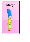
Hmmm… Now when we run this sample, we see just Marge. Oops! There are still 5 items, but they are all positioned in the same (0, 0) location, so we only see the topmost item. We really want each item to be positioned according to its Location property. That is, we want the Canvas.Left and Canvas.Top properties of each item to be bound to Location.X and Location.Y on each character.

This is where knowing that each item is wrapped in a ListBoxItem container comes in very handy! Since the items panel actually hosts these containers, we just need to modify the container style to bind the Canvas attached properties to the Location properties on the contained item. This can be done by adding the following setters to our style.

  <Setter Property="Canvas.Left" Value="{Binding Location.X}" />
  <Setter Property="Canvas.Top" Value="{Binding Location.Y} " />

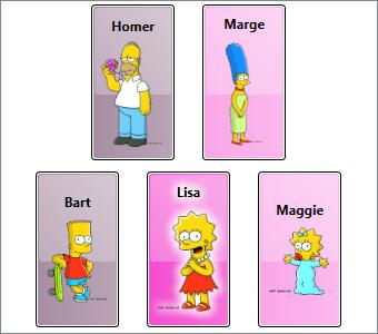
Voîla! Now when we run the code, we see the expected result (now with Lisa selected):

Okay, you might have noticed that I modified a couple of other style properties to provide consistent heights and vertical alignment for the children. The complete sample can be downloaded here.

Common Problems (Revisited)

Remember the common problems we talked about toward the beginning of this article?

  1. Custom Child Placement
  2. Mappings between Items and Visuals
  3. UI Virtualization
  4. Consistent Item Chrome
  5. Visible Selection State

We have actually tackled items 1, 4, and 5 already. Our items have custom placement due to bindings on the Canvas attached properties on the item container. We have also defined a custom template within the item container style to give the items a consistent chrome. And finally, we added triggers to that template to show the selected item.

In the next episode, we will talk about how the item container generator can be used to tackle the remaining issues. (No, we will not implement UI virtualization in that article… that will be a separate post later in the series. But we will talk about how the generator enables this virtualization.)

Default Items Hosts and Containers

For your convenience, here is a list of the native ItemsControl classes in WPF, along with their default items hosts and item container types:

ItemsControl Type Default Items Host Default Item Container
ComboBox StackPanel ComboBoxItem
ContextMenu StackPanel MenuItem
HeaderedItemsControl StackPanel ContentPresenter
ItemsControl StackPanel ContentPresenter or any UIElement*
ListBox VirtualizingStackPanel ListBoxItem
ListView VirtualizingStackPanel ListViewItem
Menu WrapPanel MenuItem
MenuItem StackPanel MenuItem
StatusBar DockPanel StatusBarItem
TabControl TabPanel TabItem
ToolBar** not used none
TreeView StackPanel TreeViewItem
TreeViewItem StackPanel TreeViewItem

* If a UIElement is added to the Items collection of an explicit ItemsControl instance (as opposed to an instance of a derived class like ListBox), it will become a direct child of the items panel. If a non-UIElement is added, it will be wrapped within a ContentPresenter.

** Note that I’ve included the ToolBar control in this list because technically, it is an ItemsControl. However, it should be noted that it has certain hardcoded behaviors that diverge from the other ItemsControl classes. It does not wrap its items in an item container and it is hard coded to layout its items in a special ToolBarPanel class. Setting the ItemsPanel property on a ToolBar will not change this behavior. The control template for a ToolBar must include a ToolBarPanel within its visual tree. If the panel is not present, the framework will throw an exception. (Bad form, framework! Shame on you!)

The BIG Problem with Silverlight's Control Templating Model

March 24th, 2008

Robby has just fired this shot in The Great Templating War Debate of 2008.  I don’t often disagree with Robby on platform issues, but…  I am now compelled to reply with an opposing viewpoint on this issue.

In my opinion, there are several problems with the templating model in Silverlight 2.0. I’m not going to focus on some of the more obvious ones (like the fact that WPF and Silverlight are using completely different models) because I think they have been covered quite well by others.

Instead, I’m going to focus on what I consider to be the BIG problem… Silverlight’s templating model breaks the developer/designer workflow.

The biggest value proposition for both Silverlight and WPF is the workflow that they enable between developers and designers. As a left-brained developer, you definitely do not want me involved in an application’s UI design. (Trust me on that!)  The good news is that in WPF, you don’t need to worry.  I can focus on the application’s functionality and the design work can be handled by a truly capable UX designer.

You may reasonably be wondering, "What does application development and design have to do with control development and design?"  Control development in WPF is very much just a microcosm of application development in WPF. I tend to write my application objects (user controls, windows, pages, the application itself) in the exact same manner as custom controls. This enables designers to create a UI that simply reflects the state of the application objects. If you think about it, this is a little M-V-VM pattern built right into WPF’s control and application models.

To fully appreciate the workflow that this model enables for both designers and developers, you just need to experience it once… You turn over a really drab, form-looking UI to your designer and watch what they do with it… Wow!  It’s an amazing feeling just to think that you had some part in the creation of such a thing of beauty! 

Perhaps you think this is just hyperbole.  Well, I know I’m not the only developer who feels this way!  And you, too, can feel this exuberance enabled by the developer/designer workflow.  Simply download Podder and toggle between Josh’s skin and Grant’s skin!  (Sorry Josh. :P)

Back to the issue at hand…  I happen to be very good at analyzing a control to determine the states that it will need to support. I’m also quite adept at implementing the functionality of a control and making sure that the functionality is exposed via the necessary methods and commands. Moreover, I’m very passionate about this type of control development.  I think the designers I work with will validate that I always strive to provide them with all the hooks they could possibly want when it comes to styling and templating my controls.

The term that WPF uses for this control model is "lookless". It basically means that the code for a control (or application) is written in a manner that makes no assumptions about the presentation layer. The control simply exposes state information via properties and events along with execution entry points via methods and commands.

Silverlight’s templating model completely breaks this lookless control model. It requires that the developer meddle in areas where they don’t belong (such as looking for and executing storyboards in the UI layer). Furthermore, it takes away the ability of designers to think outside the box when they define UX interactions because they must conform to whatever hooks have been provided by (a.k.a., hardcoded into) the control.  Or worse, it encourages designers to actually meddle in the control’s code where they don’t belong.

Without the lookless model, you cannot achieve what Nathan describes as the "holy grail" for developer/designer workflow. I completely agree. (Nathan’s blog, by the way, is another excellent resource for anyone who would like a designer’s view of the WPF and Silverlight platforms.)

The process of creating great controls will always involve designers and developers working together to meet each other’s needs. However, they each have their own strengths. As a developer, I DON’T WANT TO THINK ABOUT DESIGN!

The reason I am so passionate about the WPF platform is that it frees me to do what I do best… write code. At the same time, it frees designers to do what they do best… create compelling user experiences by designing the look and feel of an application and its controls. This is all enabled by WPF’s styling and templating model.

The arguments I keep hearing for the decisions being made with respect to Silverlight’s templating model all seem to revolve around toolability. Namely, applications like Blend need a more intuitive way to support styling and templating.

My stance is that the architecture of the platform should not be driven by the needs of the tools. The platform should definitely accomodate those needs, but this can be done through helper classes. The platform’s architecture needs to be driven by decisions that best enable the next generation of killer software experiences. I fully believe these experiences can best be enabled using a truly lookless model. I also fully believe that this model enables the most ideal workflow between developers and designers.

So how can Silverlight fix this?

Simple. Give us property triggers, data triggers, and event triggers in both styles and templates.

Mix08: The Good, the Bad, and the Ugly

March 12th, 2008

Having recently returned from Mix 08 (yes, I stayed a few days beyond the conference), I thought I should follow up with my thoughts on this year’s event:

The Good

  • Silverlight 2 Beta  (We’ve come a long way since JavaScript!)
  • The Balmer / Kawasaki Interview  (Very entertaining on both sides)
  • Deep Zoom  (No, it’s not one of those pay-per-view shows that they are promoting for $14.95 in your hotel room… you know… the ones where they feel it is important to stress that movie titles do not appear on your hotel bill.)
  • Meeting some community cohorts (like Karl and Jeremiah)
  • Shaving off that ridiculous mustache (huh? a woman with a mustache?)
  • Open Bar for the Mix party at Tau
  • Me (after my 2nd Sapphire and Tonic at Tau)

The Mediocre

  • The binding support in Silverlight 2 Beta  (Alright, I originally had this under The Bad, but it was brought to my attention (thanks Nick) that the issues around data context inheritance have been fixed in the final Mix release.  I updated my code and sure enough, it works!  Nice!!  Still…  I shouldn’t need to write code to establish the source of a binding.  Once there is support for ElementName and RelativeSource, I will move this up to The Good section.  And if you give me support for data validation and support for binding to XML data via XPath expressions (along with an XmlDataSource, of course), then I’ll create The Excellent section just for Silverlight binding!)

The Bad

  • The price of just about anything within the confines of The Venetian
  • The air quality anywhere near a Vegas casino
  • The faux vinyl, burlapesque manpurse given to each attendee
  • The scenery at Tau Beach during the Mix party
  • Me (after my 5th Sapphire and Tonic at Tau)

The Ugly

  • The templating support in Silverlight 2 Beta  (Have we just given up on the notion of a lookless control model?)
  • The T-shirt in the aforementioned manpurse  (Come on guys… this is a designer-heavy event!  I recognize that last year’s T-shirt design set a pretty high bar, but did you just give up and not even try this year?  Even setting the design aside, the souvenir quality alone is enough to automatically relegate it to the Good Will box.  For those unable to attend, I’m sure you’ll be able to pick one up at your nearest second hand store under a sign that says "7$ each or 2 for $10".)
  • Me (after my 7th Sapphire and Tonic at Tau)

up all mixed am I

February 28th, 2008

As usual, it’s been a crazy few weeks leading up to Mix, but I swear I can hear Phantom music everytime I step into an elevator, so we must be really close now!

It should be another good conference this year and I hope to see a lot of you there.  You will be able to recognize me because I’ll be the geeky looking one wearing jeans and a t-shirt.  In fact, I’d encourage you to approach anyone you see fitting this description and simply ask, “Are you him/her?”

Hopefully things will slow down a bit in March and I’ll be able to increase my posts here and in the forums.  (Although I’m happy to say that 6 months after joining the MSDN forums, I’ve finally acquired my 4th star. Yes, it took much longer than anticipated…  but oh well…  when life gives you lemons, throw them at someone!)

See you in Vegas!  (But will you see me?)

ItemsControl: 'P' is for Panel

February 10th, 2008

Let’s continue our exploration of WPF through the medium of the ItemsControl class. I know I promised to write ‘G’ is for Generator next, but after giving it more consideration, I’ve decided that it makes more sense to introduce the concept of an “items panel” first. This should give us more context when we finally do look at item containers and container generators.

To support this diversion, I’m giving this “ItemsControl: A to Z” series a new subtitle of “(but not necessarily in that order)”. 😉

How did we get here?

Let’s just recap a couple of things before we get started… In ‘C’ is for Collection, we learned that an ItemsControl surfaces a collection of items in a very predictable way (namely, as a CollectionView). Then in ‘D’ is for DataTemplate, we learned that an item within the collection can be any CLR object and the visual representation of the item is defined using a template of visual elements (called a DataTemplate).

The next question that logically arises is, “where do we put these visuals?” More specifically, once the data template for an item has been inflated, where should its visuals be positioned? To answer this question, we will now examine how “layout” is handled for items within an ItemsControl.

This particular episode begins by covering a few WPF concepts that are only indirectly related to the ItemsControl class. Some of the material is of a more technical nature. I have clearly marked these sections as “200 Level” material. Feel free to skip over these sections if you are only interested in ItemsControl or if you just aren’t in the mood to get your geek on. 😉

What is layout?

In WPF, the term “layout” refers to the sizing and positioning of visual elements within the user interface.

How does layout work?

In some cases, an element may know exactly what size it should be (because it’s Width and Height properties have been explicitly set). But very often, the size of an element is determined by its content. To enable this “size to content” feature, the WPF layout engine uses a 2-pass layout cycle to size and position visual elements:

1. First a measure pass is used to determine the desired size of each element.

2. Then an arrange pass is used to explicitly size and position each element.

The measure pass involves a recursive drilldown into the UI’s visual tree to measure each element. During this pass, an element is basically asked what size it wants to be. To determine an answer to this question, the element turns around and measures each of its own children by asking them what size they want to be. This recursion continues until all visual children in the subtree have been measured. At this point, each element can answer this question regarding its desired size.

The arrange pass involves another recursive drilldown into the visual tree to arrange each element. During this pass, the element is basically told what size it gets to be. In an ideal world, each element would get to be the size that it wants to be… but we all know life doesn’t work that way! The parent Panel has ultimate control over how much real estate each child gets and where that real estate is located.

The Nitty Gritty of Measure (200 Level)

During the measure pass, the question of “What size do you want to be?” is posed to an element in the form of a method named MeasureOverride(), so named because you will override this method on a framework element whenever you wish to implement custom sizing logic for the element. The size parameter received within MeasureOverride() represents a constraint for the element. It is the parent’s way of saying, “You have this much space to work with… with that in mind, what size do you want to be?”

Before answering this question, the element first asks its children what size they want to be by executing the Measure() method of each child. When you call Measure() on a child, this indirectly executes the MeasureOverride() of that child… hence the recursion for the measure pass.

After measuring its children, an element should be able to determine its desired size. The value returned from MeasureOverride() becomes the value of the element’s DesiredSize property.

The Nitty Gritty of Arrange (200 Level)

The sequence is very much the same during the arrange pass. In this case, the “Here’s what size you get to be” message is delivered in the form of a method named ArrangeOverride(). You will override this method on a framework element anytime you need to provide custom positioning logic for child elements. The size parameter received within ArrangeOverride() represents the real estate allotted for the element and its children.

Note that a position is not supplied to an element within ArrangeOverride(). This is because an element does not get to decide where it will be positioned. It can provide hints by setting some of its layout properties (HorizontalAlignment, VerticalAlignment, etc), but ultimately, the parent is responsible for respecting those properties and positioning the child.

Although the element cannot control its own position, it does get to control the position of each of its children, relative to itself. This process is called arranging the children and it happens when the element calls the Arrange() method on each child. The Arrange() method takes a Rect as a parameter. The position of the Rect represents the position of the child relative to the parent. The size of the Rect represents the size of the child within the coordinate space of the parent.

As with measuring, when you call Arrange() on a child, this indirectly executes the ArrangeOverride() of that child… hence the recursion for the arrange pass.

After arranging its children, an element should know its actual size. The value returned from ArrangeOverride() becomes the value of the element’s RenderSize property (and consequently, the values of the ActualWidth and ActualHeight properties).

Dispatcher Priority for Layout and Rendering (200 Level)

The WPF threading model dictates that all code execution will occur within a succinct execution block. We call these blocks dispatcher operations. Each dispatcher operation is queued for execution at a specific priority. The queue is continuously processed by executing the highest priority operations first. The available dispatcher priorities are given by the following enum:

    public enum DispatcherPriority
    {
        Invalid          = -1,
        Inactive         = 0,
        SystemIdle       = 1,
        ApplicationIdle  = 2,
        ContextIdle      = 3,
        Background       = 4,
        Input            = 5,
        Loaded           = 6,
        Render           = 7,
        DataBind         = 8,
        Normal           = 9,
        Send             = 10
    }

Layout and rendering go hand in hand. After the 2-pass layout cycle, the element tree is rendered. As a result, you may hear the terms “render pass” and “layout pass” used interchangeably. And indeed, the layout cycle and UI rendering actually occur within the same dispatcher operation. This operation typically occurs at Render priority. The exception to this rule is that the initial layout cycle and rendering (when a Page or Window is first loaded) actually occur at Loaded priority.

When a render operation executes, the visual tree is first walked to size any elements that need to be measured (IsMeasureValid == false). The tree is then walked again to position any elements that need to be arranged (IsArrangeValid == false). Finally, the updated scene is rendered.

Keeping this in mind, if you ever change a property that affects layout and you want to delay some processing until after the layout has been updated, you can use BeginInvoke() to queue that additional work at Loaded priority. This will typically cause it to execute within the next dispatcher operation after the render pass.

What is a panel?

Typically, when we talk about layout in WPF, we tend to focus on a particular category of elements called panels (so named because they descend from an abstract Panel class). You may recall from our earlier look at different WPF content models that a panel is a special element whose visual children are UIElements.

The reason we tend to focus on panels so much when talking about layout is because layout is really all a panel does. Its sole purpose is to arrange its children at their proper sizes and positions.

Specifically, a panel does three things:

  1. It maintains a collection of child elements (UIElements)
  2. It sizes those elements
  3. It positions those elements

It is important to note that layout in WPF is certainly not restricted to panels. In fact, every framework element actively participates in the layout system. More specifically, every framework element has a MeasureOverride() implementation to measure itself and its children and an ArrangeOverride() implementation to arrange itself and its children.

Non-panel elements typically have no more than one child, and often they have no children at all. The non-panel elements that do have a child rarely do anything interesting with respect to the placement of that child. Typically, the child is simply arranged within the entire rectangular area of the parent.

Panels, on the other hand, almost always do something interesting with their children. A Canvas, for example, positions its children precisely where they want to be according to the Canvas-related attached properties on each child (Canvas.Top, Canvas.Left, etc).

A Grid positions its children within conceptual rows and columns according to the Grid-related attached properties on each child (Grid.Row, Grid.Column, Grid.RowSpan, Grid.ColumnSpan, etc).

A StackPanel stacks its children vertically or horizontally, based on the Orientation property of the StackPanel.

A WrapPanel stacks its children vertically or horizontally until it runs out of room and then it starts a new stack adjacent to or below the previous stack, again depending on the Orientation property of the WrapPanel.

A lot more time could be spent explaining how the native panels implement their respective layout algorithms, but before we get too far off track…

Why are we talking about panels in this ItemsControl series?

Oh yeah… because an ItemsControl is a control that manages a collection of logical children (its “Items”) and a panel is an element that lays out a collection of visual children. Since each logical child in the ItemsControl will have some visual representation, it would make sense to use a panel to lay out these visuals. And indeed, that is how layout works for an ItemsControl. Namely, an ItemsControl uses an “items panel” (a.k.a., an “items host”) to arrange its children.

In WPF, we often describe controls as “lookless”, which means the control itself, is just a bag of functionality and the visual representation for the control (including certain visual behaviors) is defined separately using a Style and ControlTemplate. (This will be covered in more detail in a future post called ‘L’ is for Lookless.) With this dynamic approach that separates the design of a control from its implementation, we are no longer restricted to a stock layout for a control like ListBox.

As an example, in ‘B’ is for Bet You Can’t Find Them All, we saw the standard ListBox examples shown below.


In both of these examples, the items panel is simply a StackPanel, so the items appear stacked vertically, as one might expect when coming from earlier control paradigms like those in Win32 and Windows Forms.

Note that each ListBox specifies its own ItemTemplate to create a different look for items. The first ListBox contains a description for each persona, whereas the second ListBox does not include this description. If you’d like a refresher on how this works, you can revisit ‘D’ is for DataTemplate.

But we also saw the following list of radio buttons in that exercise. This control is also just a ListBox, only now the StackPanel has its Orientation set to Horizontal so that the items are stacked horizontally.

Well perhaps you don’t want the items stacked at all. You can actually use any panel as the items host for an ItemsControl. Imagine that you would really like to have the unselected items spread out radially around a selected item. The Microsoft Dynamics application actually supports this layout:

This image shows a feature of the application where the user can explore entity relationships within the business model in a very ad-hoc fashion. In this case, a “fish eye” binding allows the user to view the details of any related entity by simply moving the mouse over it. Selecting an entity causes it to animate to the center while all of its “relatives” animate into place around it. This creates a very sleek and dynamic way to explore relationships and it really makes the data come to life!

But how is this achieved? Well, believe it or not, this is all done by simply using a ListBox with a custom RadialPanel set as its items panel. (Admittedly, it’s a sleek panel that provides some cool animations, but nonetheless, it’s just a ListBox with a different items panel.)

How do you change the items panel?

There are a couple of ways to change the items panel for an ItemsControl. The first method involves setting the ItemsPanel property on the control using something called an ItemsPanelTemplate.

Recall that in WPF, a template is just a tree of visual elements that gets inflated inline to visually represent some other element. The ItemsPanelTemplate is probably the simplest template class, as it can only contain a single child and that child must be a Panel. Here is a very simple example in which the items panel of a ListBox is set to a WrapPanel:

    <ListBox Width="328" Height="260" Padding="1"
        ScrollViewer.HorizontalScrollBarVisibility="Disabled">
      <ListBox.ItemsPanel>
        <ItemsPanelTemplate>
          <WrapPanel />
        </ItemsPanelTemplate>
      </ListBox.ItemsPanel>
      <Ellipse Fill="Red" Width="100" Height="100" />
      <Ellipse Fill="Green" Width="100" Height="100" />
      <Ellipse Fill="Blue" Width="100" Height="100" />
      <Ellipse Fill="Yellow" Width="100" Height="100" />
      <Ellipse Fill="Cyan" Width="100" Height="100" />
      <Ellipse Fill="Magenta" Width="100" Height="100" />
      <Ellipse Fill="Black" Width="100" Height="100" />
      <Ellipse Fill="Gray" Width="100" Height="100" />
    </ListBox>

This yields the following ListBox in which the Ellipse items are wrapped:

What does the ItemsPanelTemplate class actually template?

We know that a template is a visual representation for something. In the case of the ItemsPanelTemplate, you may reasonably wonder, “What is it that we are templating?” We will answer this question more completely in a future episode called ‘L’ is for Lookless. In the meantime, I will try to give a satisfactory interim answer…

We’ve already seen that a DataTemplate is used to template an item of data. And we mentioned earlier that something called a ControlTemplate is used to template a control. The answer to the ItemsPanelTemplate question is related to the ControlTemplate of the ItemsControl. Somewhere within this ControlTemplate, you will typically find an element called an ItemsPresenter. This element reserves real estate within the template for the items panel. So the ItemsPresenter is the element that we are templating with the ItemsPanelTemplate. Or another way to say it is that the ItemsPanelTemplate is inflated within the ItemsPresenter, thereby creating a panel for the layout of the ItemsControl’s items.

An Alternate Method for Specifying the Items Panel

I mentioned before that there are actually a couple of ways to change the items panel for an ItemsControl. The second method actually involves re-templating the ItemsControl. Only this time, instead of including an ItemsPresenter within the template, we can include an items panel directly in the template and set its IsItemsHost property to true.

CAUTION: In this method, the ItemsPanel property on the control is essentially useless. Without an ItemsPresenter in the template, there is nowhere to inflate an ItemsPanelTemplate. As such, a designer can no longer easily swap out the items panel by setting the ItemsPanel property. If they need to do this, they will have to re-template the entire control.

Here is the markup to create the exact same ListBox as shown earlier using the IsItemsHost property to specify the items panel:

    <ListBox Width="328" Height="260" Padding="1"
        ScrollViewer.HorizontalScrollBarVisibility="Disabled">
      <ListBox.Template>
        <ControlTemplate TargetType="{x:Type ListBox}">
          <Border BorderBrush="{TemplateBinding BorderBrush}"
              BorderThickness="{TemplateBinding BorderThickness}"
              Background="{TemplateBinding Background}">
            <ScrollViewer Padding="{TemplateBinding Padding}">
              <WrapPanel IsItemsHost="True" />
            </ScrollViewer>
          </Border>
        </ControlTemplate>
      </ListBox.Template>
      <Ellipse Fill="Red" Width="100" Height="100" />
      <Ellipse Fill="Green" Width="100" Height="100" />
      <Ellipse Fill="Blue" Width="100" Height="100" />
      <Ellipse Fill="Yellow" Width="100" Height="100" />
      <Ellipse Fill="Cyan" Width="100" Height="100" />
      <Ellipse Fill="Magenta" Width="100" Height="100" />
      <Ellipse Fill="Black" Width="100" Height="100" />
      <Ellipse Fill="Gray" Width="100" Height="100" />
    </ListBox>

Hopefully this ControlTemplate approach at least makes some sense now, just based on what we’ve learned about other templates. If not, it will once we dive into control templates.

A Technical Note about Virtualization (200 Level)

A special panel called VirtualizingStackPanel serves as the default items panel for a ListBox (and consequently, a ListView, which derives from ListBox). This panel behaves very much like a StackPanel in that it stacks its children vertically or horizontally, based on its Orientation property. The big difference is that only the visible visuals are instantiated (plus or minus a few items on either side of the viewport, which are created to support keyboard navigation). Furthermore, once visuals are scrolled out of the viewport, they’re references are released and they are available for garbage collection.

It is this VirtualizingStackPanel element that allows a ListBox to be databound in a performant manner to a collection with thousands of items. Since the visuals only exist while they are within the viewport, the application does not pay the performance penalty required to create and maintain thousands of visual elements. However, the ItemsControl instance does still pay the price of maintaining a collection with thousands of logical children. To avoid this cost, you would have to include logic within your application to only bind to a small subset of the entire collection. Typically, this work is offloaded as much as possible to a performant data engine like SQL Server (or the lighter weight SQL Express).

We will eventually explore these concepts of “UI virtualization” and “data virtualization” in detail in ‘V’ is for Virtualization. In the meantime, if you wish to learn more, I would highly recommend that you check out these posts (one, two, and three) in Bea’s blog, which cover different approaches to virtualization for hierarchical data. This is one area where the .NET 3.0/3.5 releases do not provide a native solution.

And if you’re insane enough to want to write your own virtualizing panel, you can start with Dan Crevier’s 4-part series (one, two, three, and four). Unfortunately, you will also need to combine it with Ben Constable’s 4-part series on implementing IScrollInfo (one, two, three, and four). Having done this on more than one occasion myself, I can only warn you that it’s not for the faint of heart! I don’t think it’s particularly difficult, per se; just extremely involved.

Has your ICIQ improved?

It might now be a good time to revisit The ICIQ Test to review the panels that are used as items hosts by different ItemsControl classes. Not only will you get the satisfaction of realizing that you are an ItemsControl expert, but you will also have a much better understanding of the different explanations at the end of the test. (You know… the part of the test that you skipped the first time… the educational part where you were supposed to explore and learn about the controls after getting your score… okay, you’re gone now, aren’t you?)

Next Up: Item Container Generation

No, really. I promise that the next article really will be ‘G’ is for Generator (unless I change my mind again, of course).

Just to whet your appetite, an item container is the actual child element that gets arranged within an items panel. Each visible item in an ItemsControl has a corresponding item container. If the item also has a data template, that template is inflated and the visuals are placed within the item container. But the real question is… where does the container come from in the first place? Hmmm…

A New Software Architecture Pattern: M-V-poo

January 23rd, 2008

I just saw a *GREAT* presentation by Josh Smith on using the Model View Controller (MVC) pattern to develop WPF applications.  Josh did an awesome job of breaking down the different pieces of the pattern into understandable parts and showing how each fits into a very simple WPF application.  And of course, he’s already blogged about it

UPDATE:  1/28/08

Josh just posted this excellent Code Project article explaining his approach to MVC and unit testing in WPF.  It is a written version of the WPF Bootcamp presentation that he delivered at Microsoft last week.

The live presentation will eventually be available online in either streaming media or downloadable format and I will update this post with a link.

Those of us who have been writing WPF software for a while have (either consciously or subconsciously) moved to a similar architecture for our applications.  Such an architecture allows us to better leverage the power of the platform to separate UI design from the logic that is used to manipulate (or control) a view of the data.  There are many different variations of the pattern, including M-V-P (and variants), M-V-VM, or my version, which I’m choosing to call M-V-poo.

Every discussion I’ve seen on these software architecture patterns eventually ends with an argument amongst the purists as to whether specific functionality belongs in the controller (a.k.a., the presenter, the view model, the whatever); or whether the controller should really be allowed to reach into the view; or whether the controller should have any dependencies on a specific UI technology; or ad infinitum.

I anticipate seeing similar debates regarding Josh’s example.  My favorite part of the talk was where he gave a nod to the purists and invited them to share such feelings with the caveat that he just doesn’t care.  😀

We all recognize that in a perfect world, there would be a clear delineation of boundaries… but unfortunately we write software in the real world.  The cold hard fact is that there are definitely aspects of WPF (especially around things like commanding) that make it impractical to completely separate the presenter from the view.  The same thing can be said about every other UI platform I’ve seen thus far.  But WPF definitely gets us a lot closer to a perfect world than prior Windows technologies.

This leads me to my new pattern:  M-V-poo (because really, there just aren’t enough architecture patterns! ;)).  My pattern acknowledges that there may indeed be “poo” within the view model, but it tries to minimize that poo (or at least make it less stinky) whenever possible.  Please feel free to use this pattern royalty free!

Reflect On This

January 16th, 2008

In a blatant attempt to put Lutz Roeder out of business (or at the very least, hasten the demise of his empire), today Microsoft released the source code for a number of .NET technologies, including Windows Presentation Foundation.  Seven Attorneys General have already vowed to investigate this act as a possible violation of the consent decree.  Read more here.

EDIT: 1/18/08

That’s right… I did it!  I renamed this post and removed the ‘M’ word.

Why?  Because I do not want anyone to mistakenly associate me with these dolts (thanks for the tip, Brownie) who are addlepated enough to *actually believe* that this move by Microsoft represents monopolistic behavior.  They don’t get it!  The source code was not released for their benefit, nor was it released to injure them…  It was released to help those of us who are actually writing Windows software.  It certainly has nothing to do with their little project to reinvent someone else’s IP.

“Idiots!” 

          – Napoleon Dynamite

Worth the wait… this app KaRocks!

January 8th, 2008

When answering WPF questions, I like to provide pure markup samples, whenever possible.  I’m going to divulge a little secret now…  Whenever I post such a "XamlPad-ready" sample, there’s a 98% chance that I’ve never actually tested it in XamlPad.  That’s because I’ve been a kaxaml user since the 0.1 alpha release.

I’ve always liked kaxaml because of its "snippets" feature, but now there are many new reasons to really love this software.  (I’m not just saying this because Robby likes my snippets, either!)  Seriously, check it out!

(Ahhh… finally, I can cut and paste code directly from kaxaml into my forum posts… no more interim step of pasting into VS to get the syntax coloring!  And intellisense too!  Life is good. :D)

ItemsControl: 'D' is for DataTemplate

January 3rd, 2008

The term “rich content model” is sometimes thrown around in WPF circles. In this post, we examine this content model, especially as it pertains to items controls.

The WPF Content Model

In WPF, different classes of elements are categorized based on the type and number of their logical children. We also refer to these logical children as the “content” of the control. WPF defines several different “content models” for various different classes of elements.

The controls that can contain a single item (single logical child of type Object) are called “content controls”. These controls derive from the ContentControl base class. Controls that can contain a collection of items (many logical children of type Object) are called “items controls”. These controls derive from the ItemsControl base class. (These are the controls that we are focusing on in this ItemsControl series, so I’ll come back to them shortly…)

If you took time to explore the different items controls at the end of The ICIQ Test, you know that there are also controls that contain a single header item plus a collection of content items. These controls are called “headered items controls” and derive from the HeaderedItemsControl base class. Similarly, there are controls that contain a single header item plus a single content item called “headered content controls” (which, of course, derive from the HeaderedContentControl base class).

Just to be complete, I should note that there are several other types of elements that have their own content models. For example, a TextBlock can contain a collection of Inline items, which are text elements that derive from the Inline base class and are used to create flowing, formatted text. A Decorator is an adorning element that can contain a single child of type UIElement. A Panel is a layout element that contains a collection of UIElement items and is responsible for sizing and positioning those children.

The ItemsControl Content Model

So what’s so special about the content model of ItemsControl? Primarily, it allows the logical children of an ItemsControl to be any CLR objects. This is fairly remarkable, if you think about it. Traditionally, Windows developers have built up user interfaces by composing visual elements like buttons, labels, combo boxes, text boxes, etc. But using WPF’s rich content model (especially as it applies to the ContentControl and ItemsControl classes), it is now possible to build up a logical UI composed of both visual elements and data items.

To better understand this, consider the following simple example:

<Window x:Class="HomersListBox.Window1"
    xmlns:x="http://schemas.microsoft.com/winfx/2006/xaml"
    xmlns="http://schemas.microsoft.com/winfx/2006/xaml/presentation"
    xmlns:src="clr-namespace:HomersListBox"
    Title="Homer's ListBox" Width="300" Height="400">
  <ListBox Width="200" Height="300">
    <src:Character First="Bart" Last="Simpson" Age="10"
        Gender="Male" Image="images/bart.png" />
    <src:Character First="Homer" Last="Simpson" Age="38"
        Gender="Male" Image="images/homer.png" />
    <src:Character First="Lisa" Last="Simpson" Age="8"
        Gender="Female" Image="images/lisa.png" />
    <src:Character First="Maggie" Last="Simpson" Age="0"
        Gender="Female" Image="images/maggie.png" />
    <src:Character First="Marge" Last="Simpson" Age="38"
        Gender="Female" Image="images/marge.png" />
  </ListBox>
</Window>

In this example, the logical tree looks like this:

The Character object is a very simple CLR object with properties that identify characteristics of a cartoon character, such as strings to represent a first and last name, an int value to represent an age (normally, a person’s age would be represented by a calculation performed on their date of birth, but most cartoon characters never actually age :)), an enum value to represent a gender, and a string value that indicates a path to an image of the character.

When you run this little sample, you see the window shown here.

As you can see, the visual representation of the Character object is just a string. If WPF does not know how to visually represent an object, it merely calls the ToString() method of the object to get a semi-meaningful textual representation of the item.

If you were to examine the element tree of the above sample using Snoop or Mole, you would see that WPF has conveniently inserted a TextBlock into the visual tree to display the string representation of the Character. (Note that the TextBlock is part of the visual tree of elements, but it is not a member of the logical tree. The visual tree consists solely of visual elements, whereas, the logical tree may consist of both visual and non-visual objects.)

This automatic TextBlock creation is the framework’s default behavior whenever it needs to display string content within a ContentControl. In this example, the ContentControl is a ListBoxItem (the item container for a ListBox).

In scenarios where you only want to present textual data, you can simply override ToString() in your data class and return an appropriate text description. In our example, we could rewrite the Character class to return the character’s name from its ToString() override, as follows:

    public override string ToString()
    {
        return _first + " " + _last;
    }

Then at least the text in our ListBox would be a little more representative of the data, as shown here.

But, of course, we want something a little better than just text. Ideally, we’d like to have some formatted text along with an image of the character. This is where a template comes in handy…

What is a Template?

In WPF, a template is just a tree of visual elements (along with some resources and triggers) used to define the look (and often behaviors) of a member of the logical tree. As it builds the element tree, the framework watches for controls and data items that have corresponding templates. When such an element is encountered, the appropriate template is “inflated” into the actual visuals that represent the logical item and those visuals are inserted into the visual tree.

There are different kinds of templates, each of which derives from the FrameworkTemplate base class. The most common template classes are ControlTemplate and DataTemplate. The ControlTemplate class is used to provide the visual representation for a control (like a ListBox). This is the mechanism that enables the WPF lookless control model.

The DataTemplate class is used to provide the visual representation for a data item (like an item within the Items collection of a ListBox). This is the template class we will use to define the visual appearance of our Character items.

Defining a DataTemplate

The first step is to actually define the DataTemplate. In most cases, you will define it as a resource somewhere within your application. For our example, let’s just define it as follows in Window.Resources:

  <Window.Resources>
    <DataTemplate x:Key="CharacterTemplate">
      <Grid>
        <Grid.ColumnDefinitions>
          <ColumnDefinition Width="100" />
          <ColumnDefinition Width="*" />
        </Grid.ColumnDefinitions>
        <Image Margin="5" Source="{Binding Image}" />
        <StackPanel Grid.Column="1" Margin="5">
          <TextBlock FontWeight="Bold" Text="{Binding First}" />
        </StackPanel>
      </Grid>
    </DataTemplate>
  </Window.Resources>

Notice that our template tree consists of a root element (a Grid) containing several other visual elements. Some of these visuals, like the Image and the TextBlock, contain properties with bindings set on them. The notation to establish the binding is actually very simple. It merely contains a path to a property of our Character object.

One important thing to notice is that we don’t need to explicitly set a source for bindings within our data template (as long as we are binding to properties of the data item). Since our template represents an actual item of data (a Character), WPF will automatically set that data item as the DataContext of the item container in which the template is inflated. The root element of the template, and consequently, all descendants within the template, will inherit this data context. In this manner, the data context is said to be implicit for elements in the DataTemplate. Namely, the data context is the specific data item that the template represents.

Sidenote: One of the most common questions I see in the WPF Forum is, “How do I get the corresponding data item when someone clicks a button within my data template?” The answer should now be fairly obvious… just look at the DataContext of the original source of the routed event:

    private void OnButtonClick(object sender, RoutedEventArgs e)
    {
        object item = (e.OriginalSource as FrameworkElement).DataContext;
        . . .
    }

Using a DataTemplate with an ItemsControl

Now that we’ve defined a template, we need to somehow instruct our ItemsControl to use it for the data items within its Items collection. There are actually several ways to do this. The simplest approach is to explicitly set the template as the value of the ItemTemplate property of the ItemsControl, as shown here:

  <ListBox Width="200" Height="300"
      ItemTemplate="{StaticResource CharacterTemplate}">
    . . .
  </ListBox>

Now when we run our application, we see that our template is indeed being used to display each data item, as shown here.

Presto! We now have a very simple example that uses a DataTemplate to define the visual representation of items within an ItemsControl. Feel free to download this working sample, if you’d like to play with it and define a more impressive template! 🙂

Using a Type-Specific Data Template

In the example depicted here, we explicitly set the ItemTemplate for our ItemsControl. Using this approach, every item within the Items collection will be displayed using the same template. This is great for collections of similar objects, but what if you have a collection of disparate objects, as shown in the following markup?

<Page
    xmlns:x="http://schemas.microsoft.com/winfx/2006/xaml"
    xmlns="http://schemas.microsoft.com/winfx/2006/xaml/presentation"
    xmlns:sys="clr-namespace:System;assembly=mscorlib">
  <ItemsControl Width="100" Height="100">
    <sys:Int32>30</sys:Int32>
    <sys:DateTime>12/16/1970</sys:DateTime>
    <sys:Boolean>True</sys:Boolean>
    <sys:Boolean>False</sys:Boolean>
    <sys:String>Foo</sys:String>
  </ItemsControl>
</Page>

This results in the following visual representation shown below:

Now suppose you want to use one template to display the Boolean values and a completely different template to display the other value types. To enable this scenario, WPF allows you to specify a type-specific data template.

For example, you might decide that you want each Boolean value to be displayed as a checkbox, rather than the string “True” or “False”. To define such a type-specific data template, simply specify the DataType member on the DataTemplate declaration, as follows:

<Page
    xmlns:x="http://schemas.microsoft.com/winfx/2006/xaml"
    xmlns="http://schemas.microsoft.com/winfx/2006/xaml/presentation"
    xmlns:sys="clr-namespace:System;assembly=mscorlib">
  <Page.Resources>
    <DataTemplate DataType="{x:Type sys:Boolean}">
      <CheckBox IsChecked="{Binding Mode=OneWay}" />
    </DataTemplate>
  </Page.Resources>
  <ItemsControl Width="100" Height="100">
    <sys:Int32>30</sys:Int32>
    <sys:DateTime>12/16/1970</sys:DateTime>
    <sys:Boolean>True</sys:Boolean>
    <sys:Boolean>False</sys:Boolean>
    <sys:String>Foo</sys:String>
  </ItemsControl>
</Page>

Now the ItemsControl is displayed as follows:

Notice that we did not specify an ItemTemplate at all in the above scenario. Instead, when the framework needed to display a Boolean value in the ItemsControl, it performed a resource lookup for a type-specific template matching the Boolean type. Since it found our template containing the CheckBox, it used it. Without the template, it would have fallen back to the earlier observed behavior of calling ToString() on the object to get a textual representation for the Boolean value.

Defining a Default Template for a Given CLR Data Type

In our earlier example, we defined the Character template using a resource key (x:Key=”CharacterTemplate”). We could have defined a default data template by instead using a DataType declaration, as follows:

  <DataTemplate DataType="{x:Type src:Character}">
    <Grid>
      <Grid.ColumnDefinitions>
        <ColumnDefinition Width="100" />
        <ColumnDefinition Width="*" />
      </Grid.ColumnDefinitions>
      <Image Margin="5" Source="{Binding Image}" />
      <StackPanel Grid.Column="1" Margin="5">
        <TextBlock FontWeight="Bold" Text="{Binding First}" />
      </StackPanel>
    </Grid>
  </DataTemplate>

This produces a default visual representation for all Character objects that appear in the logical tree lower than the template declaration. As such, if we do not specify the ItemTemplate property on the ListBox, this template will still be used to display the Character objects. Furthermore, if we include a Character object as the content of a Button (or any other ContentControl), the same template will be used to represent the Character:

  <Button HorizontalAlignment="Center" VerticalAlignment="Center">
    <src:Character First="Maggie" Image="images/maggie.png" />
  </Button>

Sidenote: If you’re curious as to whether you can change the default template for all CLR objects, you cannot. WPF specifically disallows data templates with DataType=”{x:Type sys:Object}”. As such, you are stuck with the ToString() behavior for untemplated CLR objects.

Using a DataTemplateSelector

Assigning a default template based on data type is clearly very powerful. Nonetheless, there may even be times when this does not give you the flexibility you need to select a data template for an item. For example, suppose you want to use one template to represent characters under the age of 21 and a different template to represent those 21 and over.

(Okay, this age-based template selector is probably not a great example for cartoon characters… perhaps a different data template for girls and boys would be better… but honestly, that’s too easy to achieve using a single data template with a data trigger… so humor me and let’s just go with the age thing… ;))

For even more flexibility in selecting an item template, you can implement a custom data template selector. A template selector is a class that derives from DataTemplateSelector and overrides the SelectTemplate method to return a template based on custom code execution. Here is a very simple example to meet the needs described above:

public class CharacterTemplateSelector : DataTemplateSelector
{
    private DataTemplate _childTemplate = null;
    public DataTemplate ChildTemplate
    {
        get { return _childTemplate; }
        set { _childTemplate = value; }
    }

    private DataTemplate _adultTemplate = null;
    public DataTemplate AdultTemplate
    {
        get { return _adultTemplate; }
        set { _adultTemplate = value; }
    }

    public override DataTemplate SelectTemplate(object item,
        DependencyObject container)
    {
        if (item is Character)
        {
            return (item as Character).Age >= 21
                ? _adultTemplate : _childTemplate;
        }
        return base.SelectTemplate(item, container);
    }
}

Now to use the template selector, we simply declare an instance as a resource and set the ChildTemplate and AdultTemplate properties appropriately:

  <src:CharacterTemplateSelector x:Key="CharacterTemplateSelector"
      ChildTemplate="{StaticResource CharacterTemplate}"
      AdultTemplate="{StaticResource AdultCharacterTemplate}" />

Then we set the ItemTemplateSelector property on the ItemsControl using a resource reference, as follows:

  <ListBox Width="200" Height="300"
      ItemTemplateSelector="{StaticResource CharacterTemplateSelector}">
    . . .
  </ListBox>

This custom data template selector is also included in the downloadable sample for this article.

What’s next?

This ends our discussion on data templates and the WPF content model for the ItemsControl classes. In the next episode, ‘G’ is for Generator, we will look at item containers and item container generators. (And yes, I realize we’re skipping a couple of letters, but you don’t really want 26 posts on ItemsControl, do you?)

ClipToBounds="Maybe"

December 28th, 2007

Dear Dr. WPF,

I have set ClipToBounds=”False” on the button in the following snippet, but it still clips its visuals.

<Page xmlns:x="http://schemas.microsoft.com/winfx/2006/xaml"
    xmlns="http://schemas.microsoft.com/winfx/2006/xaml/presentation"
    Background="AntiqueWhite">
  <Grid Width="150" Height="100" ShowGridLines="True">
    <Grid.ColumnDefinitions>
      <ColumnDefinition />
      <ColumnDefinition />
    </Grid.ColumnDefinitions>
    <Grid.RowDefinitions>
      <RowDefinition />
      <RowDefinition />
    </Grid.RowDefinitions>
    <Button Grid.Row="1" Grid.Column="1" Width="100" Height="75"
        ClipToBounds="False" Content="Test" />
  </Grid>
</Page>

How can I prevent this clipping?

Thanks,
JC


Hi JC,

Yes, ClipToBounds is a bit of a misnomer. Conceptually, you can think of the ClipToBounds property as a toggle between “True” and “Maybe”.

As I describe in this forum post, the framework uses additional criteria (see Additional Clipping Criteria for Framework Elements below) besides ClipToBounds when determining the clipping geometry for a framework element. As such, setting ClipToBounds=”False” will not prevent clipping.

In that same post, I describe a trick that will prevent the clipping from occurring. Namely, you can wrap the elements that should not be clipped (e.g., your button) in a Canvas. Since a Canvas always arranges each child at its “desired size” (see Explanation of “Desired Size” below), the element assumes there is no need for clipping and won’t even try to clip its content.

Below is your snippet modified to use a Canvas in this manner.

<Page xmlns:x="http://schemas.microsoft.com/winfx/2006/xaml"
    xmlns="http://schemas.microsoft.com/winfx/2006/xaml/presentation"
    Background="AntiqueWhite">
  <Grid Width="150" Height="100" ShowGridLines="True">
    <Grid.ColumnDefinitions>
      <ColumnDefinition />
      <ColumnDefinition />
    </Grid.ColumnDefinitions>
    <Grid.RowDefinitions>
      <RowDefinition />
      <RowDefinition />
    </Grid.RowDefinitions>
    <Canvas Grid.Row="1" Grid.Column="1" >
      <Button Width="100" Height="75" Content="Test" />
    </Canvas>
  </Grid>
</Page>

Additional Clipping Criteria for Framework Elements

If you are curious about the other criteria that is used to determine a clipping geometry, it is quite simply based on the “desired size” of the child. As I explain in this post, if a child’s desired size is larger than the size of the rect used to arrange the child, then the arrange rect actually becomes a “clipping rect” for the child element. More specifically, when the element is rendered, it’s GetLayoutClip() method will use the arrange size to determine a clipping geometry.

Explanation of “Desired Size”

WPF uses a 2-pass layout cycle in which a parent element first measures and then arranges each child. During the measure pass, the parent calls the Measure() method (inherited from UIElement) of each child and the child responds, in turn, by measuring each of its own children. This logic is located within the MeasureOverride() function of the child. This results in a recursive drill-down into the visual tree for the measure pass. Once it has measured its children, the child returns its “desired size” based on those measurements. This resultant desired size is the value returned from the MeasureOverride() function and is thereafter accessible on the child via its DesiredSize property.

Sidenote: There is a similar recursive drill-down for the arrange pass. The arranging of child elements happens within ArrangeOverride(). The size returned from ArrangeOverride() becomes the element’s “render size” and is accessible via its RenderSize property.

Supporting ClipToBounds=”False” in Custom Elements

If you would like to write elements that actually support ClipToBounds=”False”, it is actually very simple. Just override the GetLayoutClip() method as shown in the following class:

public class MyButton : Button
{
    protected override Geometry GetLayoutClip(Size layoutSlotSize)
    {
        return ClipToBounds ? base.GetLayoutClip(layoutSlotSize) : null;
    }
}

Et voîla! This custom button will treat ClipToBounds as the boolean that it claims to be! A value of ‘true’ means clipping occurs and a value of ‘false’ means no clipping occurs.

I wish the framework developers would have taken this approach. Or an even better (although less intuitive) design would make ClipToBounds a nullable boolean with a default value of null. The null value would essentially represent the current “Maybe” behavior and a value of false would represent the approach demonstrated above.

As always, I hope this helps!

Cheers,
Dr. WPF