My WPF Code Snippets

November 17th, 2007

Yikes!  Has it really been over a month since my last blog entry!?!

Okay, the last 6 weeks are a bit hazy and I wish I could blame my absence from the WPF Forum (and this blog) on something exciting, but honestly, it’s just been work.  A number of projects all converged at once creating “the perfect storm” of work engagements.  And although I love writing WPF code, I’m now hoping for a small respite from the daily deadlines.  Hopefully, the next few weeks will be a little more tame and I will be able to catch up with life in the WPF community.

Whenever we go through these crunch times, I realize how much I’ve come to depend upon the code snippet support in Visual Studio 2005/2008/2010.  I totally rely on my WPF code snippets… and its not just because of the time they save me writing code, but also because of the consistency they bring to my code.  I can look at any WPF classes I’ve written over the past few years and immediately understand what is going on in the properties, events, and commands exposed by those classes.

If you do not yet have a good set of Visual Studio code snippets, I would encourage you to develop them.  I have posted my C# WPF snippets here for anyone who is interested in perusing, adopting, or improving them.  🙂

<UPDATE>

January 4, 2008:  The downloadable snippets file now contains a .vsi file that can be used to directly import these snippets into Visual Studio 2005/2008/2010.  (Special thanks to the coworker who was nice enough to create the install package for me!)

</UPDATE>

(Apologies to the VB.NET WPF developers out there…  I have never ported these to VB, as the time I spend writing VB code is extremely limited.  But if anyone is up for a challenge and wants to port these and send them my way, I’d be happy to post the equivalent VB snippets on my site.)

<UPDATE>

September 22, 2008:  I finally got around to porting these snippets to VB.  See this post for the details.

</UPDATE>

I have designed these snippets to cover 98% of the usage scenarios that I encounter in a typical WPF development project.  I have also designed them to enforce good coding patterns, especially around consistency and documentation.

I won’t spend a lot of time explaining how to use them (because hopefully they are self-explanatory for WPF developers).  There are really only three shortcut keywords to remember:

  • dp  (for dependency properties)
  • rc  (for routed commands)
  • re  (for routed events)

From there, it’s just a matter of choosing the correct snippets from the context menu.  I’ve found that I can now invoke most of my snippets without even thinking about the keystrokes… my fingers just go into “auto” mode ( d – p – <tab> – <tab> – 2 – <enter> – property name – property type – … ). 

Of course, I created the blasted things, so maybe I’m not a representative sample.  😉

In addition to the framework-specific snippets, I’ve included a few other snippets in this zip that I also use quite a bit in WPF projects… “inpc” provides an implementation of the INotifyPropertyChanged interface and “op” is used to define observable properties that raise change notifications.

For Silverlight developers, note that I use these same snippets for Silverlight projects.  Well really, it’s just a few key snippets… namely, “inpc”, “op”, and “dp”.  You will want to use variation 2 of the dependency property snippets (both standard and attached properties).  Just remember that Silverlight uses PropertyMetadata rather than FrameworkPropertyMetadata, so hit delete when you tab to that field in the snippet. 🙂

I’m looking forward to a day when I’ll be able to do more advanced things in my snippets (custom functions, custom formatting, capitalization, custom placement for different code parts, etc).  In the meantime, I hope others will find my existing snippets useful!

Cheers,
Dr. WPF

Can I borrow that DP for a little while?

November 14th, 2007

If you’re like me, you sometimes want to prove out a concept in XAML before implementing the “real” solution.  For example, you may want to create a new control which is very similar to an existing control, but lacking a property or two.  Rather than derive the control from a base class and add the new properties, it might be nice to simply re-template the existing control and pretend that it has the necessary properties.

Luckily, WPF makes this fairly easy through its support for attached properties.  It’s very likely that the framework has already defined a couple of properties of the very type you are needing.  If you cannot find an exact match, you can usually find something close enough.

Anyone who follows my posts in the WPF forum knows that I’m a big fan of “borrowing” attached properties from the framework.  This is especially useful in the forum because it allows me to provide a XamlPad-ready solution to demonstrate a concept.  Here are a couple of examples:

Over the years, I have assembled a catalog that includes most of the framework-defined, public attached DPs (yes, I’ve spent far too many hours in reflector and writing code that greps the framework :P), as well as all of the relevant information about those DPs.  For anyone who is similarly inclined to “borrow” from the framework, here is my spreadsheet of attached DPs.

A few words of caution… 

  • You should always know what the owner class does with any property you borrow.
  • You should pay attention to default values and inheritance.  Sometimes you need a bool property with a default value of true… other times you may want a default value of false.  Sometimes you need a property that inherits… other times you explicitly don’t want inheritance.  (Borrowing a property like TextElement.FontSize could really screw up things lower in the tree.)
  • The owner class may sometimes define a PropertyChangedCallback that will interfere with your ability to use the property as you wish.  Always know what the owner class does with the property.
  • The owner class may provide a validation routine for the property that prevents you from entering the value you want to specify.  Again, always know what the owner class does with the property.
  • The property may be registered in a manner that makes it costly perf-wise, such as FixedPage.Bottom which invalidates the parent’s arrange anytime the property changes on an object.  Sometimes you may explicitly want this behavior… other times it will just unnecessarily cause layout passes.  Again, always know what the owner class does with the property.
  • If you use a property in a scenario where the framework itself is trying to use the property (such as TextSearch.TextPath on an ItemsControl), you are liable to find yourself in contention with the framework.

Okay, I’m sure I could go on, but you get the general idea.

The nice thing about this spreadsheet is that it has all of the information you might want to know about the properties, including the following:

  • Defining Class / Owner Type
  • Property Name
  • Type
  • Metadata Type
  • Default Value
  • Owner Handles Changes (the owner registered a PropertyChangedCallback)
  • Coerced (the owner coerces the value)
  • Validation (the owner validates the value)
  • Inherits
  • Metadata Options

It also contains a second worksheet with a pivot table that can be used to easily filter the properties down to exactly those that meet your needs.  And remember, if you can’t find a property that matches the exact type you’re looking for, you can usually just use a DP of type string because there are type converters for most objects that are capable of translating to/from string values.  And there are a few properties of type ‘object’ that can serve as uber-utility DPs.

Let the borrowing begin!
Dr. WPF

A trigger for the MenuItem directly under the mouse (deja vu)

November 6th, 2007

By (indirect) request, I have put together a helper class that provides a property that can be used as a trigger to determine if a MenuItem is directly under the mouse.  This is analogous to this solution offered by Mike Hillberg for dealing with the TreeViewItem directly under the mouse. 

Mike does a good job of explaining the general problem and solution, so I highly recommend that you read his post!

The MenuItem scenario has its own set of issues to overcome, most of which arise from the fact that submenu items are very often disabled (due to application state).  Things are further complicated by the fact that the subitems are presented within a Popup.  I will leave it as an exercise for the reader to review my approach to see how I dealt with these issues (because I’m just too lazy to explain myself right now ;)).

Here is the code for the MenuHelper class (open source, as always) and here is a sample app that demonstrates its usage.  Note that the sample class randomly disables menu items to simulate the changing state of an application.

Hope this is useful.  Let me know if you encounter any issues with the helper class.

Cheers,
Dr. WPF

ItemsControl: 'C' is for Collection

November 5th, 2007

The series continues…

An ItemsControl would be nothing without its collection of Items. In this post, we investigate the “Items” of an ItemsControl, looking at each of the following areas:

If I were rating the technical level of each post in this series, I would put this particular post somewhere in the range of moderate to advanced (but still very approachable :)).

The Items Collection (a.k.a, the ItemCollection)

The “Items” property of an ItemsControl provides access to a collection of objects, or data items, that make up the logical content of the control. The type of this property is ItemCollection. (I will use the terms “Items collection” and “ItemCollection” interchangeably.) The “Type” of each item within the Items collection is Object. So literally any CLR object can be added to an ItemCollection.

We will look at the ItemCollection class, itself, in more detail momentarily, but first, there are a couple of things to note about the Items property declaration on ItemsControl.

1) The Items property is a read-only CLR property.

This means that the collection exposed via the Items property must be instantiated by the control itself. In fact, the ItemCollection class does not even provide a public constructor.

2) The Items property is not backed by a dependency property.

This means that you cannot set a binding directly on the Items property. However, you can definitely bind an ItemsControl to a collection of items. We will look at how this works shortly, but before we do, we should look at the simpler, non-databound (or direct) scenario…

ItemCollection Modes: Direct and ItemsSource

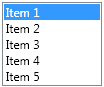
Although the Items property is read only, the provided collection is not necessarily read only. In fact, in earlier posts, we’ve already seen that you can directly add items to an ItemsControl:

<ListBox>
  <sys:String>Item 1</sys:String>
  <sys:String>Item 2</sys:String>
  <sys:String>Item 3</sys:String>
</ListBox>

Because items are added directly to the ListBox, this is an example of using an ItemCollection in “direct mode”. This is by far the simplest mode to use conceptually. In direct mode, the ItemCollection class works exactly like every other .NET collection. You can directly access all of the expected members of an indexed collection: Add(), Insert(), Remove(), RemoveAt(), IndexOf(), Items[index], Count, etc.

The other mode for an ItemCollection is called “ItemsSource mode”. In ItemsSource mode, the items in the ItemCollection correspond to items in a source collection. That source collection is specified via a separate property on the ItemsControl that is appropriately named “ItemsSource”.

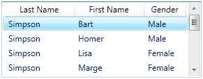
The following shows a typical scenario of an ItemsControl using ItemsSource mode:

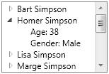
<ListView ItemsSource="{Binding Path=Characters}">
  <ListView.View>
    <GridView>
      <GridViewColumn Width="100"
        DisplayMemberBinding="{Binding Last}"
        Header="Last Name" />
      <GridViewColumn Width="100"
        DisplayMemberBinding="{Binding First}"
        Header="First Name" />
      <GridViewColumn Width="60"
        DisplayMemberBinding="{Binding Gender}"
        Header="Gender" />
    </GridView>
  </ListView.View>
</ListView>

The ItemsSource property is a dependency property of type IEnumerable. This tells us two important things:

1) The source collection can be any enumerable collection.

2) The ItemsSource property can be established using a binding.

As such, it is the ItemsSource property (in conjunction with the ItemsSource mode of an ItemCollection) that enables an ItemsControl to be databound to a collection.

Sidenote: Although you will most often see the ItemsSource property of an ItemsControl set via a binding, there is no reason that the ItemsSource property cannot be directly set to an enumerable collection, as shown here:

<ListBox ItemsSource="{StaticResource Characters}" />

The Modes are Mutually Exclusive

It should be noted that direct mode and ItemsSource mode are mutually exclusive. An ItemCollection is either in direct mode or in ItemsSource mode, but never both.

Once Items have been explicitly added to the Items collection, it is in direct mode. A subsequent attempt to set the ItemsSource property after entering direct mode will result in an exception.

Similarly, once the ItemsSource property has been set, the Items collection is in ItemsSource mode. A subsequent attempt to directly modify the Items collection (using Add(), Insert(), Remove(), etc) will result in an exception.

The only way to change modes at runtime is to either 1) clear the Items collection via the Clear method (if in direct mode) prior to setting the ItemsSource property, or 2) set the ItemsSource property to null (if in ItemsSource mode) prior to calling the direct access methods of ItemCollection.

Observable Collections Support Dynamic Updates

As noted earlier, in direct mode, changes to the Items collection are made through direct access methods of the ItemCollection class. Any such direct changes made at runtime will cause the visuals to be updated immediately.

But what about dynamic collection changes in ItemsSource mode? How could the Items collection possibly know about changes to the source collection?

The answer is that the ItemCollection cannot know about any such changes unless the source collection chooses to announce those changes by providing change notifications. The way a source collection does this is by fully implementing and supporting the INotifyCollectionChanged interface. Any collection that provides these change notifications is said to be observable.

Dynamic changes to an observable collection will be immediately reflected in the Items collection of any ItemsControl that is bound to the collection. Consequently, these changes will be immediately reflected in the user interface.

The INotifyCollectionChanged interface is not super complex, but ensuring proper implementation does place an extra burden on the source collection. If developers had to implement this interface anytime they wanted to bind to a collection, it would be a huge inconvenience. Luckily, the .NET framework provides a very handy generic template class called ObservableCollection<T>. By creating an instance of this class, you automatically get all of the change notifications without having to do any extra work.

Typically, you will see a collection class derive from ObservableCollection<T>, to create a strongly typed collection, as follows:

    public class StringCollection : ObservableCollection<string>
    {
    }

Any instance of this StringCollection class is fully observable and will serve well as the ItemsSource of an ItemsControl. It can be used exactly like an instance of Collection<string>.

So what if the collection is not observable? Can it still serve as an ItemsSource?

Absolutely. As noted earlier, any enumerable collection can serve as the source of an Items collection. The only caveat is that the Items collection will not be updated dynamically if the source collection changes at runtime. Rather, the collection will be enumerated once and its members will be added to the Items collection when the ItemsSource property is first established. Thereafter, if you want the Items collection to be updated, you must explicitly call the Refresh() method of ItemCollection.

CollectionView: “The Great Equalizer”

If you’ve worked with ItemsControl much, you probably know that sorting, grouping, and filtering are supported via the CollectionView class. This class also supports the notion of currency, which means a CollectionView maintains a current item pointer that can be accessed and moved using methods on the CollectionView.

Every enumerable collection in WPF has a default view. The collection may have multiple other views, each with its own sorting, grouping, and filtering parameters. A common way to establish a view of a collection in markup is to leverage the CollectionViewSource class, as shown here:

<CollectionViewSource x:Key="characterView"
    Source="{StaticResource Characters} ">
  <CollectionViewSource.SortDescriptions>
    <componentModel:SortDescription PropertyName="First" />
  </CollectionViewSource.SortDescriptions>
  <CollectionViewSource.GroupDescriptions>
    <dat:PropertyGroupDescription PropertyName="Last" />
  </CollectionViewSource.GroupDescriptions>
</CollectionViewSource>

This CollectionViewSource can then be specified as the ItemsSource of an ItemsControl, thereby causing its associated view of the collection to serve as the CollectionView for the control.

“But Dad, I don’t WANT a CollectionView!”

“I didn’t ask what you WANT… As long as you’re living under my roof, you’ll use a CollectionView!”

With WPF, sometimes it’s not as much about what you want, as it is about what the framework needs. The CollectionView class is a classic example. When it comes to binding controls to a collection of data items, the framework needs a way to treat all collections in a consistent manner.

Unfortunately, not all enumerable collections were created equal. For example, IList provides direct index-based access to items, whereas IEnumerable requires that you enumerate all items starting from the beginning of the collection until you come to the index you care about. For another example, consider a collection class that supports the INotifyCollectionChanged interface to provide collection change notifications versus a simple Collection<T> class that provides no such notifications.

The framework architects wanted to support binding to as many different types of collections as possible. But imagine how ugly the code for the ItemsControl class would be if it had to account for differences among collection types with conditional code blocks… if it’s an observable collection, do this, or if it’s an IList, do this, or if it’s an IEnumerable, do this, etc.

Enter the CollectionView class…

To deal with this challenge of disparate collections, WPF introduces the CollectionView class to serve as the great equalizer of enumerable collections. It is the CollectionView class that internally looks at a collection’s supported interfaces and determines how best to deal with the collection. It then surfaces a view of the collection through a well-defined set of properties, methods, and events. Essentially, it allows all collections to be treated by the ItemsControl class as equals.

So whether or not you care about currency, grouping, sorting, filtering, change notifications, etc., the Items collection of an ItemsControl is always maintained internally using a CollectionView. In fact, the ItemCollection class is a CollectionView.

Although true, that last statement is a little misleading since really, ItemCollection is just a wrapper class for an internal CollectionView member. The type of the internal CollectionView is determined by the type of the source collection and the mode of the ItemCollection. In Direct mode, it is always of type InnerItemCollectionView (an internal class designed specifically for direct mode views). In ItemsSource mode, it will be of type CollectionView for an IEnumerable source, ListCollectionView for an IList source, or BindingListCollectionView for an IBindingList or IBindingListView source.

So you’re observable… Who cares?

CollectionView does. We’ve already noted that dynamic changes to observable collections are immediately reflected in the Items collection. It is the CollectionView class that actually listens to the events raised by the collection. So if you’ve ever wondered exactly who is monitoring these events, get a life! Sorry… I meant to say, it’s CollectionView. Now you know.

Performance Considerations around Bound Collections

Keeping in mind that CollectionView serves as the great equalizer of collections, we should look at some performance considerations around binding to collections. We’ve already acknowledged that not all collections support the same features. Often, CollectionView must perform extra work to support its common interface for collections.

One of the major features provided by CollectionView is indexing for an enumerable collection. That is, CollectionView provides direct access to members of the collection by an integer-based index. This means it must support properties like this[int index] and Count, as well as methods like Contains() and IndexOf().

If the source collection already supports indexing, you will see much better performance when binding to the collection. This means that the best candidates for a source collection are those that support the IList interface. It should be noted that ObservableCollection<T> implements IList, so it’s a great choice.

If the source collection does not support index-based access (ICollection or IEnumerable, for example), then CollectionView must do a lot more work to surface the view as an indexed collection. In order to support a property like Count, it may be necessary to enumerate the entire collection. And some methods like Contains(), IndexOf(), and GetItemAt() can be super expensive, since the performance of the algorithm to support these operations is directly proportional to the size of the collection.

So the key perf takeaway is that the source collection should support IList whenever possible.

Items and the Element Trees

The items within the Items collection make up the logical children of the ItemsControl. They are said to be members of the logical tree. For a HeaderedItemsControl, the headers associated with each item will also be logical children of the ItemsControl. (Btw, if you’re not sure what a HeaderedItemsControl is, you should revisit The ICIQ Test and spend a little more time exploring the tooltips after receiving your score.)

If the items in the Items collection happen to be visuals, then they will also be members of the visual tree. If they are not visuals, they will instead be represented visually using an inflated template of visuals. Since the template represents data items, it is called a DataTemplate. For more on that, please tune in for the next episode in this series… ‘D’ is for DataTemplate.

Continuing Quest for "Star"-dom

October 25th, 2007

I just noticed that it’s been exactly two months since I joined the MSDN forums, so here’s my two-month update on my quest for 5 gold stars…

MSDN Profile

At the moment, I have exactly 3500 points, which puts me solidly in the middle of 3 stars.  I’m not quite half way to my 4th star (7500 points).  And at this rate, I should achieve my 5th star (15000 points) about 6 months from now.  Then I will finally be able to retire into obscurity (unless people start haphazardly marking all of my posts as helpful, in which case I could retire sooner)!  😉 

It’s quite clever of Microsoft to invent this little rating system that takes full advantage of the obsessive-compulsive nature of geeks to defend their geekdom.

ItemsControl: 'B' is for Bet You Can't Find Them All!

October 22nd, 2007

This is Part B in my “ItemsControl: A to Z” series.  Part A served mostly as an introduction to the ItemsControl class (one of the most abundant classes in many WPF applications).  We looked at several common ItemsControl samples involving controls like ListBox, ListView, TreeView, etc.  In this post, we will build on that introduction in what I hope will be a fun challenge and a good learning experience. 

What’s your ICIQ?

You will shortly be presented with a small, interactive quiz called “The ItemsControl Intelligence Quotient (ICIQ) Test”.  The purpose of “The ICIQ Test” is to see how well you can recognize different ItemsControl instances in a real WPF application.  You will be shown a screenshot of a WPF application that is used internally by the Microsoft Dynamics Team to build and visualize customer models.  (Special thanks to Microsoft for providing me with the image!)

Full Disclosure:  It’s Rigged!

Despite the name, “The ICIQ Test” does not really measure intelligence… rather, it measures your observational and deductive reasoning skills regarding the usage of items controls.  And yes, this test is completely unfair!  Even for the seasoned WPF developer, there will be some visuals in the snapshot that could go either way.  You’ve been warned!

It’s Intended to be a Learning Experience

Ultimately, I hope you will approach this as a learning experience.  (Well, unless you happen to get a really high score, in which case you should run around the office gloating about your extremely high ICIQ and immediately demand a raise from your boss!) 

This test should help reinforce some core concepts regarding the lookless nature of WPF controls and the power of templating to present native controls in ways that are visually meaningful.

When you complete the test, you will have an opportunity to further explore the different ItemsControl examples in the application, as shown below: 

Learning Tips

If you are new to WPF, some of the terms like “items host” and “item container” may not make sense yet.  All of these concepts will be covered in detail as this series progresses. 

“Enough already!  Let me take the test!”

Go for it!  Here’s your official link to “The ICIQ Test“.  I look forward to hearing how unfair it was!!  😉

And don’t forget to come back for the next installment in this series:  ‘C’ is for Collection.

Cheers,
Dr. WPF

ToolTip Positioning

October 16th, 2007

Hi Dr. WPF,

I have a Window which is filled with multiple images shown on it side-by-side and I have a need to show a popup window when somebody hover overs an image element. Please note that it is not really a new window but somewhat like a tooltip (but not exactly that). The popup will contain a bigger version of the image they hovered over originally and if they move their mouse over another image, the popup will contain that image at that time and will move over the image the user last hovered over.

Can you please help me with this? I have tried playing with the “Popup” element and the “Tooltip” element but have not found a workable solution yet – I was not able to place the tooltip at the location I wanted (it always appeared a little below the mouse cursor).

Thanks,
Paras


Hi Paras,

I couldn’t resist the opportunity to answer your question online, since the sample I came up with fits so nicely with the ItemsControl series I just started, ItemsControl:  A to Z.  (Yeah, I know thats not the point of your question, but still…)

Here are the key properties to use when you are positioning a Popup:

  • Placement
  • PlacementTarget
  • PlacementRectangle
  • VerticalOffset
  • HorizontalOffset

These are explained fairly well in this article in the docs.  There are also a couple of application samples in the docs you can download here and here.  But since you just want something quick…

Below you will find a very simple sample that implements the scenario you describe above using a ToolTip.  You should be able to paste the XAML directly into XamlPad.  Note that the popups may be slow since the images are being pulled across the web.  For a more performant version, you can update the strings in the Items collection to point at local files on your hard drive. 

This example uses the Placement property on the ToolTip with a value of “Bottom” combined with the HorizontalOffset and VerticalOffset properties to further displace the ToolTip.  You can play with the values in XamlPad until you find what you like.


<Grid xmlns:x="http://schemas.microsoft.com/winfx/2006/xaml"
    xmlns="http://schemas.microsoft.com/winfx/2006/xaml/presentation"
    xmlns:sys="clr-namespace:System;assembly=mscorlib">
 
  <Grid.Resources>

    <ControlTemplate x:Key="ICWithScrollingWrapPanel"
        TargetType="{x:Type ItemsControl}">
      <Border Background="{TemplateBinding Background}"
          BorderBrush="{TemplateBinding BorderBrush}"
          BorderThickness="{TemplateBinding BorderThickness}">
        <ScrollViewer Margin="{TemplateBinding Padding}">
          <WrapPanel IsItemsHost="True" />
        </ScrollViewer>
      </Border>
    </ControlTemplate>

    <ToolTip x:Key="ImageToolTip" Placement="Bottom"
        HorizontalOffset="20" VerticalOffset="5">
      <Grid Background="Gray">
        <Image Source="{Binding}" />
      </Grid>
    </ToolTip>

    <DataTemplate x:Key="ImageTemplate">
      <Image Width="100" MaxHeight="100" Margin="5"
          ToolTip="{StaticResource ImageToolTip}"
          Source="{Binding}" />
    </DataTemplate>

  </Grid.Resources>

  <ItemsControl Width="355" Height="200" Background="LightGray"
      BorderBrush="Black" BorderThickness="1" Padding="2"
      Template="{StaticResource ICWithScrollingWrapPanel}"
      ItemTemplate="{StaticResource ImageTemplate}">
    <sys:String>http://www.microsoft.com/presspass/images/gallery/campus/bldg10_flags_web.jpg</sys:String>
    <sys:String>http://techfreep.com/images/googleplex.jpg</sys:String>
    <sys:String>http://www.sfgate.com/c/pictures/2006/12/24/bu_earns_yahoo_ny.jpg</sys:String>
    <sys:String>http://img.groundspeak.com/waymarking/b696fde2-62b8-426c-81dd-4e3ae6836402.jpg</sys:String>
    <sys:String>http://www.svdaily.com/applehq.jpg</sys:String>
    <sys:String>http://www.nextcomputers.org/NeXTfiles/Images/History/NeXT_Buildings/redwood02.jpg</sys:String>
    <sys:String>http://explorer.altopix.com/uploads/hz166e.jpg</sys:String>
    <sys:String>http://www.ti.com/corp/graphics/press/image/on_line/co1772.jpg</sys:String>
    <sys:String>http://www.freefotoexchange.netsons.org/data/510/61121758627-1.jpg</sys:String>
  </ItemsControl>

</Grid>

 
Hope this helps!

Best regards,
Dr. WPF

ItemsControl: 'A' is for Abundance

October 15th, 2007

This is the first post in a series I’m calling, “ItemsControl: A to Z”.

I’ve received quite a few questions lately that were either directly or indirectly related to the ItemsControl class. It’s noteworthy that often, the questioner did not even realize they were asking an ItemsControl question.

So it occurs to me that there may be a general need for better information about this class, including its usages, nuances, idiosyncrasies, as well as all the WPF goodness that can be had through styling and templating an ItemsControl and binding a collection to it.

(And let me just say up front that it’s highly unlikely I’ll make it all the way to Z without skipping a few letters. J)

But first things first… I suppose we should start with the basics.

What is an ItemsControl?

Quite simply, an ItemsControl is a control that presents a collection of items.

The ItemsControl is one of the most abundant controls in the user interface of just about any WPF application. It is the base class of every native WPF control that presents a collection of items, including but not limited to the following:


ComboBox
<ComboBox SelectedIndex="0">
  <ComboBoxItem>Item 1</ComboBoxItem>
  <ComboBoxItem>Item 2</ComboBoxItem>
  <ComboBoxItem>Item 3</ComboBoxItem>
</ComboBox>
 
ContextMenu
Menu
MenuItem
<ContextMenu>
  <MenuItem Header="New"/>
  <MenuItem Header="Open"/>
  <Separator/>
  <MenuItem Header="Submenu">
    <MenuItem Header="Submenu Item 1"/>
    <MenuItem Header="Submenu Item 2"/>
  </MenuItem>
</ContextMenu>
 
ListBox
<ListBox SelectedIndex="0" Width="100">
  <ListBoxItem>Item 1</ListBoxItem>
  <ListBoxItem>Item 2</ListBoxItem>
  <ListBoxItem>Item 3</ListBoxItem>
  <ListBoxItem>Item 4</ListBoxItem>
  <ListBoxItem>Item 5</ListBoxItem>
</ListBox>
 
ListView
<ListView SelectedIndex="0" Height="110"
    ItemsSource="{StaticResource Characters}">
  <ListView.View>
    <GridView>
      <GridViewColumn Width="100"
        DisplayMemberBinding="{Binding Last}"
        Header="Last Name" />
      <GridViewColumn Width="100"
        DisplayMemberBinding="{Binding First}"
        Header="First Name" />
      <GridViewColumn Width="60"
        DisplayMemberBinding="{Binding Gender}"
        Header="Gender" />
    </GridView>
  </ListView.View>
</ListView>
 
TabControl
<TabControl Width="150" Height="100">
  <TabItem Header="One">
    <TextBlock>Hello World</TextBlock>
  </TabItem>
  <TabItem Header="Two" />
  <TabItem Header="Three" />
</TabControl>
 
ToolBar
<ToolBar Margin="2">
  <Button Command="ApplicationCommands.Open"
      Height="40" Width="40"
      Background="{StaticResource OpenIcon}" />
  <Button Command="ApplicationCommands.Save"
      Height="40" Width="40"
      Background="{StaticResource SaveIcon}" />
</ToolBar>
 
TreeView
TreeViewItem
<TreeView Width="150" Height="100"
    ItemsSource="{StaticResource Characters}">
  <TreeView.Resources>
    <HierarchicalDataTemplate
        DataType="{x:Type src:Character}"
        ItemsSource ="{Binding Fact}">
      <TextBlock Text="{Binding Name}" />
    </HierarchicalDataTemplate>
    <DataTemplate DataType="{x:Type src:Fact}">
      <StackPanel Orientation="Horizontal">
        <TextBlock Text="{Binding Name}" />
        <TextBlock Text=": " />
        <TextBlock Text="{Binding Value}" />
      </StackPanel>
    </DataTemplate>
  </TreeView.Resources>
</TreeView>

A Control in its Own Right

The controls listed above are most often used because of the additional features they provide on top of the base ItemsControl class. However, it should also be noted that an ItemsControl may be instantiated and used directly, as shown in the following example:

<Grid xmlns:x="http://schemas.microsoft.com/winfx/2006/xaml"
    xmlns="http://schemas.microsoft.com/winfx/2006/xaml/presentation">
  <Grid.RowDefinitions>
    <RowDefinition Height="Auto" />
    <RowDefinition />
  </Grid.RowDefinitions>
  <ItemsControl VerticalAlignment="Top">
    <ItemsControl.ItemTemplate>
      <DataTemplate>
        <Button Command="{Binding}" Content="{Binding}"
          CommandTarget="{Binding ElementName=EditRegion}" />
      </DataTemplate>
    </ItemsControl.ItemTemplate>
    <ItemsControl.ItemsPanel>
      <ItemsPanelTemplate>
        <StackPanel Orientation="Horizontal" />
      </ItemsPanelTemplate>
    </ItemsControl.ItemsPanel>
    <x:Static Member="ApplicationCommands.Cut" />
    <x:Static Member="ApplicationCommands.Copy" />
    <x:Static Member="ApplicationCommands.Paste" />
  </ItemsControl>
  <TextBox Name="EditRegion" Grid.Row="1" />
</Grid>

This markup creates what you might call a poor man’s toolbar. (No, it’s not a very likely real-world scenario.) In future posts, we will explore reasons why you might choose to use an ItemsControl directly, rather than, say, a ListBox.

Is a Panel an ItemsControl?

No. The logical children of a panel are UIElements, whereas the logical children of an ItemsControl (its Items) can be any CLR objects.

Sidebar: So what is a panel? The main role of a panel is to provide layout support for its children. Although a panel does maintain a collection of child elements, it is not technically a WPF “control”… That is, it does not derive from the Control base class and it does not support the WPF notion of templating. Instead, it is a single element with a single purpose… namely, to size and position (a.k.a., measure and arrange) its children.

Why should I care about the ItemsControl class?

Since it’s such an abundant control, it will pay dividends to take time now to understand the basic principles that apply to the ItemsControl class and its descendants. Once you understand these concepts as they pertain to one ItemsControl variant, perhaps a ListBox, it will be very easy to apply that same knowledge to other variants.

And suppose you should someday stumble upon a declaration like this:

<dw:Graph ItemsSource="{Binding Source={StaticResource OrgChartItems}}"
    ItemContainerStyle="{StaticResource NodeStyle}"
    ItemTemplate="{StaticResource EmployeeTemplate}"
    ItemsPanel="{StaticResource TreeGraphPanelTemplate}" />

Armed with your existing knowledge, you won’t panic in the least. You will simply recognize that this Graph object is a custom ItemsControl and you will immediately understand how to use the majority of its features.

What will be covered?

In future posts in this series, I hope to cover each of the topics below in some detail. I’m sure this is not an exhaustive list, but it should give you a general feel for the direction of the series.

  • The Item Collection: Items vs. ItemsSource
  • Recognizing when to use an ItemsControl
  • Item Templates
  • Item Containers
  • Item Container Generation
  • The Items Host (or ItemsPanel)
  • Styling and Templating an ItemsControl
  • Traversing Container and Template Trees
  • The HeaderedItemsControl
  • Styling and Templating a Headered ItemsControl
  • Building a Custom ItemsControl and Item Containers
  • UI Virtualization

Please let me know what other topics you’d like me to add to the list. And please stay tuned for the next topic in this series… “B is for Bet You Can’t Find Them All!”

Enhancing Developer/Designer Productivity

October 8th, 2007

“Joe” added the following comment to my earlier post on WPF project structure:

I would be interested to know how developers tackle the Blend issue. I’ve hit problems when most of the visuals are embedded in Data Templates and you only see the final product when real data is populated into the ItemsControls. Are developer teams using canned data just to edit the visuals?

The answer to that question for most of the projects I’ve worked on is definitely “yes”.  Designers are most effective when they can edit templates directly.  To do this in Blend, you often have to simulate the real data by using fake data.

Laurent Bugnion just posted a nice screencast on a very structured approach to enhancing designer/developer productivity in WPF.  This approach is built around the concept that there are three distinct personas involved in the development process:  designer, developer, and integrator (the ever-elusive “devigner” who understands both worlds and can work in the middle to integrate the code and the design).

And in this earlier blog post, Laurent provides an article demonstrating how one might provide “canned data” in design mode to accomodate the editing of templates in Blend.

Managing Application Resources when WPF is Hosted

October 5th, 2007

Dear Dr. WPF,

We are running into some issues around application level resources when we attempt to put WPF task pane UI within Office. The primary issue is that the runtime host is not WPF in these cases which means that Application.Current.Resources is not available. That in turn affects how static resource references are handled in the xaml and how FindResource() works in code.

We’re curious if you have any viable solutions or experience with this type of situation. I’m guessing that in addition to Office/VSTO that Winforms hosted interop would have similar issues.

Thanks,
Brian


Dear Brian,

Managing application-level resources in an interop scenario like yours, where WPF is being hosted within another technology like Win32 or Windows Forms, definitely requires more work on the part of the developer. In this post I’ll describe a number of approaches that you might take and you can decide which is the most appropriate for your scenario.

Brief Intro to Resources and Resource Resolution

For those who may be new to WPF (or who may just want a refresher), this section contains a brief introduction to resources and resource resolution. Feel free to skip ahead if you’re already familiar with these concepts.

Each framework element (which means any descendant of FrameworkElement or FrameworkContentElement) has a Resources collection. This collection is of type ResourceDictionary. The ResourceDictionary type truly represents a CLR Dictionary in which each value (or resource) has a unique key.

The fact that every framework element has its own Resources collection allows resources to be defined at any level in the element tree.

<Grid Margin="20" x:Name="RootGrid">
  <Grid.Resources>
    <Storyboard x:Key="FadeOutGlassStoryboard" TargetProperty="Opacity">
      <DoubleAnimation To="0" Duration="0:0:0.5" />
    </Storyboard>
  </Grid.Resources>
  . . .
  <StackPanel>
    <StackPanel.Resources>
      <Style TargetType="{x:Type ListBoxItem}">
        <Setter Property="Template">
          <Setter.Value>
            <ControlTemplate TargetType="{x:Type ListBoxItem}">
              <ContentPresenter
                  ContentTemplate="{TemplateBinding ContentTemplate}"
                  Content="{TemplateBinding Content}" />
            </ControlTemplate>
          </Setter.Value>
        </Setter>
      </Style>
    </StackPanel.Resources>
    . . .
  </StackPanel>
</Grid>


In addition, resources can be defined at the application level within a markup file called an application definition file:

<Application x:Class="WindowsApplication1.App"
    xmlns="http://schemas.microsoft.com/winfx/2006/xaml/presentation"
    xmlns:x="http://schemas.microsoft.com/winfx/2006/xaml"
    StartupUri="Window1">
  <Application.Resources>
    <ResourceDictionary>
      <Style x:Key="{x:Type GridSplitter}" TargetType="{x:Type GridSplitter}">
        <Setter Property="IsTabStop" Value="False" />
      </Style>
      <ResourceDictionary.MergedDictionaries>
        <ResourceDictionary Source="Resources\ConverterResourceDictionary.xaml"/>
        <ResourceDictionary Source="Resources\LogoDictionary.xaml"/>
        <ResourceDictionary Source="Resources\ColorsResourceDictionary.xaml"/>
        <ResourceDictionary Source="Resources\IconResourceDictionary.xaml"/>
        <ResourceDictionary Source="Resources\SimpleStyles.xaml"/>
      </ResourceDictionary.MergedDictionaries>
    </ResourceDictionary>
  </Application.Resources>
</Application>

And finally, resources can be defined at the theme level. In addition to the built-in Windows themes, control libraries might define their own theme-level resources.

So there are several levels at which resources may be defined. Now let’s look at how you use (a.k.a., reference) resources.

In markup, a resource reference can be either static or dynamic. There are slightly different rules that apply to each:

  • A static reference is applied to a property in XAML by using the {StaticResource xxx} markup extension and a dynamic reference is applied via the {DynamicResource yyy} extension, where xxx and yyy represent the respective resource keys.
  • A static reference can be used to set any CLR property, whereas a dynamic reference can only be used to set dependency properties on framework elements or freezables or to set the Value property of Setter objects in styles.
  • Static resource references are resolved at parse time (for the most part), whereas dynamic references are resolved at run time. This means a static reference can only be used if the resource has been parsed before the reference, whereas a dynamic reference can be used as a forward reference for a resource that is defined later.

The process of resource resolution begins with the referencing element. First, the Resources collection of the referencing element is checked. If a dynamic reference was used and the element has a Template and/or Style, the Resources collections of the Template and Style are also checked. If the resource was not found, resource resolution then continues up the element tree by searching the Resources collections of each parent until the resource is found.

Resource resolution always favors the logical tree. (If an element does not have a logical parent, resolution will begin through the visual tree until an ancestor is found in the logical tree and it will then continue up the logical tree.) If the root of the logical tree is reached and the resource has not been resolved, the application-level resource dictionary will be searched. If still unresolved and a dynamic resource reference was used (or a static reference was deferred), then the theme resources will be checked.

Resources can also be retrieved in code by using the FindResource() method on a framework element. The resolution process is very much the same as with dynamic references.

Resource Considerations for Custom Controls

There are special considerations around resources when writing custom control libraries. My focus in this post is purely on managing application-level resources in a hosted interop scenario. For anyone writing a control library, I would recommend that you check out the following post in the WPF SDK blog:

Using Shared Resources in a Controls Library.

Application-Level Resources in a WPF Application

When building a typical WPF application, the MSBuild project file contains a project element named ApplicationDefinition. This element identifies a XAML file whose root descends from the Application class. So for a C# project, the Application class files would appear as follows in the .csproj file.

<ApplicationDefinition Include=”App.xaml” />
<Compile Include=”App.xaml.cs”>
<DependentUpon>App.xaml</DependentUpon>
<SubType>Code</SubType>
</Compile>

MSBuild now knows that this class represents the entry point for the WPF application, so it auto-generates a file named App.g.cs that contains an entry point, as follows:

[System.STAThreadAttribute()]
[System.Diagnostics.DebuggerNonUserCodeAttribute()]
public static void Main() {
    WindowsApplication1.App app = new WindowsApplication1.App();
    app.InitializeComponent();
    app.Run();
}

This is the code that instantiates the Application class in a typical WPF application.

As mentioned earlier, the Application class contains a Resources property which identifies the ResourceDictionary where application-level resources reside. A typical ApplicationDefinition file was presented in the introduction section above.

Note that there can be individual resources in the Application’s Resources collection as well as additional merged resource dictionaries. All such resources are available at the application level, and thus, can be referenced freely throughout the application. This provides an elegant mechanism for theming the application, as well as for sharing common resources among different pages, windows, user controls, etc.

Providing Application-Level Resources when WPF is Hosted

When WPF is hosted inside a managed application framework like Windows Forms or in an unmanaged framework like MFC or pure Win32, this elegance provided by application-level resources is lost because WPF’s Application object does not even get created. (Recall that it is the auto-generated code that actually creates the Application instance.) As such, resource resolution occurs only within the element tree and at the theme level.

The good news is that there are several ways to effectively bring back the benefits of application-level resources in these hosted interop scenarios…

Create an Application Instance and Add Resources in Code

The most obvious approach is to simply create an instance of the Application class. Since the Application class is a singleton, you can simply instantiate an instance of the class and then you have access to it throughout your app. Of course, at that point, its Resources collection is empty, so you will probably want to add some resources. Since it is more convenient to declare resources in markup, I typically define my resources in a ResourceDictionary and then merge them into the Resources collection in my Application object.

Below is a very simple function that will create the Application object if it does not exist and then load some resources:

public static void EnsureApplicationResources()
{
    if (Application.Current == null)
    {
        // create the Application object
        new Application();

        // merge in your application resources
        Application.Current.Resources.MergedDictionaries.Add(
            Application.LoadComponent(
                new Uri("MyLibrary;component/Resources/MyResourceDictionary.xaml",
                UriKind.Relative)) as ResourceDictionary);
    }
}

Now you just need to make sure that you call this function prior to parsing any XAML files that contain static resource references to application-level resources. To do this, simply add a call to the above function in the constructor of your markup-based classes before any call to InitializeComponent():

public Page1()
{
    EnsureApplicationResources();
    InitializeComponent();
}

Voîla! You now have application-level resource resolution in your hosted scenario.

There are a couple of things worth pointing out here. First, in this scenario, we are only using the Application object for resource resolution. You would not want to call the Application’s Run() method in the hosted scenario, since that would start a WPF dispatcher. In our scenario, the hosting technology is responsible for dispatching Windows messages. (The exception might be if the host was a Win32 console app, in which case you would need to supply a message pump for WPF.)

Another thing to keep in mind is that the Application singleton will remain alive for the remainder of the process lifetime unless you take steps to release it. If your scenario only calls for WPF to be used for a finite period of time during application execution, you should call the Application’s Shutdown() method when you no longer need it. In a non-hosted WPF application, this would actually shut down the application by shutting down the dispatcher. In our hosted scenario, it will simply release the rooted reference to the singleton. After calling Shutdown(), the static Application.Current property will once again return null. At this point, the object should be available for garbage collection.

Define the Application Class in XAML and Create It on the Fly

The above approach is nifty, but it requires us to do the work of adding and merging resources in code. This is great if you want dynamic control over exactly which resources are added. But if your scenario always calls for the same application-level resources, wouldn’t it be easier to just define those in markup the same way you would for a native WPF application?

Good news… You can! You just need to make a couple of small changes to the MSBuild project file and the code-behind for your Application class.

First, we do not want MSBuild to generate an application entry point for our Application class. So instead of declaring the App.xaml file as an ApplicationDefinition element in the project file, we need to declare it as a Page element:

<Page Include="App.xaml" />
<Compile Include="App.xaml.cs">
  <DependentUpon>App.xaml</DependentUpon>
  <SubType>Code</SubType>
</Compile>

Next, we need to make sure that our App.xaml markup is parsed. Typically, this is done as part of the entry point function (which we just eliminated). Instead, we can simply define a constructor for the Application class and call InitializeComponent directly:

public App()
{
    InitializeComponent();
}

Now all our resources and merged dictionaries can be declared in App.xaml and our static function to load the Application instance can be as simple as this:

public static void EnsureApplicationResources()
{
    if (Application.Current == null)
    {
        // create the Application object
        new App();
    }
}

Manage a Collection of Resource Dictionaries in Code and Merge them at the Element Level

The final approach I’ll discuss for managing application resources in a hosted scenario involves programmatically managing a collection of resource dictionaries. In this scenario, we do not leverage an Application object at all. Instead, we dynamically load each ResourceDictionary at runtime and selectively merge it into pages or windows or specific elements, as necessary.

Clearly, this puts more responsibility on the developer for ensuring that the proper resources are merged at the proper locations. But it has benefits too, such as better scoping of resources and not having to track the lifetime of the Application object.

When using this approach, the trick to ensuring that application resources are truly shared across element trees is to only create a single instance of each resource dictionary. This can easily be accommodated by leveraging a static dictionary of dictionaries:

private static Dictionary<string, ResourceDictionary>
    _resourceDictionaries = new Dictionary<string, ResourceDictionary>();

Now each dictionary can be referred to using a simple name, such as “ApplicationBrushes”. A static utility function can be used to retrieve the resource dictionary by name. If the dictionary is not loaded, the function can automatically load it:

public static ResourceDictionary GetResourceDictionary(string dictionaryName)
{
    if (!_resourceDictionaries.ContainsKey(dictionaryName))
    {
        _resourceDictionaries[dictionaryName] = Application.LoadComponent(
            new Uri("MyLibrary;component/Resources/" + dictionaryName + ".xaml",
            UriKind.Relative)) as ResourceDictionary;
    }
    return _resourceDictionaries[dictionaryName];
}

And to make this solution play nicely in the WPF world, we should allow dictionaries to be merged declaratively in our markup files. One way to do this is to leverage an attached property. Suppose we define a static class called SharedResources and in that class we define a string property called MergedDictionaries. This would allow us to merge in shared resource dictionaries to the Resources collection of any framework element, by simply doing this:

<Grid dw:SharedResources.MergedDictionaries="ApplicationBrushes;ButtonStyles">
    . . .
</Grid>

As you can see, my MergedDictionaries property allows for a semicolon-delimited list of resource dictionaries that should be merged into the Resources collection of the Grid.

The only thing left to do now is actually implement the SharedResources class and the MergedDictionaries attached property. Here is that class in its entirety with a few bonus refinements:

using System;
using System.Collections.Generic;
using System.Text;
using System.Windows;
using System.Reflection;

namespace DrWPF.Windows
{
    public static class SharedResources
    {
        #region MergedDictionaries

        public static readonly DependencyProperty MergedDictionariesProperty =
            DependencyProperty.RegisterAttached("MergedDictionaries",
                typeof(string), typeof(SharedResources),
                new FrameworkPropertyMetadata((string)null,
                    new PropertyChangedCallback(OnMergedDictionariesChanged)));

        public static string GetMergedDictionaries(DependencyObject d)
        {
            return (string)d.GetValue(MergedDictionariesProperty);
        }

        public static void SetMergedDictionaries(DependencyObject d, string value)
        {
            d.SetValue(MergedDictionariesProperty, value);
        }

        private static void OnMergedDictionariesChanged(DependencyObject d,
            DependencyPropertyChangedEventArgs e)
        {
            if (!string.IsNullOrEmpty(e.NewValue as string))
            {
                foreach (string dictionaryName in (e.NewValue as string).Split(';'))
                {
                    ResourceDictionary dictionary =
                        GetResourceDictionary(dictionaryName);
                    if (dictionary != null)
                    {
                        if (d is FrameworkElement)
                        {
                            (d as FrameworkElement).Resources
                                .MergedDictionaries.Add(dictionary);
                        }
                        else if (d is FrameworkContentElement)
                        {
                            (d as FrameworkContentElement).Resources
                                .MergedDictionaries.Add(dictionary);
                        }
                    }
                }
            }
        }

        #endregion

        private static ResourceDictionary GetResourceDictionary(string dictionaryName)
        {
            ResourceDictionary result = null;
            if (_sharedDictionaries.ContainsKey(dictionaryName))
            {
                result = _sharedDictionaries[dictionaryName].Target;
            }
            if (result == null)
            {
                string assemblyName = System.IO.Path.GetFileNameWithoutExtension(
                    Assembly.GetExecutingAssembly().ManifestModule.Name);
                result = Application.LoadComponent(new Uri(assemblyName
                    + ";component/Resources/" + dictionaryName + ".xaml",
                    UriKind.Relative)) as ResourceDictionary;
                _sharedDictionaries[dictionaryName] = new WeakReference(result);
            }
            return result;
        }

        private static Dictionary<string, WeakReference> _sharedDictionaries
            = new Dictionary<string, WeakReference>();
    }
}

Notice that in this implementation, instead of keeping a dictionary of dictionaries, I’m keeping a dictionary of weak references to dictionaries. This ensures that my static class does not keep any resource dictionary in memory when it is no longer in use. (The class could certainly be augmented to provide a mechanism to lock a resource dictionary in memory for times when you want to persist resources across application lifetime. In the name of simplicity, I’ll leave that as an exercise for the reader.)

So there you have a few options for dealing with application-level resources while running hosted. Hope it helps!

Best regards,
Dr. WPF